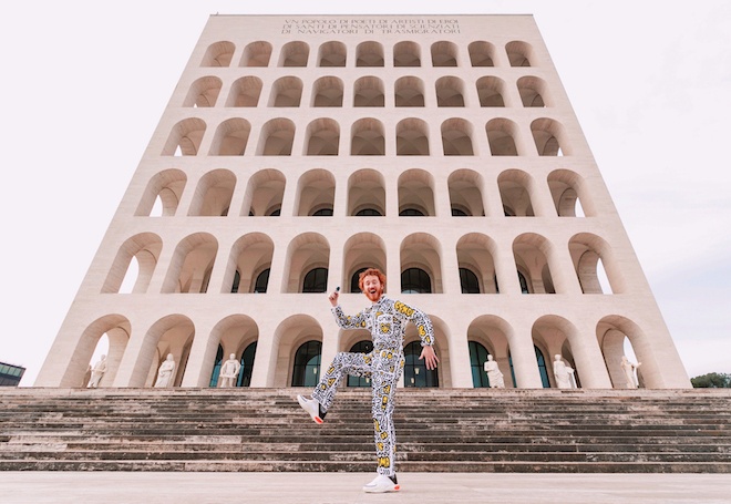
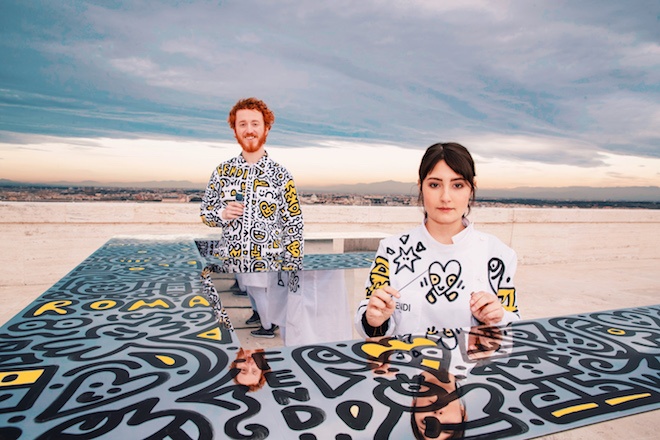
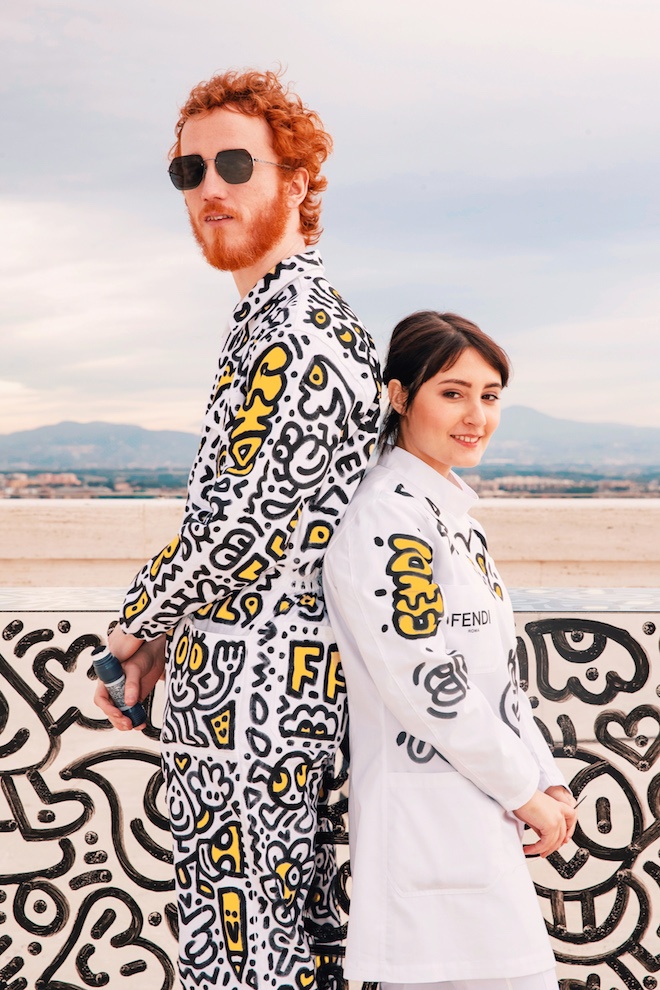
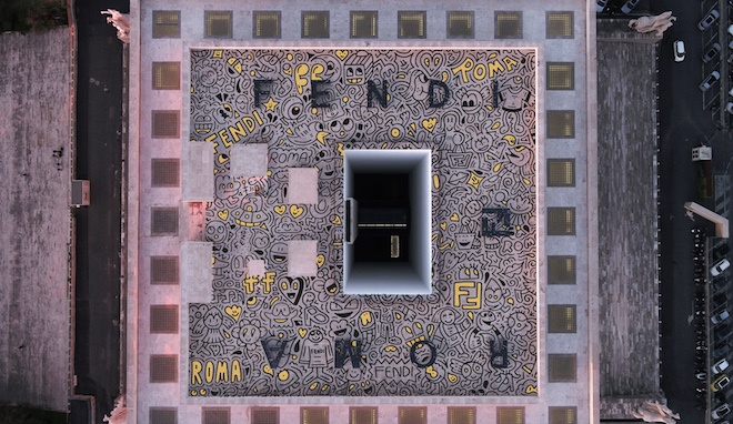
London based artist Sam Cox aka Mr Doodle has joined forces with Italian fashion house Fendi for the latest instalment of their F IS FOR…FENDI rooftop performance in an edition titled Doodling FENDI ROMA. The collaboration sees Mr Doodle — who is known for his signature drawings on walls, rooms, furniture etc. — take over the Fendi Headquarters in Rome for an extreme makeover. The artist spent two days of drawing in an ongoing creative stream where he used the label’s iconic double F logo as his outlet. Mr Doodle starts with mirrored desks and then moves on to cover the FENDI rooftop and eventually the entire Palazzo Della Civiltà Italiana. Images and videos show the artistic chemistry between Sam and Caterina, a young tailor of the FENDI atelier as she stitches on Mr Doodle’s jumpsuit by combining different tailoring techniques and applying them to different materials and textures to create a unique tailor made piece.
Mr Doodle is also the only one to have ever doodle on a white canvas Peekaboo bag, creating a one of a kind version of the house’s iconic accessory.
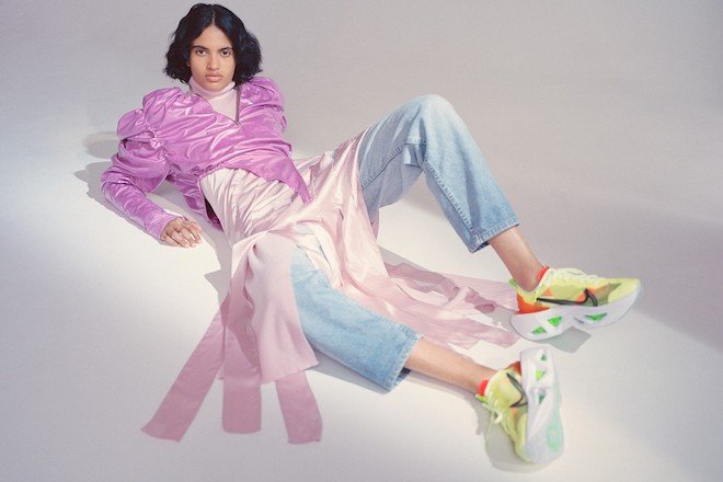
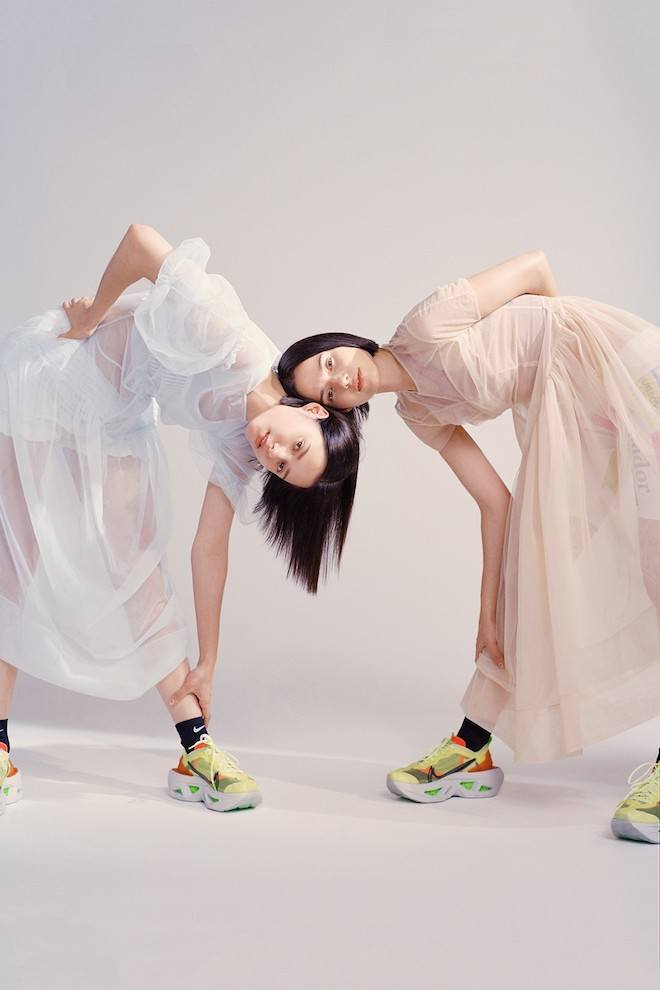
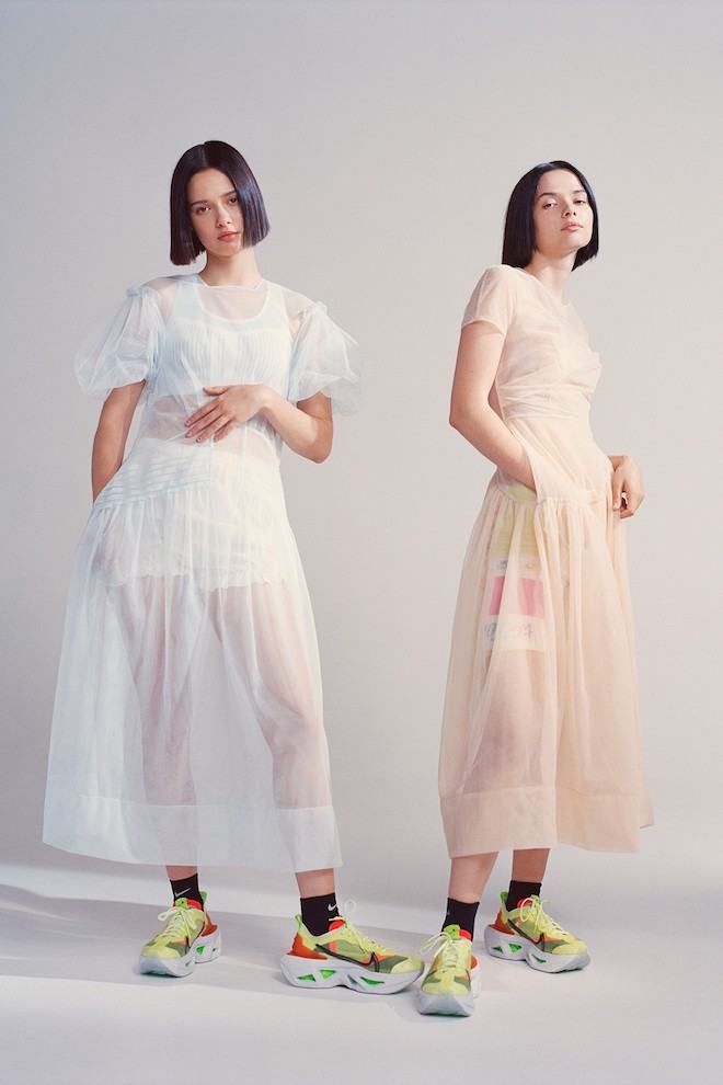
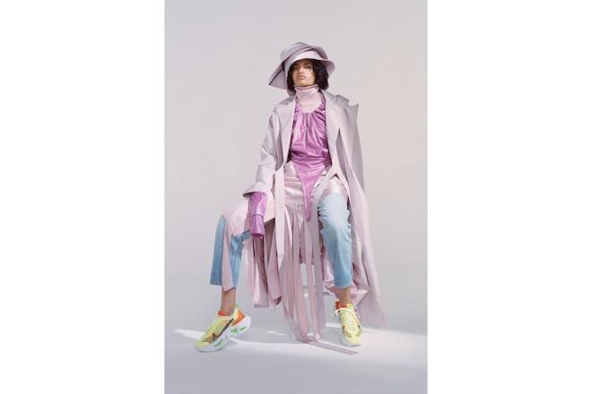
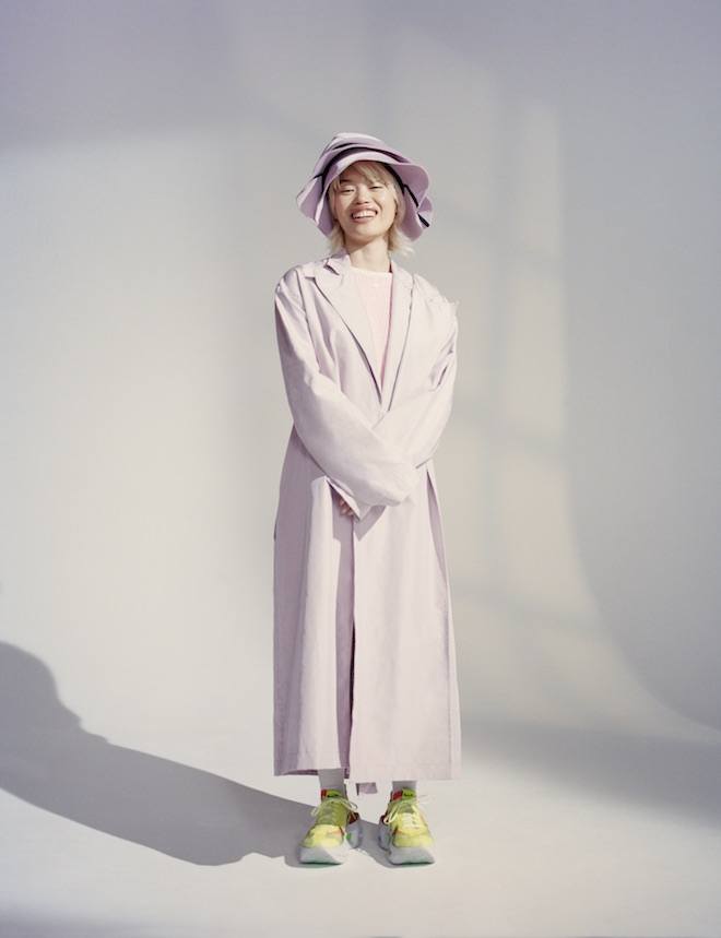
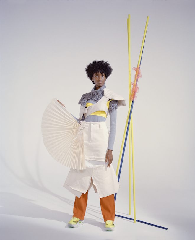
One of the sneakers of the summer has been Nike’s ZoomX Vista Grind. Released earlier last month, the sneaker, specially crafted for the female consumer has already been seen on the soles of women and men everywhere. With a statement silhouette and bold features yet a level of comfort fit for athletics, the shoe is a fusion of both streetwear and high fashion. This concept was said to have been sparked by the Women’s World Cup and the city of Paris, with the intention of creating a clash of the city and suburbs, creating something both rebellious as well as refined. Sustainability was also a key driver in the creation process of the shoe, as foam scraps from the brand’s ZoomX sneakers were used to enable a level of technology fit for sports into the Vista Grind. See the full story in our XXI issue to be released mid-September.
Born in Dallas Texas, artist Gray Wielebinski uses their practice to explore the ways in which gender and sexuality intersect with other structures of power and identity, often referencing their body and journey as an individual who is currently undergoing the transition from female to male.
Working between London and Los Angeles in print, video, performance, sound, sculpture, and installation, Gray moved to London in 2017 to complete a masters in Fine Art Media at The Slade. Since then, Gray has exhibited internationally and is currently an artist in residence at The City & Guilds of London, alongside Taku Obata and Alistair Gordon.
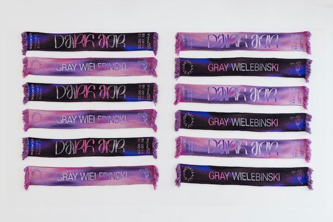
Using a variety of strategies to explore identity, specifically their ambivalent relationships to masculinity, Gray’s more recent research and practice uses sports for both aesthetics and metaphor as an entry point to examine themes such as national identity (specifically the US and Americana), desire, myth making, surveillance, hierarchies, race, and gender. In Dark Air, the artist’s first solo exhibition at SEAGER gallery curated by Martin Mayorga and Vanessa Murrell from DATEAGLE ART, we observe Gray’s ongoing exploration of sporting ceremonies as seen in the artist’s personalised football scarf stand. Located at the entrance of the gallery space, the piece highlights the ritualistic yet commercial nature of the sport, while also reiterating the entwined nature and relationship found between myth and sport.
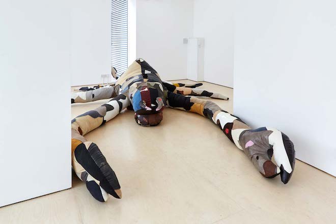
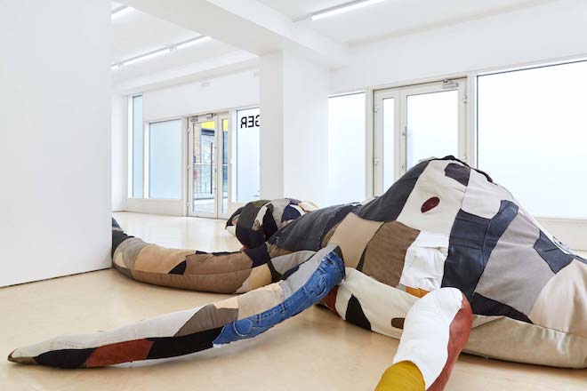
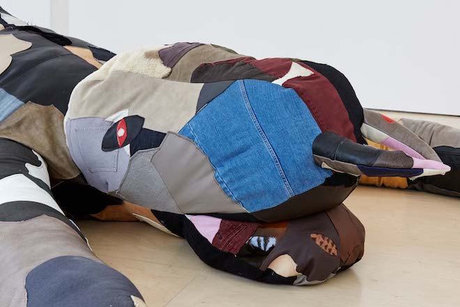
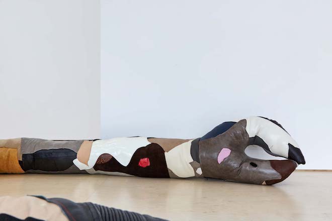
Instead of displaying a body of work, the exhibition uses the body as the work – acknowledging it as something which can be moulded and adjusted continuously. Using a diverse array of textiles to create a patchwork of materials that include recycled leather and jeans, Gray creates a site-specific sculpture, a monstrous creature that is representative of both the sphinx and Scorpion. Stuffed and stitched, the physical act of creating the hybradised beast presents the audience with a work that exists in a paradoxical realm. All at once it is violent and volatile yet gentle and vulnerable – playing with traditional binary stereotypes of male and female. With only a few days left to see Dark Air, Gray spoke with Twin about the show and their grotesque Frankenstinian beast. Gray also speaks openly about their own dysphoria and dissociation with their body as well as the importance of being conscious in order to re-inhabit and bridge the gap between their mind and body to create as harmonious a relationship as possible.
You started to create art as a way of helping you relate to your own body – is this where the tactile element of your practice and its link to your own body manifests from?
In a lot of ways, in regards to my gender identity as well as my art practice itself, I was existing very much in my own head and in an ideological way rather than a physical one, which isn’t necessarily a bad thing but I think became a problem for me as I was coming to terms very starkly with my own dysphoria and dissociation with my own body. This show in particular deals with a rejection of “before” and “after” narratives in a broader sense around myth making and storytelling, but that are so tied to mainstream/cis narratives around transness that can really seep into my consciousness, but is ultimately a dangerous way of thinking when it comes to my own understanding of myself and my life. I don’t particularly identify with the concept of “being in the wrong body” so while my dysphoria is real and distressing in its own way, there’s also a recognition of and gratefulness for the body I have and what its capable of and finding ways to inhabit it more consciously as I discover the ways, big and small, I might have subconsciously unlearned out of self-preservation. The “before” and “after” narrative tells us we aren’t complete yet or we can’t be happy or know ourselves until an outward marker of change or identity has been breached for others, but that obfuscates the work and learning and daily experiences we encounter on the road towards knowing oneself. Everyone in their own way has these experiences with learning or unlearning themselves, recognizing and accepting their bodies and their possibilities or limitations, and making their own meanings and interpretations on their own terms. With this in mind, I moved towards a more physical or tactile practice which has been a way of trying to reinhabit my body in a more conscious and present way on a daily basis (sewing in particular is quite a meditative act). Without sounding too much like Frankenstein, there is a power and a catharsis for me in creating these new ways of embodiment that take up physical space and I can hold in my hands or that literally dwarf me in a room, and I can also use this physical practice as a means of furthering my ideological pursuits and explorations of my identity and the world around me, and in so doing I hope to get closer to bridging my mind and my body in ways that are within my control.
You are influenced by science fiction and the way it allows us to create other worlds and possibilities Can you name some of your influences?
Whether it was books or films or TV, I consumed a lot of media and stories as a kid and still continue to do so, so the list of inspirations is long and muddled together in some ways, but science fiction has always held a special place. Science fiction has long been a means, particularly for marginalized people, to hold up a mirror to see and critique that which is made to feel “natural,” which can then be a very useful tool for survival, communication, community and ultimately questioning and fighting the powers that be by understanding where they came from and how dominant narratives are upheld.
In Kindred, Octavia Butler interrogates the impacts of slavery and white supremacy through a time travel narrative. The Matrix has widely been revisited through the lens of the trans experience and transitioning, particularly as the directors, Lana and Lily Wachowski, came out as trans in recent years. The Twilight Zone is masterful at weaving both the minor and major elements of creating uncanny atmospheres that can go from nudging you slightly off kilter to knock you out for the count. For ‘Dark Air’ specifically I was also thinking about Stanislaw Lem’s Solaris which subverts a more typical trope of space exploration as a colonization narrative, and in fact is ultimately about the astronauts’ inability to cope, physically and emotionally, with an overpowering ocean planet. It’s about our complete inability to understand or fathom the extraterrestrial (and maybe even our own subconscious). Science fiction, at its best, lets us imagine and wonder and be awestruck with possibilities, while still keeping a foot firmly on the ground and, in fact, may help us see reality even clearer.
With Dark air you hope to overthrow the notion of the “hero’s journey” and our perceived set paths, goals, and obstacles – is this a comment on the overwhelming conditioning that has been determined through society and the West’s patriarchal system?
I’m fascinated by the idea of the hero’s journey as a storytelling archetype, and I think more so than completely subverting or throwing it out the window, it’s about an even deeper dive into it and not shying away from the minutiae and the mundanity that arguably differentiates a story from a life. The conditioning you’re referencing I think is important especially in relation to our contemporary moment within capitalism and this tension between expectations and conditioning to want certain things for our lives, to take certain paths or understanding success in specific ways, while at the same time being led to believe it’s our decision and that our happiness or opportunities lie squarely within ourselves or within our grasp rather than questioning what is out of our control and what might be possible to question or tweak within ourselves to find our own ideas or barometers of success. Some people are just trying to survive while at the same time we’re being told what we need to be happy or what we are doing wrong or what we need to overcome, and then the goal post keeps moving. It’s a function of capitalism to obfuscate our “true” foes or obstacles and for our path to be fog-covered, so perhaps even subconsciously I proposed of a sphinx that fits in with this atmosphere, or at least how I often feel while trying to navigate it. This all sounds a bit pessimistic but in actuality I hope for it to be empowering in any small way it can, that even in a time where things are made to feel and may very well be out of our immediate hands, there may be ways to internally recalibrate our parameters for success and happiness and fulfilment even on a day to day basis, even if it’s just how we relate to ourselves and each other.
Can you explain the link between your exploration into Mythology and sports and how you connect the two?
I’m interested in blending ancient storytelling and mythological creatures or narratives with contemporary interpretations and iconographies, and in so doing am hoping to bring into question the biases and power dynamics/hierarchies that are often involved in storytelling and myth making both in the past and the present, and how that has the potential to shape our futures.
I also was thinking of intersections of sports, mythology/religion and even being an artist-the relationships between the grand events and the mundanity of the everyday that both, in their own ways, make up these experiences and our relationships to them. Holidays, championship games, art exhibitions certainly hold their own meanings, they can build community and give us something to look forward to and remember, but these go hand in hand with the everyday and the myriad other emotions and experiences built up around these that make up our meaning as well. Personally I am also thinking about gender and transitioning and the relationship between insular and exterior identities and how to shift narratives from a “before” and “after” to a whole other way of being and experiencing and becoming oneself on a daily basis. Rather than being a sort of trick or gimmicky reveal, my use of this iconography and the set-up of the exhibition itself is coming from a place of optimism and empowerment, of wanting to give both myself and the audience the choice to create meaning for ourselves and to question how and when we might be told otherwise.
What else will you be working on this year?
Right now, I’m working towards making new works for a group show at Lychee One in London and a three person show in Odense, Denmark both in September. I am also working on a newly commissioned video and performance piece in collaboration with HRH that I’m really looking forward to. After that I’m going to take some time to reflect on what I’ve made this year and how I want to move forward.
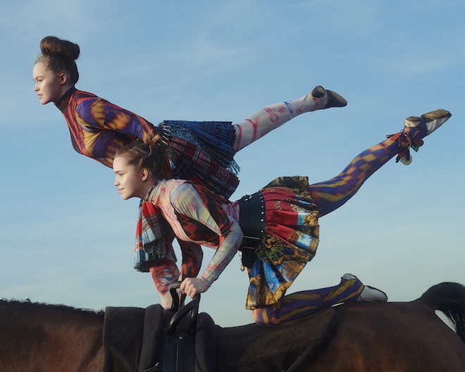
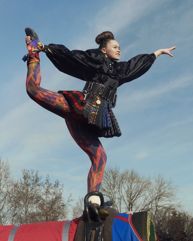
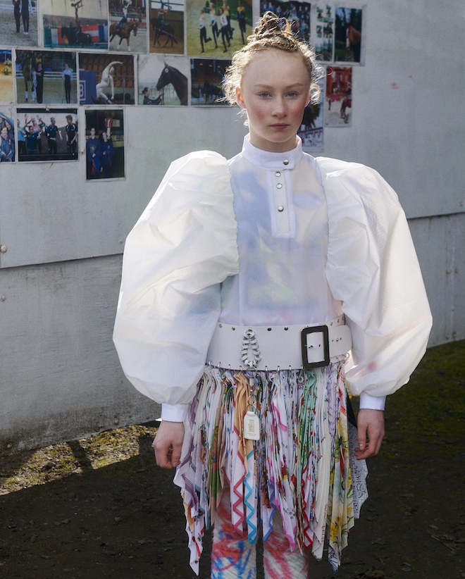
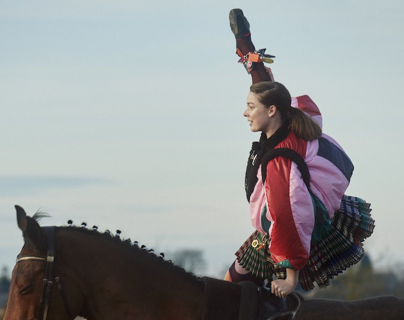
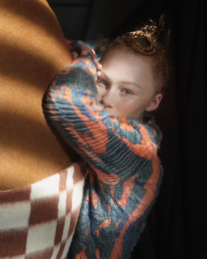
Global luxury retailer Matches Fashion, has recently partnered with London-based emerging design talent Chopova Lowena for the launch of an exclusive capsule collection for AW19. Post-graduation from Central Saint Martins, the design duo Emma Chopova and Laura Lowena initially launched their brand in 2018, which eventually took off and gained a cult like following for their interesting and distinctive designs. From traditional Bulgarian fabrics, to wide leather belts, to rock climbing carabiners added as statement pieces. The designers have united with the luxury retailer to offer all that and much more including a few additives such as kilt skirts, wool coats etc.
“MatchesFashion.com have been a dream partner and support system to us. Spotting our potential so early on and so carefully guiding us to fine tune our product with such care and a mentoring eye has been vital to our knowledge and our growth. Working with them has changed the way which we think about a woman’s wardrobe and her life,” explained the duo. In celebration of the partnership, Twin went ahead in joining the design duo for a brief Q & A.
What was the inspiration behind this capsule collection?
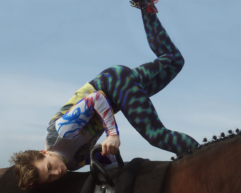
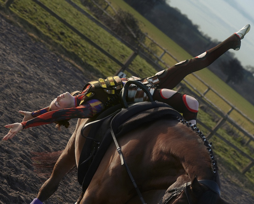
This collection was inspired by Albanian Traditional dress and Equestrian Vaulting.
What are the most important things you consider when designing?
We consider first and foremost the combination of our two references and really merging them seamlessly. Also thinking about our customer and her comfort.
Who would you say is the ideal Chopova Lowena woman?
There is no ideal, we would love if all kinds of women connected with our garments. That’s our ideal.
How would you describe the direction for the capsule’s campaign?
We worked closely with Charlotte Wales, Jamie Reid and Agata Belcen who are all so connected with our vision and we collaboratively decided on the campaign and shooting it on Equestrian Vaulting Team GB2019 in their barn in Warwickshire.
What’s next for you guys?
We are working on our new collection and campaign.
The collection has been launched at 5 Carlos Place and also includes a book in celebration of the brand’s latest campaign.
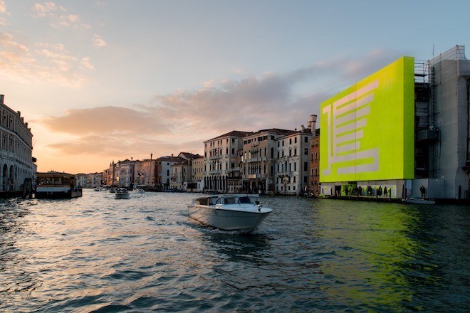
This year, the Venezia Pavilion at the 58th International Art Exhibition of La Biennale di Venezia moves beyond the confines of the exhibition space and infiltrates the city. Reflecting the multitude of stories, of splendour and beauty and of cruise ships, flooding and souvenirs, these esteemed Italian artists plunge into the wealth of inspiration to depict the ancient city in new lights.
As Alessandro Gallo, Artistic Director, explains: “In thinking about the creative concept of the pavilion, we have focussed on two angles: on one side, we wanted to return to the original elements that have characterised and shaped Venezia, and from the other side, we wanted to communicate the dichotomy of representing the stereotype that Venezia has in the world, and also a more authentic reflection of the city lived from the inside.”
Twin spoke to the artists involved, Mirko Borsche, Lorenzo Dante Ferro, Sidival Fila, Ferzan Özpetek, Fabio Viale and Giorgos Koumentakis, as well as artist director Alessandro Gallo, about their artistic approach to Venice.
Alessandro Gallo , courtesy of Fondaco Italia
TWIN: How have you responded to Venice in your work?
Ferzan Ozpetek:
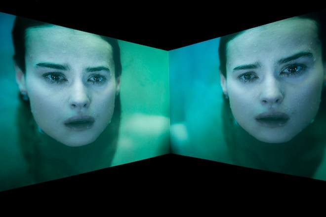
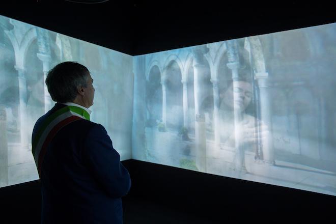
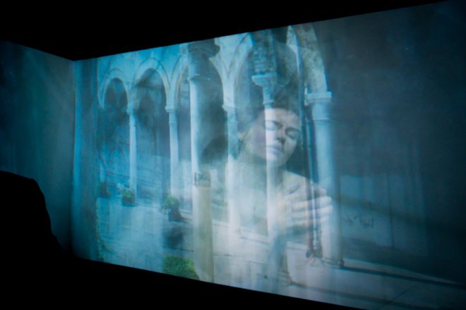
As soon as I was asked to visualise a personal idea of Venice, I had mixed feelings: I was proud to be asked, but at the same time overwhelmed by the difficulty of finding a creative way to tell the story of a city that has always been a symbol of unparalleled beauty, art and landscapes. A place deeply probed from all points of view. All of a sudden, I remembered so many walks I had taken in the Laguna, not just in the city, and above all the times I spent some days at the Lido either with my movies or as a member of jury for La Mostra del Cinema. That’s it, Water and Cinema: a dream of fluidity once again. You happen to reach the Lido on a motorboat, get off and soon you can enter the huge screening room where a collective rite is going to be held. I gathered some of those memories and emotions and revived them into imagery.
Fabio Vale:
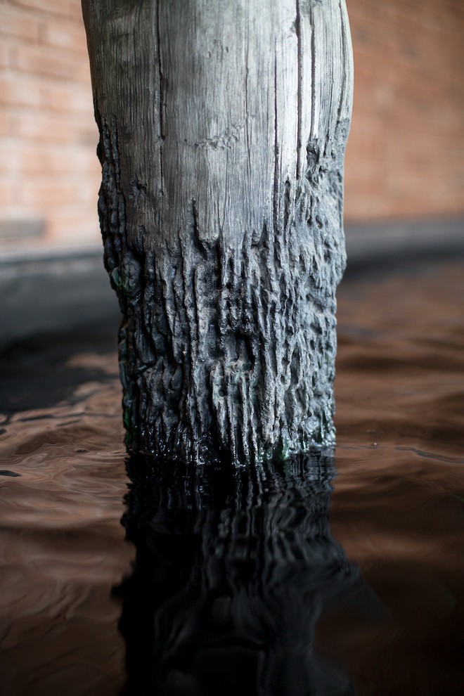
In this work I was trying to represent not the object, but the spiritual side of Venetian Bricole.
Lorenzo Dante Ferro:
My work as a Master Perfumer originated in Venice in the 1500s when it was a flourishing and prosperous centre for the trade and commerce of precious spices, unguents, fragrant oils and resins brought back by navigators and explorers returning from voyages to distant lands. They provided Venice with the first new ingredients and raw materials necessary to give impetus to the development and creation of the first Italian perfumes, making Venice a natural location. Today, I continue this work as the keeper of secrets and traditions of artistic perfume creation from my perfume studio in Gradiscutta di Varmo (Udine) only a short distance from Villa Manin, the summer residence of the last Doge of Venice, Ludovico Manin.
Sidival Fila
Sidival Fila:
I was invited as a selected artist for the Venice Pavilion from the beginning of the project, so I was able to follow its birth and its development; my involvement was both individual and collective, and for different reasons during the making of the show, many synergies were born with the other selected artists. I was also present in Venice for the opening of the Biennale and I was able to see that the message I wanted to share, through the descriptive elements of my installation and through a specific technical procedure , was communicated to the visitors, in the form of reflection and emotion.
Giorgos Koumendakis:
This work has been created specifically for Venice, a vibrant city that combines the crossroads of many different cultures that approach it by water and could not exist in its present form for any other city!
Mirko Borsche:
The Venice Pavilion invited our studio to contribute as an ‘artist’. The biennale’s theme this year is FAKE NEWS, among other topics that form ‘interesting times we live in’. We are not artists, but we believe in graphic design as a strong tool, so we developed an identity for the Venice pavilion, which could be seen to be the identity of the whole Biennale and therefore is aligned with the concept of the Biennale, it also creates the maximum awareness for the pavilion of Venice. The centre piece of our concept is the Lion of St. Mark, the symbol of Venice. Bureau Borsche created a reduced, abstract form of the lion to highlight the six boroughs of Venice in the lines of his wings. These simple geometric shapes were also used to create the secondary graphical element – an exclusive typeface. This consists of mainly vertical bars in reference to the omnipresent poles throughout Venice. The popping Neon Yellow is a modern interpretation of the golden ornaments of the historical centre. Functionally, the colour is used as a signal colour because of its special visibility. Together the lion, the typeface, and the colour create a strong and yet ironically confusing guiding system for the city – ultimately leading to the pavilion of Venice. The graphical system is applied on many elements like signs, posters, flags, and public transport etc. At the same time there will be several take-away items such as apparel, tennis balls, plastic bags or lighters referring to the city’s strong tourist business. All these items are branded the same way and reveal their connection to the Venice pavilion once the visitor arrives at the pavilion.
TWIN: What does Venice mean to you?
Alessandro Gallo – Artistic Director:
Having the privilege to live and know this place deeply, we feel we belong to an identity that has developed over centuries, creating something so strong, unique and personal; something that has put together and mixed different influences and culture that have shaped it.
Ozpetek, Image Courtesy of Fondaco Italia
Ozpetek, Image Courtesy of Fondaco Italia
Ozpetek, Image Courtesy of Fondaco Italia
Ferzan Ozpetek:
I called my work Venetika right because that is the ancient byzantine name given to the powerful maritime city. Venezia was and still is deeply marked by centenary – better say millenary – stratifications of Ottoman culture and traditions. Having grown up in Istanbul, Venezia to me is another “mother-city” where everything reflects, immerses in and resurfaces from water.
Fabio Vale: Venice is a very hard city that forces you to move with its rhythms, different than ones we are used to. Thanks to this slowness you can appreciate the details.
Lorenzo Dante Ferro:
Tradition and culture that express an elegance and style that is entirely unique. These are all elements that I treasure and take great pride in as a Venetian.
Sidival Fila:
Venice has always been a place of choice for art, culture and beauty. It’s a metaphor of travel and meeting, a unique and timeless city.
Mirko Borsche:
I really like Italy in general, not very surprising for a German I guess, but for me it was always a place I wanted to live.
Venice is special, I love the city, but more around Autumn, when it gets a bit quiet again. Most of the season tourists take over, like a flood, which is disturbing for a lot of Venetians and forces them into the background. I can tell because Munich is a very touristic city too, and during the season it’s quite hard to get through the city or get anything done.
Giorgos Koumendakis:
Venice is a city symbolic for music, visual arts and architecture. I am very happy because after many previous collaborations and presentations of my music in Venice, the time has come to compose a piece that is written especially for the Biennale and the city’s Pavilion. It is a great honour and privilege to participate in this important venture, along with great artists and under the artistic direction of Stelios Kois.
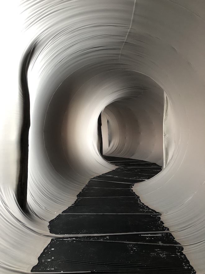
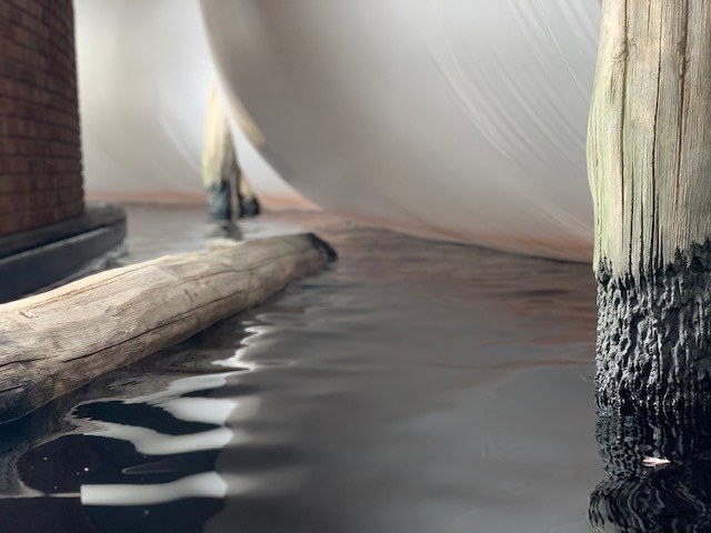
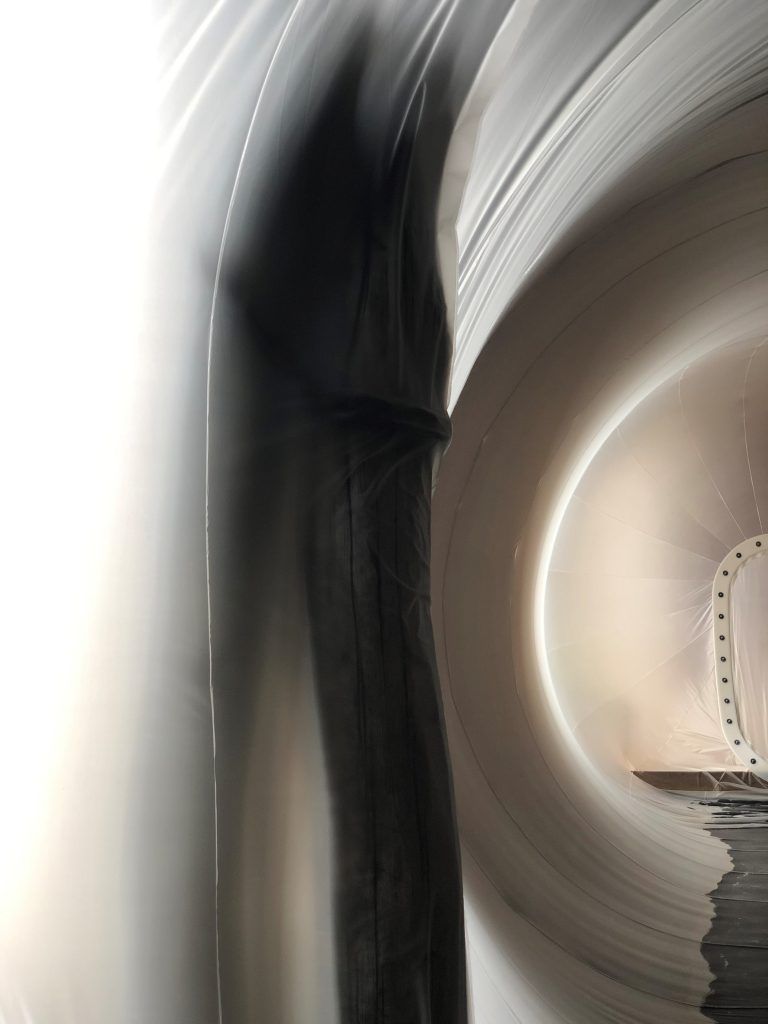
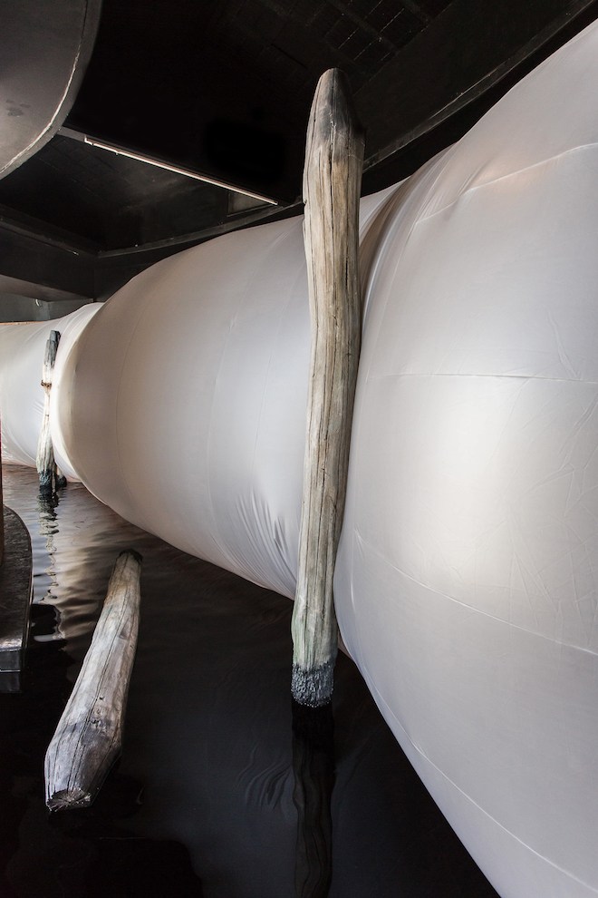
Water Tunnel by Plastique Fantastique
Water Tunnel by Plastique Fantastique
TWIN: How have you interpreted this in your work for the Venice Pavilion?
Ferzan Ozpetek:
The city has hit my imagination as a vision of a woman immersed in water. That woman is performed by the wonderful actress Kasia Smutniak, who conveys the sense of a mysterious and magical experience. At a certain point that female figure representing the city emerges on the surface and thus Venezia materialises once the liquid becomes solid. Now we can recognise its extraordinary shapes, its dreamy buildings, its great paintings as in a revolving kaleidoscope of human figures and astonishing images.
Fabio Vale: The installation was a collective work where all the artists collaborated together for one project.The meaning was to create a landscape where the viewer is immersed as they would be in the city of Venice
Sculptor by Fabio Viale
Sculptor by Fabio Viale
Lorenzo Dante Ferro:
“Venéxia Odorum” is the natural essence which I composed, inspired by the Venetian lagoon with its briccole bathed by saltwater and the evocative notes of Mediterranean vegetation in the air. This geolfactive fragrance is my invisible contribution to the collective work which I have created to portray and to prolong the olfactive memory of the Serenissima into the future of all those who have had the opportunity to visit the Venice Pavilion.
Sidival Fila:
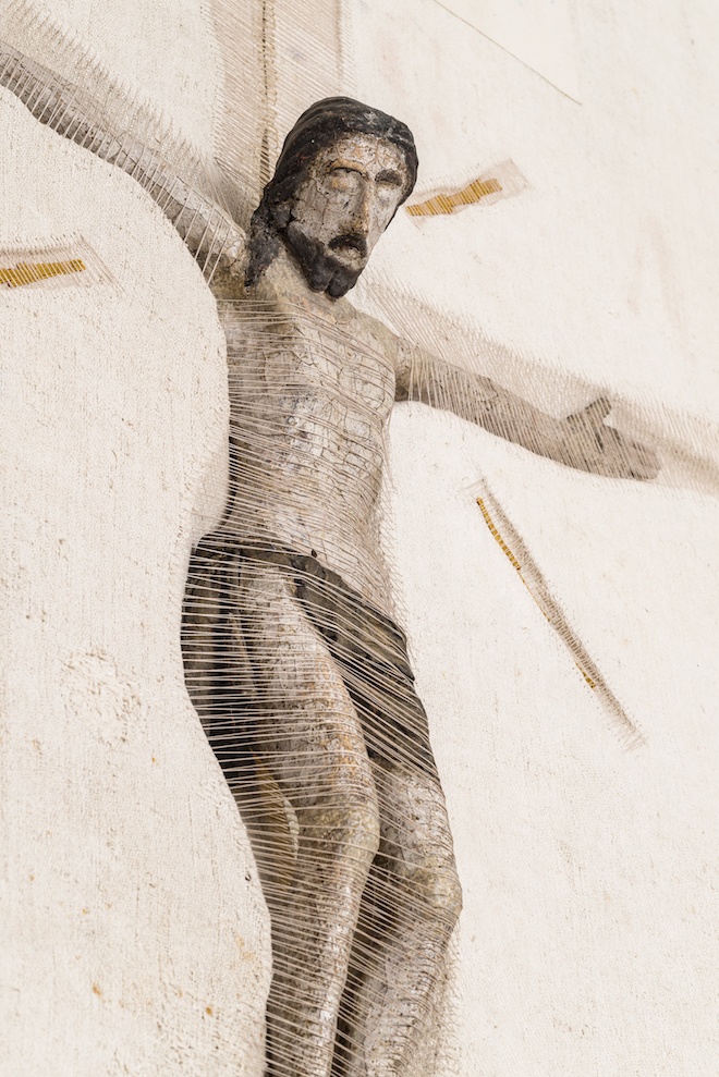
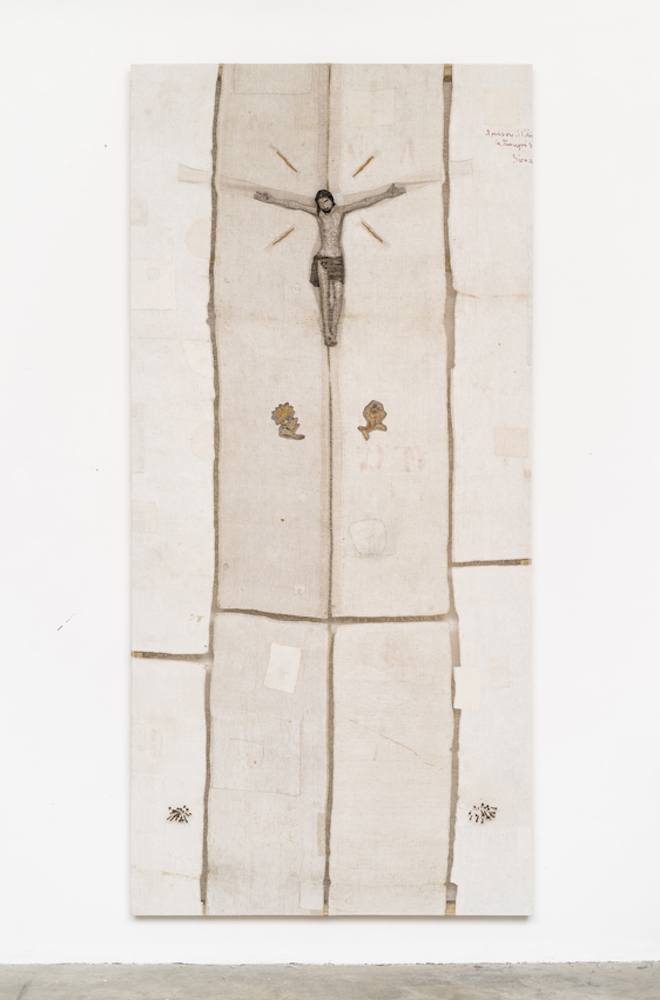
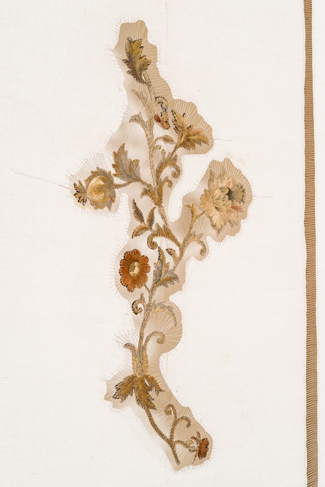
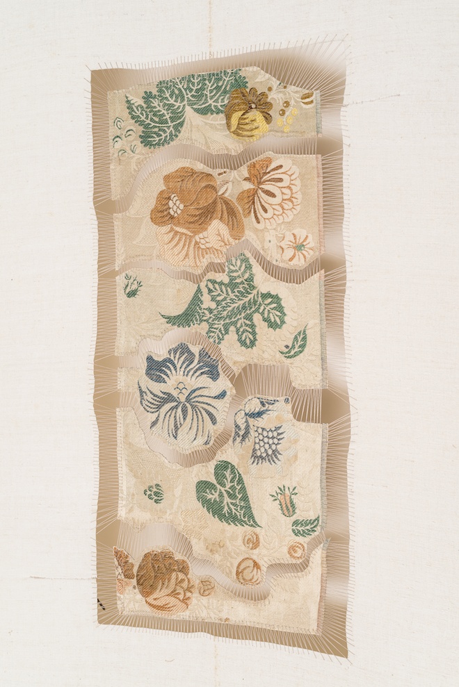
They asked me to talk about spirituality as a constitutive dimension of the life of Venetian civilization, so I decided to present the crucifixion as the representation of a historical event, not only as a sacred or liturgical element. My “Golgotha” installation is composed of eight elements, but only one of them presents a figurative sculpture of the Holy Cross; the other 7 elements open the doors to spirituality and transcendence, but they are not directly related to a specific religion, they only want to speak to every creed and to the heart of the people.
Giorgos Koumendakis:
In my work “The pedal tone of a closed current”, Byzantium, Renaissance and this modern city overlap, by the use of pedal tones from the Byzantine music together with western polyphonic elements. All those have an operatic dimension, symbolically accumulating at an orchestra pit full of water.
Mirko Borsche:
Our aim was to involve the Venetians to be part of our concept, they either got items provided by the pavilion for their own use, or make their own souvenirs, they can also download the graphic elements for free to create their own products. The idea is to make this symbol viral and make the whole city of Venice an extension of the Venice pavilion.
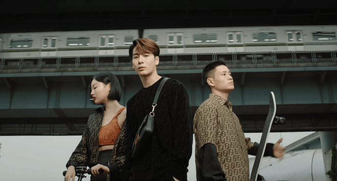
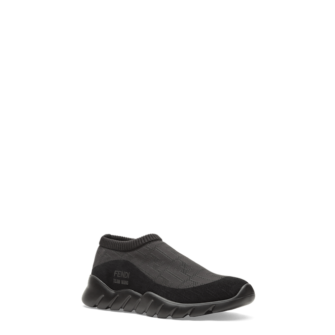
Today Italian fashion house Fendi launches a special capsule collection in collaboration with Chinese celebrity rapper, singer and songwriter Jackson Wang.
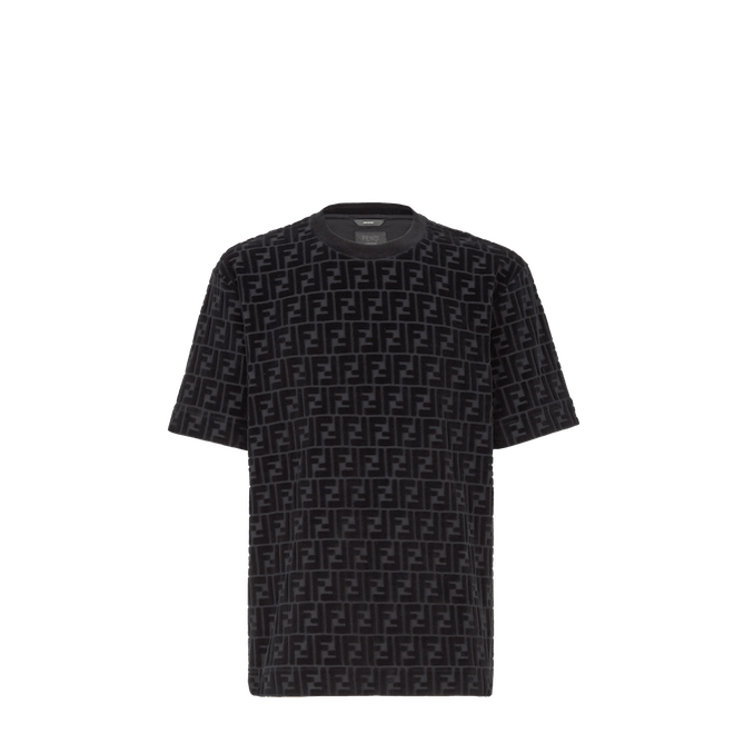
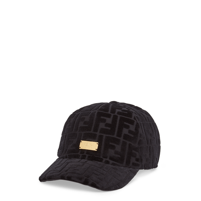
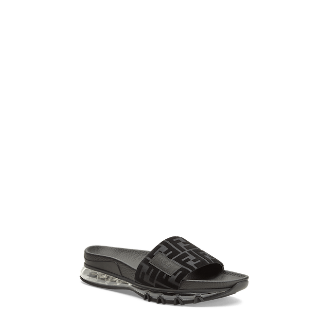
The capsule collection is one that continues Wang’s partnership with the brand as an ambassador by mixing fusing his signature style with distinctive aspects of the FENDI DNA, creating a kind of pathway between the worlds of fashion and music. The collection mainly featured in black velvet and chenille includes a formal suit along with more casual pieces like jumpers, t-shirts and trousers. The list of accessories also include a black leather Baguette with a velvet FF logo, a clutch, slide sandals, a baseball hat rendered in chenille, running sneakers and a variety of other ready-to-wear pieces. The Fendi x Jackson Wang Capsule collection will be launching in 33 selected FENDI boutiques and online from July 20th .
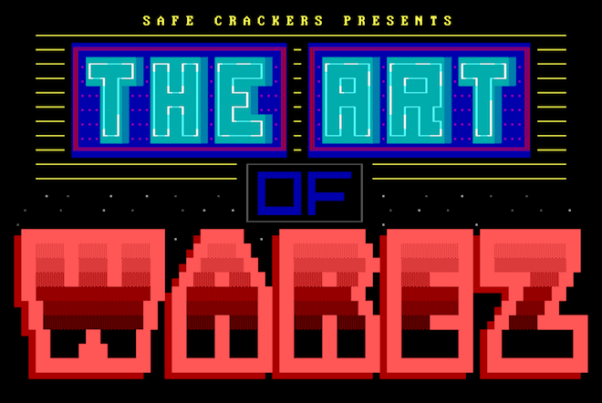
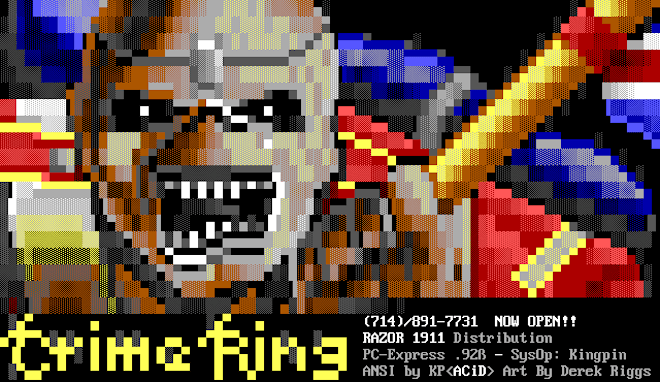
In a time pre-internet, in the late 80’s early 90’s, existed an era when computer users would communicate through the telephone lines by leaving messages for each other on Bulletin Board Systems or BBS’s. This practice soon became known as a very early form of file sharing where Hackers and Internet Pirates would use BBS’s to illegally distribute cracked software, known as Warez and other genres of illegal materials. This graphic display of BBS was known as ANSI, and ANSI was the visual component to the BBS scene and subculture of hackers, software pirates and computer game crackers. At the end of this month, acclaimed artist-filmmaker Oliver Payne, with the help of one-time ANSI artist Kevin Bouton-Scott, will release a film entitled The Art of Warez, taking a glimpse back to the ANSI graffiti art scene, pre-internet hackers, copyright theft, pictures of fantasy warriors, comic book monsters, naked ladies and graffiti B-Boys.
This 30-minute film, is one that carefully documents a genre of art that holds little to no trace left on the internet. Not long after its invention, the ANSI art scene took off and transformed into a type of underground art movement where artists formed crews to compete against each other. However, the arrival of the internet and the updates made to computers wiped out the ANSI art scene and the majority of the artworks in the process, which is why the artists’ film holds such relevance as a recollection of an iconic genre which no longer exists. Keep your eyes out for the full version of the film to be released on Safe Crackerson July 31st.
Idil Tabanca isn’t someone you would necessarily assume to be a Chairperson of a museum. Her alternate title, Creative Director, absolutely clicks with the persona of the woman that founded and ran New York’s loved fashion and culture title Bullett Magazine, but a chairperson? If the role of a chairperson is to allow fair and open discussion of matters, Idil is set to be a total coup – the expectation of others, matched with the vision of herself seems like a task she is more than equipped to handle. Bringing a fresh standpoint she is sure to provide: now that is vital to the success of any Institute.
We are here to talk about OMM, the Odunpazari Modern Museum, that Idil is holding these integral positions within. Opening in September in the Turkish city Eskişehir, OMM will be a foundry of both global and local vision.
“OMM will have education programmes, residencies, and pairings with global and local artists – opening up the doors to create an institution that will be a stepping stone for a lot of young artists. We want this place to be like an exchange for artists – creating spaces for people to come together and have these intercultural dialogues. There will be a hotel attached for artists to stay, and a quadrangle, with a vegetarian café which is almost unheard of in Turkey! Giving people options and breathable space to come together and create. The building itself will be a feat of architectural beauty, designed by the respected Japanese Kengo Kuma and Associates. I don’t see OMM as a museum – it’s a platform, a bridge, for young people to have their voices heard”.
Photo by Batuhan Keskiner
Photo by Batuhan Keskiner
Photo by Batuhan Keskiner
With an education in film and digital media, you see this influence impact Idil’s approach to presenting the Museum on a global, innovative and connected scale. Her editorial background gives Idil a lateral and relevant viewpoint: the threat facing museums is that they face cultural extinction unless they adapt to new audiences – if anyone can speak about creative agility as a necessity you need not go further than anyone in the magazine trade.
“It is very similar work – you are still creating content but instead of a magazine page you are working with a gallery wall. You are giving someone a platform for display.”
Idil has grown up since her DIY New York days. From pulling together character love letters with celebrities, Idil is now invested in the importance of educational awareness of her beloved museum within the surrounding art schools of the heavy university town she finds herself in.
Her eyes still sparkle when she speaks of the projects and the collaborative partners ahead; a natural thinker and doer, mover and shaker.
Did Bullett set her up effectively for this role she is undertaking?
“I think it set me up to manage people more than anything else to be honest! Juggling different people and personalities is always tough, especially when you are working in fashion and art, and managing all these moving parts. Creatively Bullett helped me shape my vision – I can’t imagine if I didn’t do Bullett how I would see things.”
Marc Quinn, Mekong Delta İce Floes, 2008, Photo by Ozan Çakmak
So why has Eskişehir been chosen as the favoured site for an interactive, cutting edge cultural institute?
“There are 3 universities here, and they are all art universities – for all the cities in Turkey it is a very secular city and a very intellectual city. It is also geographically quite central, so easy to get to from the other surrounding cities. It was in 2004 that the first contemporary art gallery happened in Turkey, so we only have a very short history of museum culture here. Now it is somewhat challenging as we are creating something that hasn’t been there before. Sure, in Istanbul, but not in other places. We did a study and found out 80% of people hadn’t done a cultural activity in their lives – rates that were astonishing. What is exciting about this situation is for me to change that.”
Will the OMM be more about creative expression rather than strictly art?
“Absolutely – we want to carry collaboration into every aspect of what we are doing.”
Bedri Rahmi Eyüboğlu, İsimsiz, tuval üzeri yağlıboya karışık teknik 1956
And Fashion?
There will be a store selling a small line, and a big name designer will be creating the uniforms for the staff. Hey, you can take the chick out of New York fashion…
And a global outlook?
“We want to have a global outlook, but want to ensure we are starting by getting local communities involved. The city has the potential for this. Our mission is to ensure that we are also educating global audiences that we are a destination: have this connection with the rest of the world.”
Tanabe Chikuunsai IV Installation photo by Kemal Seçkin
There will be work showcased by the local and the international, starting with a permanent collection made up of Marc Quinn, Julian Opie and Sarah Morriss, to Turkish artists such as Bedri Rahmi Eyüboğlu, Ramazan Bayrakoğlu and Canan Tolon. A site-specific commission by bamboo artist Tanabe Chikuunsai IV will be installed for opening in September.
While we can’t say we knew Idil before, and we can only imagine this role has led her into a new direction – museums and galleries must ensure the voices of the next generation are accounted for, and Idil seems set on bringing her native country into the realm she finds most familiar: of the innovative, the creative, the outsiders, the brave.
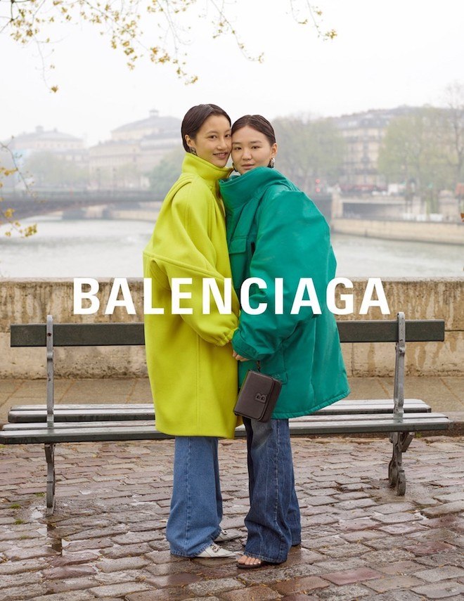
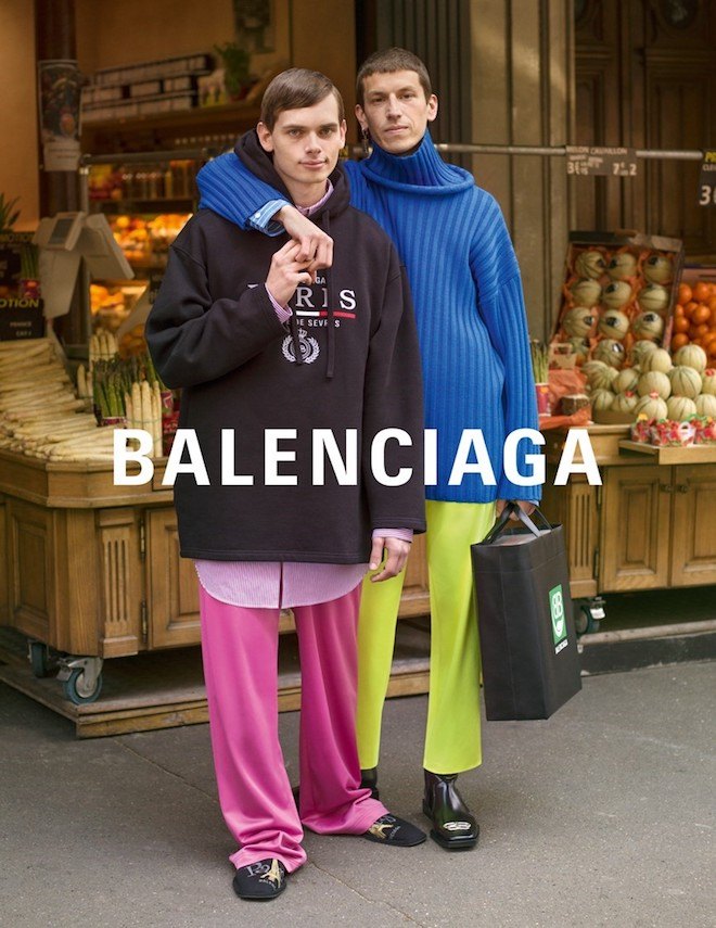
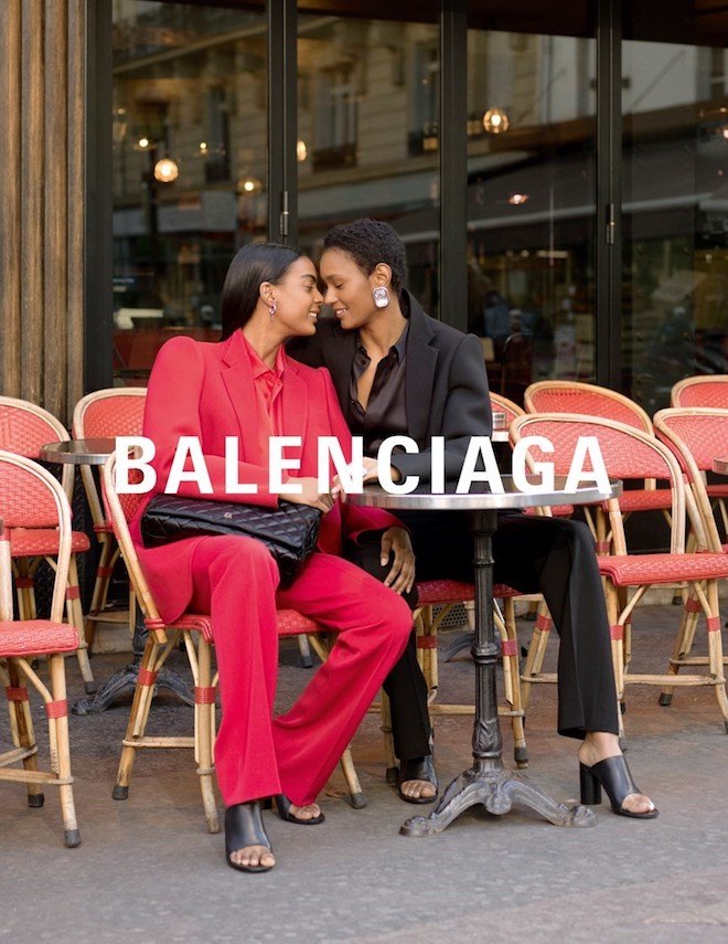
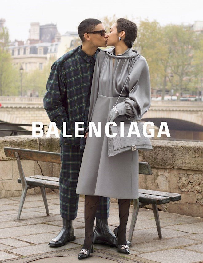
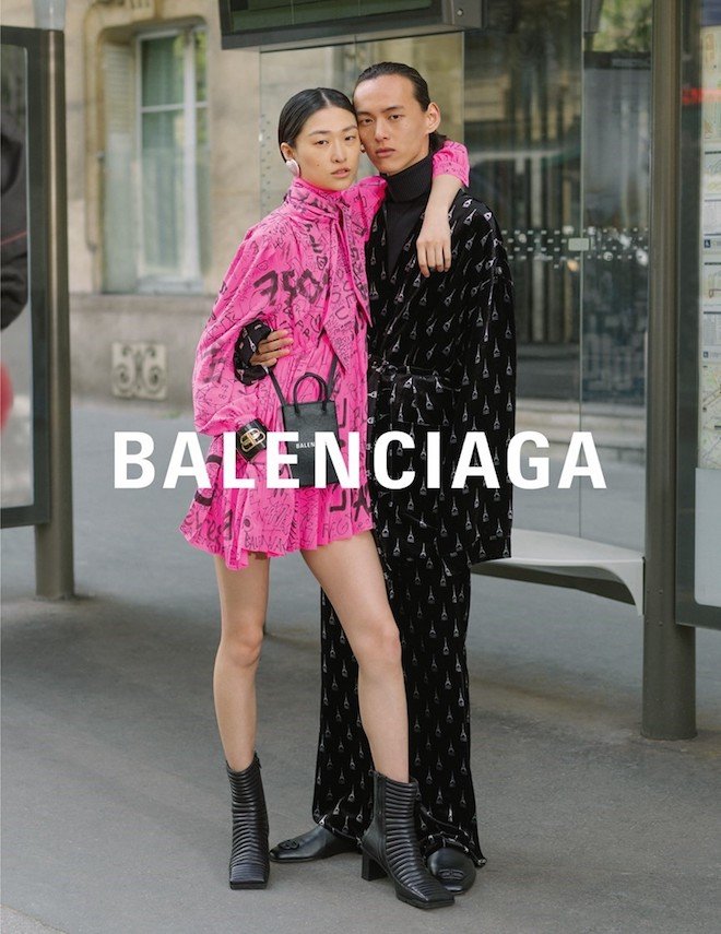
Paris has long been known as one of the world’s most romantic city in Europe. With historic ‘love’ bridges, the Eiffel Tower and other amenities, over the years, it has become the city on the moodboards of couples all across the world.
For their AW19 campaign, Parisian luxury street brand Balenciaga opted to pay homage to the city’s romance with a photo-series of real life couples decked out in Balenciaga gears — oversized coats, big hoodies, stonewashed jeans, anoraks jackets. Gushing in romance, each couple is intimately captured through the lens of photographer Greg Finch — a creative more known for romantic, wedding shots rather than editorials — around the metros, on benches, outside grocery stores, in front of cafés etc. The photo campaign is also accompanied by a video shot by videographer Ed Fornieless on CCTV in various locations as they each discuss their bond. It has always been said that sex sells, but try love, this campaign makes us all want to grab our partners and head all down to play dress up in some Balenciaga gear. To view the full campaign, visit Balenciaga.com
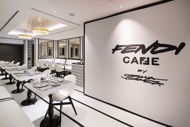
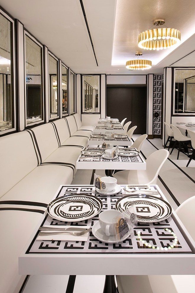
This summer, Italian fashion house Fendi has joined forces with luxury department store Harrods in London, on the embarkment of an exclusive dining experience.
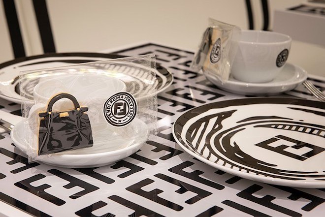
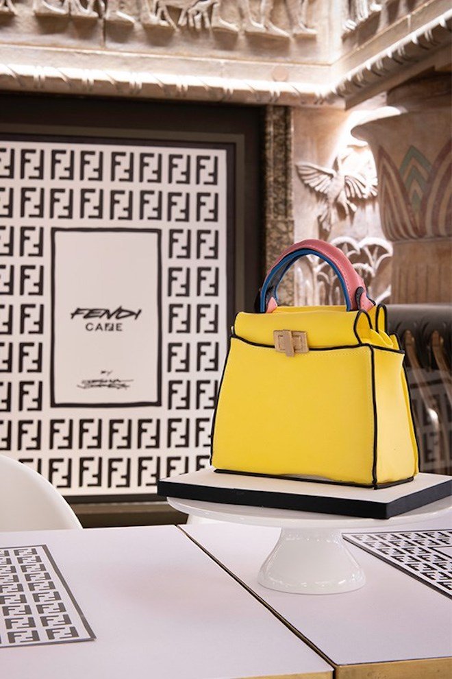
From July 1st to August 31st, the fashion house has taken over the fifth floor of Harrods and transformed it into a conceptual cafe with the help of LA based visual artist Joshua Vides who re-designs the space according his signature “Reality to Idea” style. As he covers the building’s inside in his unique black and white graphic, while reimagining the iconic double FF logo in monochrome, artist creates an expression of Fendi’s instinct sense of humour and ingenuity. The double FF logo takes centre-stage in the cafe from on walls, to tables, menus , cups, saucers, down to the menu with Fendi logged cappuccinos. The menu is also very important as it gives diners a special taste of genuine Italian cuisine within the hearts of London.
Milan-based photographer and creative consultant Piotr Niepsuj is best known for his raw portraits of urban scenes. Born in Lodz, Poland, Niepsuj first arrived in Italy to study architecture before working for PIG Magazine, the Italian equivalent of Dazed or ID. It was at PIG that he was first given a camera and sent on assignment to photograph people anywhere from the streets of Milan to music festivals. He now shoots campaigns for brands like Off-white and Perks and Mini who he photographed for issue XX of Twin.
Most recently, Niepsuj presented a photo magazine called Spreads at Artifact in Spazio Maiocchi in Milan. Spreads features images of Tokyo inspired by Moriyama, which Niepsuj took on a digital camera on his recent trip to the Japanese capital city. Here, we speak with him about his practice and evolution as a photographer, his thoughts on contemporary photography, and his new work Spreads.
Image by Piotr Niepsuj
What is your first memory working as a photographer?
My first assignment ever. It was an interview and portrait of Jeremy Scott of Moschino. I didn’t even know what I was doing. It was very courageous of the magazine PIG, and it was a very good time for me. I learned everything. I learned about magazines. I learned about photography. A lot of hard work, no money, and good parties.
How have you evolved as a photographer since then?
I grew up in a very vice school of photography. You would go with your camera and photograph whatever surrounded you whether it was a party or a festival or a trend on the street. It’s basically what everybody does now, but it’s what anybody from Ryan McGinley to Juergen Teller who’s kind of father of this style was doing when I started. The approach doesn’t really change. I just go with my camera and shoot what I see and what I like.
I think the world changed more than I did. In the beginning, we photographed parties, trends, and us being young. Then, us being young turned old and boring. It’s also much more difficult to take pictures of people now because of how much more aware we are of being photographed. The naturalness is lost. This changed about the world.
Image by Piotr Niepsuj
Have you changed cameras? What are you working with – digital or analogue?
I change cameras from analogue to digital. I shoot a lot with my phone also, because it’s the easiest and the fastest way. I think it’s like the contemporary equivalent of point and shoot.
When I first started, I used to love analogue. Then, I didn’t approve of it. You realize all of your pictures look the same as the pictures of people twenty or thirty years ago – but they are not as good. When you think about how they’re going to be seen in the future, you wonder why a picture from 2019 has to look like a picture from 1980?
I think the iPhone picture is the picture of 2019, and when someone sees in 2050 a picture from 2019, it’s a bit strange to see it like a fake picture from 25 years before. I became bored, too, with the graininess of it. Then, it became commercial.
When I started working for real and shooting commercially, I realized film is the way not to get crazy. I produce so many images that my hard drives are exploding. Even mentally it’s too much. With digital, you can be shooting all the time – 2000 shots per day. I arrived to the point I understand film again.
Image by Piotr Niepsuj
Why do you like photographing urban scenes?
I studied architecture, so it’s always somehow inside me, this interest in cities and urbanization. Cities are the same everywhere you go, the same elements exist. They’re temporary and permanent. Temporary things eventually stay, and permanent things get old and change. Old and very new always clash, because the old is still functional and still works. It’s a documentation. Cities are like living structures in the end, and urban scenes are like a proof of history filled with layers, evolution, communication, advertisement, stratification, development.
I always think and hope every time I take an image that it’s not for selling a product, that it will have a value in 20 years. Even if I shoot the backstage of a fashion show for a brand, I always try not to show like a perfect image. It’s always like trying to find the mess, what’s human.
What is your new work Spreads?
P: It’s at Artifact, the store space Kaleidoscope shares with Slam Jam at Spazio Maiocchi. The work is about Tokyo and Moriyama. Last October, I went with some friends to Tokyo. I’ve always wanted to go to Tokyo, and I brought this little point-and-shoot digital camera and just went down the streets and took pictures of everything from little homes in the streets to the trash. There’re thousands of images of this trip. I also went into all the bookstores, looking at old and new books to add to my collection. I found this one about Record Magazine that Moriyama founded. It’s the magazine he made for himself with only his pictures. I was reading this and looking at thousands of his images and realized it’s the same. I want to have my record now. I’m presenting it for the first time. 150+ prints from the magazine and outtakes were also “exhibited” during the launch.
Image by Piotr Niepsuj
Spreads reminds me of your Instagram @spreadingspreads where you post images of photos in books, often two-page spreads. Are the images in conversation with each other or intended to create a dialogue?
Not necessarily, but when there are two images next to each other, you always try to find a dialogue. It’s important to me to think about. Even if you look at the Spreading Spreads Instagram, I very rarely put a spread that is only one image. With spreads, sometimes there’s no conversation. Sometimes, there is. Sometimes, it’s a joke. Sometimes, it’s aesthetically working. That’s the fun of making a magazine or a book.
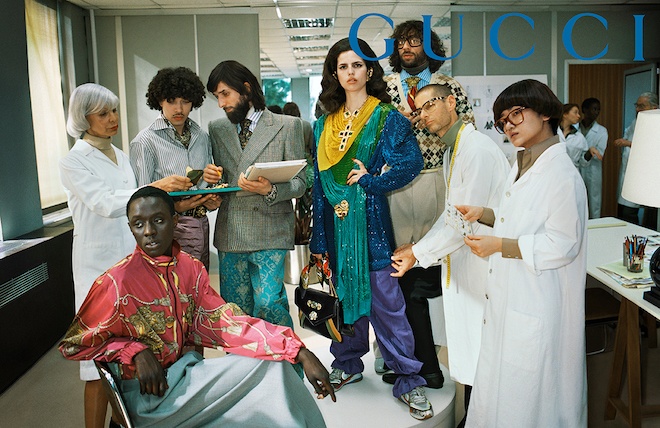
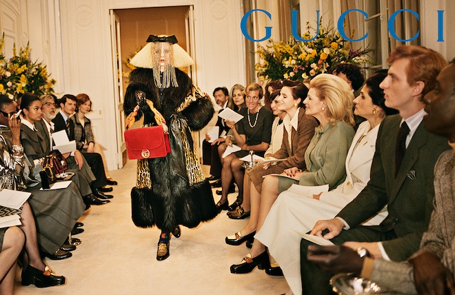
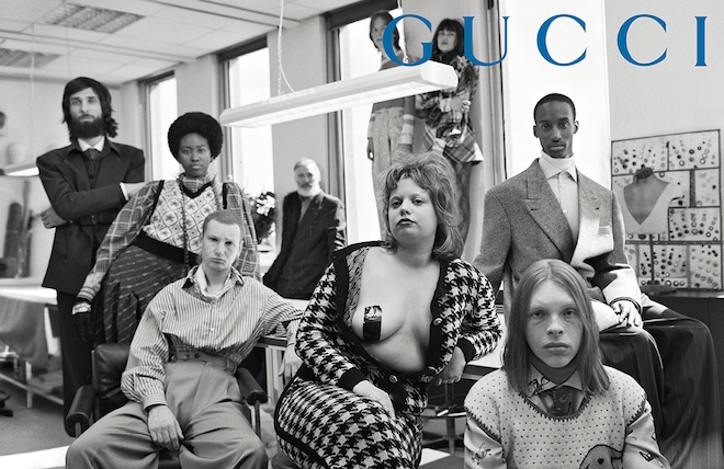
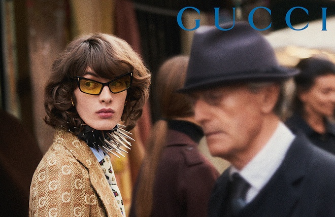
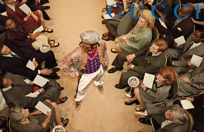
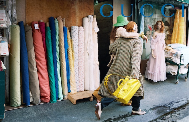
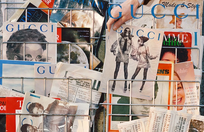
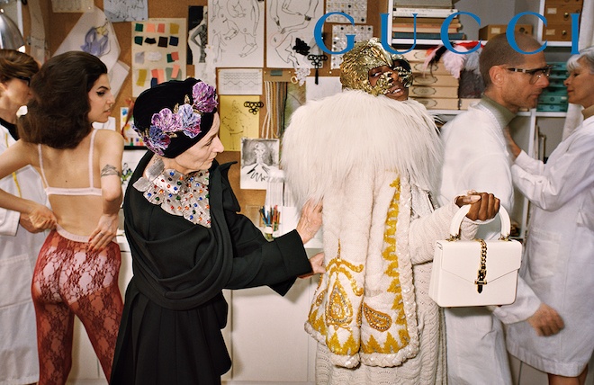
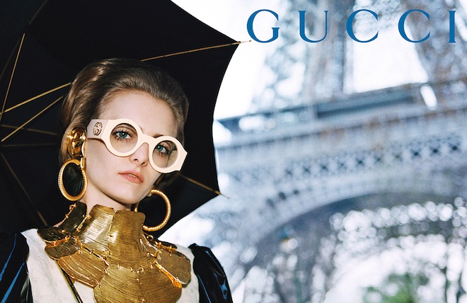
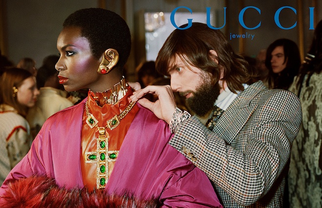
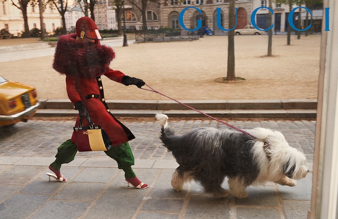
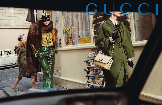
In the past few seasons, Italian fashion house Gucci has become renown for the creative direction behind their elaborately artistic fashion campaigns. For Fall Winter 2019, the campaign released earlier this week, creative director Alessandro Michele pays homage to the evolution of prêt-à-porter from the 1950’s to the 1980’s, a period in which ready to wear was at it’s peak. Shot by Glen Luchford, the campaign features the concept of fashion as a genre of science or art form, where each subject is shot surrounded by spectators and analysers inspecting each and every elaborate look from the FW19 collection.
“The fabula of fashion, however, begins at the drawing table, then moves to the workshops, during fittings, trials and fault finding… It is a tale of manual and material skills, the result of a specific know-how that today we tend to discount, to take for granted,” the team stated.
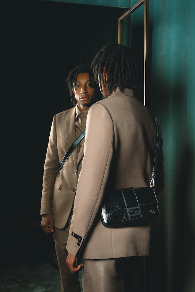
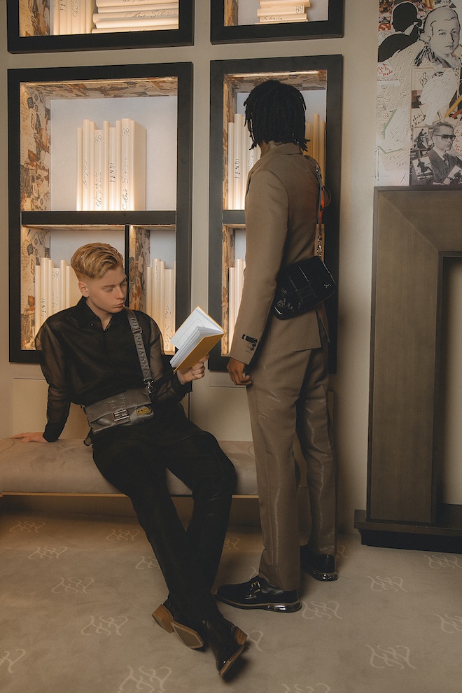
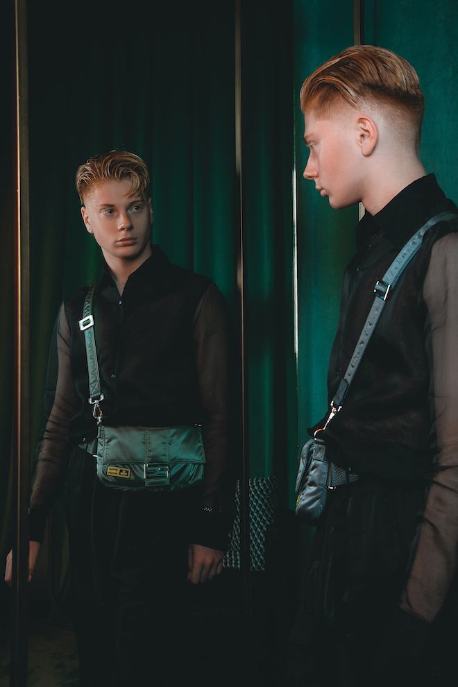
For the first time during the FW19 menswear season earlier this year Italian luxury fashion house Fendi debuted their iconic Baguette in several men’s versions on the catwalk. The brand’s iconic bag, originally launched in 1997 by Silvia Venturini Fendi, was reimagined in different styles, materials and sizes to fit. The baguette has been featured in three different sizes including mini, regular and maxi and is crafted in different materials such a croco, mink and Selleria leather. An additional feature is although it may be a baguette, thanks to the flexibility of it’s straps it can be worn in several ways, from cross body to hand-carried or even as a belt bag. Today launches the digital campaign featuring a group of influencers friends including Marc Forné, Leo Mandella and Nasir Dean as they are shot sporting different versions of the baguette while decked out in their FENDI wardrobe. The baguette will be available in FENDI boutiques worldwide and online starting from mid-July.
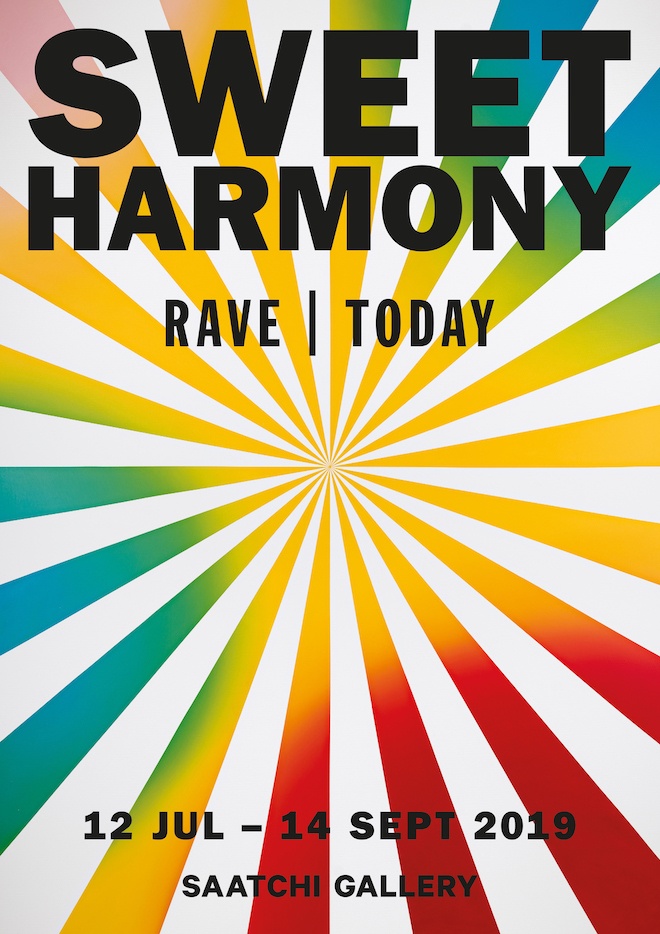
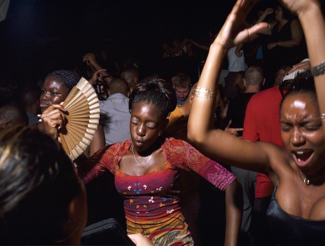
Today, London’s Saatchi Gallery opens it’s doors to an immersive retrospective exhibition devoted to presenting a revolutionary survey of rave culture through a variety of various voices who have experienced it. The exhibition, titled Sweet Harmony: Rave| Today is set to open on Friday July 12th and will include several portrayals of the new world which emerged from the acid house scene. Throughout the exhibition, the space will feature multimedia room installations and audiovisual works by some of the rave movements experienced by first hand. As the concept of the acid house revolution is set to be recalled through photo series , live music events, talks and panel discussions by the movements’ architects and influencers of the 80s and 90s.
The Saatchi Gallery’s director Philly Adams in partnership with co-curator Kobi Prempeh have assembled a team of youthful visionaries and photographers including Sheryl Garratt, Agnes Bliah, photographers Tom Hunter, Vinca Petersen and a Twin favourite Seana Gavin. In anticipation for the upcoming event, we called upon the London based artist for a quick chat on what to expect.
. In anticipation for the upcoming event, we called upon the London based artist for a quick chat on what to expect.
For the exhibition, your work is mainly based off your time during the Spiral Tribe, what would you say was the definition of the term “rave” during a time such as this?
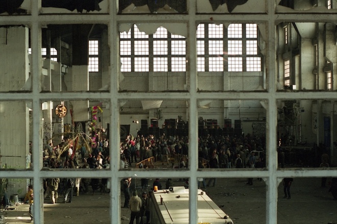
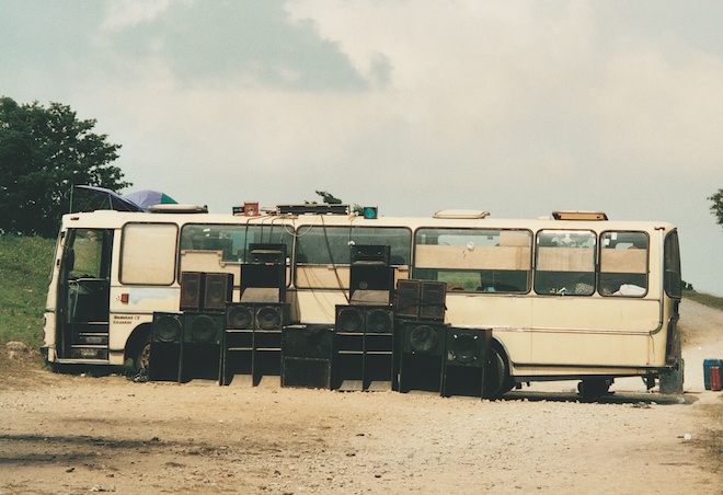
The raves I attended began in London. They were parties put on by collectives and sound systems such a Spiral Tribe who would take over abandoned empty buildings like office blocks, factories, post offices and outdoors in fields and quarries and would transform them into spaces where people from all walks of life could sweat the night away on a dance floor surrounded by likeminded individuals. The parties were run on a donation only entrance policy. Their ethos were all about the freedom to party as a way to break away from the commercial club culture that was emerging at the same time. They were illegal, very underground and it became a subculture. When Spiral Tribe left the UK in 1993 they would continue their mission across Europe. Other sound systems followed and raves turned into multi sound system Techno Festivals known as ‘Teknivals’.
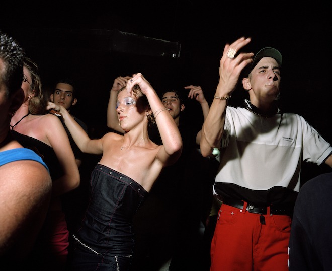
New Years day,Barcelona by Seana Gavin
How would you say rave culture has changed since then and in what ways has the way in which you document rave culture since then evolved?
Overlapping with the scene I was part of, rave culture expanded from illegal warehouses into ticketed commercial club events. Even though raves and Teknivals still go on today they can’t have the same energy and rawness from the early days. Nothing can be repeated like that. In the early days to find out about the parties there was a secret party line info number you’d call on the night. It is incredible to think that between 30-50,000 people attended the iconic Castlemorten 3 day rave in the British countryside in 1992 purely through these channels and on a word of mouth basis.
In Europe, flyers were also handed out to pass on info about the next party. In my era it was pre-smart phones and social media so there was less documentation. Nowadays the digital age and overload of selfie culture has tainted things. Everyone has a portable camera in their phone so there is less mystery around it.
I think it’s great that clubs like Berghain in Berlin try to keep things more old school by storing your phone as you enter the club. Which also forces you to be present in the experience and not live through the lense of your smart phone camera.
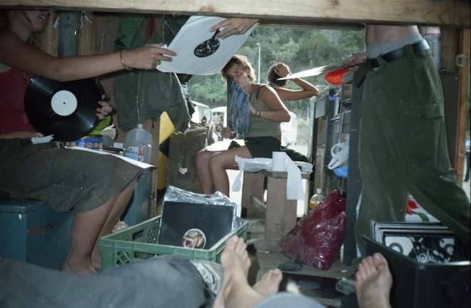
record dusting, hostomice Teknival 1998, by Seana Gavin
What would you like your audience to take away from your series?
I’d like to think the viewers would feel a sense of intimacy to the subject matter. I wasn’t a photo journalist documenting this scene at the time, I was immersed in this way of life . The photos I’ve included in the show capture the raves locations, the journeys in between, the aftermath of the parties and people who defined the scene.
I would hope the viewers would get a sense of the perspective of what it felt like to be part of that community which was more than a night out but an alternative outlook to society and a way of life.
Twice as Nice, Aiya Napa, London, 1999VINCA PETERSEN Bus And Rig
Shoom at FC Sacha Souter 1988, DAVE SWINDELLS,
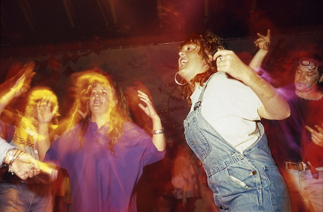
Spectrum Tent Girls (1988), Dave Swindells
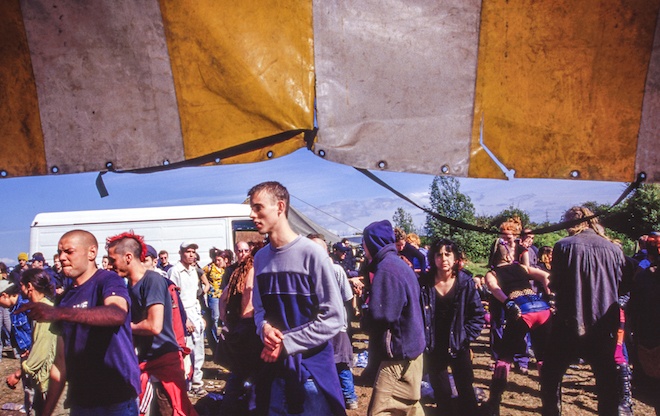
Castlemorton 10th Anniversary, Steart Beach (1992), Matthew Smith
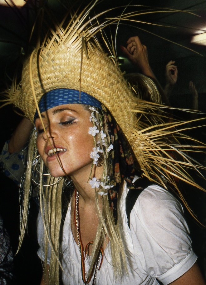
Girl W Fan 1990, Ewan Spencer
Other names of images makers included in exhibition are Ted Polhemus, Dave Swindells and Mattko. Throughout the exhibition, a space is created featuring the visually stimulating collections of each artist accompanied by a Spotify playlist with sub-genres of Detroit Techno, Acid House, Happy Hardcore, UK Garage and Grime. Uniting a selection of like, yet diverse minded creatives including electronic musician, visual artists and of course photographers. After the exhibition’s debut this Friday, it shall remain open to the public throughout the summer, until September 14th. For more details, visit Saatchi Gallery.
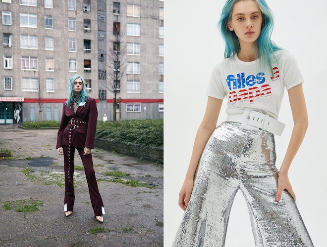
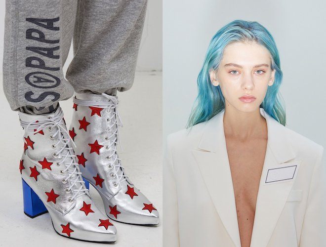
This month Belgian fashion brand Filled A Papa, broke new ground with the launch of their very first footwear collection for the AW19 season entitled POWERSHIFT.
Carol and Sarah Piron, the creative duo behind the line created a collection of 4 styles including ankle and thigh high boots, inspired by the theme of the previous collection , being the iconography of American Motorcross and Mud Wrestling with a touch of 90’s aesthetic. Laced high boots are reworked in both black and white suede with an added sparkle of Swarovski crystals, the brand’s signature numbers the Bliss and Cocomodels are offered in the same fabrics as well as a metallic “American Flag” version, leather and black tailoring with white dots. Each shoe is matched with its own personality that gives it’s wearer a unique extra oomph while sporting it. To view and purchase the full collection on pre-sale, visit Filles A Papa.
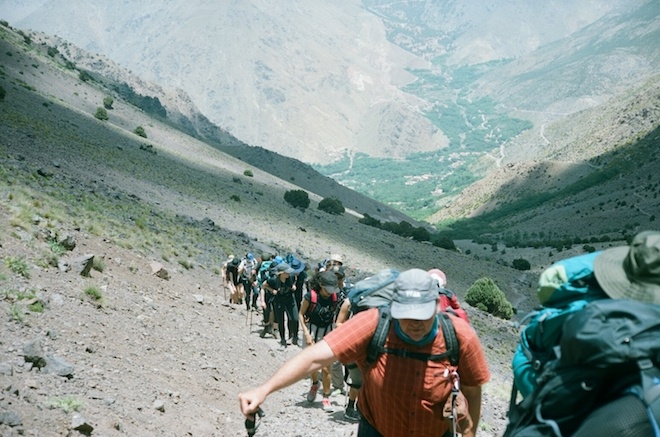
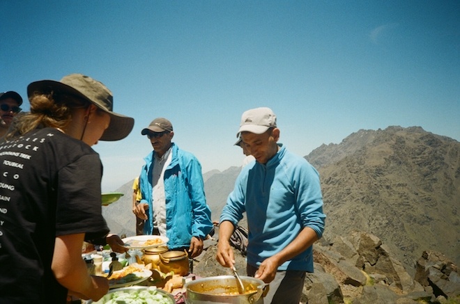
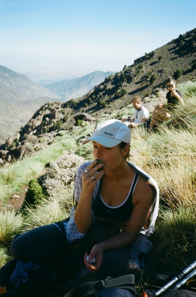
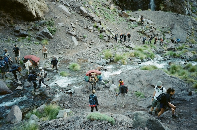
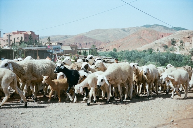
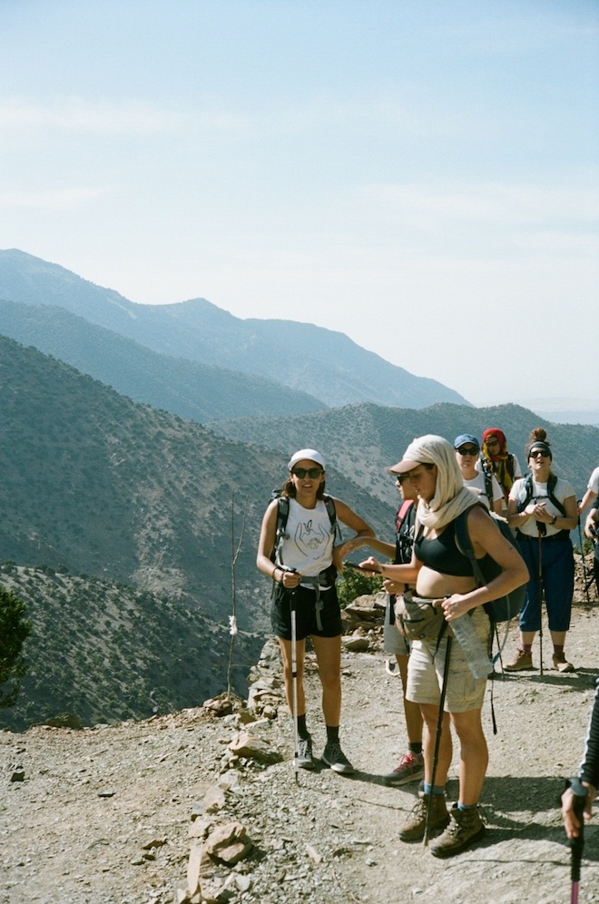
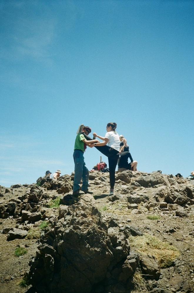
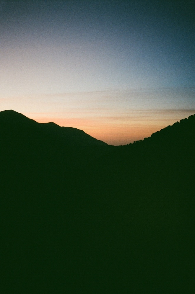
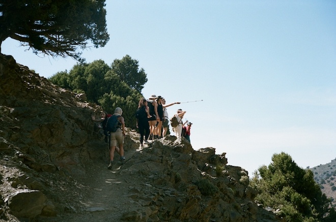
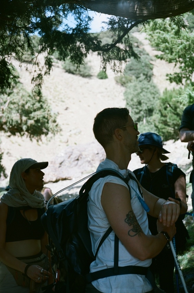
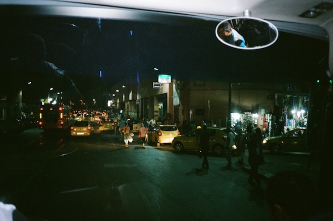
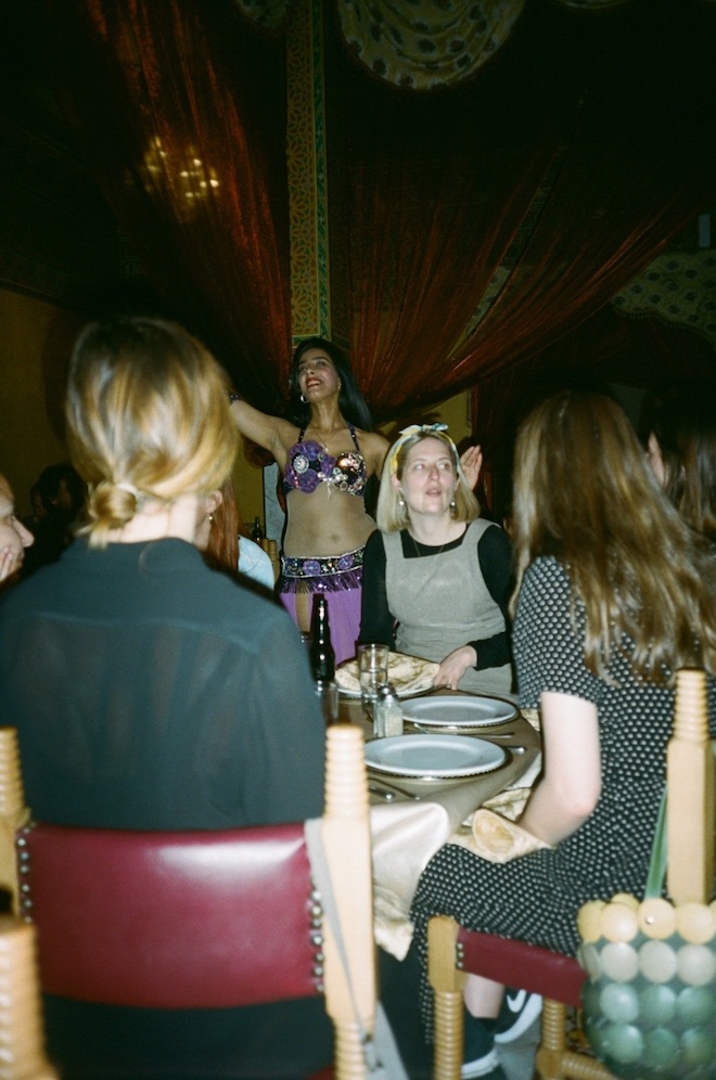
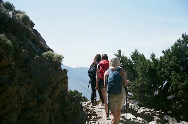
Earlier this year, we announced our initiative in collaboration with Whistle and Trekstock in aid of raising funds and awareness for young adults with cancer. For the trek, a group of us including a few members of our teams set to climb the highest peak in North Africa situated in Marrakech for six long days with heavy packs and thrilling cliffs. We also managed to be graced by the presence of photographer Fenn O’meally, who was able to capture all the highlights of each special moment. See a few moments spent below.
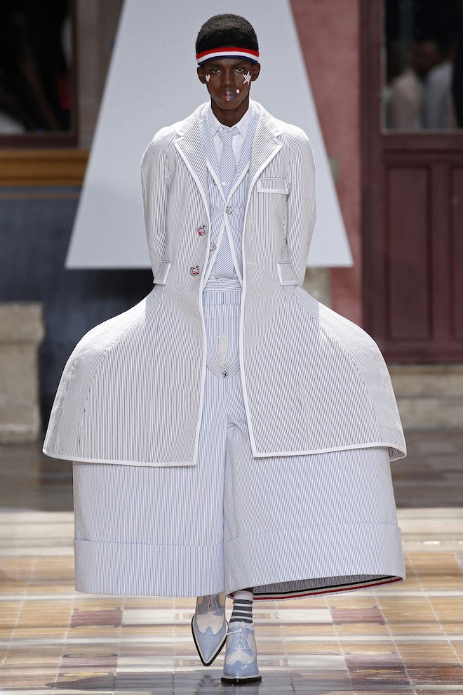
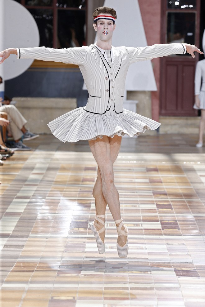
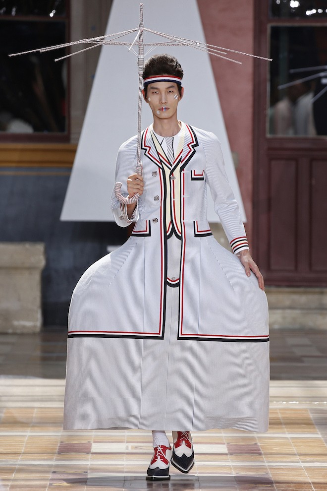
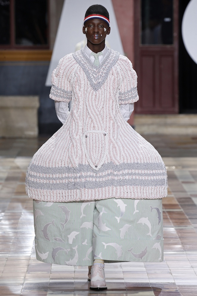
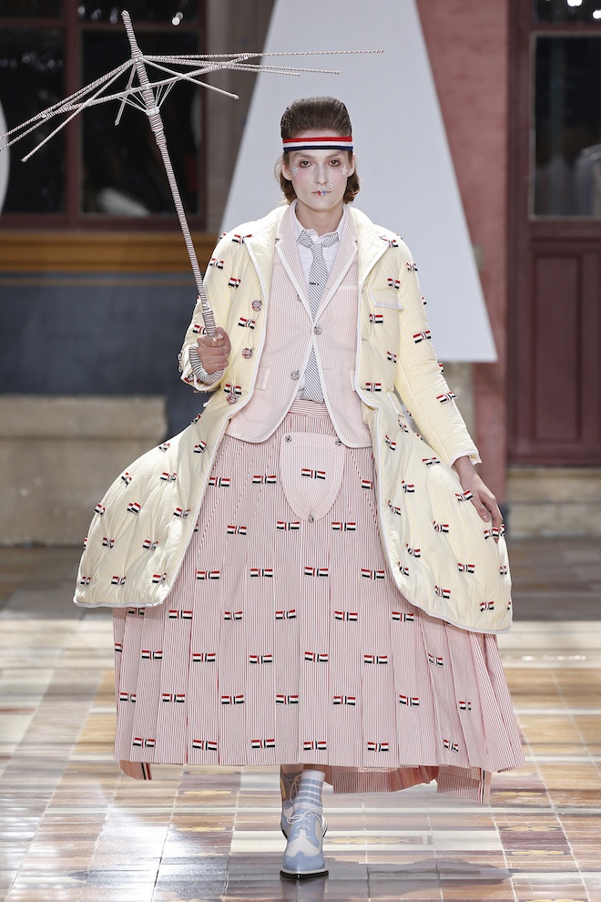
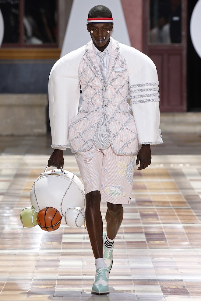
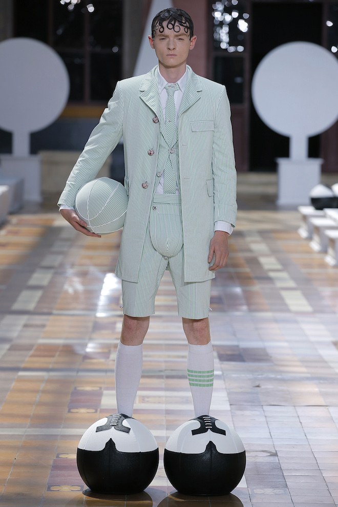
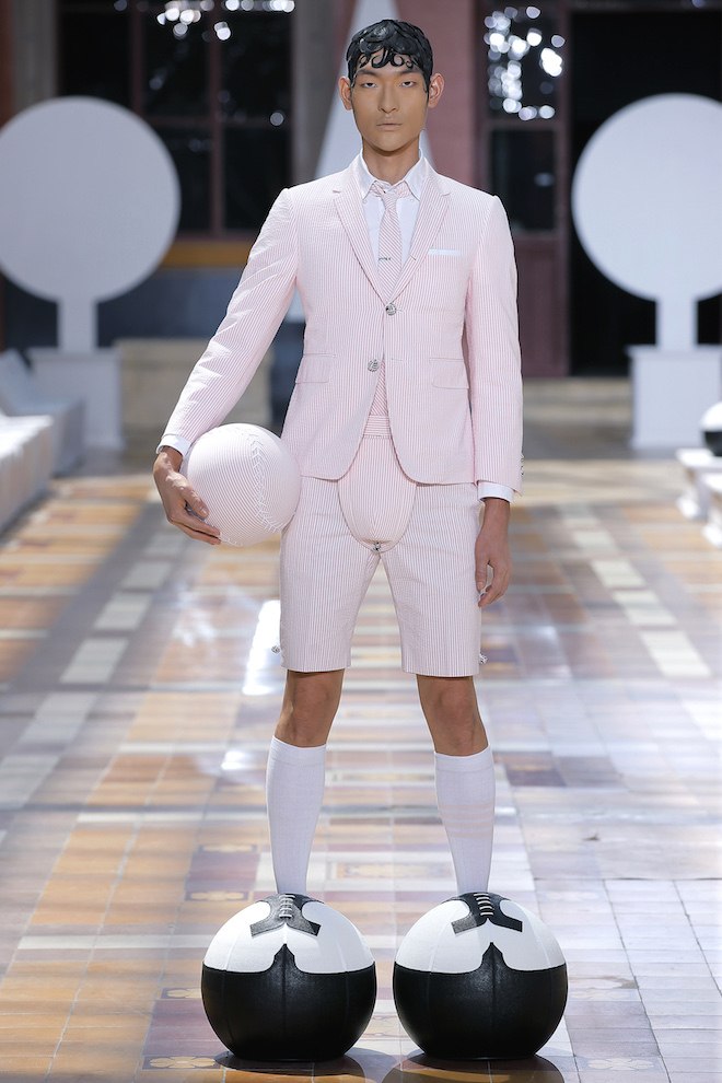
Within the past few seasons designer Thom Browne has managed to establish himself as one of the more creative menswear voices in fashion. Each season he manages to reflect the scenery that is the objet d’art of his complex mind. Creating fusions of menswear with forms of femininity and couture tailoring. For spring summer 2020, he created a story around a secret garden where he unleashed his fantasies of typically masculine sports reinterpreted and blown up with masculine qualities while still caressing the idea of vulnerability. This was shown through XVII century clothing that were reinvented and reinterpreted. From hips that blew up inches wider than usual to oversized shoulders all shown in the classic Thom Brown seersucker fabrics. Football balls pads and codpieces paid tributes to the sports in red, green, yellow among other colours.
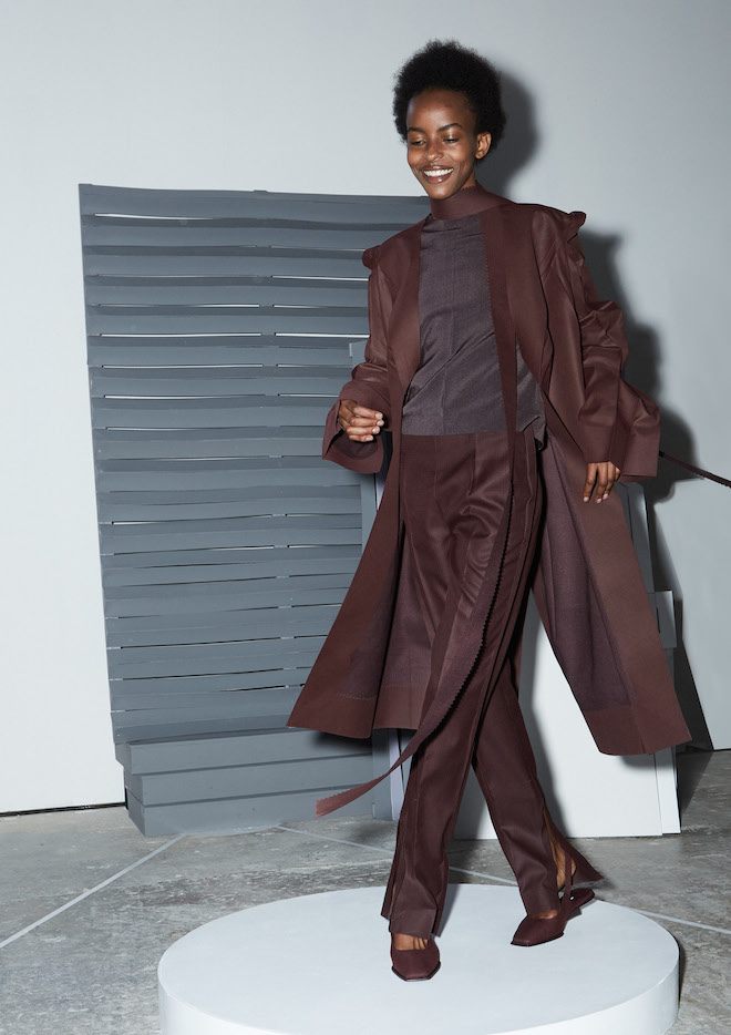
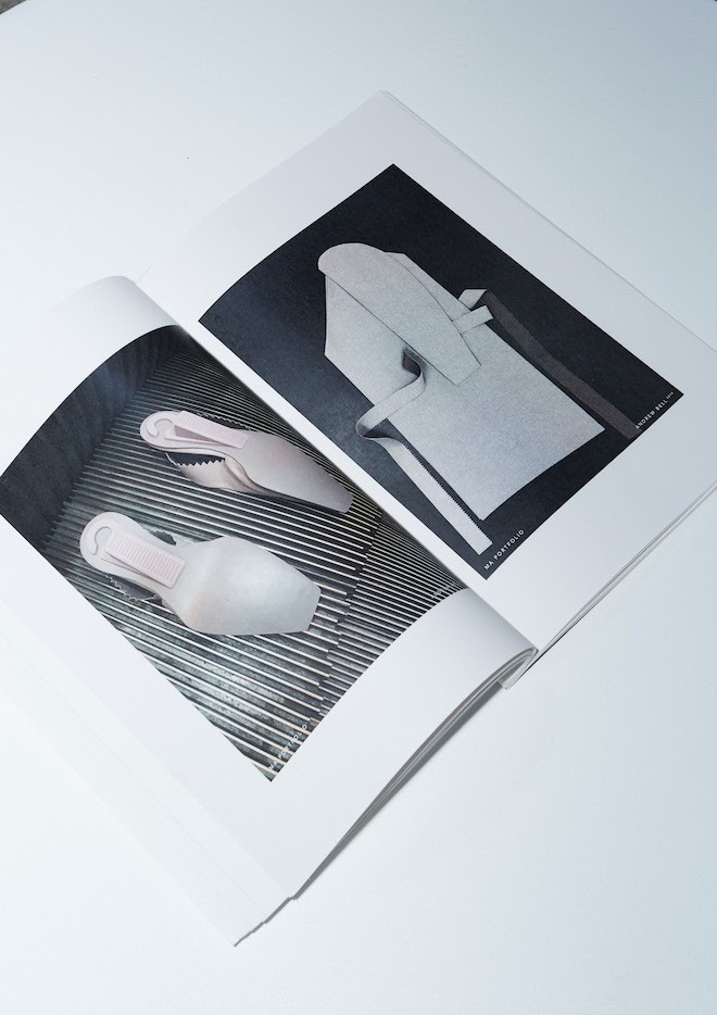
The needle and thread, the binding hallmark of the fashion industry is devoid in the work and craftsmanship of the fashion designer Andrew Bell.
Using cutting-edge sonic welding technology, in a disruptive approach that undermines the one constant that has traditionally kept fashion together, Andrew is a creative looking at alternative means to design. For Andrew contemporary fashion is stuck: designers are consistently creating the same shapes and silhouettes, very much defined by tools and techniques which have not changed for decades. Having graduated from Zowie Broach’s MA degree at the Royal College of Art, Andrew was one of the front running thinkers of her encouragement towards radical thinking: the graduate show entitled All At Once summarising the spectral chest of ideas on show.
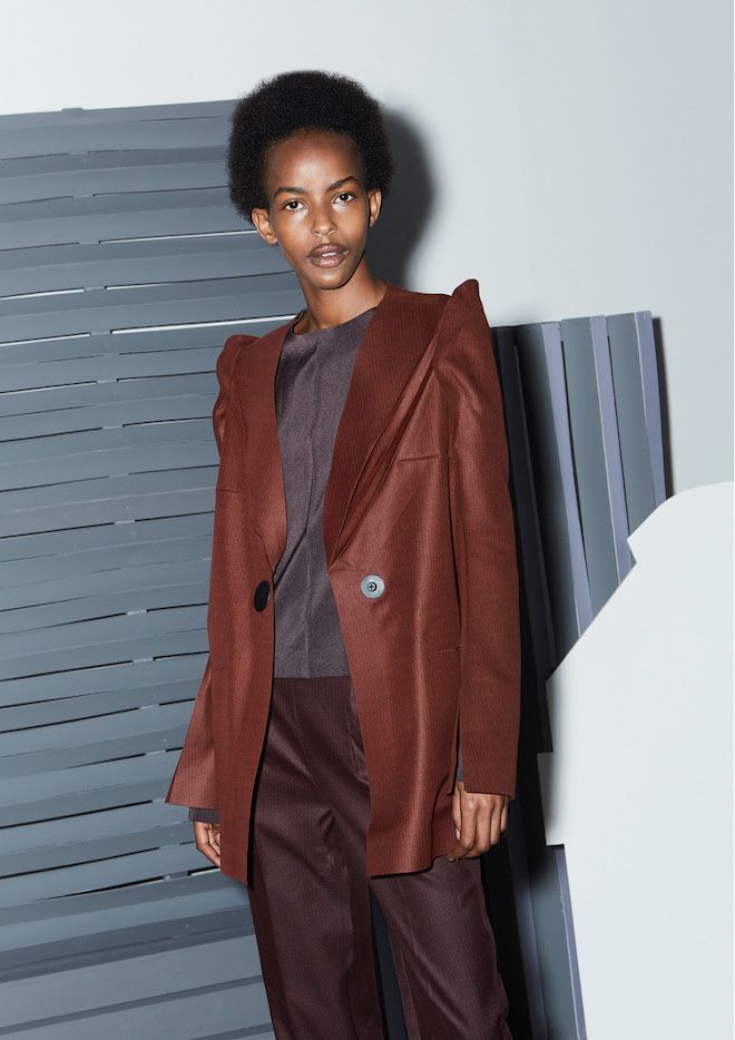
Unpicking the traditional and moving forwards with new technology is central to what makes Bell’s aesthetic fresh and striking. Collapsible coats, razor sharp pants and fluid-cut tops combine to project a signature look that crisp, sharp, compact and concise. Side-stepping the familiar, traditional and pre-determined is at the heart of what makes Bell’s work engaging. Animatedly explaining how he used Sonic welding technology to seal not only to edges and outlines of his pieces, but to bind the very aesthetic direction of his work, Andrew has ensured that in the absence of stitch lines his pieces are super-lightweight, which in turn allowed him to develop a series of collapsible coats and jackets that fold completely flat to just 1.5cm in profile.
Andrew’s work hinges on an axis of high-low paradoxes. On one hand his cutting references the collapsible hover bag, on the other the very cornerstone of modern womenswear tailoring – the Dior Bar Jacket. For Andrew this paradox reflects the collapse in the traditional frameworks that bind our notions of ‘luxury’ and ‘non-luxury’ in an era of material excess. In this saturated context Andrew’s work presents in part a portrait of the collapsible, but equally projects an alternative vision for the future, with ‘Future Tailoring’ the term the designer uses to condense and communicate his approach.
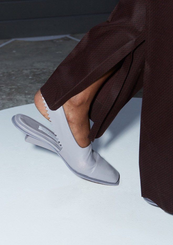
Across his MA collection Andrew has explored the hallmarks of a new era of garment construction across a spectrum of materiality; from sharp and structured to soft and fluid. The edges of this new aesthetic are instantly identifiable through his iconic zig-zag emblem; More subtle is the completely clean-cut, non-fray edge that defines every other sleeve and side seam in the collection. Up close, the zig-zag edging harks of easy-open, single-use supermarket stock.
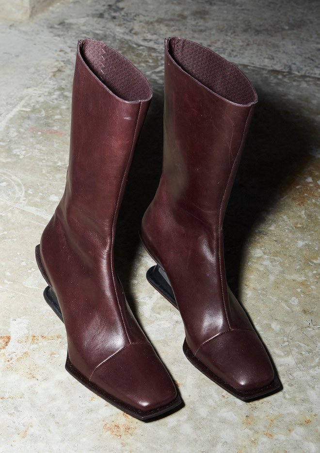
Collaborating with a print designer, Ciaran Moore, on the fabric, the pair capture the beauty of industrial textures, such as the rusty non-slip grills that go unnoticed under our feet. The ephemeral geo-prints that line envelopes and parcels sit side by side with heritage herringbones; luxury and the lo-fi abound. This approach is extended to the footwear in the collection too. In collaboration with fellow RCA alumnus Tabitha Ringwood, the pair present a capsule of footwear completely crafted from scratch. For the heels the designer borrowed the humble door wedge, re-moulding it both physically and conceptually as an object of beauty that extends beyond its primary status as a mass-produced, valueless and solely functional article.
Perfume is an off-shoot, but nonetheless connected project to Andrew’s vision: exploring the potential of a fragrance focused magazine that features different contributors each issue. Just as the designer’s outerwear collapses the material hierarchies of ‘luxury’ and ‘non-luxury’, so too does his fragrance concept. In the place of traditional cut-glass bottle, Bell’s concept sees bio-degradable PVC sachets as a sustainable alternative. As such Andrew dissolves the most expensive aspect to any fragrance – the bottle – allowing fragrance to become more accessible to young designers and their audience.
Andrew’s work reminds us that aesthetics and technology can harmoniously inhabit a creative space together – technology cannot abandon visual beauty, nor can form ignore the potential and the responsibilities of production and design. Andrew has allowed technology to shape his process, re-articulating items of the banal everyday into structures of body-skimming beauty. As Bell surmises, in order to break the deadlock, the repetition and the dead-stock, fashion must look to new ways of making, and new ways of thinking.
It’s an approach that Bell attributes to the inimitable teachings of Zowie Broach, a modus operandi that demands a fearlessness in approach. Under Broach’s leadership Andrew was chosen by Value Retail to be the 2nd recipient of the highly coveted support scheme for rising Irish talent; The Kildare Village Fashion Scholarship which allowed Andrew to take his place at the RCA, an opportunity that the designer explains would otherwise have been closed to him.
The designer is often a perfectionist: in the way they touch, feel, look. Every facet is examined, explained and evaluated in detail. Andrew Bell is no exception – it is this exhaustive dedication to the metaphorical folding of fashion that has allowed a designer to emerge that is refreshingly new.
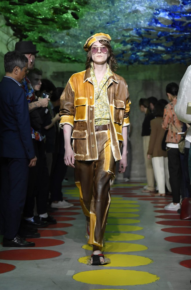
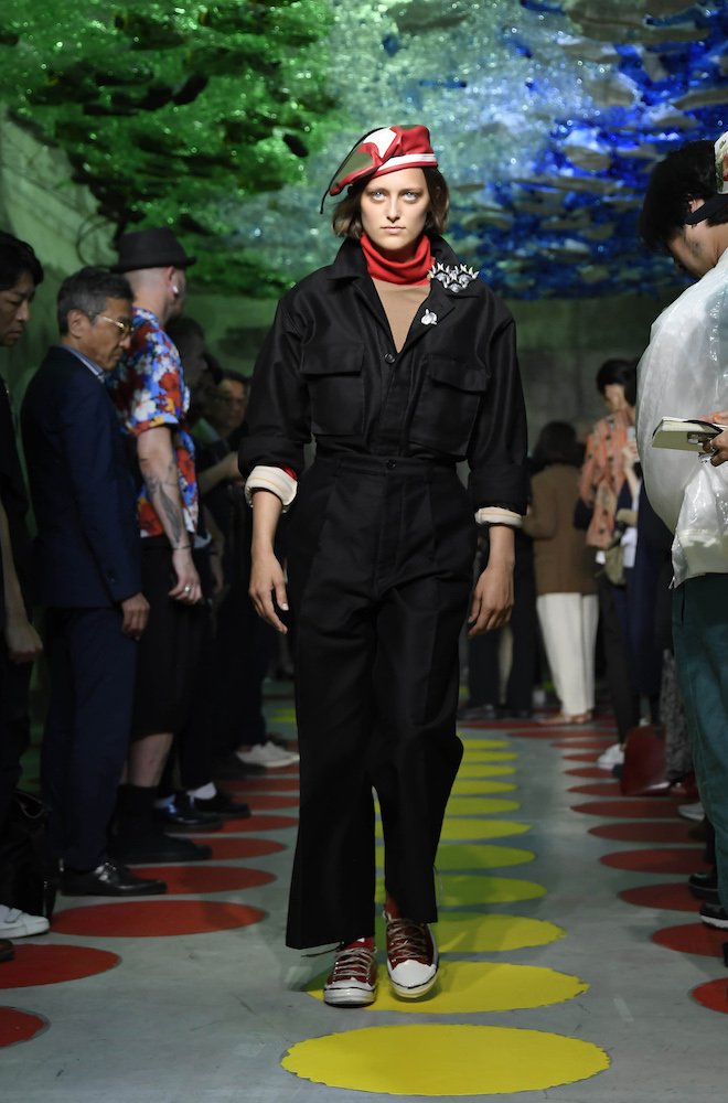
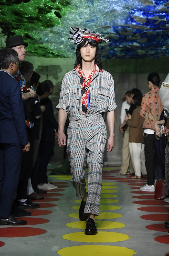
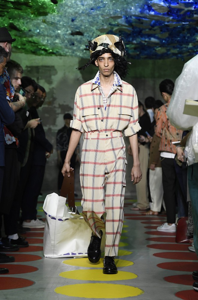
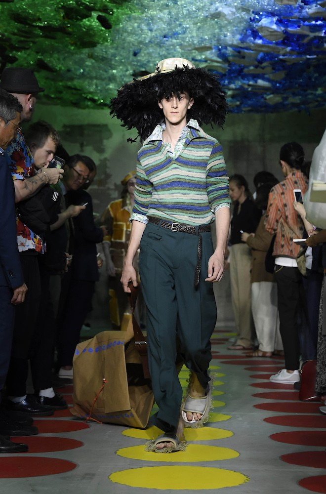
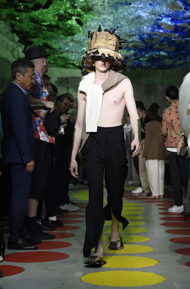
Last week in Milan, Marni’s creative director Francesco Risso, who has in some ways become the enfant terrible of Milanese fashion invited guests to a show space that featured a net ceiling filled with plastic bottles for the presentation of his SS20 collection. The show’s set, although containing a strong message to environmental matters we face today was simply just a backdrop, or as the designer himself put it, “a reminder of the issues we’re facing with plastic hanging over our heads.”
The collection itself was a celebration as much as it was a rebellion. Risso imagined an unlikely marriage between Argentine revolutionist Ernesto Che Guevara and American novelist Truman Capote with himself as the wedding planner. This resulted in the harmony of two opposing worlds, carnival meets military. From hats made from staples, to old furs, plastics and debris by artist Shalva Nikvashvili, to slippers crafted from cardboard cut outs and plimsolls dipped in oil.
“A study in clashes, and the uneven harmony that ensues by mixing opposite worlds, jumbling it all together. The extreme graphic properness and formality of suits. The radical rebelliousness of field jackets and militaria, with a tropical slant.”
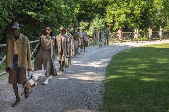
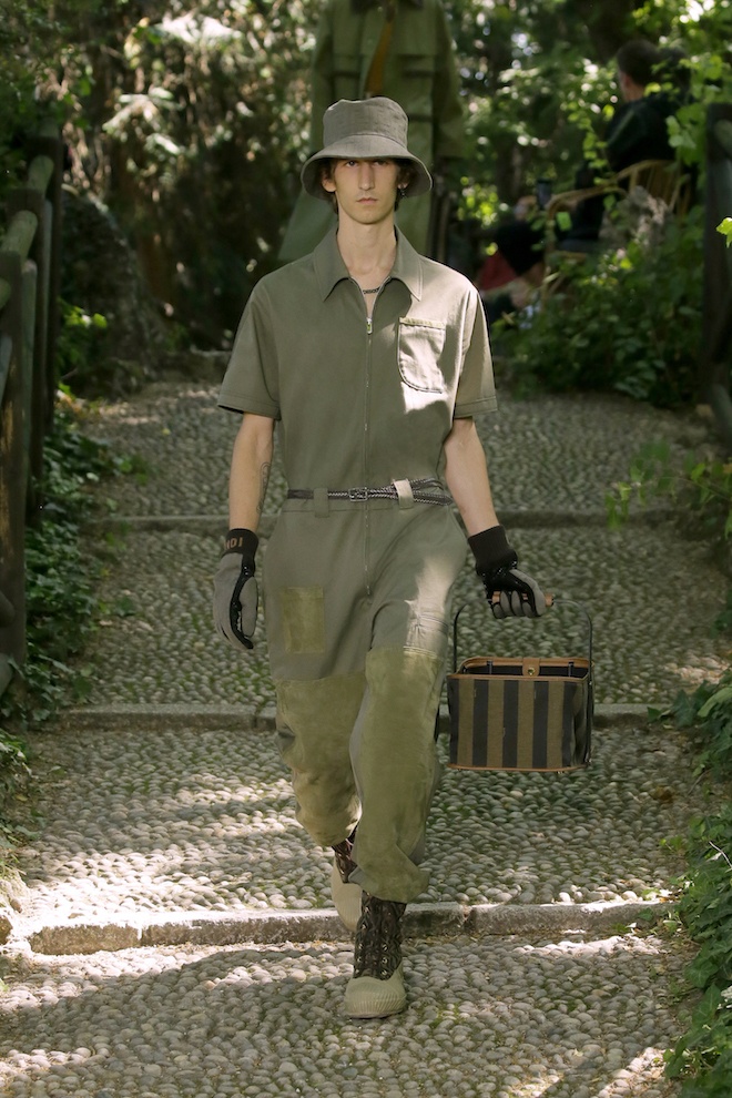
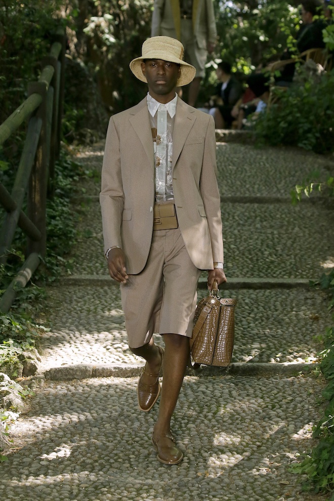
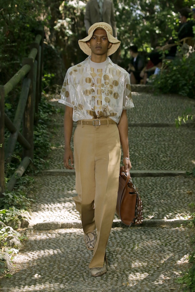
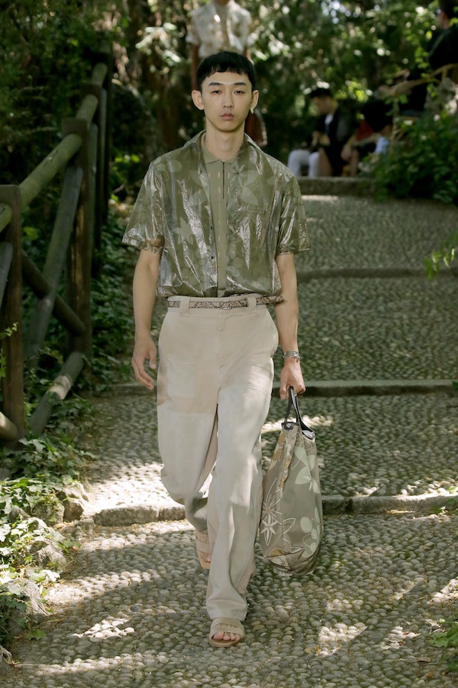
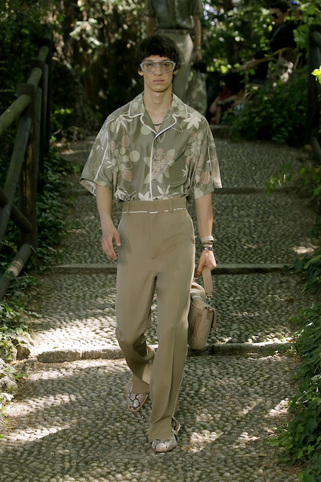
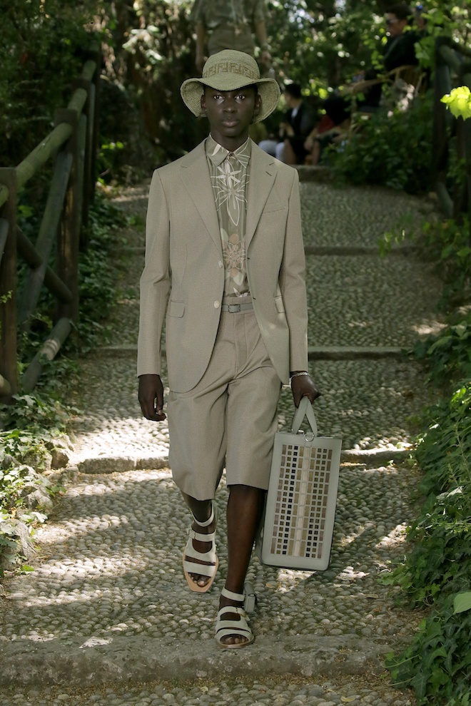
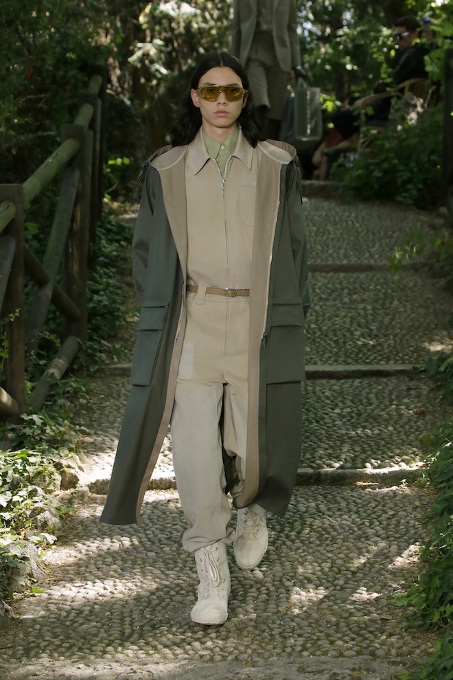
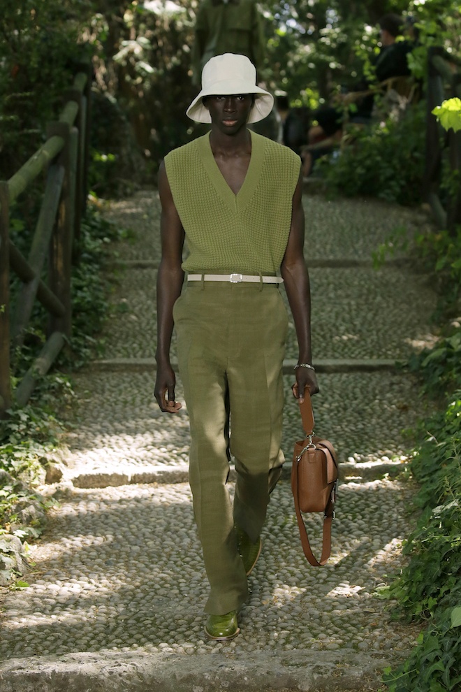
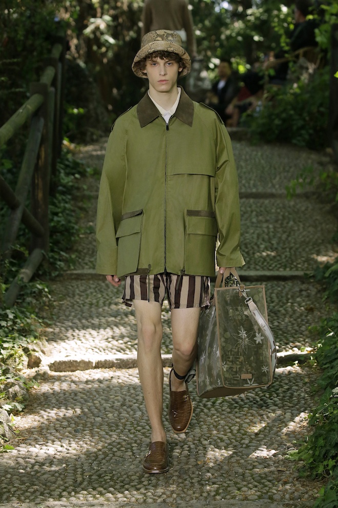
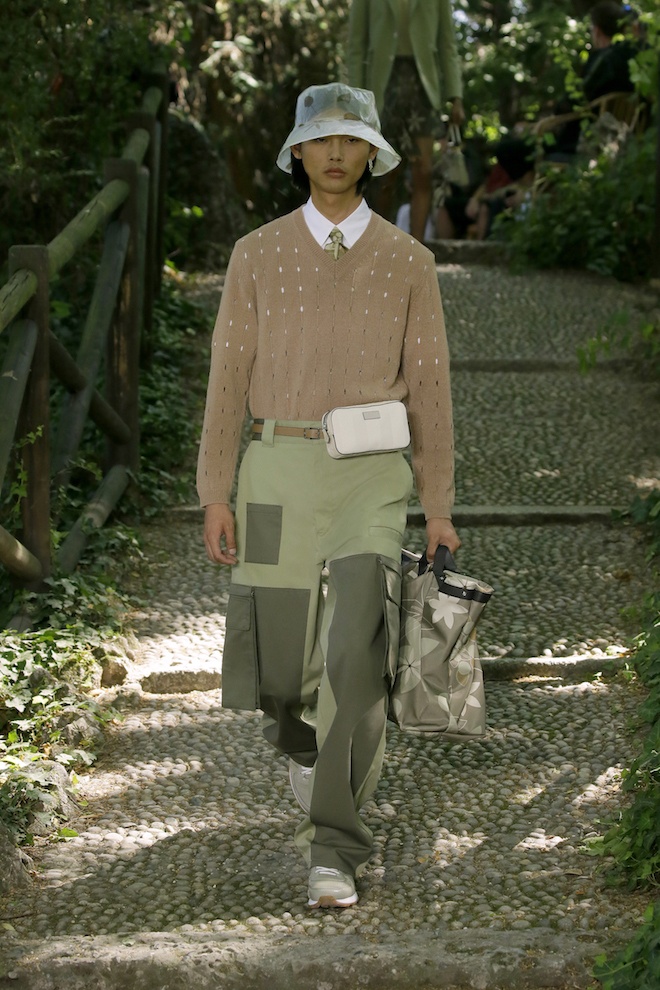
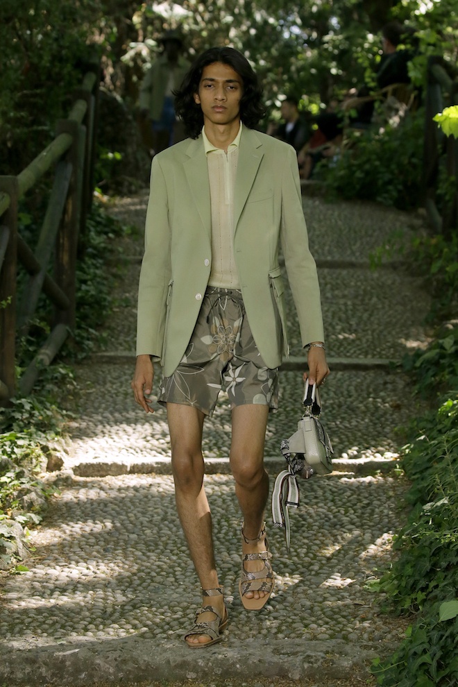
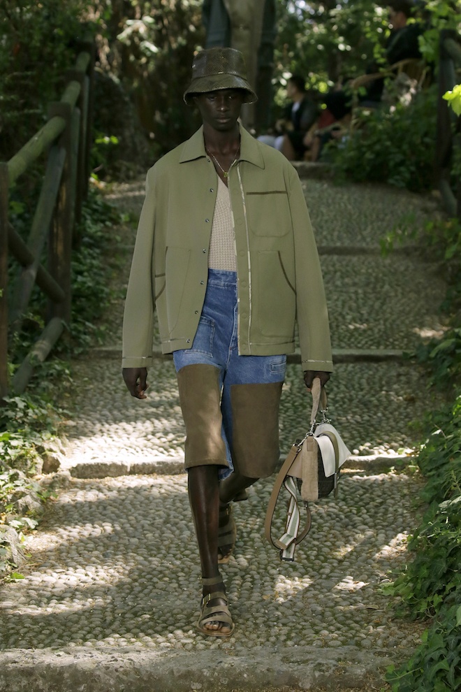
For the first time in a very long time, Italian fashion house Fendi stepped off site their routined Milanese show space and headed for the gardens of an 18th century villa in central Milan for their SS2020 show. A switch that had been prompted by creative director Silvia Venturini Fendi’s need for a break from the virtually infested world we live in as she takes a minute to appreciate the fruits of Mother Nature . This collection was a version of the Fendi man that goes fishing on weekends and gardens in his spare time. Sartorial workwear pieces were presented with a casual elegance that allow their wearers a sort of relaxed eased approach towards life.
From khaki cotton overalls, to striped beach slips, to fishmerman style vests and cargo pants. Throughout the collection, the house also revealed their collaboration with renown “Call Me By Your Name” director Luca Guadagnino who drafted a few botanical prints for the collection. These were brought out through digital prints and cut out knit wear. The colour palette was one that blended with the habitat ranging from beiges, to greens , browns and whites. In regards to accessories, the house debuted a Pequin printed Fendi watering can, garden baskets, big totes, pouch bags as well as versions of the Fendi baguette and peekaboo bags. This collection was a breath of fresh air for the house, one that in some ways allows for a sort of reset, and more than anything conjures the desire for a vacation.







 PREVIOUS

 Twitter
 Tumblr
 YouTube
 Facebook
 Instagram
