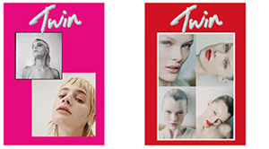
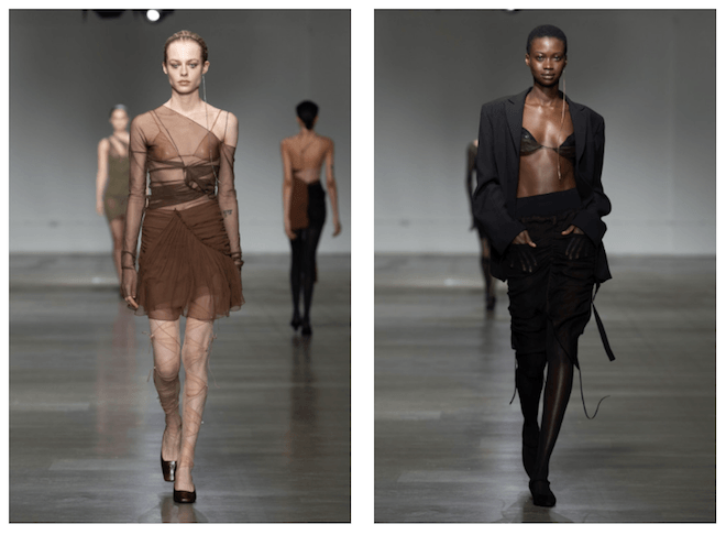
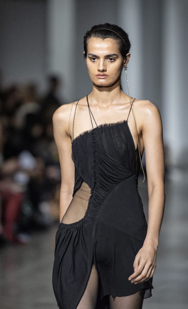
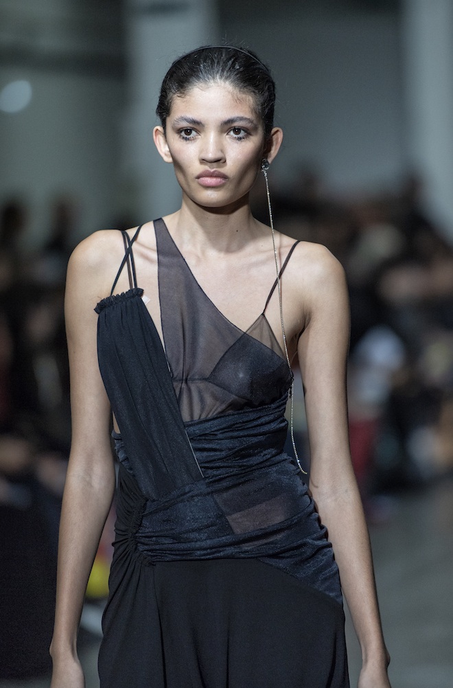
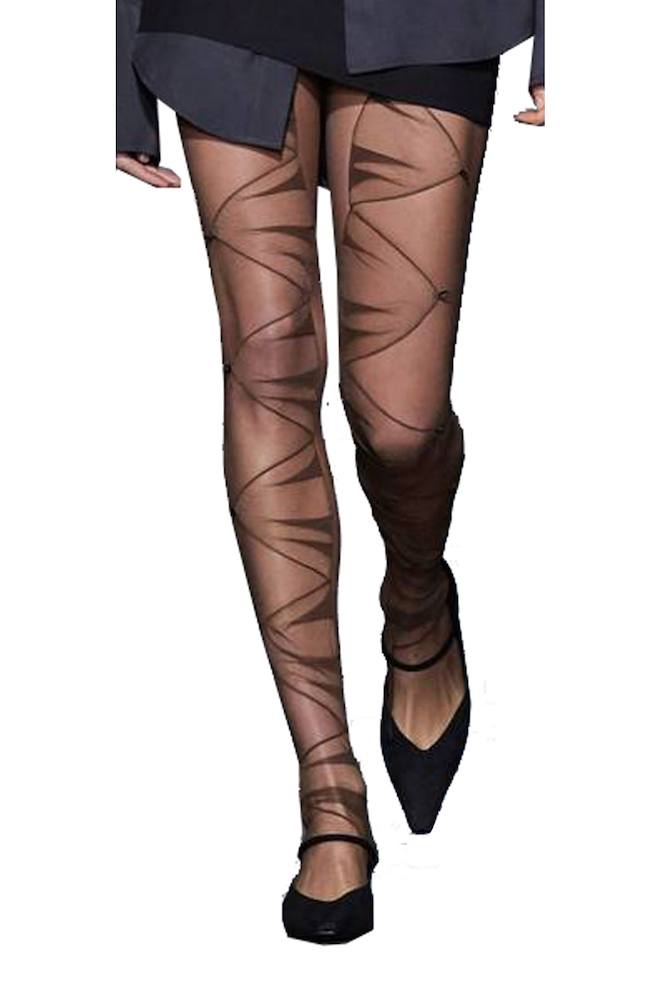
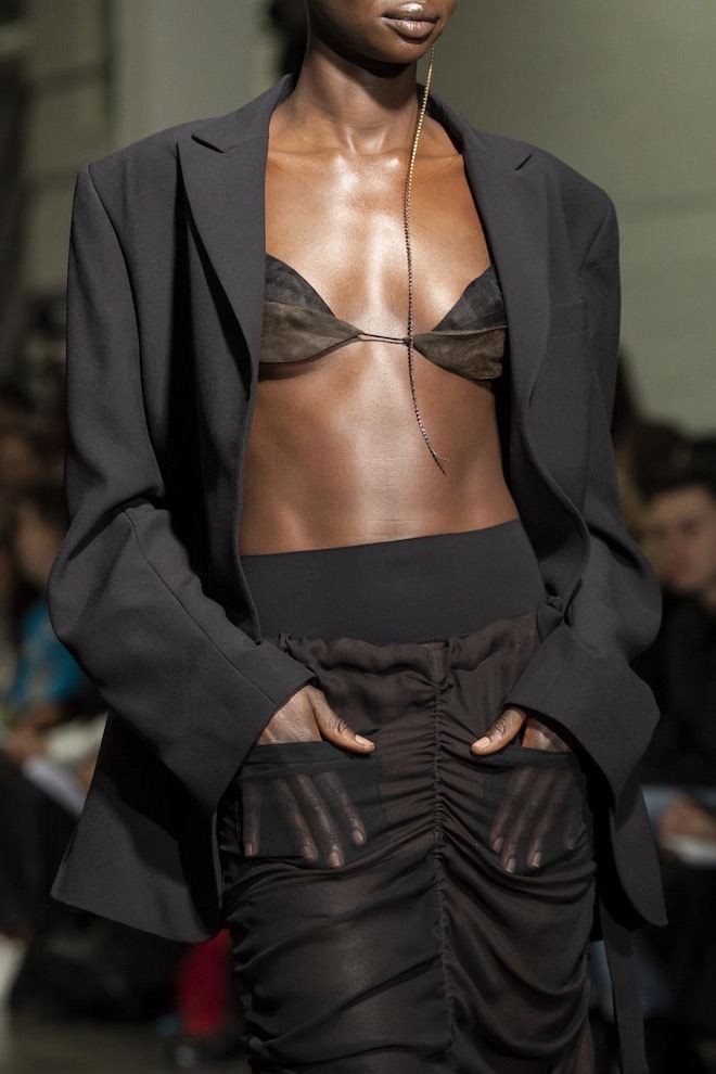
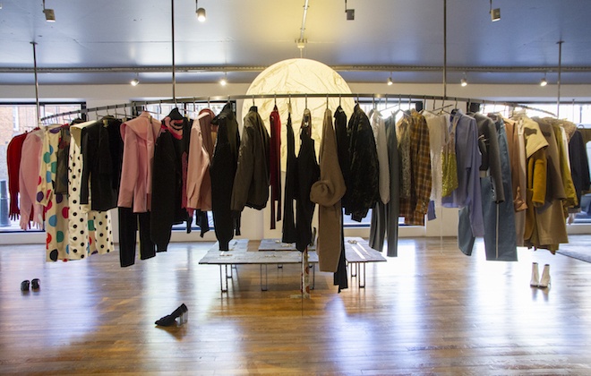
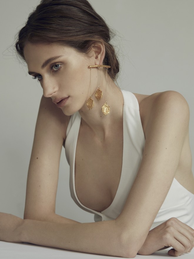
Designer Nensi Dojaka’s vision is strictly about the modern woman – and that means embracing her in all her polarities. AW20 marks the designer’s first season with Fashion East, and already it’s clear her message is as powerful as the designs it informs. A recent Central Saint Martins MA graduate, it’s her BA in Lingerie Design that serves as the underpinnings of a delicate interplay, where strength and vulnerability are held together by the finest thread, or just-concealed among collaged layers of sheer silk. Talking to Twin about subverting sensuality with a female-first mindset, the Albanian-born creative tells us just why empowerment is shaping her approach to femininity.
How did your label begin?
After finishing my MA, SSENSE contacted me about buying the MA collection, and their trust and support pushed me towards working on my own brand. I followed with another capsule for SS20, and now AW20 with Fashion East, and things started to evolve naturally.
Where do you find inspiration?
At the beginning of each collection, I always have a ‘mood’ I want to convey. My woman is out there to stun, but she does it discreetly and this gives her a flavour of danger and fun. After that, I start to drape it all on the mannequin and it comes naturally as a result of visual research. My references of ‘90s fashion will always be there as most of my fashion research stems from ‘90s magazines, and looking a lot at designers like Ann Demeulemeester, Alessandro Dell’Acqua, Jean Colonna.
Your designs are intimately feminine – what made you want to explore femininity through your collections?
I studied lingerie during my BA so naturally, my work is about silhouettes that complement the female body. It is about embracing the strong and the soft duality of modern womanhood. I love working in the same amount of detail and scale that lingerie has, the mini details like straps, rings, which I use a lot.
I like the way lingerie contours the body because of the way it’s constructed; how some delicate straps can hold and create the dynamics of the whole piece. There’s always some bra elements in my work. I try to come up with unconventional shapes like the circle bra part of a top in AW20, which is held together by a contrasting elastic strap and goes across the bust in a very graphic way.
There’s both a strength and a vulnerability to your designs. How would you describe the message behind your aesthetic?
I think my woman is complex and her beauty stands in the fact that there is a perfect marriage between severity and delicacy in her, and I try to translate this idea onto my clothes. By distorting the perception that comes along certain materials; creating delicacy from severity, and vice versa.
To mirror that duality of softness and severity in women, I work with different levels of transparency intermingled together in every piece; some bolder drapes against lighter bits which are placed next to each other in an asymmetric, more erratic way. The way the drapes fall onto one another in a more “unexpected” way is to distort that notion of being just pretty and give it a twist into something more aggressive. The sheer fabrics also allow for me to play around with layers, which gives a more ethereal look and also serves as an “armour” by covering up despite being sheer.
Why do you feel fashion is the best way to communicate your message?
Because it is the wearer that brings that message to life and I love the relationship between the wearer and the garment and the meanings attached to it.
How do you want women to feel when wearing your pieces?
Beautiful, strong, alluring yet mysterious.
How has your connection to London and Albania shaped your design approach?
Both places have shaped the way I think for sure. In Albania, I had the luck to have the help of amazing tutors who contributed to my well-rounded knowledge. And when I came to UK, it opened up even more possibilities for me. Both places have a nice juxtaposition of chaos and order that really inspires me and is reflected in my work and the way I see things.
How do you see the fashion industry adapting in this time of uncertainty?
The pace is suddenly much slower but I see brands passionately trying to move forward despite the difficulties, and of course adapting to finding ways around it without having the comfort of being at the studio with the team or the usual cash flow.
What have you got planned for your next steps?
I’m looking forward to showing my next collection in September, and figuring out the best way to do it to ensure safety during these tough times.
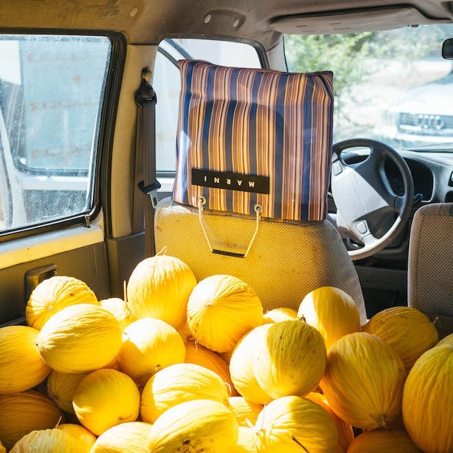
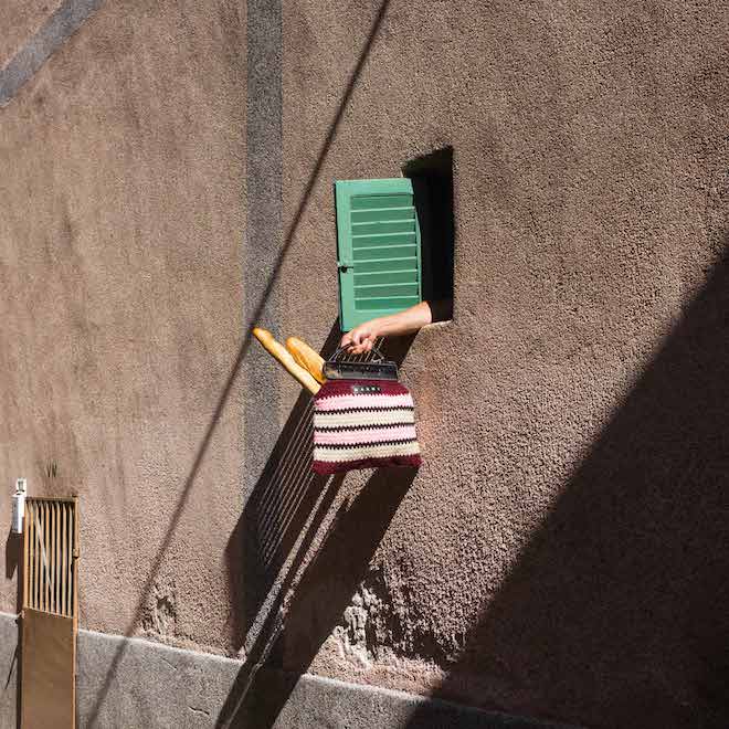
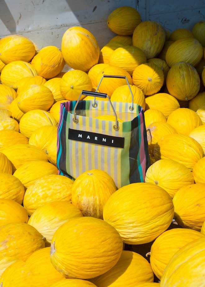
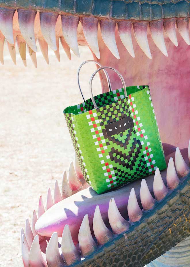
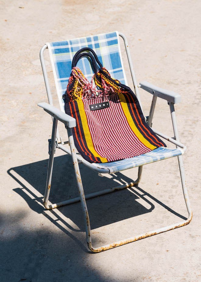
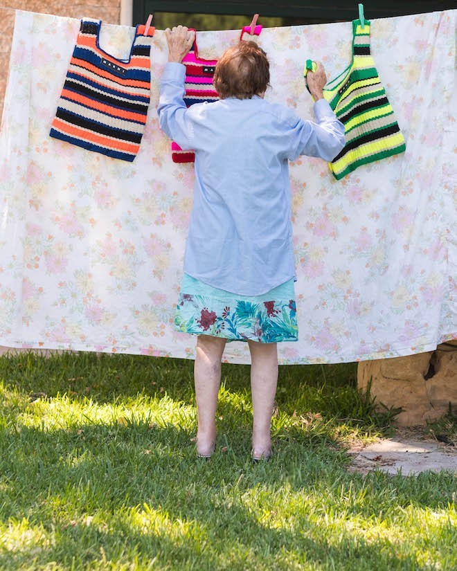
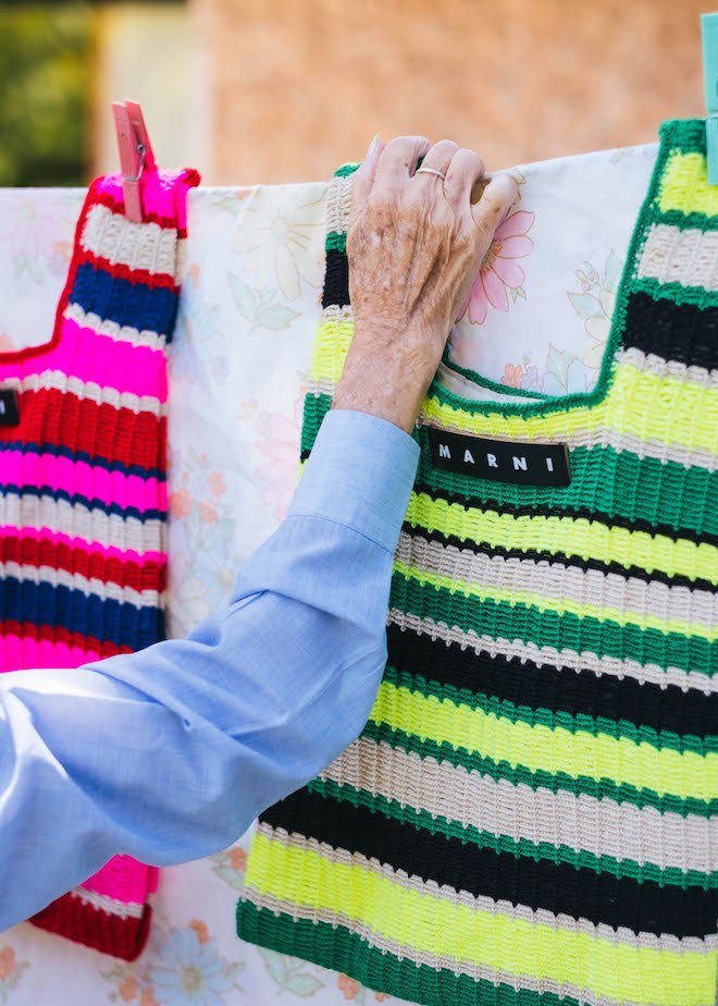
Last April during Milan Design Week, Italian brand Marni presented a line of bags, furniture and design objects in their signature show space.
This week the brand has finally put these objects on sale via what they dub their online Pop Folk Market. With a series of colour combinations featuring their Crochet bags (in cotton & wool) , Hammock Bags, iconic striped bag and an introduction of their Fish Bag in a fluorescent shade, the house has created a visual story as they embark on a road trip filled with the characteristics of colour, humour and personality. Each of the pieces included in the collection is said to be a unique creation handcrafted by their long term Columbian artisans using the meticulous artisanal process of the local traditions. All the pieces from Marni Pop Folk Market are currently available at Marni.com
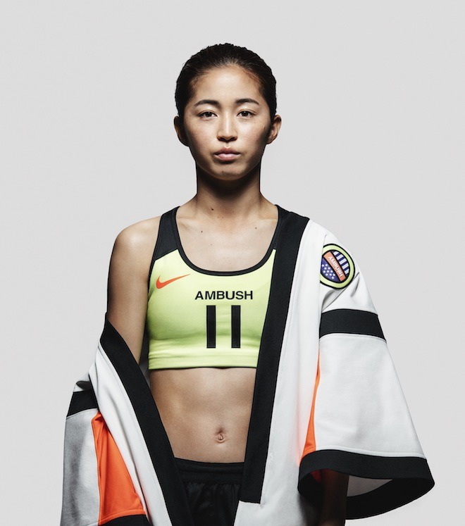
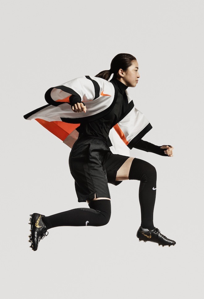
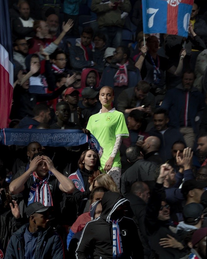
Just in time for the 2019 Women’s World Cup in June, Nike released their new collaborative campaign this week featuring four of fashion’s most promising female designers. For the collaboration Ambush’s Yoon Ahn, LVMH Prize recipient Marine Serre, Koché’s Christelle Kocher and MadeMe’s Erin Magee redesigned the classic football jersey with matching sports bras from their own perspective of these sports staples.
Yoon Ahn of AMBUSH created a jersey that speaks to diversity by reflecting aspects of Asian culture in a unisex hybrid jersey inspired by the Happi coat, which is a traditional Japanese straight sleeved coat.
“ I chose the happy coat because, although we are celebrating the tournament and the incredible female players, I believe it is just as important for the fans, for everyone to have universal piece to celebrate in,” she explained.
Nike x AMBUSH
Nike x AMBUSH
Christelle Kocher’s vision however, stemmed from the idea of creating a sort of elegant asymmetry. “I created this dress by reconstructing the soccer jersey around the female body. The result is a dress that can be worn by a girl who plays, dances or moves in the city,” she stated.
Nike x Koché
Nike x Koché
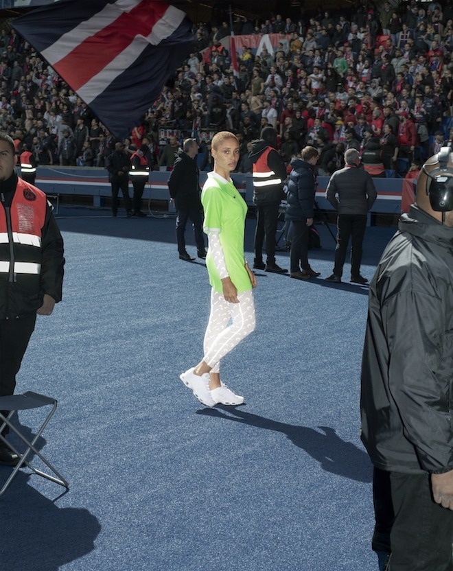
Marine Serre was of course able to offer a version of the signature print which has aided in gaining her recognition over the past few seasons by presenting it in a printed body suit worn under a slender neon green jersey. “The focus of my design is always hybridity and adapting to daily life. It’s important to create a purposeful line that makes a female feel good without compromising style,” said Serre.
Nike x Marine Serre
Nike x Marine Serre
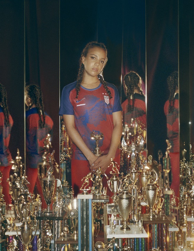
MadeMe’s Erin Maggee instead paid homage to the U.S Women’s National team of the 90’s with a match ready Nike stadium jersey featuring the USA federation crest. “I wanted this jersey to be sport first, fashion second. It’s meant to celebrate the incredible victorious history of the USWNT by drawing attention to the woman namesake of the iconic sportswear company itself: Nike the Goddess of Victory.”
Nike x MadeMe
Nike x MadeMe
The collection will be available for purchase at NikeLab stores globally and a few retailers as of June 7th.
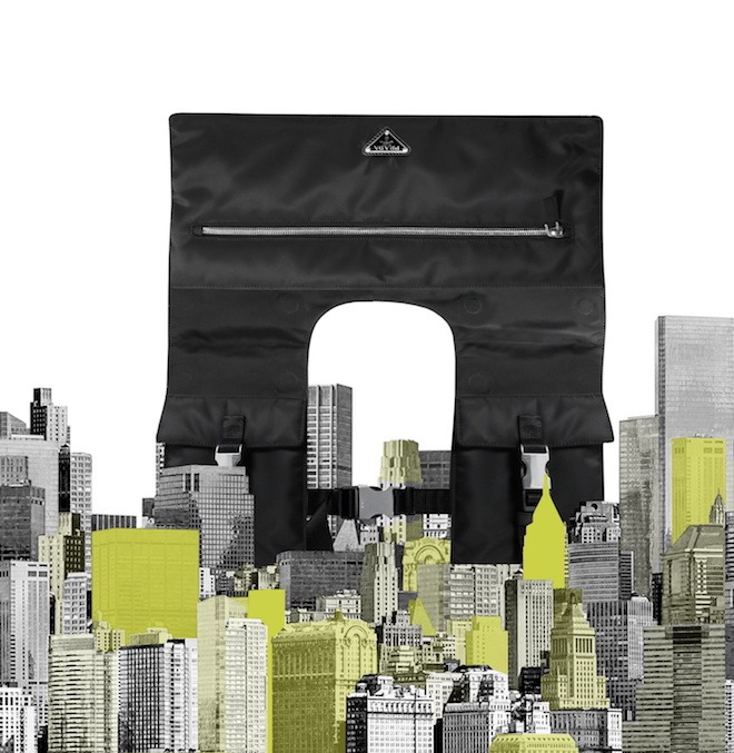
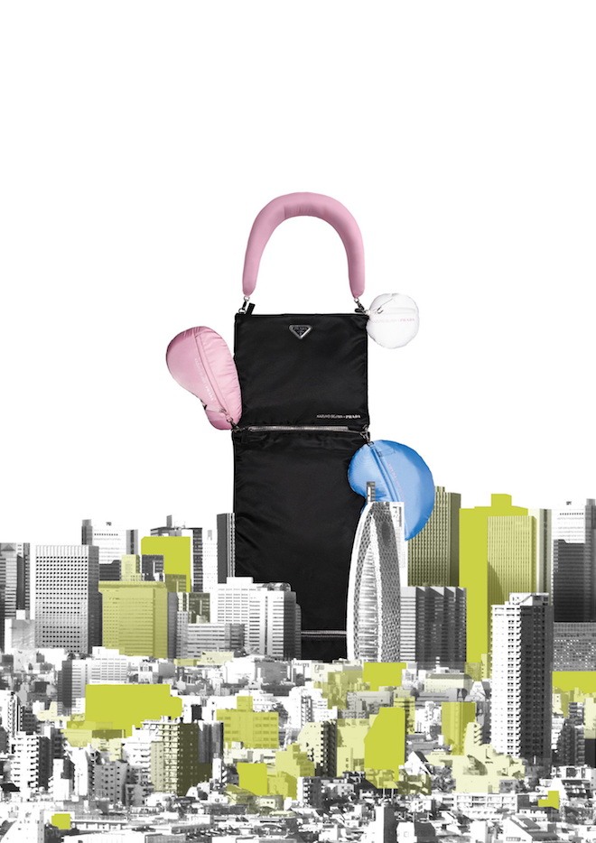
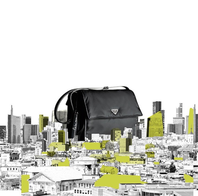
On theme with Milan Design Week, today Prada Milano launches a series of projects titled Prada Invites in collaboration with three outstanding female architects. The Italian luxury house has invited Cini Boeri, Elizabeth Diller and Kazuyo Sejima to give their takes on the brand’s signature nylon fabric. For the project they are presented with the task of creating an accessory item for women and each artist produces something of a unique item. Italian architect Cini Boeri has conceptualised a functional bag that can expand and reduce according to its need or occasion; Japanese architect Kazuyo Sejima has crafted rather more playful designs with a long version dubbed the ‘daln’ and a curved version called ‘yooo.’ While American architect Elizabeth Diller’s designs — ‘The Yoke’ bag and ‘The Envelope’ garment bag cover a wider range of multiple functions. This new chapter of Prada’s venture is only a small display of their ongoing fascination with multifaceted representations of contemporary femininity. Prada Invites pieces are on sale with several different drops from the end of March until the beginning of May, in select Prada stores across the world.
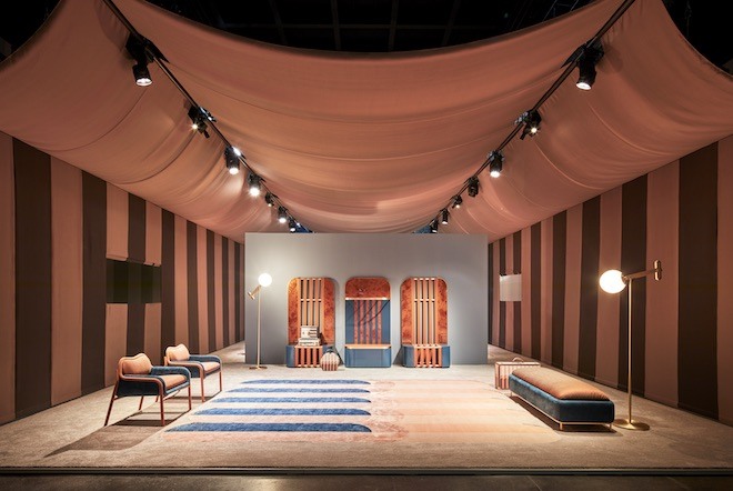
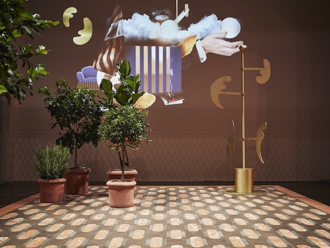
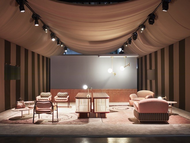
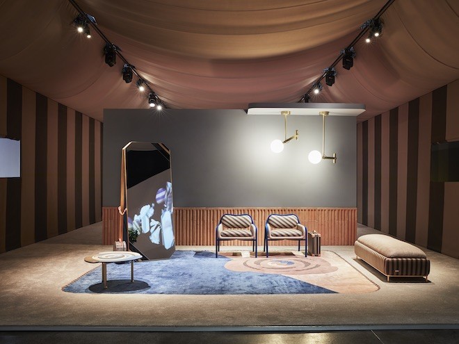
For Milan’s annual international design week, Italian luxury house Fendi has teamed up with renown Italian architect, designer Cristina Celestino for their latest project entitled “Back Home.” Fendi first tapped Celestino back in 2016 for their first successful collaboration, the “Happy Room” at Design Miami. The duo worked well enough that it was indeed deserving of a second collab, which presents as the FENDI Casa’s “Back Home” line. The collection, on exhibition at the house’s showroom in Milan, is a celebration of the Maison’s iconic Pequin striped motif first produced back in 1987.
Throughout the exhibit Celestino produces a reinterpretation of the motif while using the house’s iconic patterns to create a wide creative range of furniture pieces in elegant marbles, onyxes and fascinating metallic surfaces. She creates a story centred around the iconic Pequin stripes using geometric armchairs and sofas with masculine designs to counterbalance the femininity of their shapes. A rose-like version of Fendi’s classic geometric motif also appears on coffee tables and carpets along with the FF logo. Influences of fashion are evident throughout the exhibit, a few mirrors and lamps were inspired by the silhouettes of cufflinks, cabinets echo a few of the houses stylistic codes with strong vertical lines, geometric shapes and bold curves.
On site, the installation is divided into five parts, the Terrace, Entrance, Waiting Room, Dressing Room and Living Room. Each room evokes a different feeling with a general recollection of 70’s Roman house revised with bourgeois qualities. The FENDI Casa “Back Home” has its Milan doors open to the public until the 12th of April.
A few days ago Italian designer Stefano Pilati debuted a collection under his name with a runway show in Montréal. The collection, and label titled Random Identities, is the designer’s first independent venture since he parted ways with Ermenegildo Zegna in 2016. A few days prior to the collection’s debut, the designer took to the internet to release a photo series of intimate images shot by photographer Luis Rodriguez. These images featured male bodies shot in black and white wearing nothing but black caps and boots from the collection. This was a series of photographs that at first glimpse on a timeline would instantly capture one’s attention, it felt as if Pilati had something to relevant to say, and this was one’s cue to listen carefully.
The fact that the designer chose to debut in Montreal as opposed to one of the European fashion capitals well within his reach enforced that he was not aiming to continue or tell a story of Yves Saint Laurent, Ermenegildo Zegna, or any of the previous houses he was associated with, but instead, this represented the flip of a blank page for a completely different type of fashion story.
“An honest statement is necessary: fashion at high prices no longer means exclusivity. My response is to produce moderately priced clothes — ‘the low’ — and present them in a high fashion context, creating limited edition items which by quality of design will justify the proposal — ‘the high’.’ The collection was menswear oriented and featured several looks of separates combined and styled to create silhouettes which were genderless. Dominated mainly by shades of black and olive green, the designer describes the pieces as forms of protective wear — constructed from twill and nylon and offers a presence which is both friendly and secure, providing a feeling of power whether during the day or clubbing at night. Following such a powerful debut of the brand, it will be interesting to see what next he has to offer, as one who seems to have a different voice with an interesting perspective and story to back it.
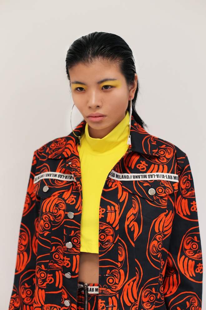
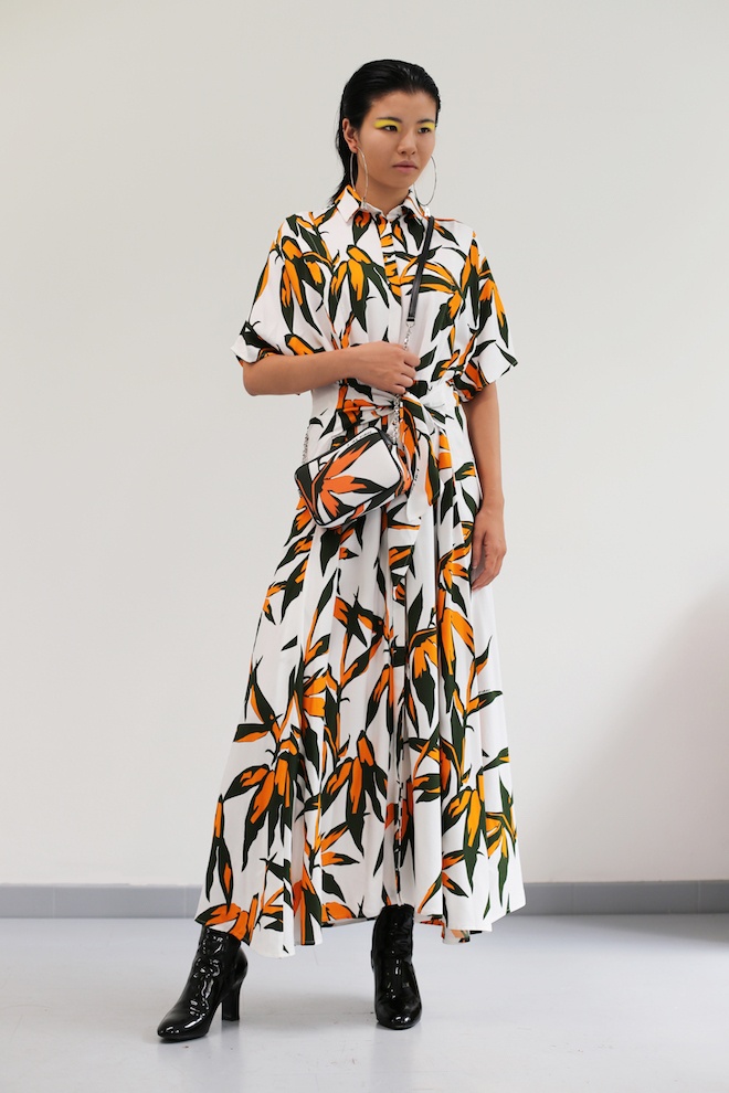
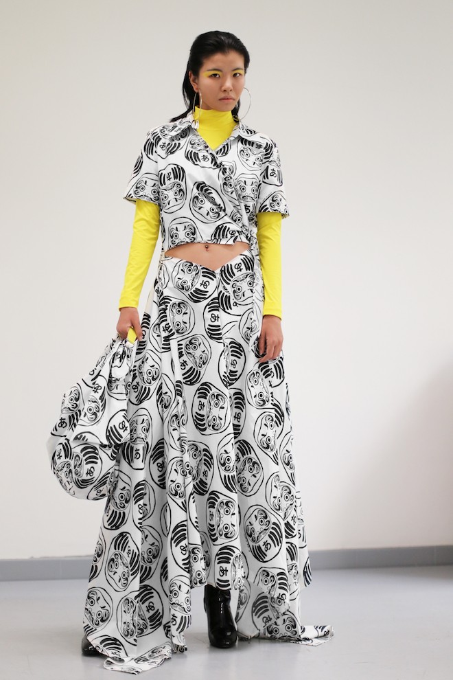
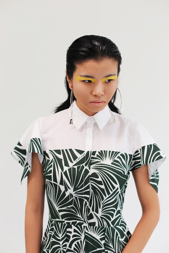
Emerging Italian brand A-LAB MILANO, conceived by Milanese designer Alessandro Biasi is a mark which plays on the lexicon of modernity and contemporaneity through the outlet of fashion design. For his Spring/Summer 2019 collection, Biasi cooks up a mixture of his signature 2-D graphic prints combined with Japanese themed iconography and techniques reworked in an innovative manner inspired by street style from the Harajuku district of Tokyo. Varsity jackets, graphic printed t-shirts and oversized raincoats give direct references to contemporary street style while the designer pays homage to the Japanese culture by the use of things such as the Furoshiki — a traditional Japanese cloth, often with a unique pattern used to wrap bento boxes, gifts and other objects for enhanced presentation using knotting techniques. With this technique, Biasi has created a fashion story around the collection of which the protagonist is the art of knotting, used in both functional and decorative ways throughout wrap dresses and blouses. The collection is also accompanied by an accessory line which features fabric Japanese pinstriped bags with leather handles, pouch bags, silk scarves, and shoulder bags.
On the East End of London, somewhere along Chance Street, Shoreditch this weekend launches a boutique which caters to the likes of a fashion lovers minimalist and maximalist tastes all in one store. Its name: Gentlewench, owned by Chinese personal stylist Wei Yue, is a collaborative effort which includes his expertise of international retail shopping and buying director Tijana Djordjevic’s mass experience in the fashion industry. “It was important to find a memorable name, the meeting of a gentle educated and refined lady with the saucy, outgoing personality of the wench encapsulates the dual character of the store,” says Djordjevic. The boutique will carry a wealthly catalogue of global designers and under the radar designers which will include the likes of French label Lemaire, hybrid Japanese label Facetasm, Georgian designer Lado Bokuchava, and specialist brand founded by a former Comme des Garçons pattern cutter Hed Mayner and Overcoat. “ Our vision is to combine gentle subtle design alongside exuberant fashion and explore the affinities between the two,” says Djordevic. The store interior, created by Fred Rigby and Dunstan James of Projects & Design, offers an intimate luxurious experience while underscoring the industrial heritage of the area. A section of the space will also house a selection of home ware items including wooden kitchenware by Grain & Wood and ceramics by a Jude Jelfs. The store’s aim is to create an artistic space with hints of surprise in its design where consumer can explore, talk and relax. Doors open to the public this Sunday, be sure to stop by and have a look yourself.
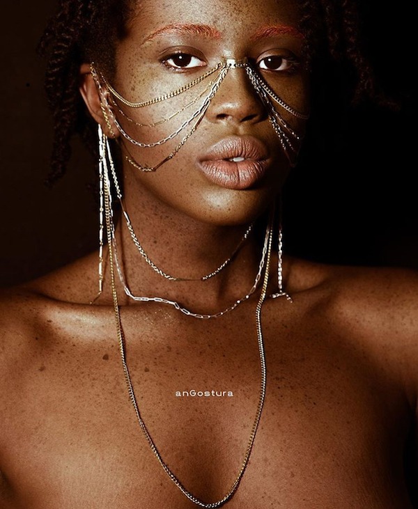
Emerging Italian jewellery brand anGostura , is a brand conceived by designer Giulia Tavani who drew inspiration from the meaning behind the word — an aromatic bitter bark from South American trees, used as a flavouring for cocktails and formerly as a tonic to reduce fevers. The designer describes the birth of her jewellery line as her way of giving a bitter, yet mandatory punch to the cocktail of life itself. Endorsed by the mother of soul herself, Erykah Badu, the collections often feature unique chunks of silver and gold carved into interesting forms which when worn are often seen as poetry to the body.
For her latest collection the designer drew inspiration from the biological term symbiosis — a long-term relationship between two or more organisms living closely together. The form of symbiosis she chose to focus on was communalism, which is the type of relationship where each organism benefits equally from the arrangement and depends on the other for survival. This is how Tavani envisioned her jewels in relation to the human form, “I want them to be seen as not just ornaments but decorated extensions of the human body.” The collection is a collaboration with wig designer Ilaria Soncini which includes dark stones, semi precious natural stones, gold and silver jewels, hats and also uniquely fashioned wigs. For more information visit their site at anGostura.
“Robeauty” — an ode to the beauty of robotics — was the inspiration behind Milanese brand Miaoran’s SS19 collection.
The label, run by Chinese designer Miao Ran, launched three years ago after intense collaboration with Missoni. Specialising in both menswear and womenswear, Ran often delivers collections inspired by ethereal subjects and incorporates them through structure, print and delivery.
For his latest collection, the designer uses soft silhouettes, prints, colour, broken lines and macramé embroideries to construct looks in alignment to this automaton aesthetic. He also teams up with photographer Marcello Junior Dino, to create a lookbook influenced by muses of the future. Twin met with the designer to learn more about his process.
What materials are your favourite to work with and why
At the beginning it was so much about natural fibres but for the SS19 collection I choose many synthetic fabrics. I can’t really say I have a favourite. Each season it’s a different intention and a different mood to portray.
I always pay attention to materials. A fabric can deeply change the look of a shape and make it something you would never expect. Sometimes it works, sometimes it doesn’t but it’s important to experiment. It is always worth it.
What has been your biggest challenge so far since the launch of the label?
The biggest challenge for me, as for many designers nowdays, is to stay original. It’s important to combine many different aspects when your passion becomes your job. You have to make something beautiful, something that could be different among the all other products, something that has a twist but will also work in the stores. It’s difficult but it’s also very exciting for me.
How would you describe the ideal Miaoran woman/man?
Someone who is confident and who can wisely choose a piece of clothing and give it life. I love people with great personalities.
What inspires you the most?
I am very open to the world, and what happens on a daily basis. You can take a picture, read a book, watch a movie… but it’s not just that. It’s your background and your own world that makes you see everything in a different way.
Why were robots your inspiration for this collection?
Robots are the future. Aren’t they? And so are children, which was why we decided to pair them both for the look book.
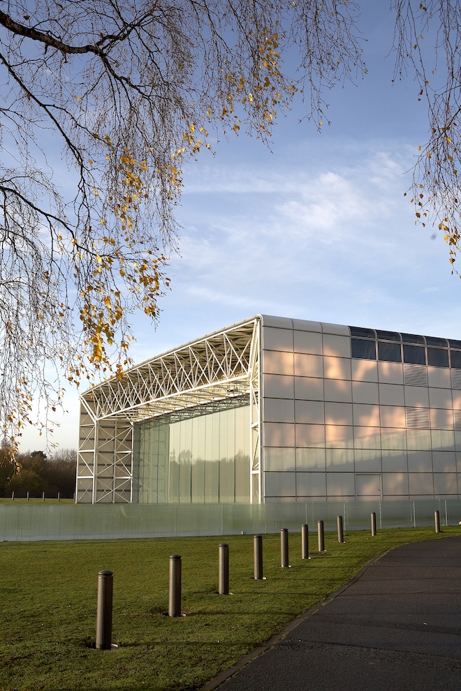
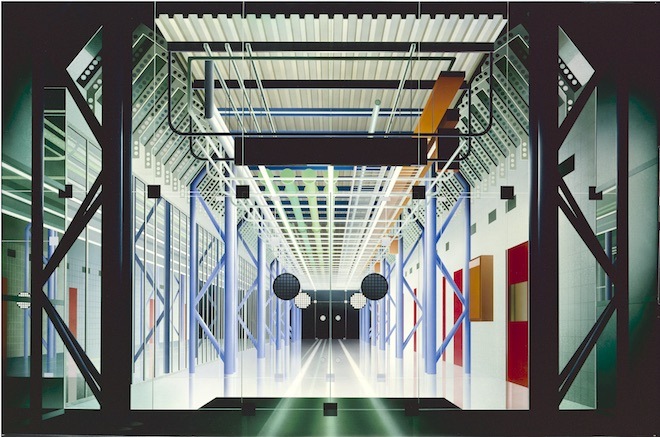
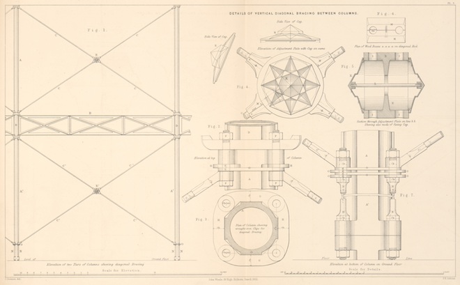
The phrase ‘high-tech’ makes most of us think about phones, computers or intelligent dishwashers. But it’s one that makes some architects gasp with indignation. This year the Sainsbury Centre celebrates its 40th anniversary with “Superstructures: The new architecture 1960–90”. An exhibition that picks apart the architectural movement behind the centre itself and examines the controversial label of ‘high-tech’ against the wider architectural canon.
‘High-tech’ architecture was championed by legendary British architects Norman Foster (the designer behind the Sainsbury Centre) and Richard Rogers (Centre Pompidou), amongst others. This group of architects found ideas of adaptable, expandable and mobile buildings exciting. They were interested in pragmatic solutions, and inspired by earlier architectural ideas and innovations like Buckminster Fuller’s geodesic domes and Jéan Proves demountable house.
The high-tech style managed to blend post-war 60s utopian ideas with 19th, and early 20th century ideas about adapted architecture – a mixture that resulted in expressive and very characteristic buildings. It was a technologically focused – one might even say obsessed – development from modernism.
Talking via a malfunctioning, ironically un-high-tech Skype connection, Twin chatted with curators of the exhibition Jane Pavitt and Abraham Thomas. An era of optimistic architecture that looked to engineering and technology for new possibilities certainly seems resonant in 2018.
Could you begin by telling me a little bit about the exhibition?
Jane Pavitt: The exhibition is about this crux in late modernism, the term often used in association with it is high-tech. We have taken a rather interesting positioning I suppose… In the exhibition we show the long history of association between technology, engineering and architecture. It starts with the the Sainsbury Centre, a superstructure that is, in a sense, an enormous shed. It’s complex, beautiful, precisely engineered, but still kind of like a shed.
We used this building to explain the high-tech approach to architecture. Then we look at ground structures like the Crystal Palace, and through to the modern experiments by Prouvé and Buckminster Fuller. Finally we look at the generation of architects that we are focused on. The first part of the exhibition tell the pre-history, then we get to high-tech it self.
Abraham Thomas: Should I go back to high-tech?
Jane: Yes, I see that she’s dying to hear about it.
Abraham: One of the things that we wrestled with as curators is using the phrase high-tech without actually using the phrase high-tech. The term is very divisive, a bit like postmodernism. Many of the practitioners of postmodernism hate that label. Jane curated the big postmodernism exhibition at the Victoria & Albert Museum so she has been through this.
Abraham: We had to be conscious to the fact that many of these leading architects absolutely reject the term high-tech. It is reasonable to an extent, they reject it simply being a style. What we are trying to say is that it was more than a style. It was a sort of ethos, a movement. But it is a convenient term, it refers to the idea of influence of technology. In a way it is valid. But we also sort of pick it apart, don’t we?
Jane: We wanted to make it very clear that it’s certainly not a style label, although it’s often used like that. These buildings are stylistically very different. The architects reached different types of solutions, but they all share a set of principles. The Sainsbury Centre and the Pompidou Centre are totally different solutions to the same set of ideas and concerns. They respond to their sites, position and purpose in different ways. On the other hand, we felt as curators, and historians, that if there is a term that has some currency historically – it is a frequently used label in architectural history – then this is the right time to kind of, as Abraham says, pick it apart and attempt a much more nuanced understanding.
Do you think there is another term that could work better?
Jane: Architecture of advanced engineering is a good description. That’s what they are concerned with, testing the limits of certain kind of building methods. If you think of high-tech as a process, rather than a style, that’s quite a useful way of approaching it. I would say that it’s a type of technological modernism.
But people like labels, don’t they? Like art deco. Everybody has contested the meaning of art deco, but it is still a very powerful term. Postmodernism is a term that makes people angry [laughs] but it persists. Rather than abandon the label all together, we wanted to unpack and position it. These buildings share certain things about advanced engineering and precision engineering, but they can also be simple solutions.
To take an example: we have reconstructed a section of Michael and Patty Hopkins house in the exhibition. It is not high-tech in that sense. It is appropriate technology. They liked the idea of using pre-fabricated components and cost effective materials that could be assembled simply, cheaply, effectively with a powerful aesthetic.
Abraham: There are a number of examples of high-tech buildings with ideas from other explicitly progressive technological contexts. For example, here at the Sainsbury Centre, Foster created a double skinned wall which allows a lot of the servicing and utilities to be packed away, resulting in this sleek exterior surface and an uninterrupted interior space well suited for an exhibition layout. That idea came from Foster’s observations of a passenger aircraft, were you have a sort of false elevated floor where all the services can be packed underneath.
Jane: There is this section in the exhibition where we have some of the original cladding from the Sainsbury Centre next to a part from a [Citroën] 2CV van. Those ribbed aluminium panels that slot into a car are remarkably like the panels that clad this building. The term high-tech is a bit forbidding, but these buildings have almost the childhood appeal of assembling models.
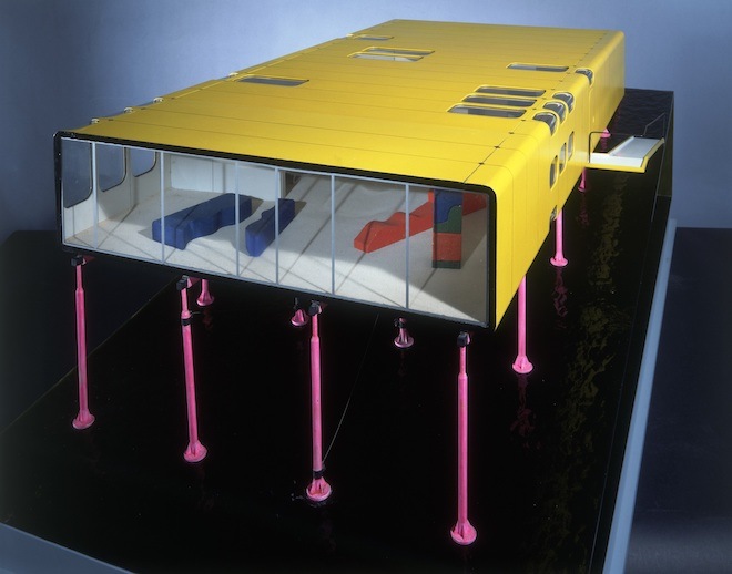
Abraham: Jane’s point immediately makes me think of this amazing object in the exhibition, a project called Tomigaya. It is a mixed use, residential and cultural space in Tokyo, and the model is made from Meccano. It’s a slightly lighthearted moment in the exhibition. The model of Tomigaya encapsulates a rare notion of simplicity, an understanding of how buildings are put together. It makes it very accessible.
Jane: The Sainsbury is one of Britain’s best postwar buildings and it is extraordinarily powerful. It attracted a huge amount of controversy, admiration and criticism at the time it opened. It’s been fascinating to re-examine that. This group of architects are among the most prominent in the world and produce buildings in all typologies: office buildings, factory buildings, buildings for culture, domestic projects, airports, stations. In London, especially in transit, we all move through these buildings. You probably could encounter a Foster, Rogers, a Grimshaw building within any square mile of central London.
Abraham: I went through Heathrow today and the Rogers’ Terminal 5 has a lot of expressive engineering.
What would you say was most challenging with this exhibition? There are so many different aspects to it.
Abraham: I think it’s always tricky when you’re a temporary guardian of someone’s legacy. These are all very successful architects now, huge international names.
Abraham: Yes they are all still alive! You’ve got to be really careful with how you present that legacy. That is always the case when you’re working with any contemporary artist or architect, but I think that is particularly the case here.
One of the hardest things was to ensure that we were sensitive to their legacies, but also created a new narrative. Since the mid 80s there have been shows on these key British architects – Jane and I didn’t want to do another “Best of British Architects” exhibition.
Jane: It’s not a biography show. Architecture exhibitions are difficult. A lot of visitors may not be familiar with reading architectural plans and some of the buildings will be unfamiliar to them. We wanted to explain how buildings worked and how they were made. We’ve just come back from installing two giant wooden carved prototypes of the steel joints from Waterloo International Station. They are about a meter or so high, but fantastic objects. Like pieces of sculpture.The process of construction is fascinating for people of all ages, we are just trying to emphasise that.
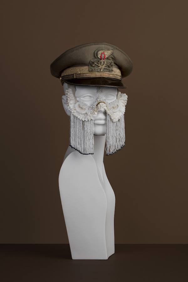
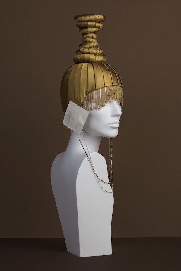
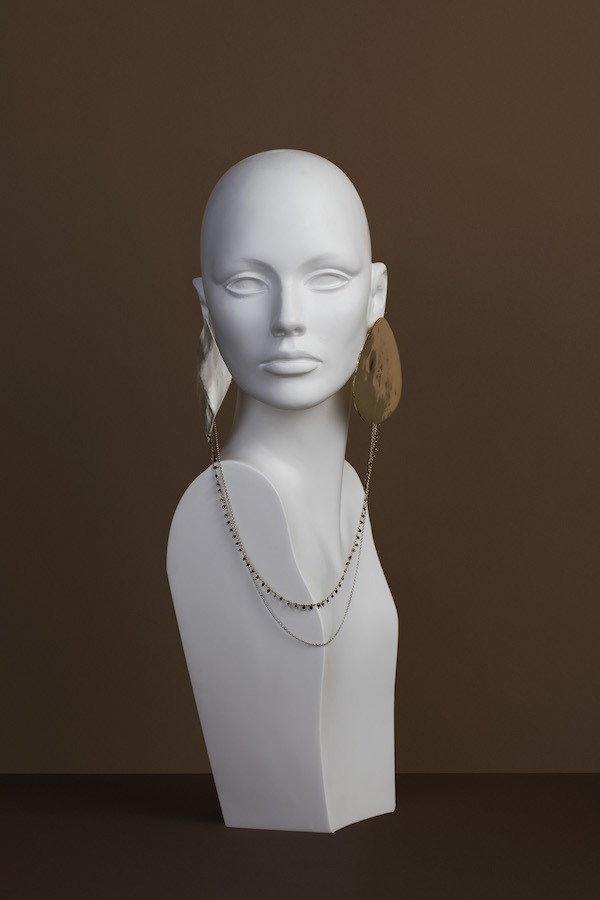
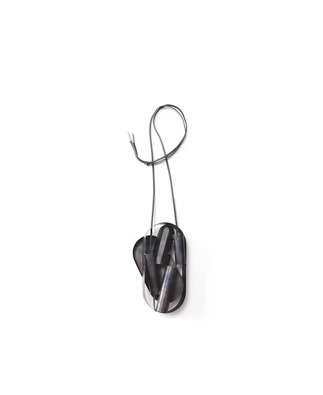
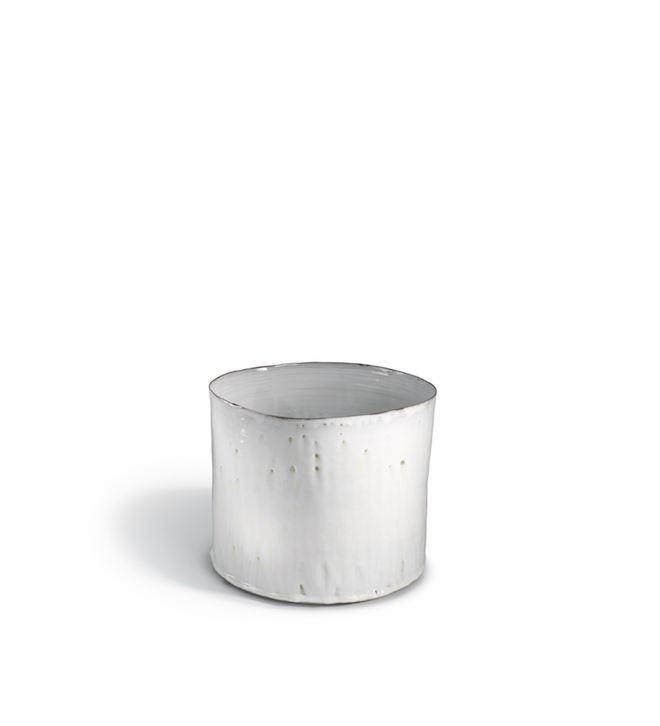
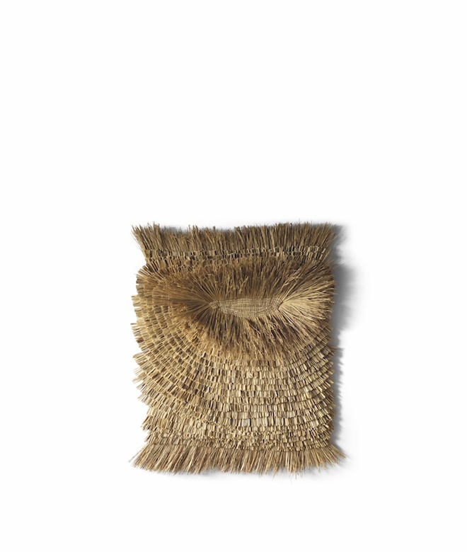
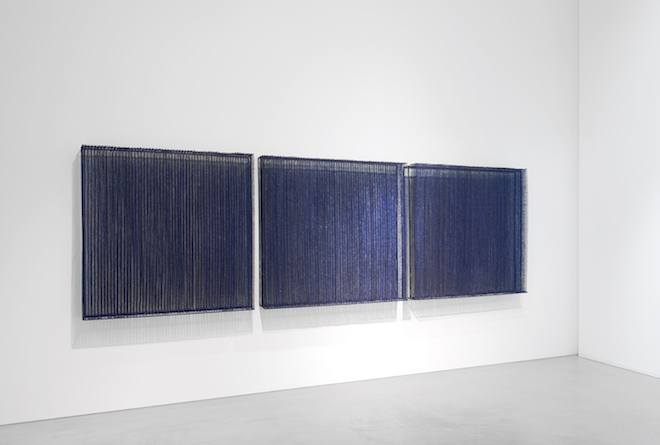
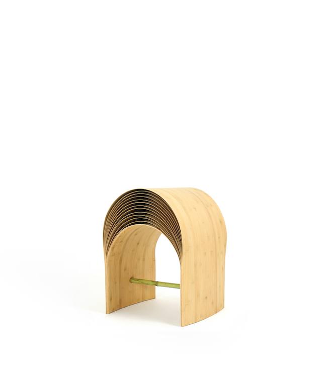
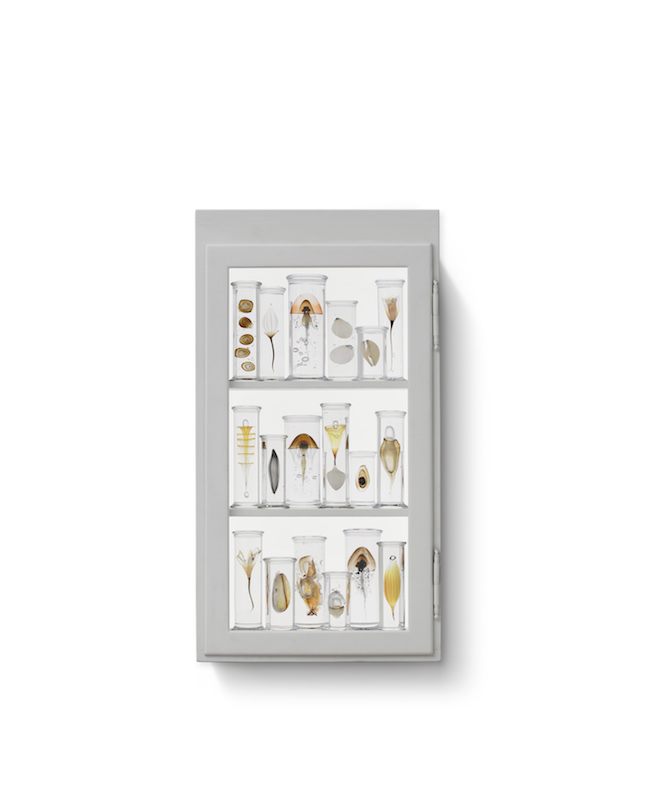
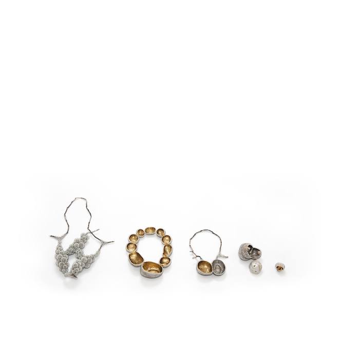
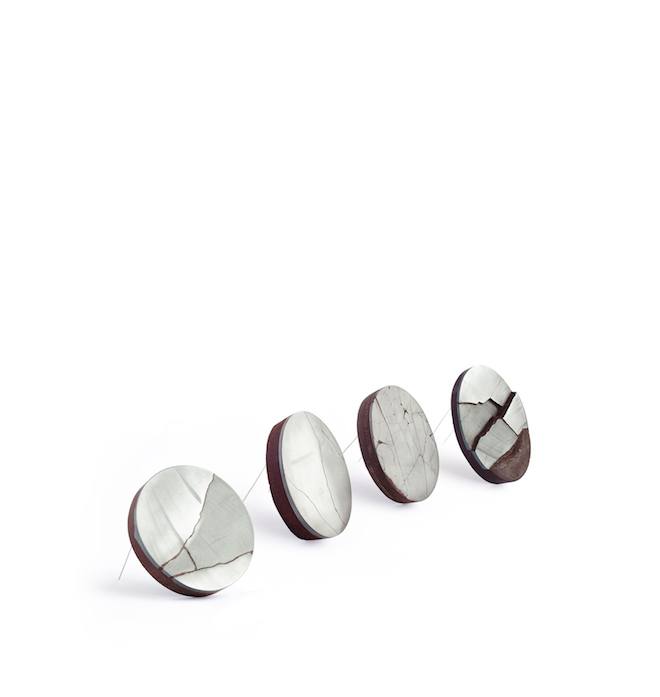
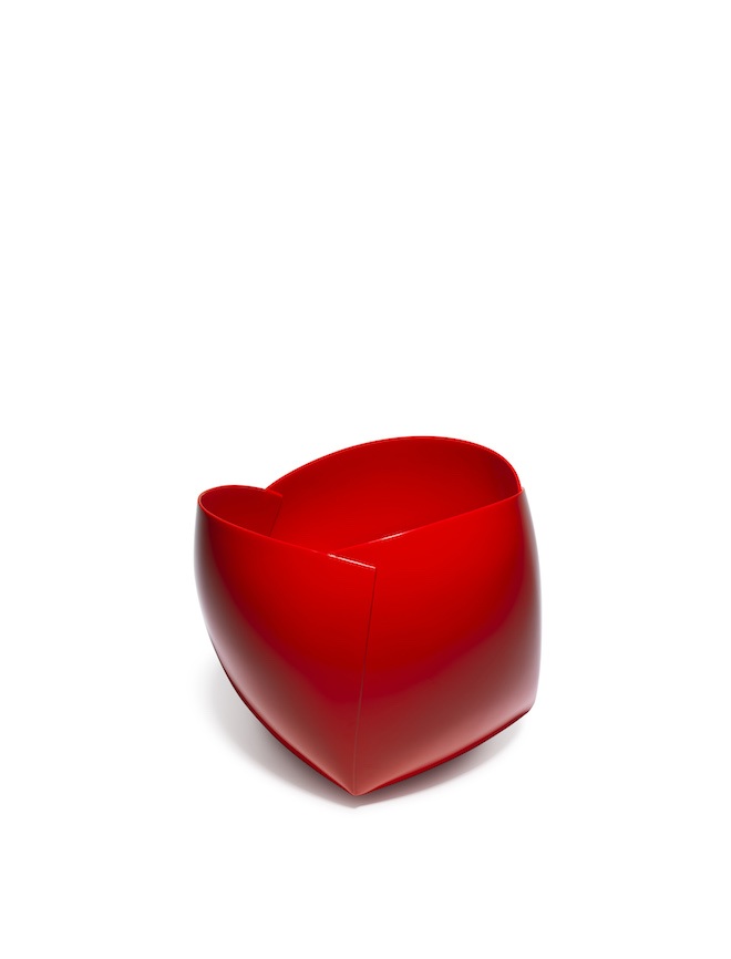
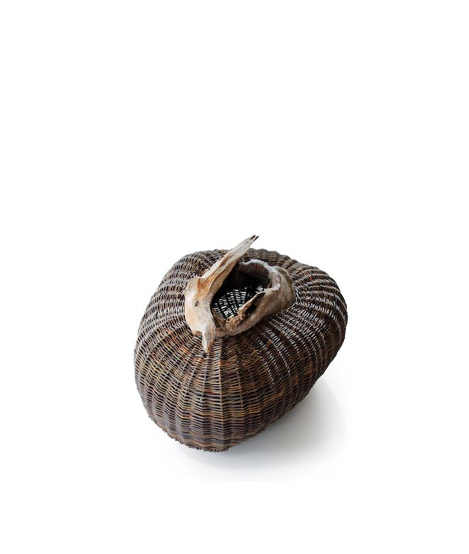
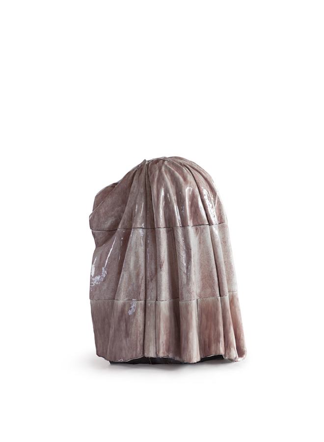
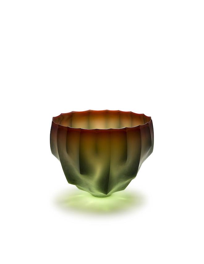
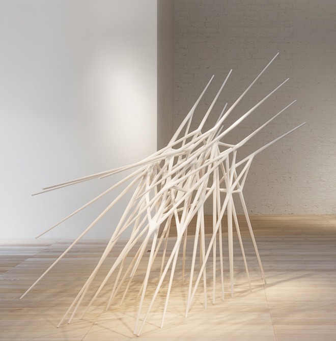
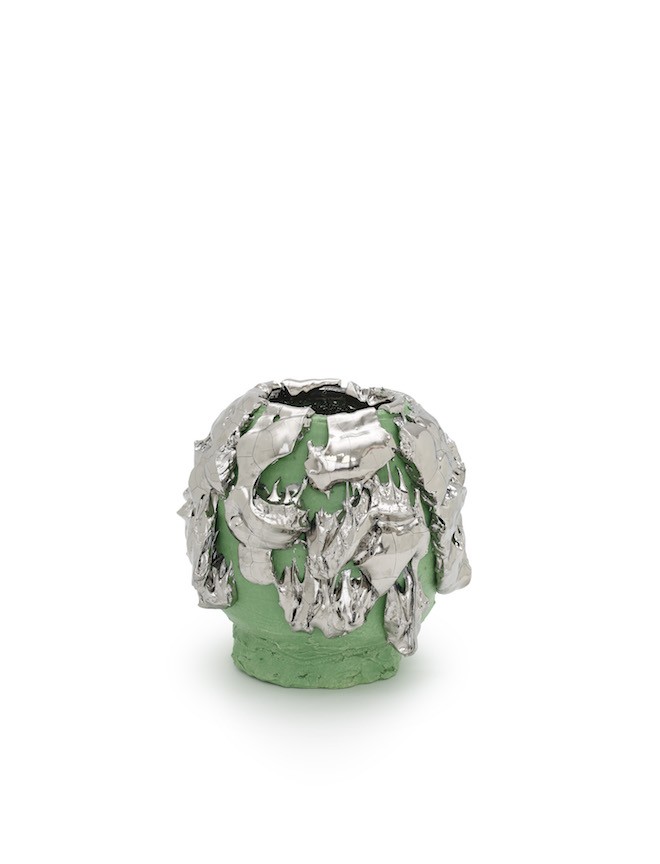
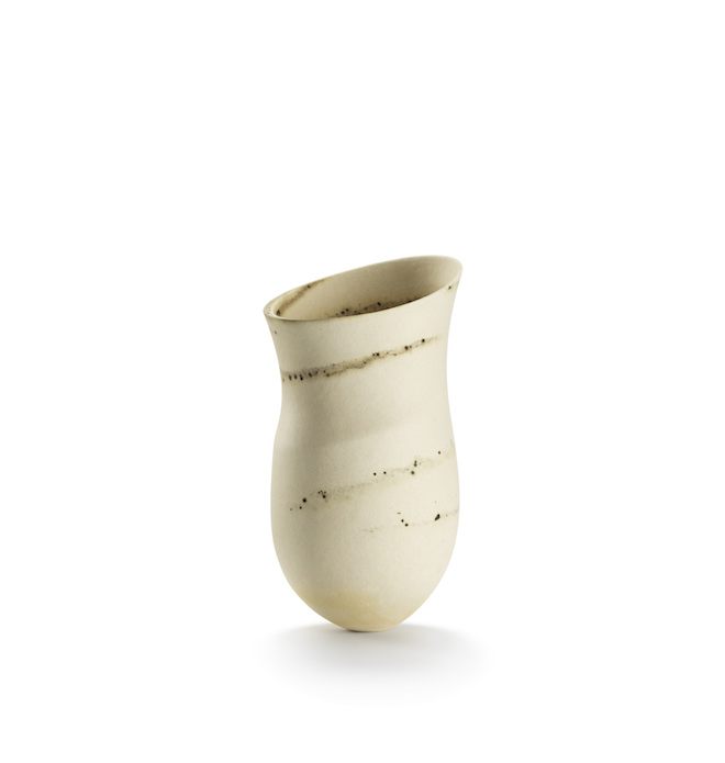
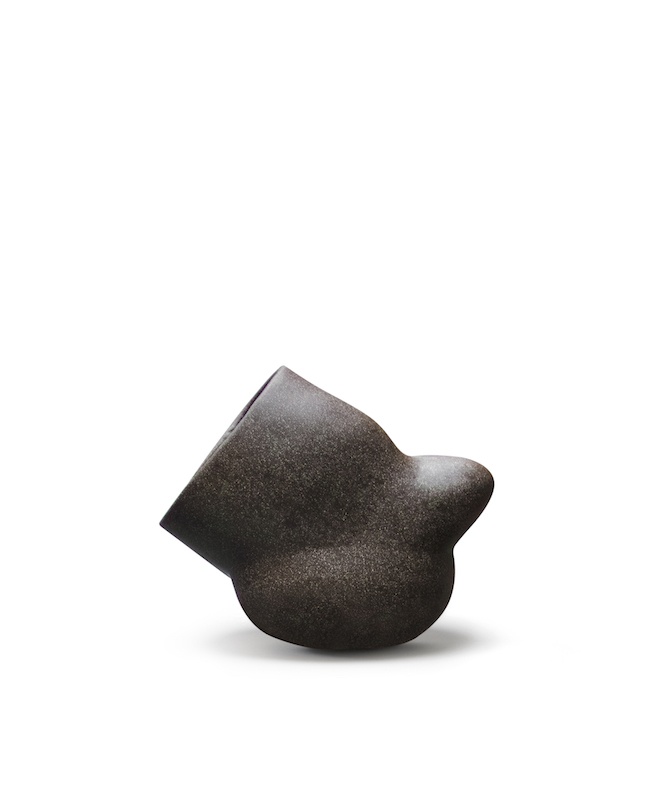
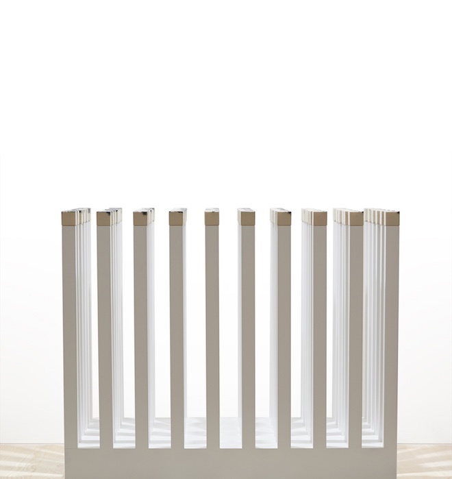
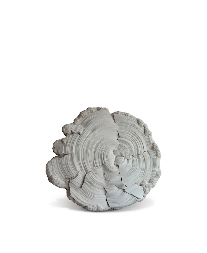
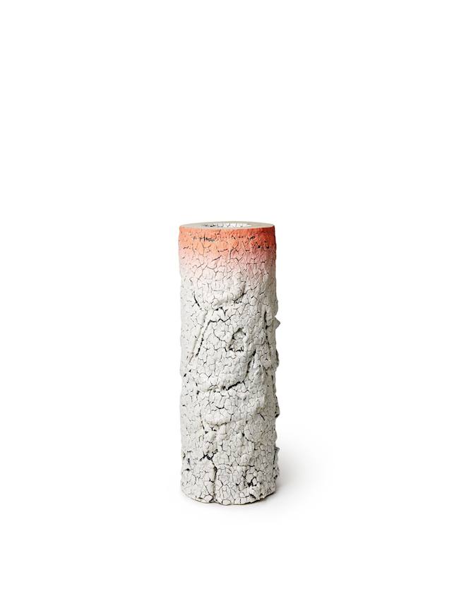
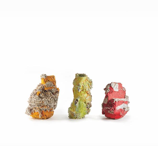
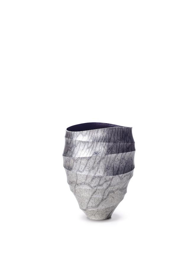
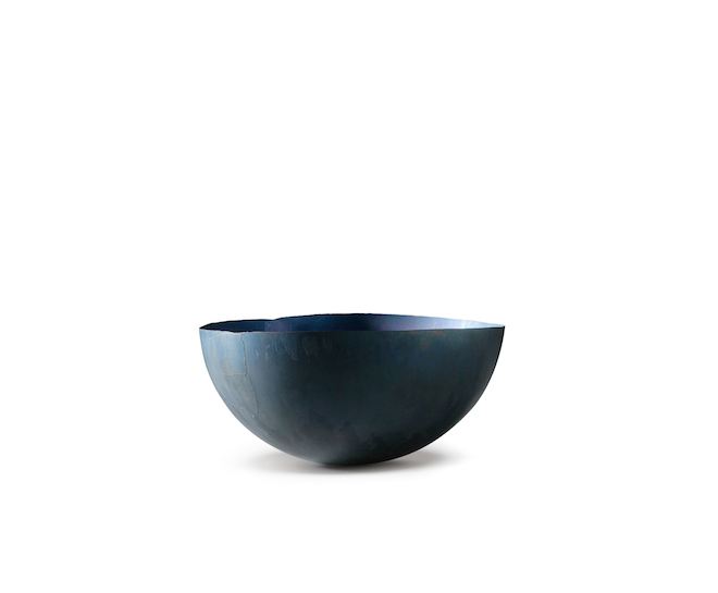
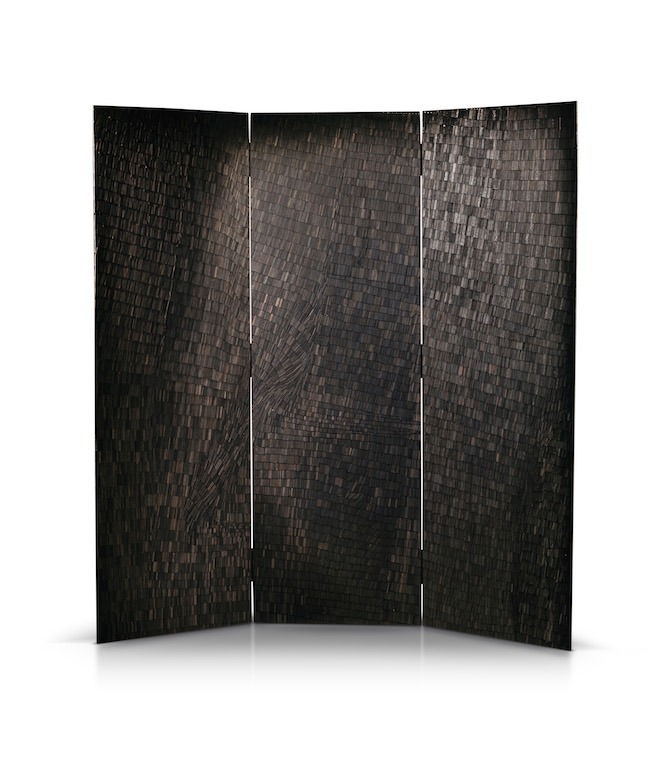
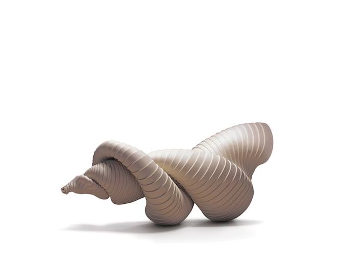
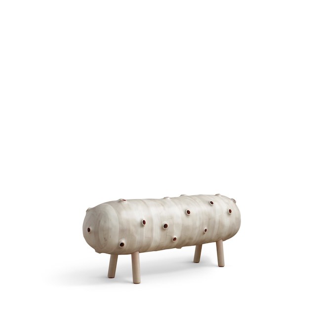
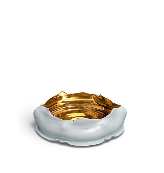
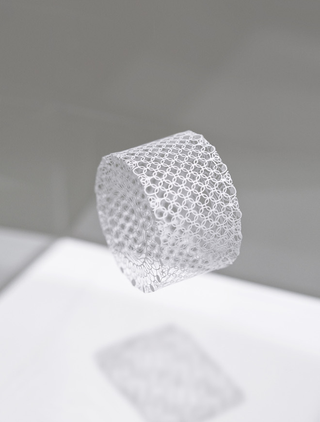
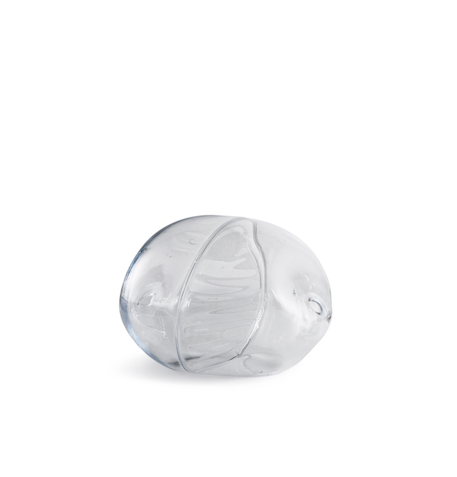
The Loewe Craft Prize will take place in May of this year, and already there’s a buzz around the finalists. Comprising of 30 artists from 17 countries around the world, the shortlist celebrates creativity and innovation in craft. A reflection of the diverse talents working at the moment.
Creative director of LOEWE Jonathan Anderson conceived the award to champion creativity. A part of an ongoing commitment to locate LOEWE within a wider cultural context. Speaking ahead of the second year of the awards, the designer commented: ‘Craft is the essence of LOEWE. As a house, we are about craft in the purest sense of the word. That is where our modernity lies, and it will always be relevant.’
The full list of nominees, along with examples of their work, are below.
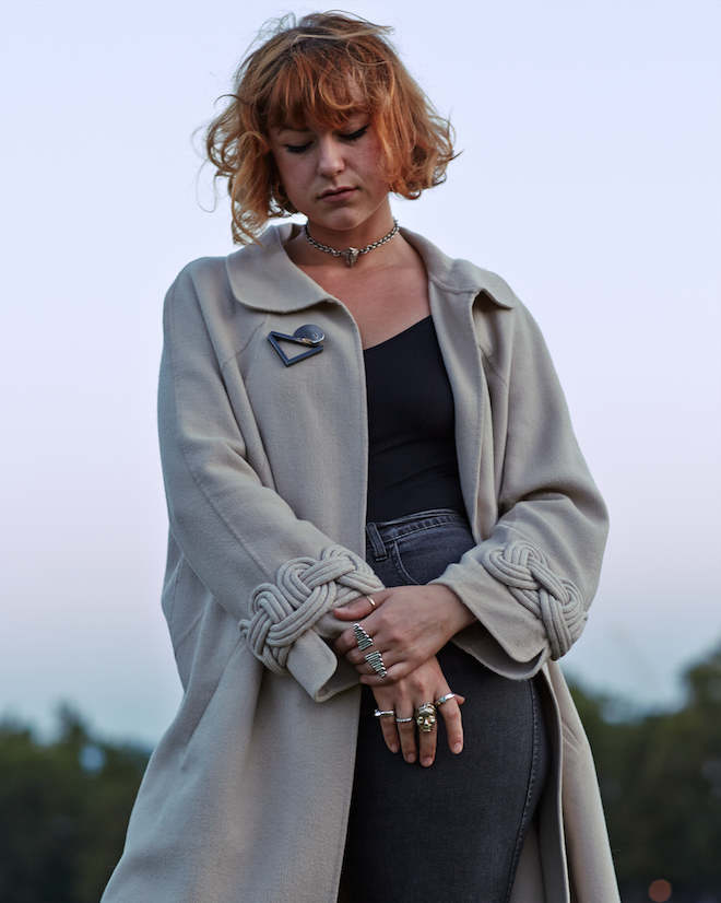
South London based jewellery designer Joy BC specialises in creating bespoke designs that embody both the anthropological and physiological sides of jewellery. Her work spans a range of themes, from ideas around protecting people while travelling; to remembering the dead; to celebrating love to more simple examination of form. Her aim is to use jewellery to engender conversation, imbuing fine jewellery with new and heightened significance. Ahead of her workshops at Draw Haus, Twin caught up with Joy BC to discuss the possibilities of silver and her collaborative ethos.
How did you become interested in jewellery?
It started with a ring which was made by one of my ancestors in Italy. It resembles a futurist sculpture. My mother use to wear it on special occasions and I found it hypnotic. I drew comparisons between the form and feeling that that ring gave me to those within Brancusi’s pieces and Barbara Hepworth’s. Otto Kunzli, a jewellery artist who made a necklace made from divorcees’ wedding bands, which subsequently became an emotionally laden piece, and thus un-wearable, really excited me in how powerful jewellery can be.
What are you influenced and inspired by?
A variety of things. Sometimes it’s simply the materials, and their intrinsic beauty.
Why is important to use jewellery as a tool for engendering conversation?
Jewellery travels with with you – lives with you and speaks for you. Without words it can convey messages or feelings. A huge Hellenistic marble sculpture which conveys strength (Nike at the lure, for example) isn’t something that you can strap to your body – but a boobies ring which encourages discussion on the natural way of breast feeding, or female nudity – literally ‘freeing the nipple’ – is something that you can. The ‘listening aids’ I make are to encourage people to be better listeners, something we could all benefit from. Especially myself! I talk way too much; it’s the Italian in me! In fact I’m currently wearing my ‘I’m all ears’ piece, which is made of 47 tiny ears in precious silver and gold, while I listen to the news of the news.
What are the limitations of working with silver? And do you have a favourite material to work with?
Limitations? I’ve never thought of the limitations of silver, only the possibilities. It oxidises, which gold doesn’t. However I like that – I often use a chemical to speed up the oxidisation process to create a dark blue black patina on some of my work. I don’t have a favourite material, but I have to say, 18ct yellow gold is delicious. I also love wax – especially the type I used in Tokyo which was made of beeswax and cedar resin. They use that combination to make traditional Kenji Stamps (then cast into bronze). And it smells beautiful.
What do you hope to achieve through your workshops at Draw Haus?
I hope people really enjoy themselves, and help people making something that they feel proud of. Whether it’s a playful experiment or precise present for himself or herself or someone they care about. It’s always fascinating to see what pieces people make.
Draw Haus Creative Workshops: Jewellery Making with Joy BC will take place on 17th November. Buy tickets here.
Rosh Mahtani, founder and designer of London based jewellery label Alighieri, has collaborated with Ozzie designer Anna Quan which sees them together explore the boundary between jewellery and ready to wear. Their collaborative collection includes jewellery intertwined with a shirt, shirtdress and palazzo trousers along with a selection of jewellery by Alighieri for Anna Quan. We caught up with Rosh to discover more about this collaboration.
Tell us how you started off in industry?
I studied French and Italian literature at university – my final year was focused on Dante Alighieri, and the Divine Comedy. After I graduated, I knew I wanted to do something creative; I felt a little bit lost, and kept reading the text. I couldn’t help but imagine the characters, the feelings and descriptions in golden objects; that’s when I started making one piece of jewellery for each one of Dante’s 100 poems. Creating Alighieri was a way to pursue photography, writing, and designing alongside business and strategy.
Why Dante?
So many reasons! His work is so visual, firstly; he was the first person to portray Hell, Purgatory and Paradise in such a human way. But more that, his journey is so universal, it really captured me. It begins with him, lost in the middle of a dark wood. His fears, his anger at being exiled from Florence, his love for an idealised woman (Beatrice) are at the crux of his work, and I suppose I wanted to translate these feelings in my own way, as they were so relatable to me.
How would you describe your design aesthetic?
I call my pieces Modern Heirlooms, because I love creating imperfect objects that tell a story. Imperfection and vulnerability are at the heart of the aesthetic, and that’s why I like to shoot the imagery using film. It’s all about the happy accidents; I work very much on intuition.
How did the collaboration with Anna Quan come about?
Anna is based in Australia and we were following each other’s work over Instagram for a quite while, we swapped an earring for a crisp white shirt over the ocean, and we met last Christmas, when I was on a bit of a disastrous road-trip in Australia! We had breakfast in Sydney, and talked about giant golden buttons on her perfectly tailored shirts, and billowing trousers. It happened really organically.
Why do you think the partnership works?
We have quite a similar aesthetic in some ways, and a genuine obsession with each other’s work. I live in oversized white shirts and tailored trousers. It’s also a great juxtaposition because Anna’s designs are so perfectly executed, the tailoring is immaculate, and it was fun to have that as a canvas to add a scraggy and imperfect detail. We work really well together (often over 3am Whatsapp conversations!) We’ll think of an idea and just get the ball rolling. DHL plays their part too!
What qualities do you admire about her?
Besides her obvious talent for creating clothing that makes you feel really special, the giant oversized cuffs, for instance, I really admire her work ethic. She never stops, and is also incredibly grounded and modest. She’s a very savvy businesswoman which is really inspiring to be around.
Where do you see yourself in 5 years?
I’d like to keep growing Alighieri as a brand; it’s been the best and most rewarding ride, and I’d like to create more than just jewellery, as I think of Alighieri as a way to tell stories. If I can keep doing what I’m doing now on a bigger scale, with a bigger team, I would be very happy!
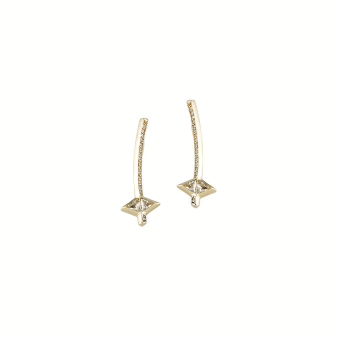
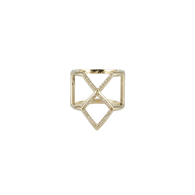
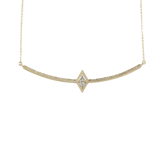
London born and based jewellery designer Rachel Boston showed her first fine jewellery collection at London Fashion Week. Full of beautifully wrought, geometric pieces, the items in the collection have the potential to become treasured heirlooms. Twin chats to the New Designer of the Year nominee.
When did you decide you wanted to go into jewellery design? I knew that I wanted to design jewellery from very early on. I always liked working with my hands so would use my parent’s toolbox and take apart my sister’s jewellery and put it back together in different ways – which I’m sure she didn’t enjoy too much. I then started basing all my projects in my Design and Technology class around jewellery so that I could build up my portfolio and work towards getting in to a jewellery course at university, which I did.
Why did you decide to study at the Gemological Institute in New York rather than stay in the UK? I grew up in London and also stayed here for university at Central Saint Martins, so really felt like I needed to experience what it was like to live somewhere else, even for a short while. New York has always had such an allure to it for me that when I found out they did the course there it seemed crazy not grab the opportunity. It was the best decision I ever made. I met so many amazing people on the course from all over the world but also met my boyfriend whilst living out there and we’ve been doing long distance for almost 3 years now, which seems crazy to most people but works really well for us.
You showed your first fine jewellery collection at LFW; why did you decide to move into fine jewellery? Making jewellery that wasn’t trend based and seasonal has always been very important to me. I’ve wanted to create pieces that could be worn forever and passed on as gifts to others so I decided it was necessary that the materials reflected this also. The price point is higher because it’s 18ct gold now instead of plated, but you have the reassurance that these are pieces that will not tarnish, the gold will not fade and you can theoretically pass these onto your grandchildren and they will stay in good condition. The history and the meaning that is given to jewellery and how people become attached to it is one of the reasons I fell in love with it in the first place, so making fine jewellery has happened very naturally.
Do you craft each piece by hand yourself? I do. As of right now every piece is made in my studio off Hatton Garden (London’s jewellery district) and all the materials are sourced locally. As the business keeps growing this won’t be feasible for me making every piece as it’s a huge amount of work but I’d like to keep it in the studio and based in the UK as I’m a big supporter for British craftsmanship.
What is your favourite piece so far?
It changes all the time but from the new fine collection I think the Jera ear cuffs or the hinged Dagaz ring. The hinged ring is really comfortable and I barely notice I’m wearing it so it’s a great statement piece you can wear everyday. I love the Jera earrings because they fit the ear really nicely and I have the white sapphires specially cut here in London so I they’re very special because it’s such an unusual cut to have.
What is your favourite item of jewellery? Earrings, necklaces, bracelets or rings? With me more is always more so I like layering necklaces, playing with different lengths and piling rings on for more of a statement. I tend to dress quite casually for the studio, generally just jeans, plain tee and a leather jacket so I love wearing a lot of rings to create more of a statement.
What are the key jewellery trends coming up for SS15? The market is definitely leaning more towards fine jewellery these days, which I’m really happy about. I think people are starting to realise how much better it is to invest in one significant piece then spending lots of little bits of money on high street jewellery which falls apart so quickly.
What are your plans for your brand – where will you be this time next year? I’m doing a lot more bespoke engagement ring work which I adore doing. It’s a huge honour to be asked to create someone’s ring that they intend to wear forever and I love working with couples to create something unique, so I definitely would like to do more of that. Otherwise I want the brand to keep growing both in the UK market and internationally and at some point open a small store in London.
What would your advice be to someone who wants to go into jewellery design? I think it’s important to learn patience and how to figure out your own path and style. I definitely think you have to build a strong foundation on the technical side as well and not just fob it off and give everything to someone else to do for you, you don’t learn that way and you don’t end up pushing yourself.
Who is your ultimate jewellery/fashion inspiration? Most of my favourite fashion muses are from bygone eras but I love the androgynous style of my heroines like Patti Smith and Joan Jett; they exude this amazingly powerful energy and are such strong women so anything they wear looks automatically cool.
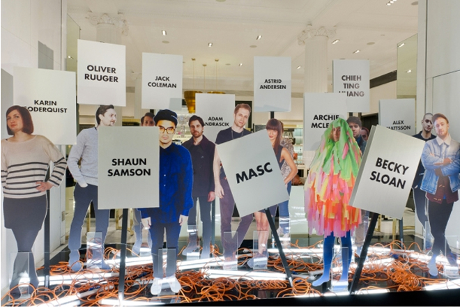
If London is known for anything as a fashion capital, it’s nurturing and supporting a hotbed of creative talents all across the design spectrum.
For a second year running, Selfridges has selected its Bright Young Things. The project allows 15 newcomers from the worlds of fashion, art, design and food talents to create a window display for its Oxford and Duke Street stores.
With participants this year including womenswear designer/illustrator and CSM graduate Sorcha O’ Raghallaigh, who specialises in intricate metallic coloured and lace designs (Lady Gaga is a fan) and designer Maarten van der Horst, who gave a new and fashionable life to the otherwise dreaded Hawaiian prints, it’s a testament to the design talents that the Big Smoke has to offer.
For those more interested in non-fashion creativity, interior designer duo Tinker & Tailor have created a Twitter-friendly interactive space, while coffee connoisseur Jack Coleman made his own personal ode to the art of the brewing and roasting.
There’s never been a better reason to stop and take a closer look. Rush hour crowds notwithstanding.
Bright Young Things is on until February 29. selfridges.com
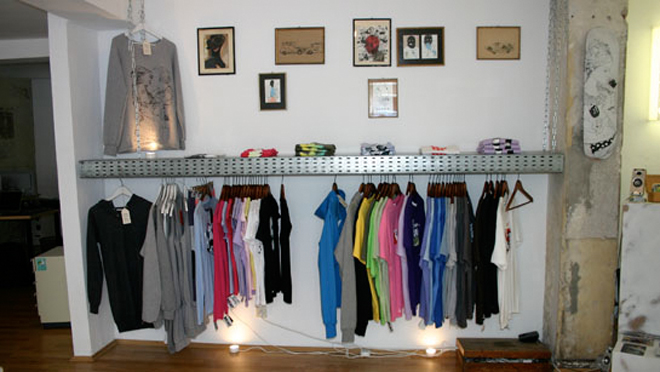
Staffed by five friends who met in the silk-screening studio at HAW Hamburg art college, Kingdrips opened their gallery-cum-skateshop-cum-graphic design offices in their small one room basement space back in December last year. The guys are the height of skater-boy cool but the highlights of the shop are Maren Szeymies’s masterfully hand-stitched hooded sweatsuit dresses, and super-soft organic cotton T-shirts which provide the canvas for slinky line drawings of irate chihuahuas, taggers, kittens, kissing couples and seagulls.


 Twitter
 Tumblr
 YouTube
 Facebook
 Instagram