Introducing Gucci’s Zumi -A playfully appealing accessory
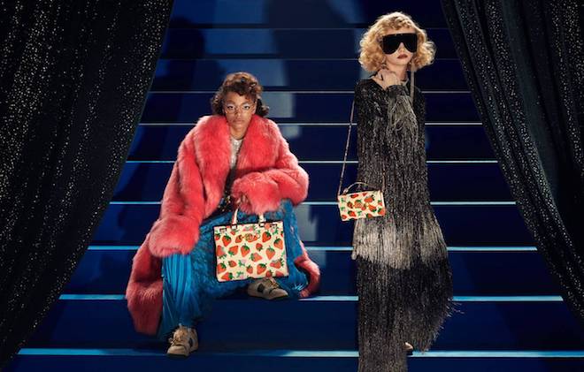
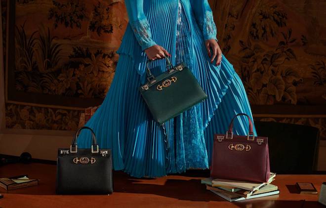
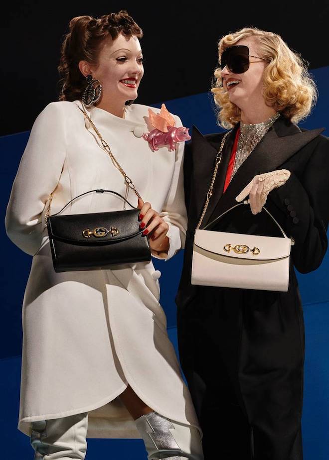
Earlier this week, Italian fashion house Gucci’s released one of their latest ventures which features the release of a new handbag. Creative director Alessandro Michele has casted L.A based actress and experimental musician Zumi Rosow as his muse as he created a line of bags inspired by her free spirited, creative spirit. The bags, dubbed Gucci Zumi are accessories which feature a combination of the house’s signature motifs, being the interlocking G as well as the Horsebit hardware which was replicated from a rare piece of the house’s archives chosen by Michele.
Of course the bag is presented in several different versions — the sophisticated top handle version, offered in medium and small — this version is featured in smooth and grainy leather, python, elapse, ostrich and crocodile. The Gucci Zumi Shoulder bag is offered in the sizes mini and small and features the option to detach the leather strap, transforming into a clutch. Michele also drew inspiration from a vintage 60’s bag for the tote version of the Zumi which was presented at the SS19 show and is offered only in crocodile and lizard skins. The bag is also included in fun Gucci strawberry prints in the medium top handle and mini shoulder versions. To shop visit Gucci.
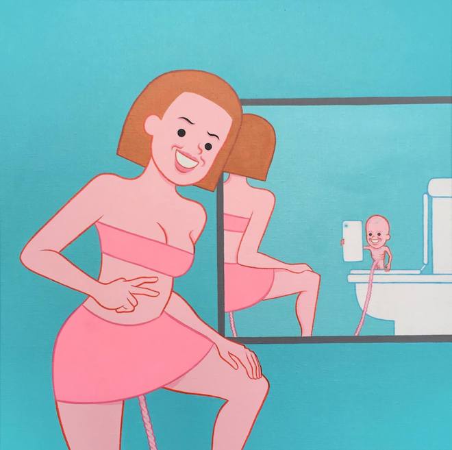
Public Gallery ft. Joan Cornellà: “IM GOOD THANKS”: Apr 3rd – May 4th
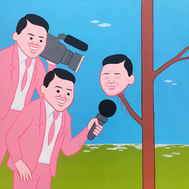
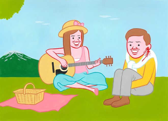
London based contemporary space Public Gallery in collaboration with renowned Catalan artist Joan Cornellà presents ‘IM GOOD THANKS’ — a solo exhibition featuring the artist’s work set to open on the 3rd of April. The exhibition will feature a series of new works by Cornellà featuring his instantly recongisable mix of pitch black humour and deeply unsettling imagery as he gives his audience a glimpse of his dystopic view of contemporary life. Throughout the exhibition paintings will line the walls and surround a central sculpture which represents the artist’s trademark suited character. Each piece of work included in the upcoming exhibition acts as a mirror into the depraved nature of society; confronting topics like our obsessive attachment to social media and masturbatory selfie culture to politically controversial topics such as abortion , addiction and gender. Upon first glimpse the artist’s work may appear as playful and lighthearted but upon further thought and inspection it reveals his admirable method of twisting saccharine settings to dissect modern culture.
“I think we all laugh at misery. We must start from the idea that when we laugh, we laugh at someone or something. With empathy or not, there is always some degree of cruelty. In spite of that, I am aware that if one of my cartoons happened in real life , I would not laugh at al,” he comments. In sync with the growing feeling that the world is sinking further into depraved absurdity, Cornellà sheds some light unto human nature, presenting us in his notoriously dark and disquieting manners. The exhibition is set to run until the 4th of May.
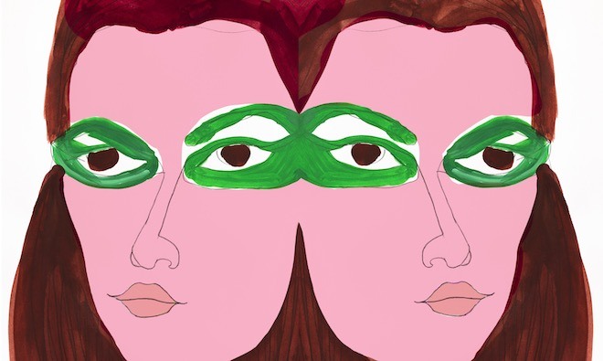
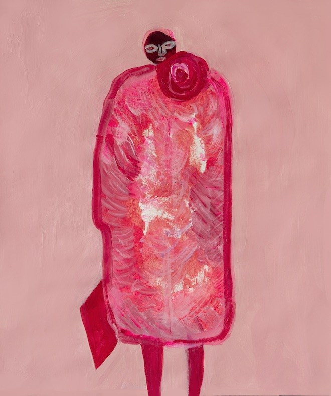
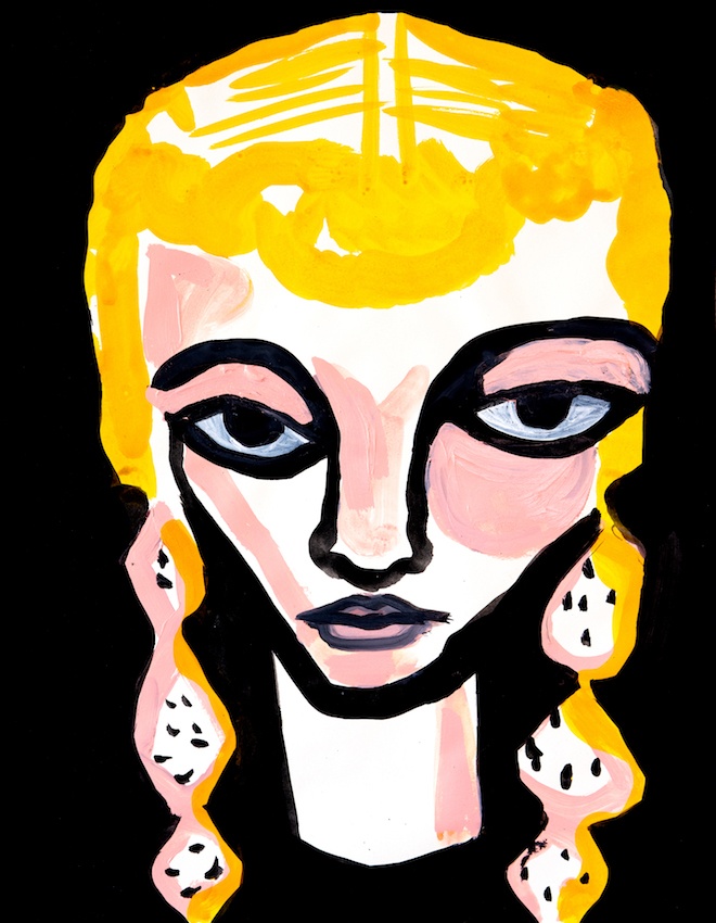
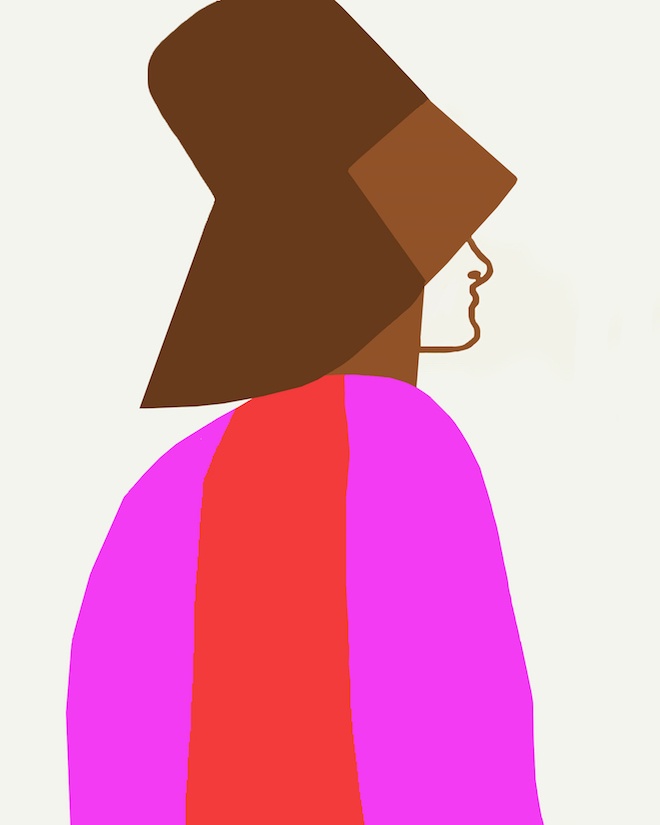
Broad strokes, dense colour, a sense of positive circularity to her work – Christina Zimpel is an artist of a wonderfully bold disposition. Being an Australian in New York City, her work has lifted the pages of Vogue Australia to the SS19 handbags (and set design) of Michael Kors. There is a natural magnetism to her illustrations, often heavily centred around reinterpretations of the runway or figures of fashion. Christina breaks down familiar catwalk looks into bright colour comparisons of ink and gouache (think green against pink, red beside baby blue), or almost-Surrealistic monochrome, creating confident combinations. Large almond eyes are bestowed on her interpretations, and for all the magnetism of their form and colour, look out with a gentleness: a reflection of the artist? May Christina Zimpel’s illustrative hand continue: she creates illustrations that lift the page through colour and composition.
What do you do for fun, what’s your favourite colour?
For fun I eat and garden and go for walks. My favourite colour is currently a mossy green.
What were you good at in school, what were you not so good at?
I enjoyed history and art and creative writing. I did not pay enough attention to maths and biology.
Who were you favourite bands growing up? Who do you listen to these days? I like the same bands today as I did growing up… Bowie, Roxy Music, Kraftwerk, Prince, Miles Davis, The Clash, Joy Division etc etc. all really great to work to. And my son Lil Jabba!
How did you get into art and illustration? I got into art by suddenly deciding I wanted to draw – so I drew everything I could see around me every day for a couple of years and shared the results on Instagram. Illustration commissions started coming due to that. In the past it might have been harder to get my foot in the door. However, now I have an audience and some great people saw something interesting in me and gave me work which is wonderful!
Describe a day in your life . I am quite boring especially in winter when I barely leave the house! I work at home so I am up and working at the kitchen table. I can multi task as the dishwasher and stove are close to my brushes and paints. In the summer I get to go outside and do a bit of gardening or walk around my neighbourhood if I need a break.
Your work appears to be shaped greatly by blocks of colour: does colour or form come first for you when you start a piece? When I’m painting, colour is an important starting point. I have a definite palette and love to work within those parameters. My colour choices come from distant memories when I became really conscious of my surroundings. The sixties pop colours, the clarity of bright reds and greens and pink my mother loved. They form my landscapes. With illustrations I tend to be influenced by the subject matter be it fashion or narratives. Using very bright colours is tricky so I add banal colours to balance them, otherwise you’d get a headache.
Do you doodle? I love to doodle! That is something I’ve always done.
You are from Perth yet currently reside in New York: do aspects of either Australia or New York enter your work? Definitely- Australia is a land of bright clear colours and I like the uplifting feelings it gives me, it ties in with the Fauvist paintings I love so much. New York really gives me so much love for humanity… so many people all the time all living their lives right in front of you. It really comes out in my work – observations of people’s expressions, body language, the heaviness of life.
Does your mind drift as you draw or does drawing help your mind drift? I have always been the anxious type. Drawing is the best help I’ve found to drift away from my thoughts and tune out the chatter. It makes me live in the moment. In the UK, the government is increasingly moving focus away from the arts, leaving a potential massive gap in young people’s education of art.
How important is art to you? When you are exposed to the arts there is something each person will find interesting or beautiful or earth shattering amongst it. All people should get the opportunity to open up their world and find their own creativity or passions. It shouldn’t be a luxury.
You have worked with the likes of the CFDA, Maison Kitsune and Michael Kors: what role has collaboration played in your career? I was really lucky to work with some iconic brands in 2018. I had the opportunity to draw portraits, landscapes and create brand identities. I had my first merchandise produced – totes and phone cases and T-shirt’s, as well as beautiful look books and interactive displays. It’s been really exciting and it’s giving me hope that I can grow exponentially, and be collaborative, not just work in a bubble.
What was the last thing that made you excited? The whole thing- I did not see any of this coming!
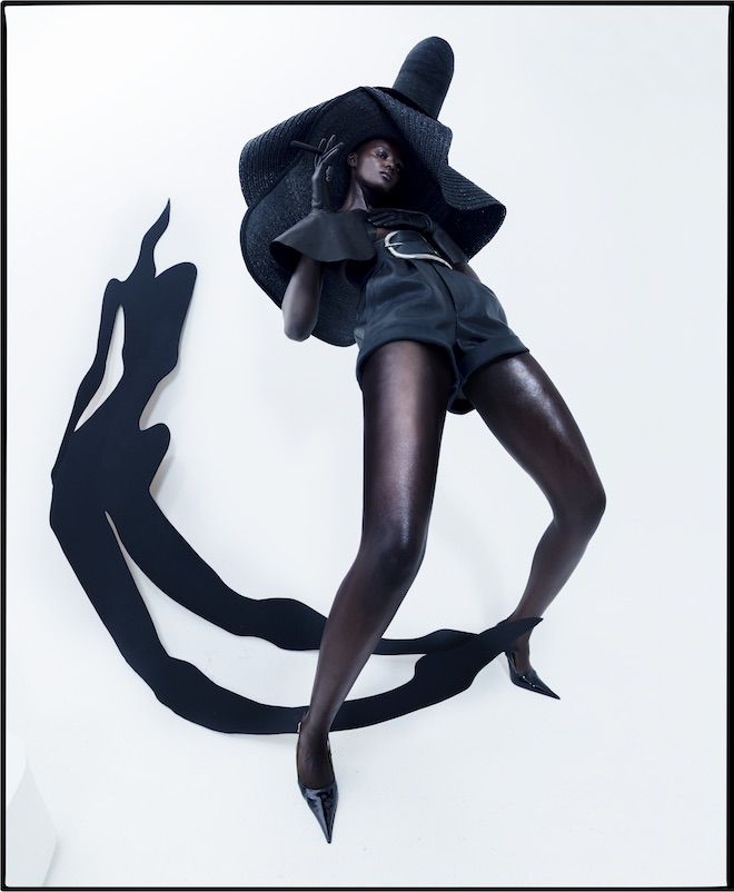
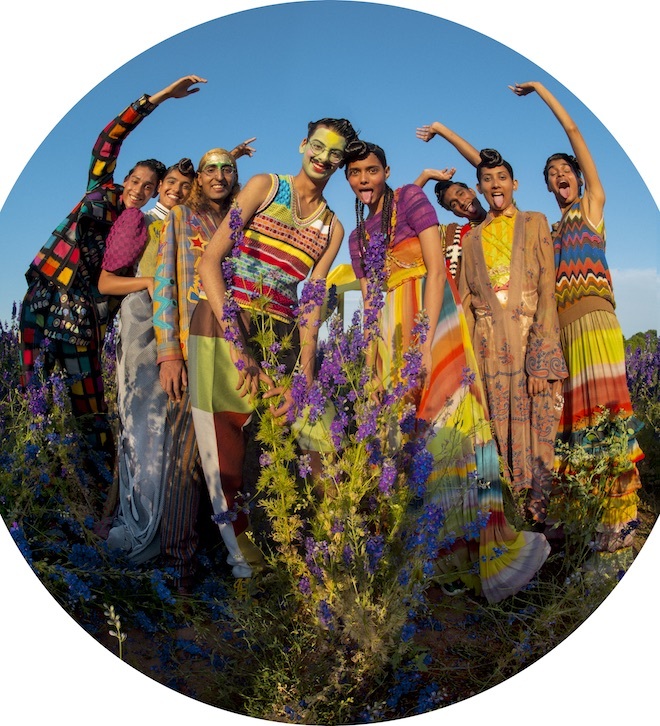
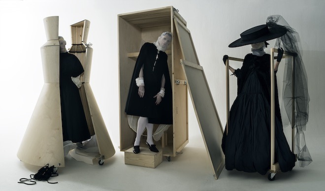
This Autumn London’s largest museum Victoria and Albert is set to host an exhibition on one of fashion’s most celebrated photographers Tim Walker. Titled Tim Walker: Wonderful Things , the exhibition is scheduled to open on September 21st, and will include the largest collection of Walker’s images to date. Curated & designed by leading creative director and Walker’s long-term collaborator Shona Heath , the exhibit will feature 10 new photographic projects which have been directly influenced by the V & A’s vast collection. In preparation for the exhibit, the photographer scoured the museum 145 public galleries, scaled the roof of the 12 acre South Kensington site and explored the labyrinth of Victorian passages below level. Where he encountered , antique jewellery , erotic illustrations, the museum’s largest photograph as well as many other rare artefacts to serve as inspiration for the projects.
“To me, the V&A has always been a palace of dreams – it’s the most inspiring place in the world. The museum’s collection is so wide and eclectic, and I think that’s why it resonates with me so much. Many of the objects that I saw during my research at the museum made my heart swell and I wanted to try to create a photograph that would relate not only to the physical presence and beauty of that object, but also to my emotional reaction to it. Each new shoot is a love letter to an object from the V&A collection, and an attempt to capture my encounter with the sublime. For me, beauty is everything. I’m interested in breaking down the boundaries that society has created, to enable more varied types of beauty and the wonderful diversity of humanity to be celebrated. Preparing for this exhibition over the past three years has pushed me into new territories, which is very exciting, and I’m at a stage in my life where I feel brave enough to do that,” said the man himself.
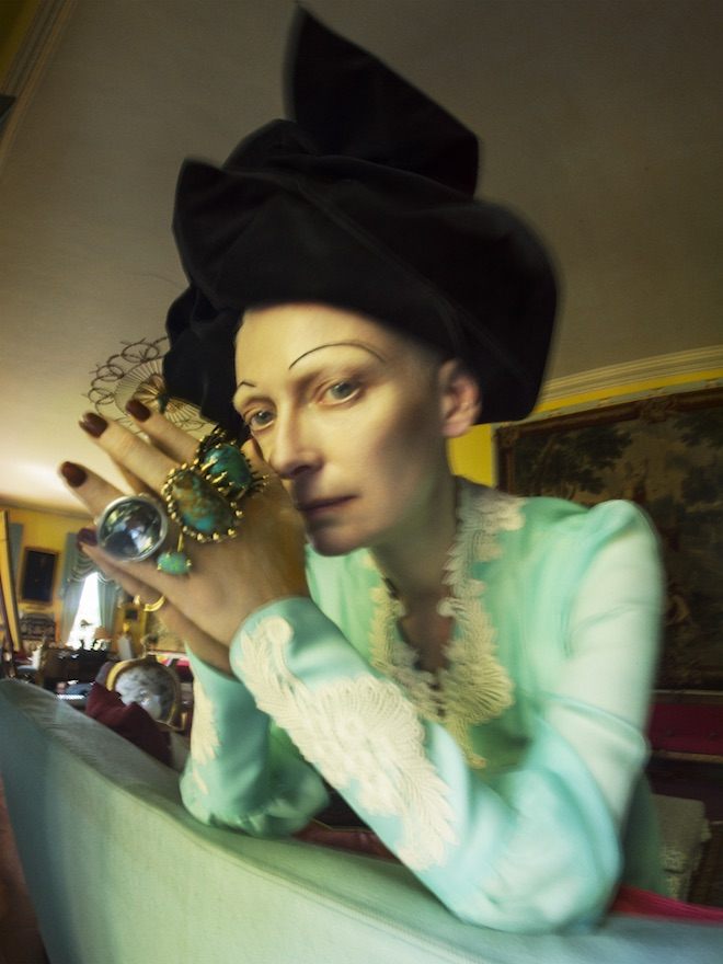
‘Tilda Swinton’, Renishaw Hall, Derbyshire, 2018 (c) Tim Walker Studio
The exhibition will begin with showcasing over 300 items including short films, photographic sets, props, sketches, scrapbooks and other items from which Walker drew inspiration as well 100 photographs from his previous projects. It will the continue into 10 additional rooms filled with the photographer’s work work inspired by the V & A, his films installations and evocative sets and props alongside the images they inspired. The exhibition will take it’s bow on March 08, 2020. For more information, visit V & A.
‘Zo, Kiran Kandola, Firpal, Yusuf, Ravyanshi Mehta, Jeenu Mahadevan, Chawntell Kulkami, Radhika Nair’, Pershore, Worcestershire, 2018 (c) Tim Walker Studio‘Karen Elson, Sgaire Wood & James Crewe’, London, 2018 (c) Tim Walker Studio
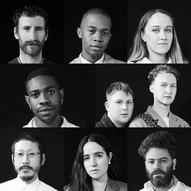
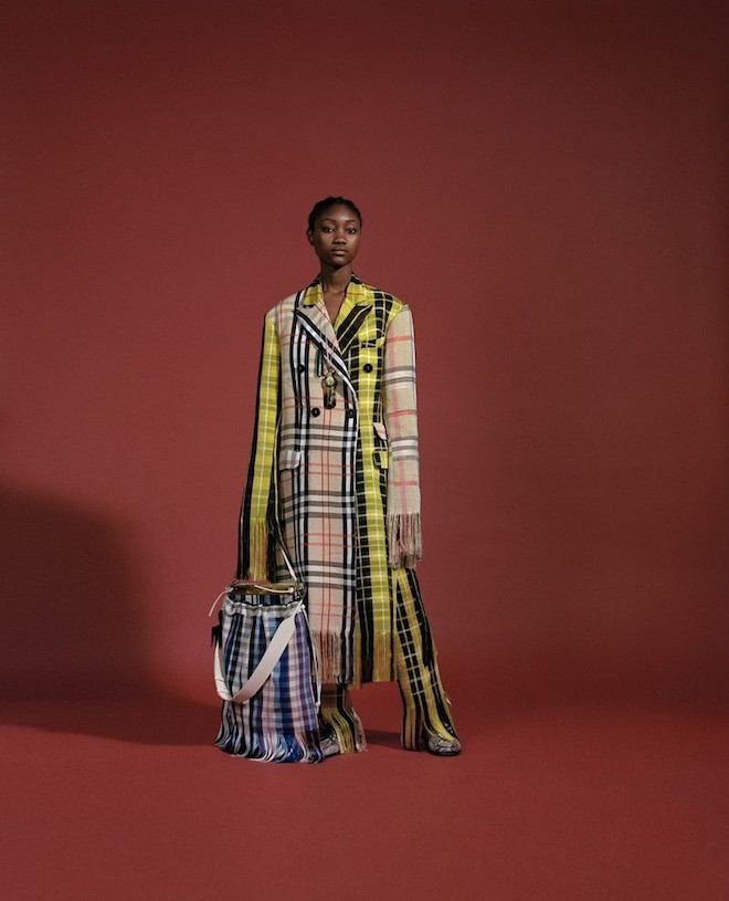
Earlier this year the LVMH Prize announced the top twenty designers selected since it’s worldwide open call for their sixth edition in running. The batch was a diverse group of creatives including London based talents Kiko Kostadinov, Richard Malone and Paria Farzaneh. Kenneth Ize from Nigeria, New York based Caroline Hu among several others who presented their collections last month in Paris at the LVMH HQ for industry insiders.
Since then, the Prize’s panel of experts including Naomi Campbell, Pat McGrath, Adrian Joffe and Jefferson Hack have narrowed down the list to 8 finalists. The revised list is as follows:
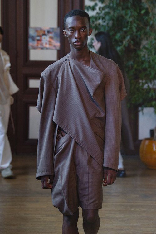
KENNETH IZE
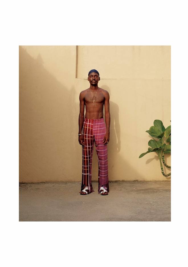
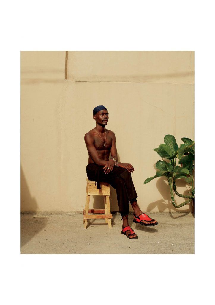
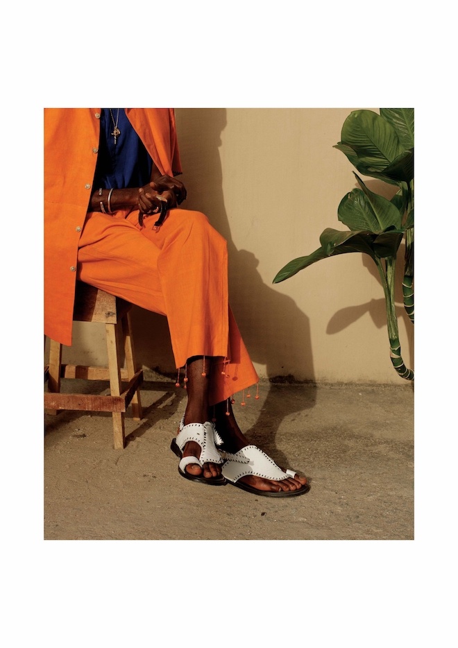
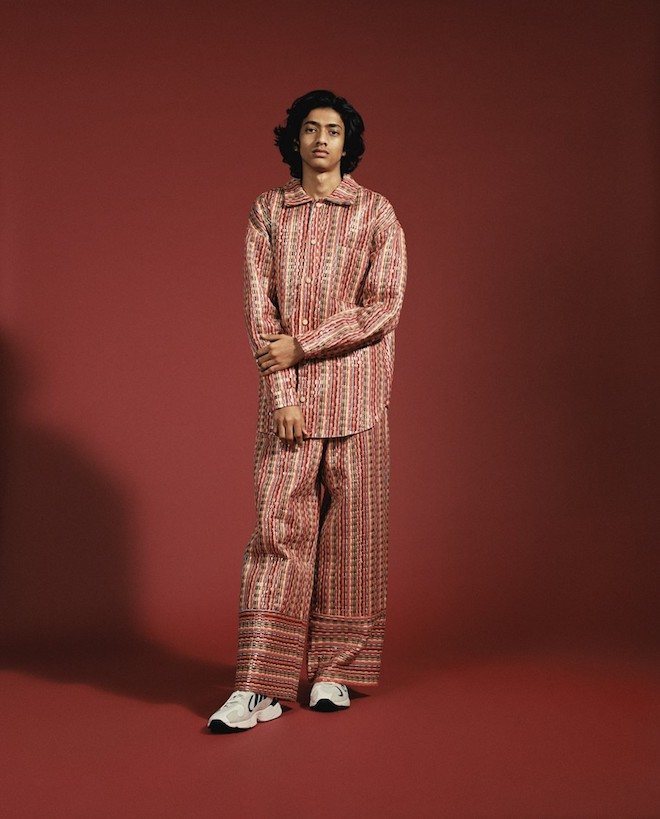
“At Kenneth Ize we focus on reinterpreting examples of Nigerian craft to create an original perspective on luxury production within textile and fashion. We work with a community of weavers, and also with a variety of artisan and design groups across Nigeria. The label is devoted to the long established traditions of craft and local artisanship, merging a contemporary design aesthetic and new production skills with a specifically local handcraft practice. It is an approach we hope to expand upon to include other design cultures around Africa and abroad. There is the strong belief that in exploring and nurturing existing cultures, one opens up an exciting territory for creating and inspiring future traditions.”
STEFAN COOKE
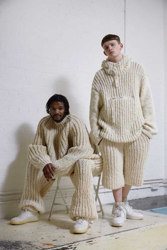
The London-based Stefan Cooke brand is directed by Cooke and his partner Jake Burt. The pair are currently working on their Fourth Season, Spring/Summer 20. The combination of Cooke’s subversion of textile techniques and Burt’s skill for silhouette and design underpins the signature style of the pairs’ forthcoming looks. Original techniques and collaboration is at the heart of the process for their work and continues to be a force of innovation.
THEBE MAGUGU
Thebe Magugu is a young designer based in Johannesburg, South Africa. Originally from the small town of Kimberley, he moved to Johannesburg to study fashion design, fashion photography and fashion media from LISOF. After winning best graduate collection, he interned and worked for a selection of designers fashion institutions and retailers. After 2 years, he began his namesake label, THEBE MAGUGU – a South African fashion brand primarily operating within the field of women’s ready to wear.
Speaking about the brand, the designer says, “together with our pillar values of quality, novelty and culture, we constantly seek new ways of presenting women with clothing that both complies with and enhances the everyday. Sleek, forward-looking design intersects with motifs from our continent’s storied past, providing smart, multifaceted clothes as valuable as their woman”.
PHIPPS – by Spencer Phipps
Spencer Phipps was born and raised in San Francisco. He studied at Parsons School of Design in New York City graduating in 2008 with a nomination as “designer of the year” for his final year collection – an initial exploration of sustainable fashion. He started his career at Marc Jacobs as part of the menswear design team and after, relocated to Antwerp to work with Dries Van Noten as their first American menswear designer. He is currently based in Paris where he pursues his passion for rock climbing and other outdoor activities.
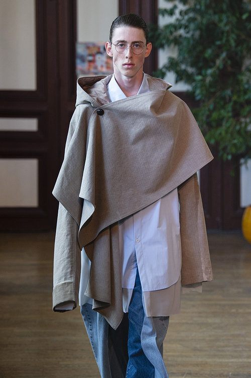
HED MAYNER
The sacred and the traditional are both part of Mayner’s world, as well as a passion for authentic menswear pieces, which he likes to twist and rework. His clothes can be passed on from father to son, escaping the transient nature of designer fashion. Focusing on a substantial and stylish wardrobe of everyday separates, his debut collection emphasizes comfort and self-expression, underlining the universal appeal of archetypal clothes. Addressing the essentials of a male wardrobe -from a sleeveless trench jacket and a pair of loose jeans to a roomy bomber or draped white t-shirt- he roots his sartorial vision within an appreciation of honesty and sincere clothing, as well as an interest in the finer details. Impeccably tailored and constructed, the designer’s clothes are as beautiful inside as they are on the outside, evoking a subtle sense of luxury which must be felt and experienced instead of being seen.
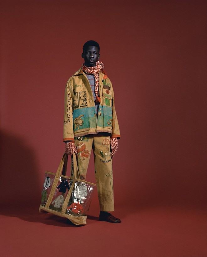
BODE – by Emily Adams Bode
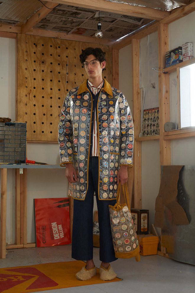
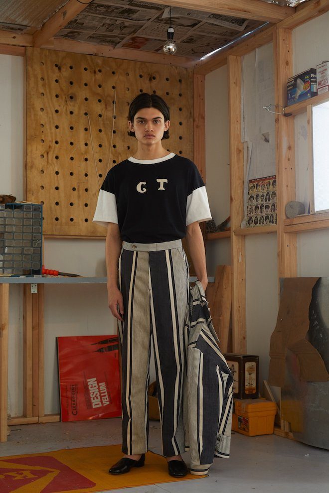
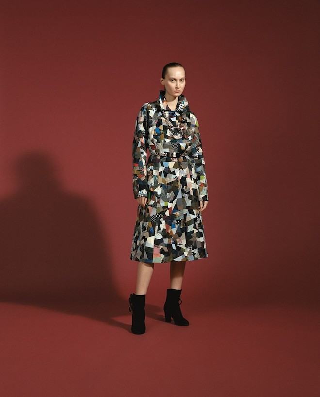
Emily Adams Bode was born and raised in Atlanta, Georgia. After studying in Switzerland, she moved to New York and graduated from Parsons School of Design and Eugene Lang College with a BA/BFA dual-degree in menswear design and philosophy. Bode expresses a sentimentality for the past through the study of personal narratives and historical techniques. Modern workwear silhouettes united with female centric traditions of quilting, mending, and appliqué shape the collections. Each piece of clothing tells a story, and is tailor-made in New York and New Delhi.
BETHANY WILLIAMS
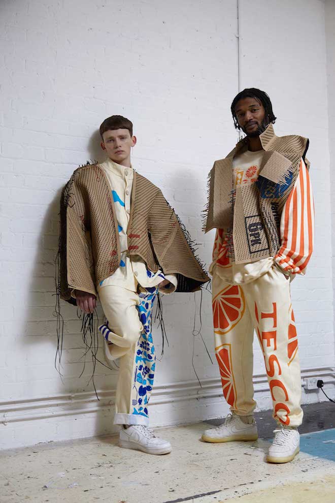
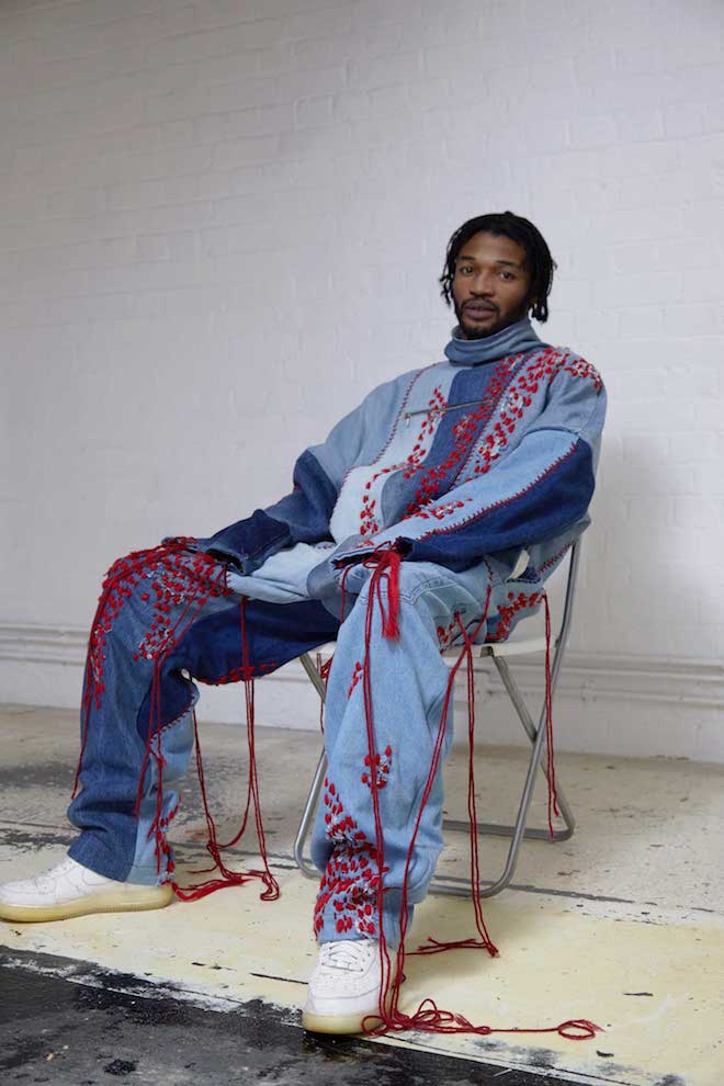
Bethany Williams is a pioneering British menswear designer committed to exploring social and environmental change within her work and working with marginalised parts of society to bring about positive change and social enterprise. At a time in which socio-politics are at the forefront of many designer’s minds, this pioneering designer isn’t just protesting bur rather offering solutions and call-to-actions. For her collection Women for Change, she has worked closely with female prisoners and the San Patrignano drug dependency program. Bethany Williams, a London-based sustainable fashion designer, focuses our attentions onto women’s rehabilitation for spring/summer 18. For Bethany’s most recent collection she has collaborated with Adelaide House, a women’s shelter based in Liverpool, one of only six such facilities in the country. Adelaide House provides a safe place for women leaving prison with various needs including domestic violence and homelessness.
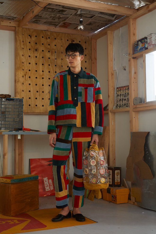
ANREALAGE – by Kunihiko Morinaga
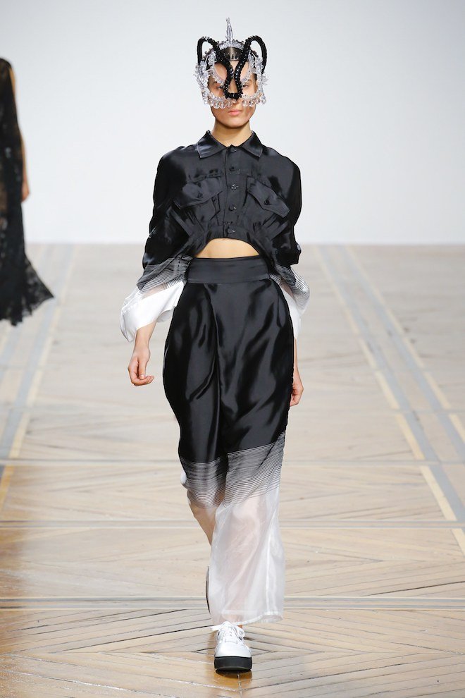
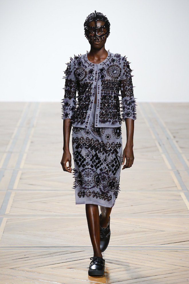
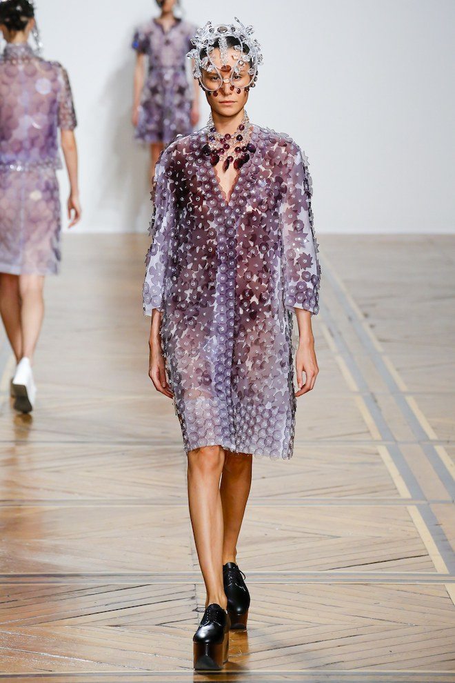
Born in Kunitachi, Tokyo Kunihiko Morinaga began making clothes in Vantan Design Academy while he was still in Waseda University and launched his own brand “ANREALAGE” in 2003. ANREALAGE is a combination of the words ”REAL, UNREAL and AGE’’. The name, ANREALAGE was born from a desire to create real clothes for everyday use while utilizing ultimate dimensions, original concepts, and unique elements. Our collections utilize three key elements. These are “hand craft work”, “conceptual shaping” and “technology” under the mantra of “God is in the details”. In 2005, ANREALAGE won the Design Vision Award For Avant Garde at Gen Art competition for new designer in New York. In 2011, we won the 29th Mainichi Fashion Grand Prix for the best new designer in Tokyo. In 2014, we participated in the Paris Fashion Week, starting with Spring/ Summer 2015. We held “A LIGHT UN LIGHT”, the exhibition with clothes of collections in Paris, in Japan.
The Prize’s winner , to be decided later this year will receive 300,000 euros and a one-year mentorship program facilitated by the LVMH team. The Prize also acknowledges three young graduates who have completed a course in fashion school by presenting them with an opportunity to join the creative team at one of the houses of the group for a year as well as a 10,000 euro grant.
London based gallery Cadogan Contemporary recently teamed up with Canadian painter and botanist Ilana Manolson for the conception of a solo exhibition titled Chance Encounters. Set to open on April 23rd, the exhibition will be Manolson’s debut showcase in the city and will feature over 20 of her acrylic paintings with themes of representation and abstraction presented in ways which challenge traditional depictions of nature in nature in art.
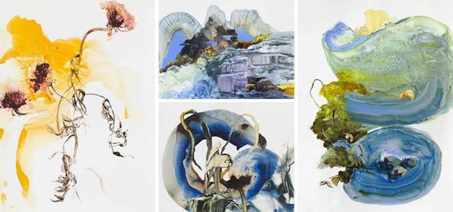
A trained botanist, Manolson offers the viewer an intimate and profound knowledge of the natural world , she began painting while working at Canada’s National Park system in Alberta, where her office became a de facto art studio. Eventually, her passion and talent led her to study printmaking and painting at one of America’s most prestigious art schools, The Rhode Island School of Design.
“I see being a naturalist and being a painter as being very much related in that you are looking at an environment closely, looking over time and looking for the details that explain the larger whole,” the artist explained. The showcase will make its run throughout mid April and take its bow on the 10th of May.
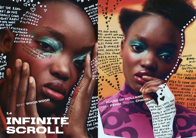
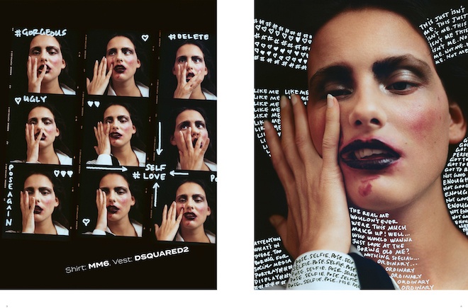
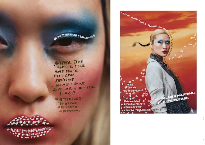
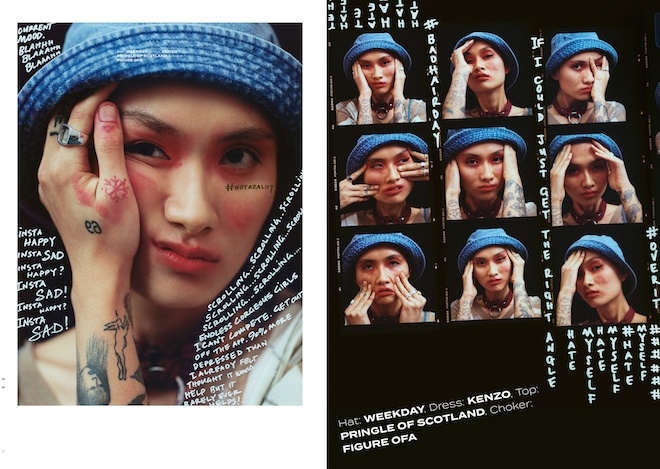
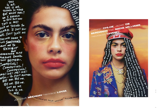
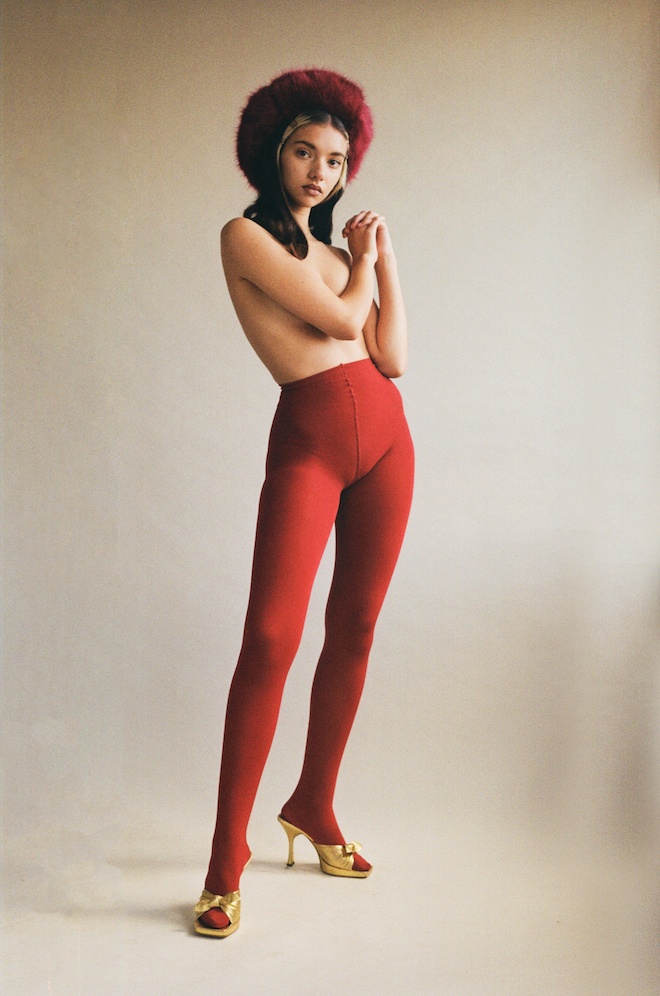
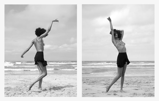
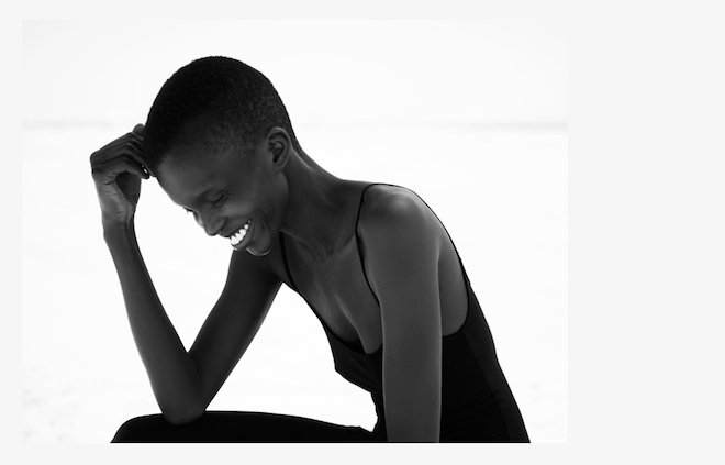
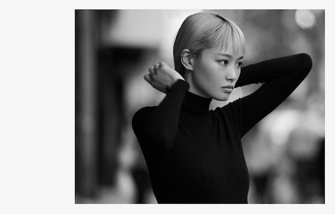
In a special series of images for Twin, we unpack the idea that perfection is on the surface. In a social media age, nothing is more important than owning your best self on the inside. You know who you are: strong, powerful and empowered. That will never change, but that doesn’t mean you can’t switch it and experiment for kicks – this #betterfacechallenge is served with a wink and a smile. Online is the space to play, take ownership of the fun you can have, all the while knowing that your perfect self is in all your imperfections.
Models Moffy at Storm, Elaine at Nii, Lola at The Squad, Aoi at Tomorrow Is Another Day, Melody at The Hive, Make Up Siddhartha Simone at Julian Watson Agency using CHANEL Vision d’Asie: L’Art du Détail and CHANELRouge Coco Flash, Hair Anna Cofone at The Wall Group, Script/Writing Sonya Titus
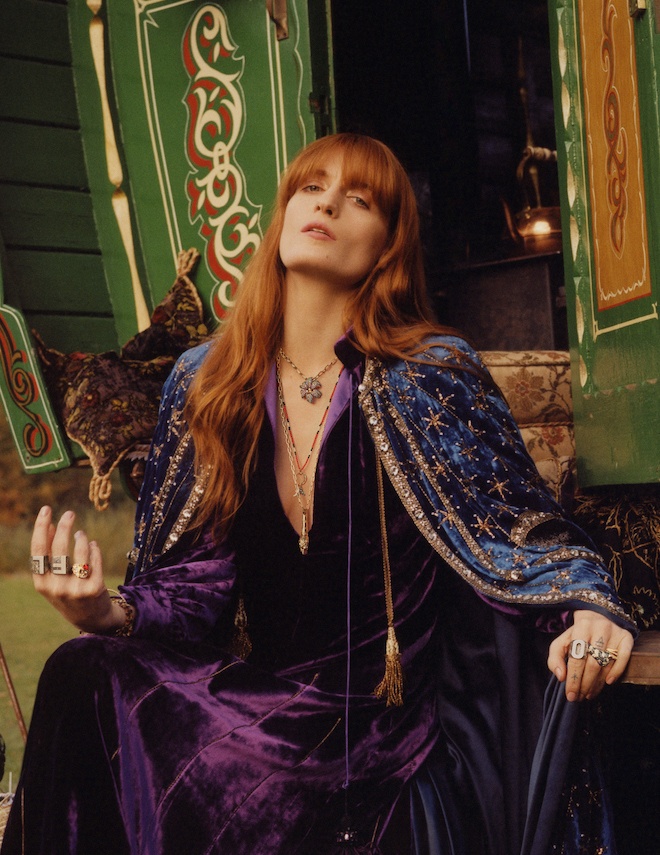
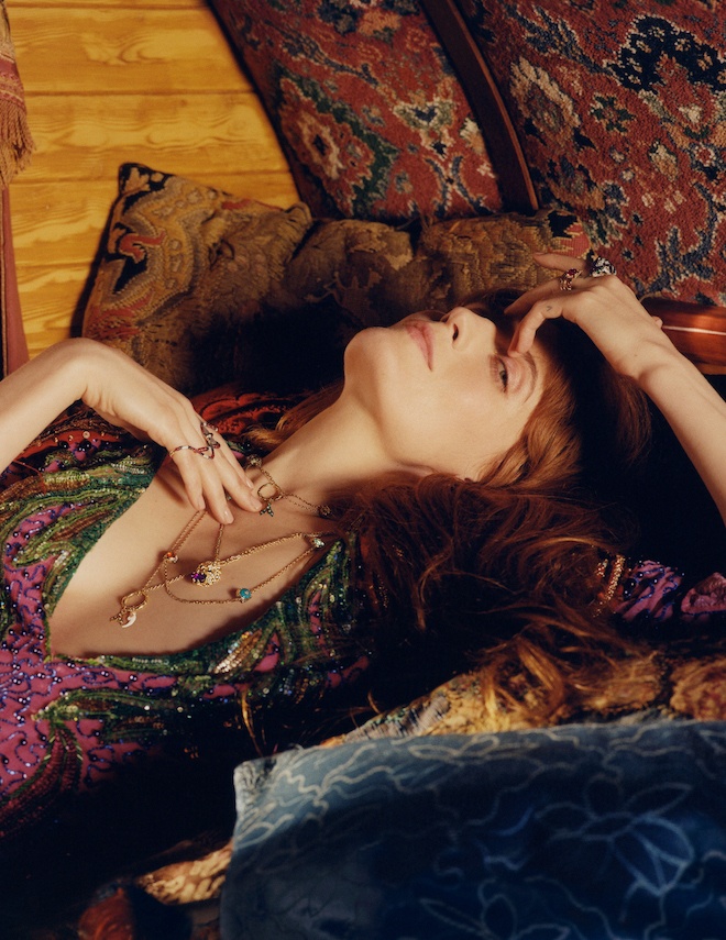
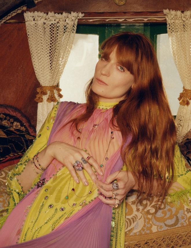
Gucci Jewellery ft. Florence Welch -Bohemian Elegance
Earlier this week Italian fashion house Gucci launched it’s new advertising campaign featuring their jewellery ambassador and longtime friend, musician, singer, songwriter, producer Florence Welch. A match made in heaven , Florence is to Gucci as Madonna is to Gaultier or in even simpler terms as bread is to butter. Shot by photographer Colin Dodgson, the campaign features Welch in a retro styled wooden wagon surrounded by a bed of colourful decorative bohemian styled fabrics and furniture as she poses for the camera adorned in the house’s stylised rings, bracelets and necklaces. The artist’s light, nonchalant luxurious mood pairs perfectly with the garments and bijouterie carefully selected from Gucci’s Le Marché des Merveilles, Gucci Ourboros, Gucci Flora and Dionysus fine jewellery collections. Visit Gucci to discover more.
Issue 20 celebrates a landmark in Twin’s history: 10 years of championing women and emerging creativity. Fittingly, this issue is packed with interviews and contributors that embody our independent and boundary pushing spirit. Who more emblematic of that ethos than Katharine Hamnett? Her radical vision has consistently held power to account and advocated for sustainable values and the power of education. Or boxer Ramla Ali, who knocked out the idea that ‘women don’t box’ and became a champion – inside and outside of the ring. Both women shattered existing expectations to establish new rules of their own. Also in this issue, filmmaker Fenn O’Meally and poet Debris Stevenson talk feminism, community and creativity, dismantling the system one punchy takedown at a time. You’ll want to read this interview twice. These are the influencers of our times, but we’ve also asked leading creatives to talk about the icons who came before. Designers Michael Halpern, Mimi Wade and Art School’s Tom Barratt contribute loving family portraits of the women who originally inspired them.
This anniversary, community is key. In ‘Queens of Scampia’, photographer Jess Kohl offers an intimate portrait of the trans women in northern Naples, while Lotte van Raelte’s discusses her open, natural portraits of women’s bodies in all their unique wonder. Francesca Allen’s ‘Tokyo Girls’ is a love letter to women and the city, while back in Britain, artists Jeremy Deller talks Stonehenge and his collaboration with Aries. And with a similar nod to the pagan, photographer Steph Wilson’s ‘White Nightmare’ conjures surreal and weird world where the white male has been overpowered and the freakish and strange rule. Looking back to look forward, Philomena Epps reflects on the original contributed for our first issue, in the context of where we are now. “The Age of Aquarius will last for another 2000 years”, she says, “but will we?”
Given the innovative creatives that have helped to promote original thinking over Twin’s last 10 years, the answer is probably, yes. The range of talent that has helped to establish the magazine’s pioneering voice is a reason to be optimistic about the future. Here’s to a bright, bold and disruptive decade ahead.
“The Coromandel Collection” – Chanel’s Ode to Madame Gabrielle C.
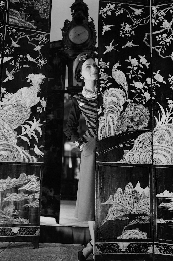
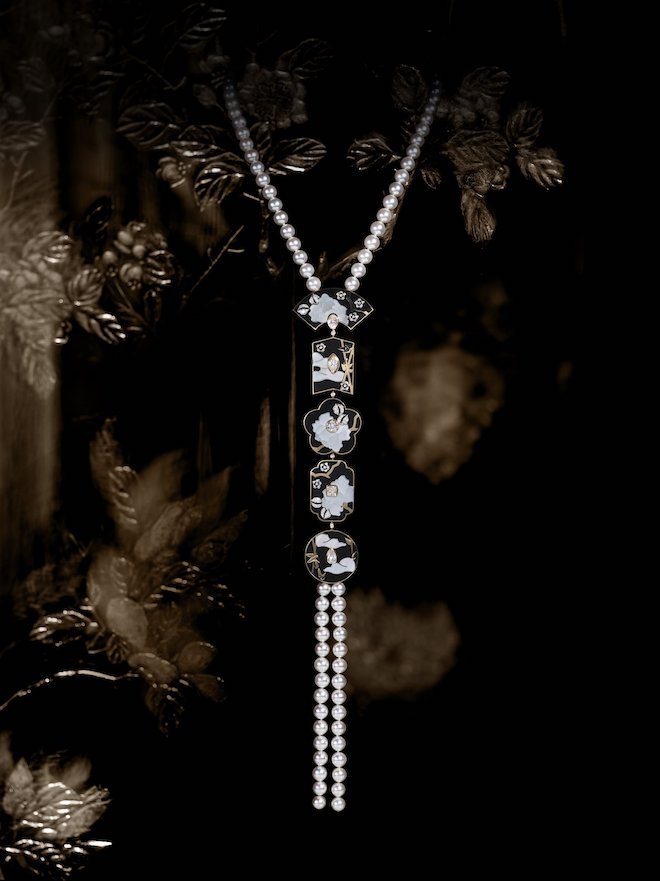
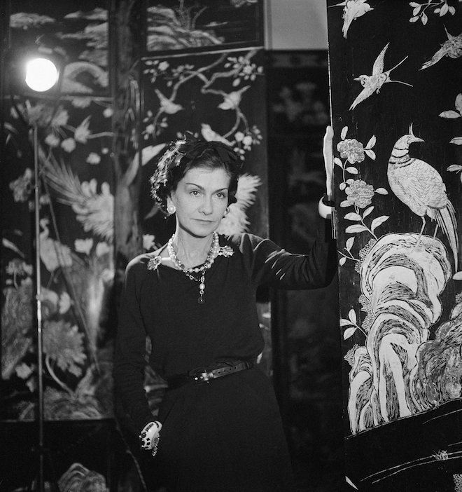
Gabrielle Chanel was said to have been one who lived a figurative lacquered box where sailing ships, palaces, flowers and birds plaited in flashes of gold and deep red stood out against the darkness of light. This fantasy landscape meant so much to her that she often wished to always carry this fantasy in a portable form. This was how her love for Coromandel screens was first discovered in 1910 on a journey with her great love Boy Capel. “The first time I saw a coromandel screen, I cried out: It’s so beautiful! I had never said that about any other object,” said Madame Chanel.
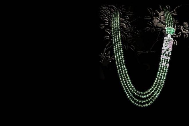
The French fashion house which lives in on in her name recently chose to honour their founder’s passion with a high jewellery collection of fifty-nine pieces inspired by coromandel screens. The collection includes twenty-four pieces which are entirely unique with reworked motifs around the themes of floral, noticeably evoking her signature flower, the Camellia; animal, through the bestiary of Coromandel; and mineral, reflecting her love of crystal and gemstones.
The Fleur De Laque Necklace
The designer was undoubtedly greatly inspired by the intricacies of these Chinese Coromandels which often included art of flora and faunas. She would muse upon the screens and attach photographs and drawings to create a sort of moodboard or theatre in which she would often immerse herself. “When I look at this screen in the evening for example,”she continued, “ I see doors opening and knights setting off on a horseback.”
At the heart of this animal theme, the workshop captures a flock of in flight birds as they appear on some of the designer’s screens in an ornament diamond right that boasts over ten carats. The collection’s gems also calls on the colours of the Coromandel lacquers which includes the greens of the Tsavorite garnet, emeralds and the over thirty-seven carat tourmaline on the “Vibration Minérale” ring; the red spinel on the “Evocation Florale” ring and the ruby beads and deep hypnotic black lacquer transposed onto the onyx. To shop or view the full collection visit CHANEL.
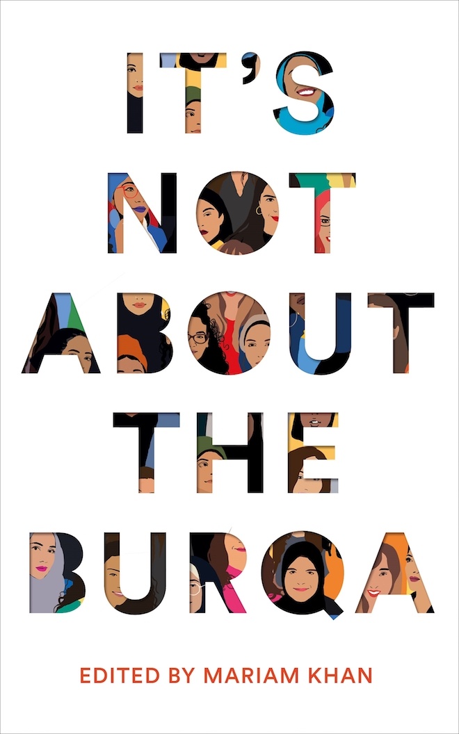
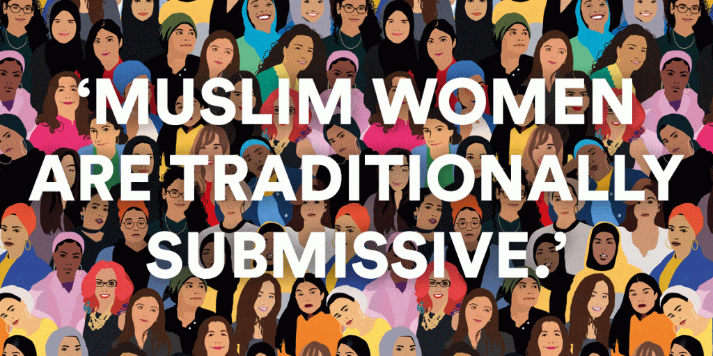
TO READ: “It’s Not About The Burqa” – As told by an Ingenious Collective of Muslim Women
During a time where Islamophobia and Xenophobia are still currently on the rise, “It’s Not About The Burqa” conceived and edited by writer and activist Mariam Khan is an essential hardcover offering insightful unique perspectives from inside the Muslim community. Published by Pan Macmillan earlier this year, the book features an anthology of 17 informative essays from 17 of Britain’s Muslim female youth brought together by Khan as they reflect on their stories of oppression, the lazy stereotyping, misogyny and islamophobia.
Mariam’s concept for the book was triggered when she first came across a report about a leaked conversation had by British Prime Minister David Cameron and one of his officials where he expressed his views of the “traditional submissiveness” of Muslim women being a key problem in the fight against Islamic extremism. Mariam soon grew tired of conversations like this being had about the definitions and needs of Muslim women by parties that were neither female or muslim.
From this, the idea was conceived to unite the voices of these women with different stories ranging from funny , to warm, to sad and angry, as they discuss freely the hijab, the wavering faith, love and divorce, feminism, queer identity, sex etc. “I wanted a book that let Muslim women speak on their own terms, without being spoken over, about whatever they wanted and for that not to have to go through a white filter. We had to have a platform of all sorts of voices, and represent the vast experiences. I couldn’t edit the book thinking, ‘I don’t agree with that,”said Khan.
The book counteracts the media’s distorted definition of a Muslim woman being “all about the burqa” and gives insight to what it’s truly like. Mariam’s chapter titled “Feminism Needs To Die” discusses her experience as a feminist as she came to the realization that mainstream “white” feminism did not have room or wasn’t interested in accommodating the choices she makes in regards to her faith. Each essay, with titles like The First Feminist (Sufiya Ahmed) , Immodesty is the Best Policy (Coco Khan) , Hijabi [R]evolution (Afshan D’Souza-Lodhi) and Not Just A Black Muslim (Raifa Rafiq), presents a unique testimony from a few of the only voices we should be listening to about the journey of what it’s like to be a Muslim woman in 2019. To get your copy visit INATB.
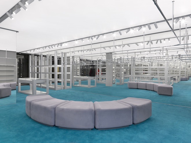
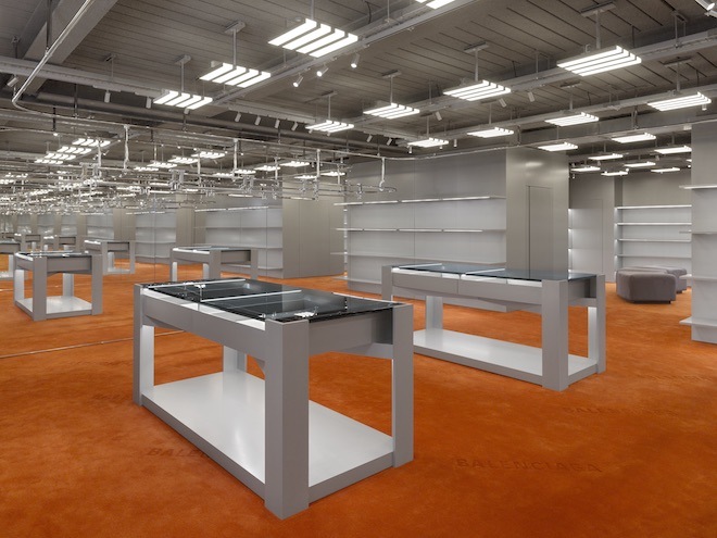
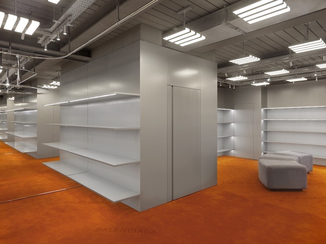
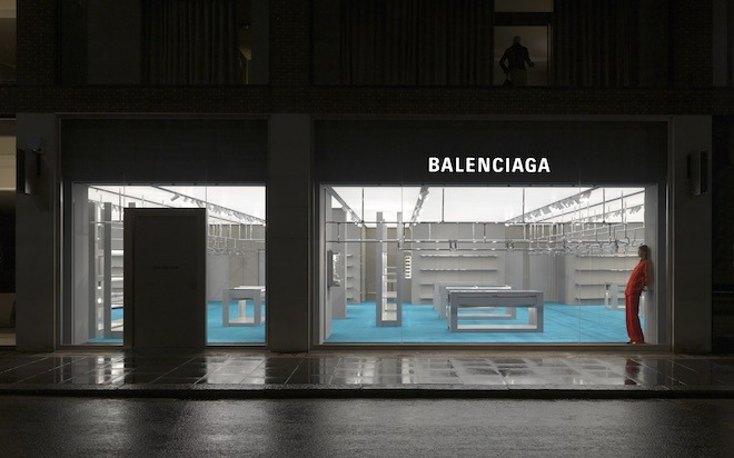
Yesterday Spanish luxury fashion house Balenciaga opened it’s doors in London to a new two story ready-to-wear and accessory store on Sloane Street. The store’s interior design is an exploration of Creative Director Demna Gvasalia’s interest in the look and feel around the idea of diverse retail environments. The store features a large display case along with a combination of ceiling panel lamps and floor to ceiling with on the ground floor. With a very futuristic feel, it includes grey scaled industrial furniture and columns, aqua green carpets, and glass and metals shelves complemented by minimal wrapped seating. The storefront also introduces a pair of hyper realistic mannequins based on two exclusive models: Eliza Douglas and Takato Harashima.
Centre National de la Danse: “Where Did Our Love Go?” – March 16th & 17th
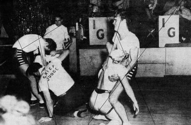
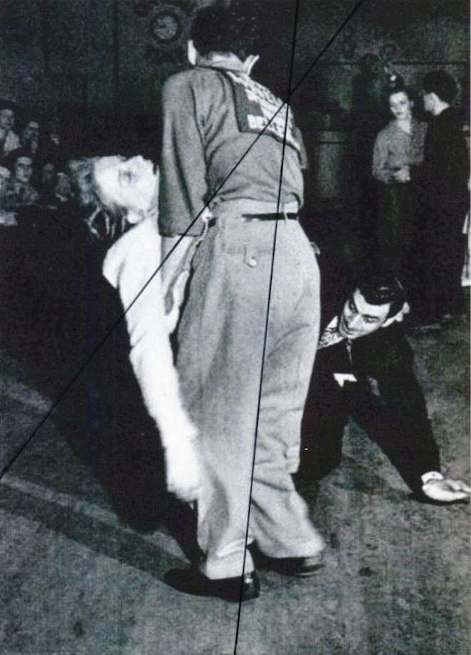
In the early 90’s during the Great Depression of the US, there began an interesting tradition of exhaustive dance marathons. Participants would dance for hours while mesmerised audiences made bets on winners and predicted losers. Although they included many rules with risks of disqualification, these marathons offered a cathartic release as they acted as a sort of mirror to the crisis happening where the main aim was survival as opposed to glamour.
French institution Centre National de la Danse as a part of their Trois Fois Rien exhibition recently tapped artist and choreographer Émilie Pitoiset to conceive a performance titled, “Where Did Our Love Go?” in ode of the iconic dance marathons. The 6-hour performance set for March 16 & 17 at the institution’s headquarters in Pantin, France will explore the dance form which Pitoiset has been studying since 2009. It will include repertory of gestures and postures which are at the heart of her studies and artistic works from the time period which will feature the bodies on the borders of falling, intimately enduring the mechanisms of capitalism in ways to appear increasingly contemporary. For more information, visit CN D.
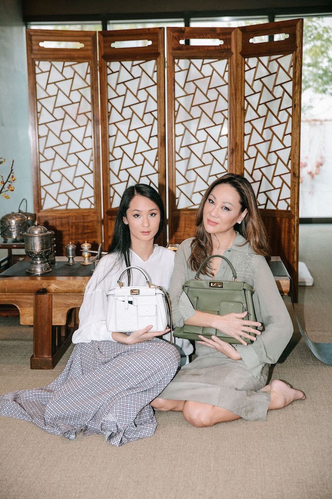
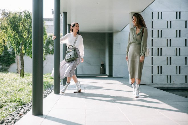
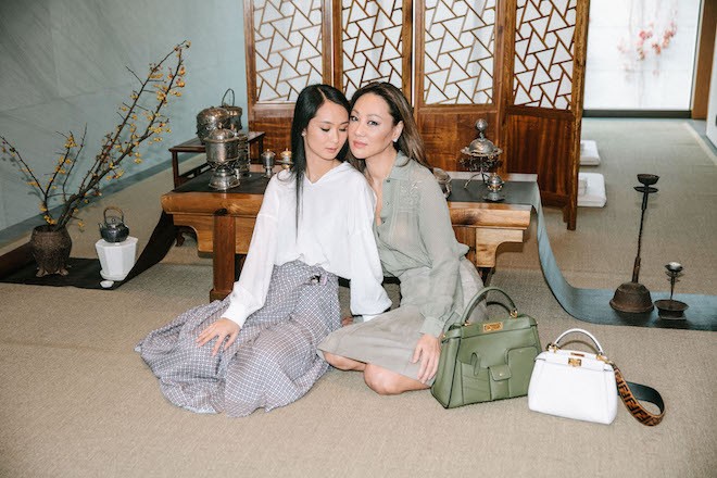
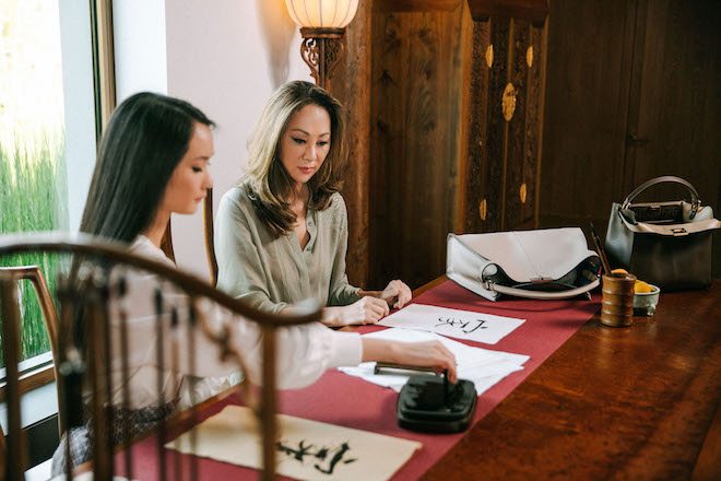
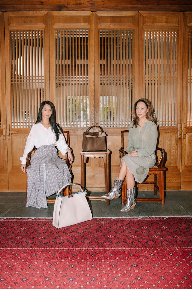
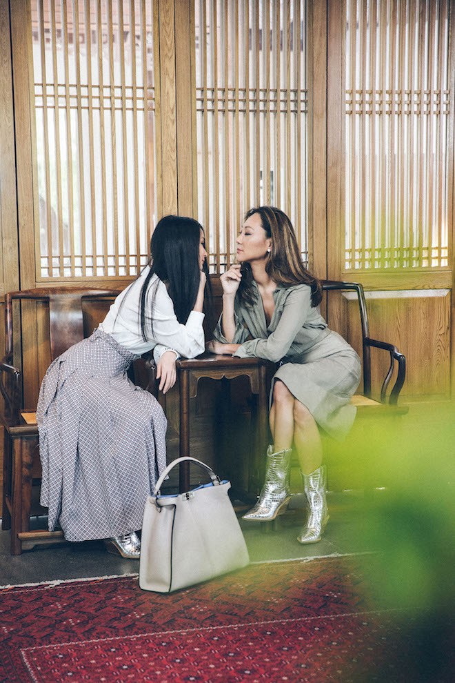
For International Women’s Day, Italian fashion house Fendi launches the 8th episode in the second chapter of their Me and My Peekaboo series. The series which began earlier this year features 10 iconic women across the world which included names like Kim Kardashian, Kris Jenner and North West.
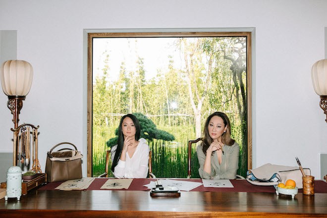
The second chapter of the Peekaboo series focuses on the bond of iconic pop families. From J-pop stars identical twins Ami and Aya shot in Paris to Taiwanese renowned actress and movie director Sylvia Chang with her son Oscar Wang in Shangai. The latest episode (Ep. 8) features businesswoman and socialite Grace Pen accompanied by her visual artist, model daughter Jossilyn Pen shot in the Amanyangyun resort in Shangai. The mother daughter duo are filmed enjoying and intimate bonding day with their Peekaboo bags in hand on the architectural ecological grounds which also houses a 15 year tree conservation project in protection of the rich heritage, traditions and sites it holds. The episode includes versions of the Peekaboo bag which have been seen on the Spring Summer 2019 runways. To view the film and shop, visit Fendi.
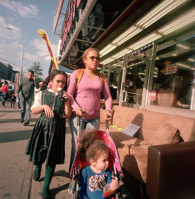
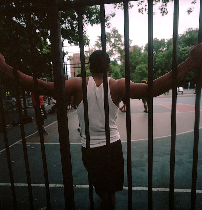
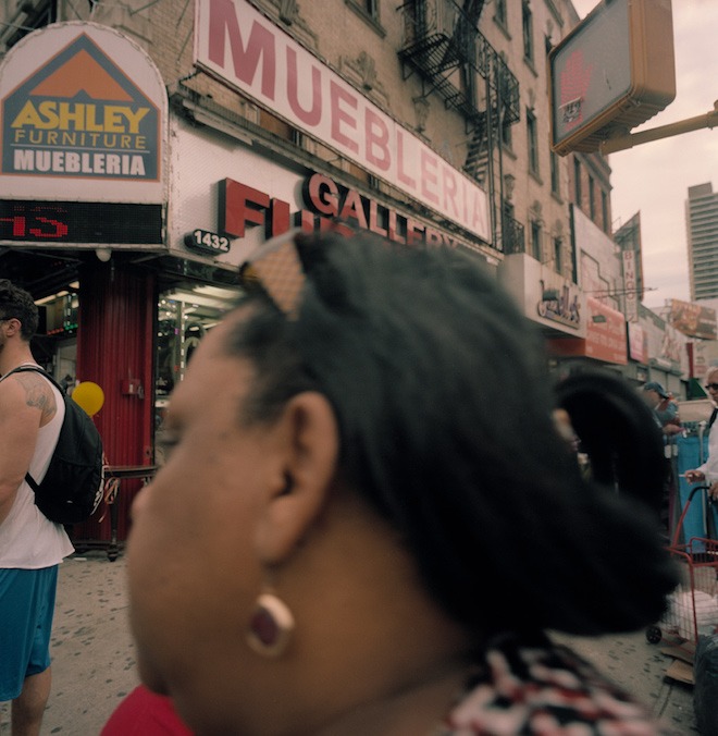
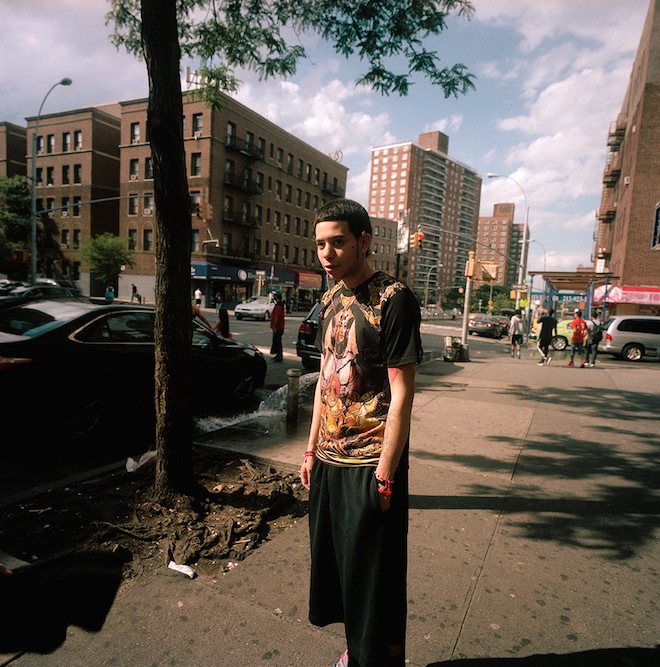
“The Wahi Series”, – Northern New York City as seen by Kasandra Enid Torres
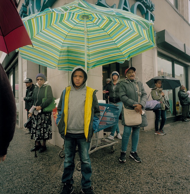
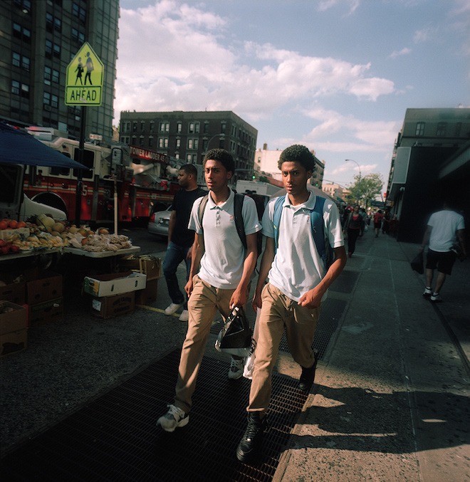
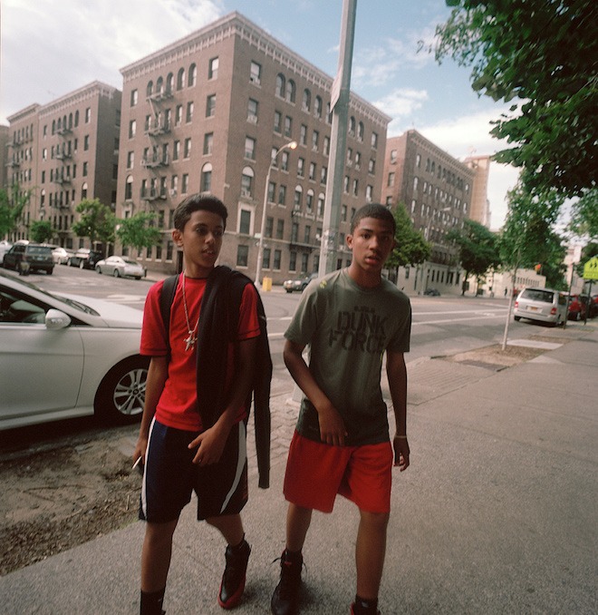
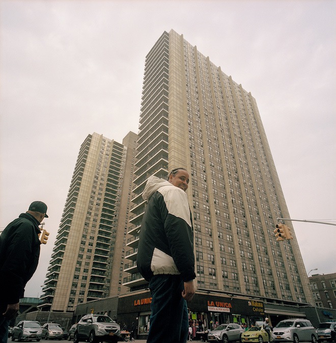
Kasandra Enid Torres is a culture and fashion photographer based in Washington Heights, NYC who has been documenting the soulful inhabitants of her neighbourhood for the past three years. Her series titled “Wahi” — short for Washington Heights — diaries the vivacious poetic spirits of the busy district in ways which treasure the Old New York City aesthetic with a 21st Century twist. In conversation with the photographer , Twin discusses her inspirations and experiences throughout the process of the project.
When did you first start shooting in New York?
I moved to the city at the beginning of 2013 after graduating from Savannah College of Art and Design in 2011. For the first two years I didn’t shoot much, I was constantly working 24/7 and if I had free time I spent it sleeping. I was also on an artist block, I wasn’t sure what to shoot. I came from an art background making abstract photography and films. To get myself unstuck, I started to shoot anything and everything.
What inspired you to start the “Wahi” series?
Around 2015 I started to shoot regularly. At the time I didn’t have access to models so I decided to shoot outside in my neighbourhood. I am not the most extroverted person and having to go out to make pictures by approaching strangers was daunting to me. It was definitely a challenge. I slowly got more comfortable with it and found my flow. I got my hands on a Hasselblad Superwide C, which is a medium format camera with no viewfinder. It was fun experimenting with it and finding its sweet spot. It is a somewhat big and chrome camera. I liked shooting with it for this series because it attracts attention. It is also a conversation piece, people approach me asking me about it and allow me to take their portrait.
How do you select your subjects?
I walk up and down on St Nicholas Ave between 168th and 191st street, keeping myself open for opportunities. I am attracted by really interesting people, how they are dressed, how they walk, their expressions etc. I also choose things that speak to the culture of the neighbourhood, such as the supermarkets, the crowded bus stops, the chairs, domino tables, and the empanada carts.
What’s your favourite thing about Washington Heights?
My favorite thing about this neighbourhood is the people. I love being surrounded by other hispanics. Having lived away from my family for the past eight years, I like being reminded of my culture and roots. I like listening to the radio blasting salsa or reggaeton while walking to the supermarket. I like watching the intensity of people playing dominos. I love the sidewalk parties of people chilling on their lawn chairs, drinks in paper bags, puffing from hookahs and grilling up on barbecues. I love the wafts of food smells, such as pernil, mofongo, empanadas, and asopao. It feels like home.
What would you like people to take away from viewing this series?
I want these images to give the viewer a look inside this Old New York style neighbourhood. There really aren’t many places like this in the city. Majority of the city has been gentrified and franchised. I want them get an honest raw interpretation of this community. I want them to be able to see how interesting and cool the neighbourhood is, to feel as if they were there.
Can we expect to see more projects like this from you in the future?
Yes I will continue to document series like this one. I just wrapped up a series I shot near the Adirondacks in January of a Snowmobile drag race. I shot that one during an insane blizzard! I am also currently shooting a series at busy subway platforms like Times Square, documenting all types of people.
What’s next for you as a photographer?
I am always looking for new ways to challenge myself. With each new series I try to do something I haven’t done before, be it a camera technique, lighting technique, shooting a specific way or subject matter.
Where can one view more of your work?
Majority of my work is online. I have work published here on Twin (my Afropunk series), Document Journal, a couple of other indie magazines and my website. My Dependence series is published on issue 7 of Recens Paper, another of my favorite project. In the future, I aim to have a gallery show at a space in the neighbourhood. I want to give back to this community that has given me so much.
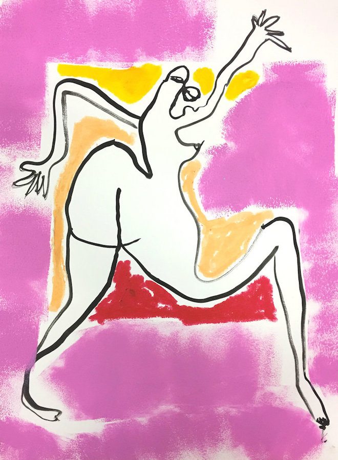
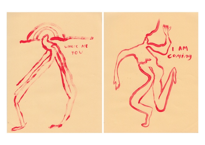
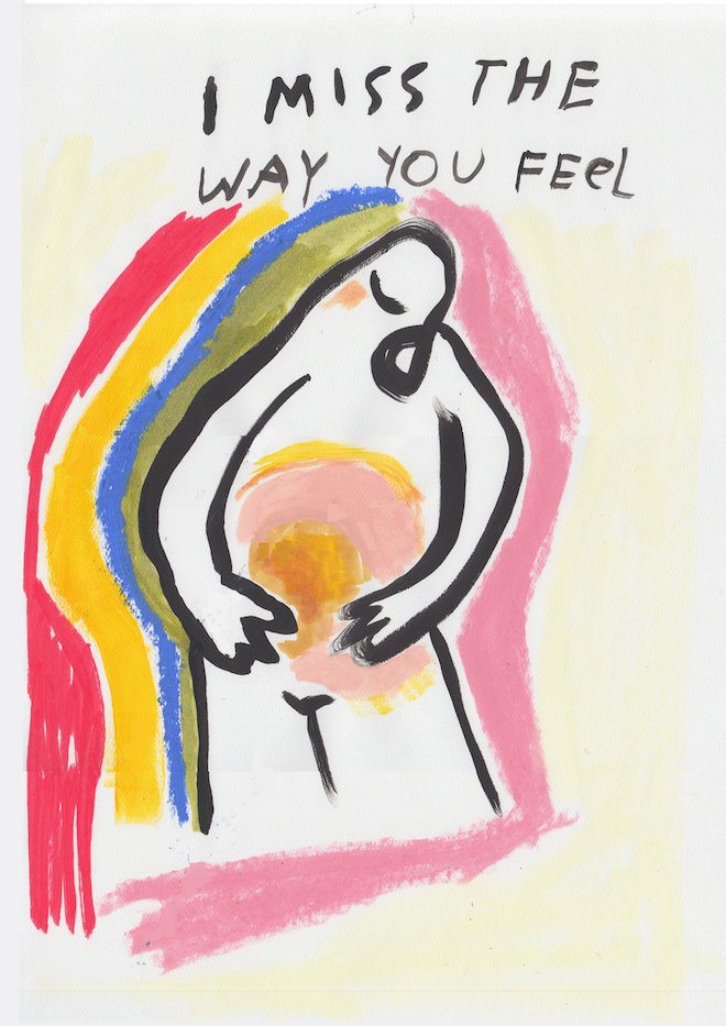
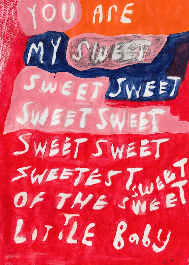
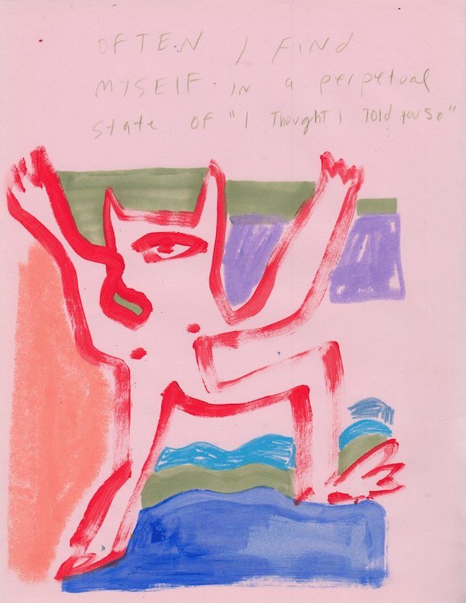
Carla Uriarte’s doodles are dinky, wonky, pinky-plonky. She incorporates scrawls, bubble writing and statements, the catching’s of a conversation, passing thoughts and internal monologues into her drawings of birds, creatures, women and abstract landscapes. Her approach has a way of presenting a female sensibility amongst her make-believe Australiana landscape lilt and intriguing creatures and friendly monsters: some of her work are simply abstract forms that might hold mouths, tongues, teeth, housed in globules of colour and shade.
They are definitely doodles, in the sense that they seem to be scratched from the surrealism of her mind, yet are brought forth into reality through the statements that neither start nor stop. It almost feels like the images and the words reflect one another: they neither have sharp edges or some no edges at all. Merely soft openings without the need for a cathartic finish.
They are surrealistic, they are eye-catching, they are calming: they are doodles destined to define nothing in particular but open a frame into a world Carla has created for herself and her viewers, invited to enter and interpret as they see fit.
What do you do for fun, what’s your favourite colour, how did you get into drawing and illustration?
What were you good at in school, what were you not so good at?
Sport. Focusing.
What defines a doodle?
Quick movements without too much effort or thought.
When you draw, what comes first: the statement or the illustration?
Still unsure. Can’t say. Either or depending on the moment.
Who is the best doodler in history?
David Shrigley
In the UK, the government is increasingly moving focus away from the arts, leaving a potential massive gap in young people’s education of art. How important is art to you?
Very IMPORTANT – for obvious reasons. I think that without the education of art it is easy for a young person to think that they cannot make a career out of ART which can cause them to feel forced into working in a field that does not interest them — leading to a life with no passion or pizazz, resentment etc. etc.
Does Australia enter your work?
The landscape, feelings, people and experiences of wherever I happen to be always enters my work.
Does your mind drift as you draw or does drawing help your mind drift?
I think my mind drifts 24/7. I find that the mediation of drawing brings me inside of my head allowing me to explore the different layers of all that goes on within.
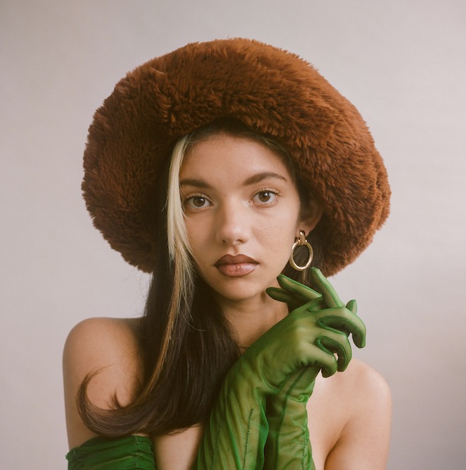
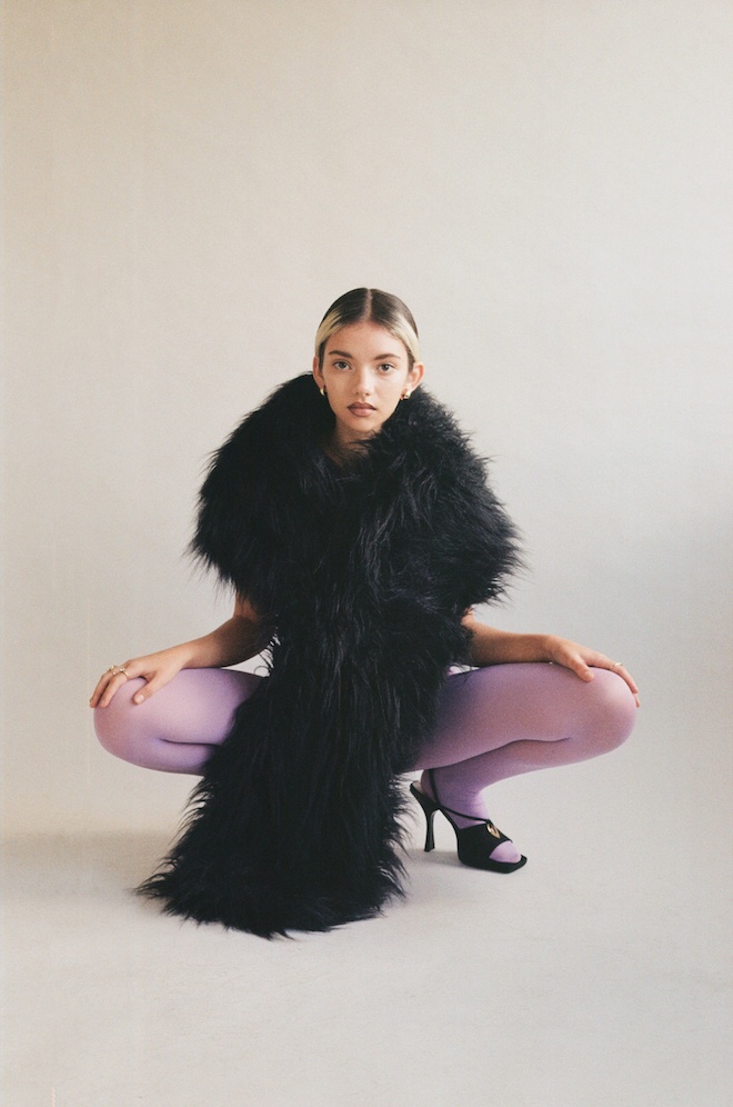
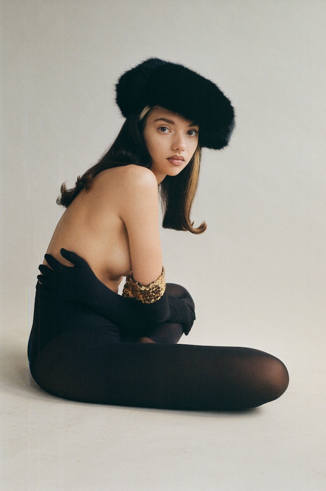
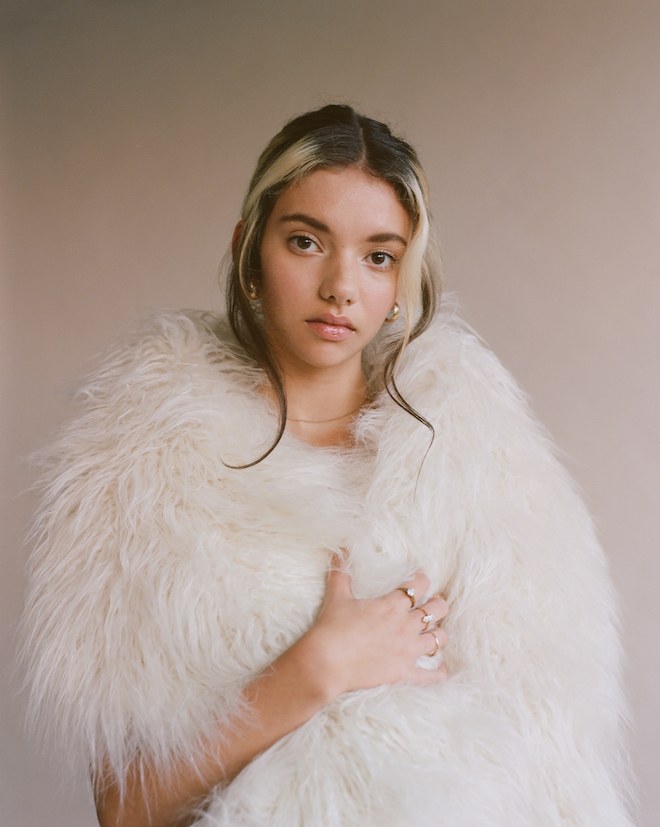
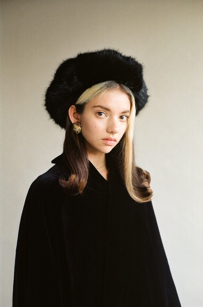
Within the past few months you’ve probably noticed that faux fur hats and garments have been trending, from the streets of London, Milan and Paris Fashion weeks, to magazine editorials and cover shoots. Upon further inspection, you’ll probably find out that a great number of these pieces were made by British millennial milliner Emma Brewin. Her clientele has been from the likes of Rita Ora, Miley Cyrus, Adwoa Aboah to Kylie Jenner for Paper Magazine, Vogue USA among others. Brewin has been stitching faux fur outerwear and accessories for these pop culture behemoths from the comfort of her hometown Sandwich in South East England.
“I really enjoy being out here in the middle of nowhere and doing my own thing,” she says. Twin sat down with the designer for a chat about struggles, inspiration, and the creative direction behind her latest SS19 Campaign shot by photographer Chloe Sheppard.
When and how did you learn to make hats?
I studied fashion design at university but I suppose I am self-taught in millinery. I made my first hat back in 2013, to match a coat I had made, and now I can’t make a coat without a furry topper!
What persuaded you to go in the direction of faux fur as opposed to any other fabric?
At university I did lots of studies into what fabrics children find most appealing when dressing up, and fur was a always up there with the first things they grabbed, once I started working with it I completely fell in love, for me it can complete any outfit and make it so much more special.
How long does it take you to make each piece?
It completely depends on the piece but if I am working on a hat I always give myself a full day from start to brushing and boxing up.
What was the direction behind your SS19 campaign and collection?
When starting a collection I never really have any particular direction, it’s my favourite part of the whole process, the girls and I just make, make and make. Usually producing pieces that we would dream of finding in old vintage shops then playing around with them until they are perfect. The studio is like a fancy dress box of hats, and the ones we dress up in the most are usually the ones we put into production. In regards to the campaign we really wanted to let the hats speak for themselves, which is why (for the first time) we shot in a studio.
Where, what or who do you look to for inspiration?
Everything old.
What has been your greatest challenge since the launch of the label?
Relinquishing control and not doing every job myself.
Who is the ideal Emma Brewin woman?
Our customers. We really do have the best customers on Earth.
What’s next for you?
We have spent January and February locked in the studio making some wonderful new styles, we released a sneak peek of our new Cat Hat on Instagram the other day, and have some matching new accessories to twin with our hats coming very soon..
This week, British organization The Art of Women launches their exhibition in support of women across the United Nation. The Art of Women is a solidarity movement for the empowerment of women which unites UN Women with fashion models in an effort to amplify their voices. The organization is a commitment to human rights and is a form of advocacy for respect towards women and diversity by promoting change through art and raising awareness around issue surrounding feminism . The Art of Women opens the doors of their exhibition tomorrow March, 4th through 6th at the Florence Loewy in Paris. The exhibition shot by Nikki Esser, provides a perspective on a diverse representation of women, authenticity and empowerment as the photographer captures the personalities of her muses through her warmth and the connections she creates with them. For further information visit The Art of Women.
J Hammond Projects: “Fuck Paintings, Etc.” by Betty Tompkins
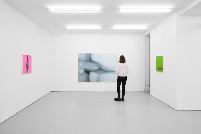
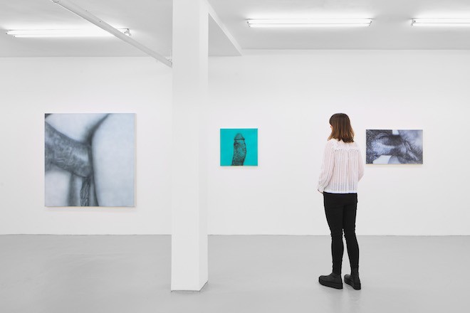
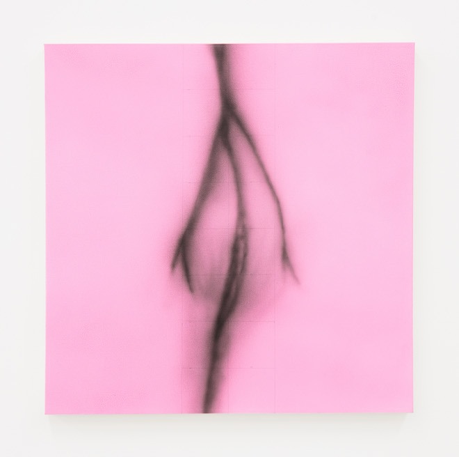
This week London based exhibition space J Hammond Projects presents the opening of their latest exhibition “Fuck Paintings, Etc” by pioneering feminist artist Betty Tompkins. The exhibition which opens today features a series of pornographic images aimed predominantly at men missing heads, hands and other identifiers until the work takes a form of abstractionism. The artist tells the stories of sexuality and desire from a female perspective, in attempt to break the monopoly of the male gaze. The series will include a selection of ‘Fuck’ , ‘Cunt’ , ‘Pussy’ and ‘Dick Paintings’ which the artist has completed throughout the last decade along with four brand new text works from Tompkin’s “Insults/Laments” series.
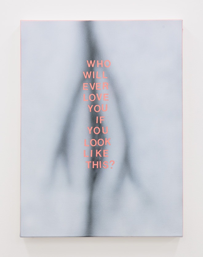
The “Insults/Laments” is a combination of the artist’s work featuring quotes of crude and degrading language directed at women. “I’m always moved by what I’m quoting, by including the words in my paintings, I’m showing respect for how women have survived these awful experiences,” stated Tompkins.
The artist began her journey of making giant genitalia ‘Fuck Paintings’ over half a century ago and was presenting a body of work which had initially been rejected by all corners of the art world for its sensitive subject matter. As a result, despite a handful of group shows during the early 1970’s these paintings have been ignored for the past three decades stored in the Tompkins’ New York studio until a solo exhibition in 2002 and her participation in La Biennale de Lyon the following year. The exhibition is set to run throughout March until April 13th.
Betty Tompkins Who Will… Acrylic on canvas 2019 Betty Tompkins Cunt Painting 2017, Acrylic on Canvas
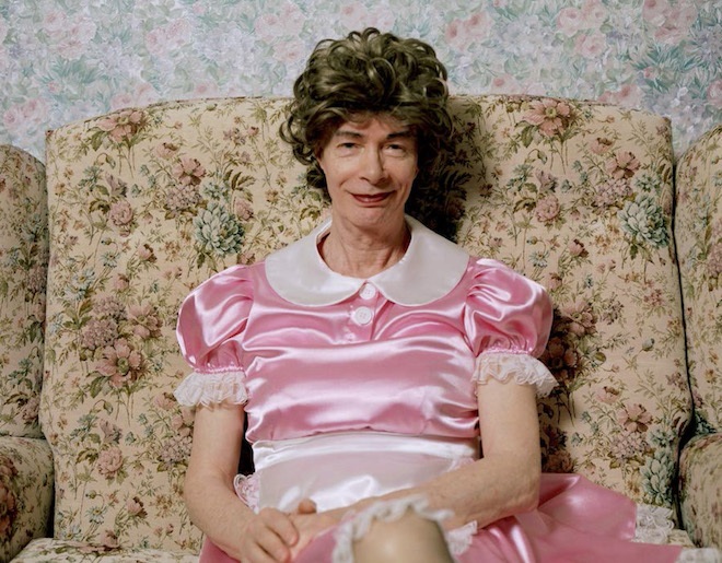
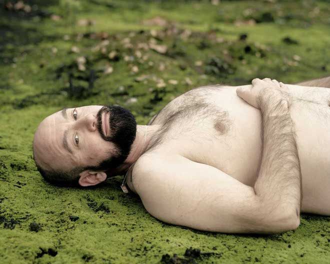
British fashion and documentary photographer Bex Day in collaboration with producer curator Sandrine Servent and artist publisher William Esdale have recently joined forces in the conception of a campaign which seeks to raise awareness and visibility of the UK’s older transgender community. The campaign titled ‘Hen’ is an initiative Day has been working on for the past three years, that aims to promote a better understanding of integration in and outside the transgender community through an exhibition, film, talks and workshops.
According to Day, “Hen is an anthropological study on gender fluidity and an exploration into the lasting impact societal restrictions concerning sexual identity and gender roles upon us. It examines how gender stereotypes have affected the older transgender community and questions how we define gender and if as a society we should, as well as exploring the inherent social and cultural problems within these alienating classifications.” The exhibition is set to display a series of 30 photographic portraits in various sizes and a newly commissioned film featuring subjects over the age of 40 which with successful funding, will take place in London at the Herrick Gallery during the first week of April following Trans Day of Visibility day on March 31st.
Unfortunately , the campaign is sans funding and is in attempt of seeking financial sponsors to cover the expenses of the panel discussion, transport and installation of the artwork, equipment for the three workshops among other costs. The workshops will be hosted by the charity Stonewall Housing with whom the exhibition has partnered with to ensure that 50% of prints sales goes to the organization as one of the UK’s LGBTQ+ and trans only supported accommodations. Twenty percent will also be contributed to partners Press For Change as one of the UK’s leading campaign groups in focus of the rights and treatment of transgender people. To donate, visit Hen The Exhibition, to learn how.


 PREVIOUS

 Twitter
 Tumblr
 YouTube
 Facebook
 Instagram
