
A loving tribute to Gabrielle Chanel
To mark the launch of their latest fragrance, Gabrielle, Chanel brings the scent to life with a new pop-up shop on Bond Street.
Running until 24th September, the space will invite audiences to immerse themselves in the history and personality of Gabrielle Chanel; a series of events and workshops designed to unpack her rebellious nature, and how this has been conveyed through scent.
To find out more about the workshops and events on offer, and to book your place, click here.
Tags: Chanel, london, london fashion week
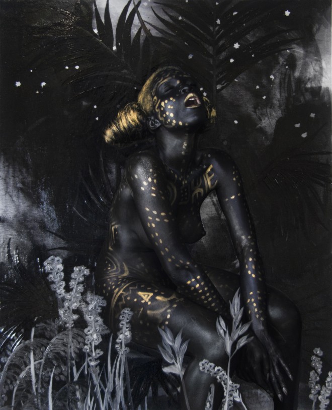
“A black and gold chapel, of sorts”: Artist Lina Viktor presents her fictional dystopia
From the 12th September to the 20th October, Amar Gallery in London will host Lina Iris Viktor’s first solo exhibition in the UK. Of British and Liberian heritage, Viktor explores narratives surrounding race and the African diaspora in her work.
Black Exodus brings together both new and existing abstract works, which have been made using Viktor’s trademark black and gold colour palette. This exhibition marks the first ‘Act’ in an evolving series for the artist, which reimagines artistic and socio-political definitions of blackness. Twin spoke to Viktor about the implications of her two-tone colour palate, and the exhibition’s roots in a mythologised dystopia where the black race no longer exists.
Black Exodus is based on a mythologised dystopia, where the black race has been extinguished. How do these works respond to that theoretical future?
These works are not literal interpretations of this theoretical concept, but rather investigatory visualisations that are very abstracted; the entire idea is completely abstract, though it may bare historical significance and relevance. My work has always been driven by concept. Whether or not I have chosen to clearly express the driving force, the conceptual narrative is central to the development of a body of work. On this occasion, I believed the concept was imperative to share when reading the work. However, these concepts are and never should be constricting.
All of my work is essentially a continual experiment – with concept, colour, and material stripping away all that is nonessential. The idea of a dystopic world where the black race no longer exists was conceived to illustrate how integral and essential the black race has and will always be to the development of humanity. It is more of an idea to keep in mind while viewing the work rather than a signifier that is sought through the work. The black in the work and the surrounding space is allegorical – as are all the hues, resonances, and finishes of black that are incorporated. Black is source: without it we all would cease to exist (as would light), so even theoretically it is an impossibility. But it is an interesting future to contemplate – especially with all that continues to be done to stymie the progress of those that belong to the African diaspora globally. It is our daily reality. I simply pose the question of a future without the black race, for the viewers’ contemplation rather than mine. I hope the works can further elaborate that question.
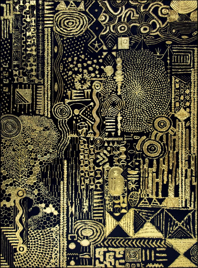
Lina Iris Viktor, Constellations III, Pure 24 Karat Gold, Acrylic, Gouache, Print on Matte Canvas 2016, Unique, courtesy the artist and Amar Gallery, London
Your colour palette for Black Exodus exclusively uses black and gold. What are the associations of those colours for you?
These are mainstays in my artist palette, which has always been very specific and focused. The departure into an entire body of works within this even more restricted palette was about stripping away all of the nonessential, and also seeing how far I could stretch and push these contrasting extremes into a series of unified works within a unified space. In my practice, black is a value – one polar extreme of the colour spectrum; it represents the full absorption of light within the colour spectrum and it contains all colours. Therefore it is completely saturated and colour-full. Gold is the closest to a godly metal one can find. Revered since its discovery, previous civilizations have likened it to the sun – a bearer of light – the immortal metal that will never tarnish, fade, or rust. Both black and gold hold light in very different frequencies and resonances; gold shines in the dark and requires very low-lit conditions to illuminate. In this exhibition, the gold imbued in light depicts the interconnectedness and interdependency of light to dark and vice versa. Both are required to appreciate the other.
This exhibition marks the first Act in an evolving series for you. How do you see the series developing?
I am already planning Act II for next year, and it will take the form of next solo show in New York. I grew up acting and in theatre, and I view each solo exhibition as a continuum, an intervention or revolt that is staged to counter what we have all been taught. This Act is called ‘Materia Prima’, meaning ‘first matter’, so it deals with the concepts expressed on a universal and primitive level through abstraction and limited palette. It addresses the relationship of light to dark, absence and presence et al. The next act will be an evolution from that, and it will be more topical and less abstracted. Essentially it will be the next chapter in my exodus story.
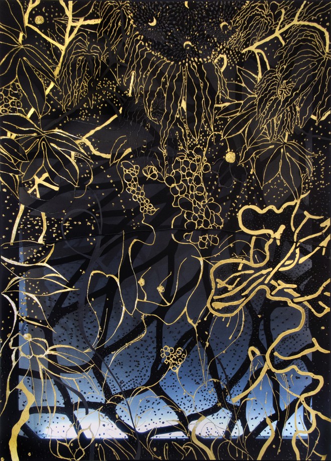
Lina Iris Viktor, Black Union Pure 24 Karat Gold, Acrylic, Charcoal, Poly Resin, Wood on Fabric 2017. Unique, courtesy the artist and Amar Gallery, London
How does this body of work depart from your previous collections?
I feel like all of my work is just a continued conversation that builds on the previous – each one poses more questions, and pushes me further technically and conceptually. But really, every artist only has a few good ideas that they delve deeper and deeper into over time. No matter how varied the work may appear, I have found that the core thesis is usually very consistent; they are essentially the questions you have been asking since you were born that you have yet to resolve.
This work is more complete as it is a suite of paintings, and it utilizes different creative processes to produce each – many processes that were experimental and will most likely be refined over time. I have become more open to the experimental aspect of work production – creating with less of a determined outcome.
Can you tell me a little bit about your artistic process?
A great deal of thinking and planning before execution. The execution happens quickly, but the preparation can take an age.
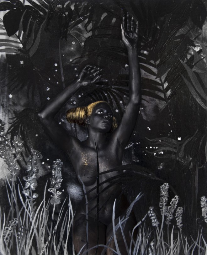
Lina Iris Viktor, Dark Continent No. XX _ A prophecy. And the scramble began . . . Acrylic, Ink, Print on Cotton Rag Paper _ 1 of 3 _ 2017, courtesy the artist and Amar Gallery, London
How does your work unite materials and methods from both contemporary and ancient art forms?
I gild with 24-karat gold, which is an ancient practice that I have modernized for my usage. I gild on a variety of substrates and materials that are not conventional within traditional gilding practices.
What do you hope people will take away from this exhibition?
I hope that it is somewhat of a visual assault, a slight overload for the senses in simple complexity. The works are very dense and the space is also limited, adding to the visual barrage. I want people to enjoy it on an aesthetic level, as well as really contemplate this theoretical concept when viewing the work. I just want them to hold that idea in their head and think about the implications. I believe anyone open enough to view my work will also be open enough to ponder this fictional dystopia. The space will be built to be one of contemplation – a black & gold chapel of sorts.
Lina Iris Viktor’s first solo UK show, Black Exodus: Act I, will be on display at the Amar Gallery in London from September 12 to October 20 amargallery.com
Tags: Feminism, Feminist art, Lina Viktor
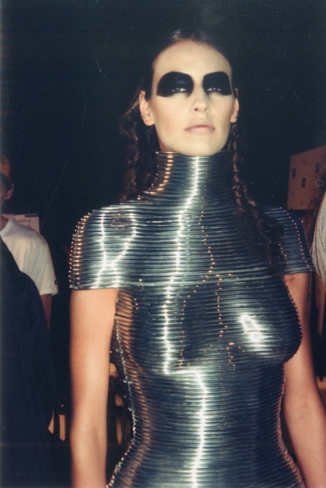
Lou Stoppard brings Fashion Together
Whether it’s designers, photographers, stylists or artists, fashion is full of dynamic creatives who come together, in pairs and in teams, to produce emotional, meaningful images. But occasionally there are partnerships that stand out and endure beyond the whirring cycle of the industry, and it is these notable and lasting collaborations that Lou Stoppard has chosen to spotlight on in her latest book, Fashion Together.
The book consists of 18 interviews between creative duos across fashion, design, photography and film. Highlights include Inez van Lamsweerde and Vinoodh Matadin’s portrait of Clint Eastwood for the New York Times Magazine (2005) and Shaun Leane for Alexander McQueen’s ‘Star’ headpiece from the Salem Collection (Autumn/Winter 2007), as well as conversations with Marc Jacobs, Rick Owens, Vivienne Westwood, Nick Knight and their creative partners. Conversations range from childhood memories to thoughts on the fashion industry, and a foreword from The Met’s Andrew Bolton provides the perfect means of entering these worlds.
Ahead of the launch of the book, Fashion Space Gallery will celebrate the collaborative spirit with a new exhibition opening this week. As an insight into the industry, and the minds behind the makers, this new book provides a warm, engaging presentation of some of fashion’s most enduring and memorable partnerships.
Fashion Together opens at London’s Fashion Space Gallery, 8th September 2017 and ‘Fashion Together: Fashion’s Most Extraordinary Duos on the Art of Collaboration’ is released on Rizzoli Press, October 17th.
Photo credit: Backstage at the Alexander McQueen ‘Black’ show, June 2004. Aluminium Coiled Corset by Shaun Leane for Alexander McQueen, The Overlook, Autumn/Winter 1999 | Courtesy of the Shaun Leane archive
Tags: Fashion, Lou Stoppard
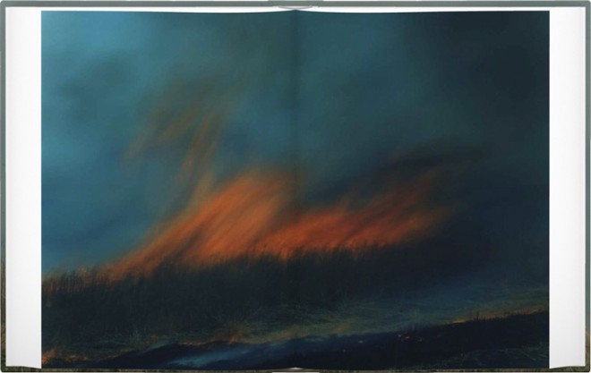
Photo books to fall in love with, from the founder of Yoffy Press
“Selecting 10 favourite photo books is a nearly impossible task, so I limited the scope to photo books I own. Each of these books represent aspects of the type of book Yoffy Press strives to publish in terms of design, innovation, and quality.” Says Jennifer Yoffy Schwartz, who founded her Atlanta-based publisher Yoffy Press. The publisher specialises in transforming photographs into bodies of art, creating a visceral and lasting celebration of creativity. We asked Jennifer to curate a selection of her favourite photo books – see her list below.
Black is the Day, Black is the Night, Amy Elkins, self-published
I tell everyone who will listen about this book. Elkins takes a subject that seems impossible to photograph – the thoughts and memories of death row inmates and the overarching capital punishment system – and brilliantly does just that. The book weaves together these images with ephemera, text, and representative objects. The design also happens to be gorgeous.
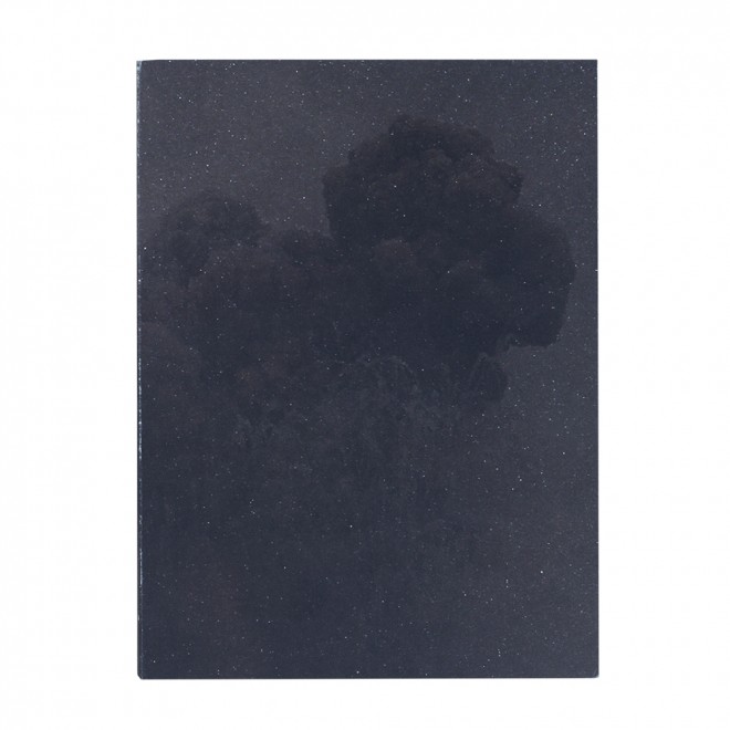
Beyond Maps and Atlases, Bertien van Manen, MACK
This book is beautiful, and fairly straight-forward from a design perspective. But looking through is immersive. It feels like a world I want to know. I am also in awe of the edit. There are several images that are imperfect, flawed. I don’t know that I would have been brave enough to include them, but they make the book sing.
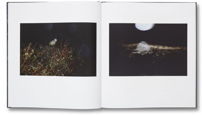
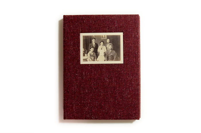
Silent Histories, Kazuma Obara, RM Verlag
I randomly came across this book in New York last spring. It appears handmade, with dozens of little treasures tucked between pages, creating an incredibly engaging viewing experience. I bought it, because at the time, Louie Palu and I were deep into concepting mode for his book, Front Towards Enemy (to be released in October). The interactive aspect of this book was something we were striving for. Coincidentally, when I met up with Louie in New York that weekend, he pulled the same book out of his bag, and said, “this is our inspiration”.
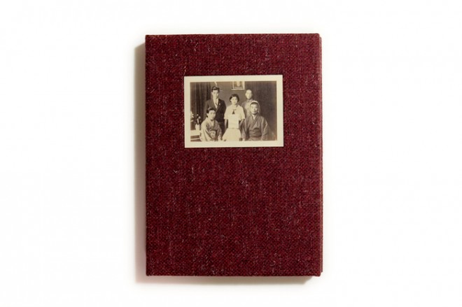
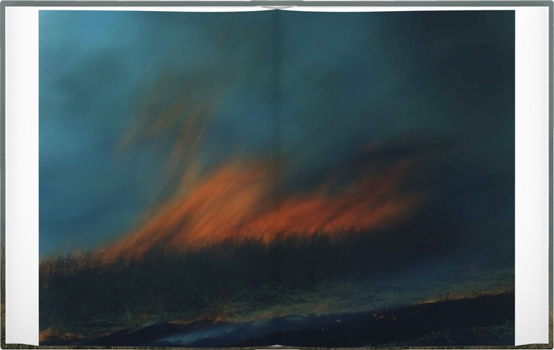
Ametsuchi, Rinko Kawauchi, Aperture
I recently bought this book off a recommendation from a friend, so I haven’t had a lot of time to spend with it yet. I bought it, because of the strong recommendation, and because I love images of fire. But the jackpot surprise is the French folds! You can peek inside to see the negative image of the photograph on the outside page. Brilliant.
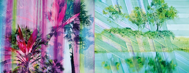
Swamp, Chloe Sells, GOST
Sells photographs in Botswana and then completes the images in the darkroom by experimenting with layers, texture, and forms to create unique works. The book captures the feeling of wildness through full-bleed images and oddly trimmed pages filled with intense color and overlapping patterns. This is a great example of what Yoffy Press strives to do – create a book that marries design to content to create a new work of art that is so much more than just a series of bound photos.
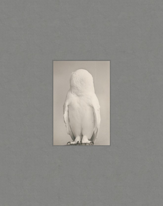
Tori, Masao Yamamoto, Radius
I adore Yamamoto, and I have a bit of a bird obsession, so it’s not surprising I love this photobook. But beyond the obvious interest, the design makes a large book feel precious, like Yamamoto’s images. Flipping through the pages feels like carefully sorting through a Box of Ku. You want to touch everything. You want to know what will come next. You want to look closely and examine every detail.
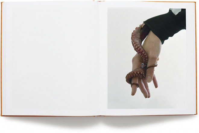
Vanilla Partner, Tørbjørn Rødland, MACK
I have a difficult time articulating why I love this book. It just feels smart and sexy and fun and a little unsettling. Looking through it feels like watching a really great movie you don’t entirely understand.
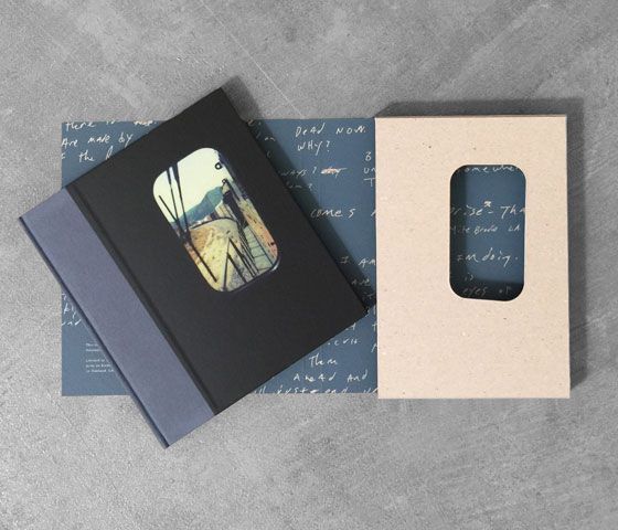
Tones of Dirt and Bone (Special Edition), Mike Brodie, Twin Palms/TBW (Special Edition)
The color palate of Brodie’s images is distinct and striking, and the book does a great job of keeping the viewer in the mood the project evokes. But the closer for me is the slipcase in the special edition. The train window cut-out? So smart.
My Last Day at Seventeen, Doug Dubois, Aperture
The integration of a comic into this book blows my mind. It tells a story that is based on true events – a story within a story. It’s like insight comes in sideways. It’s a hint of something beyond our grasp, but it’s enough information to let the viewer feel it. Then there’s that last page…
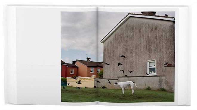
The History of Photography in Pen & Ink, Drawings by Charles Woodard, A-Jump Books
While not technically a photobook, it is a book about photographs, and it is a delight.

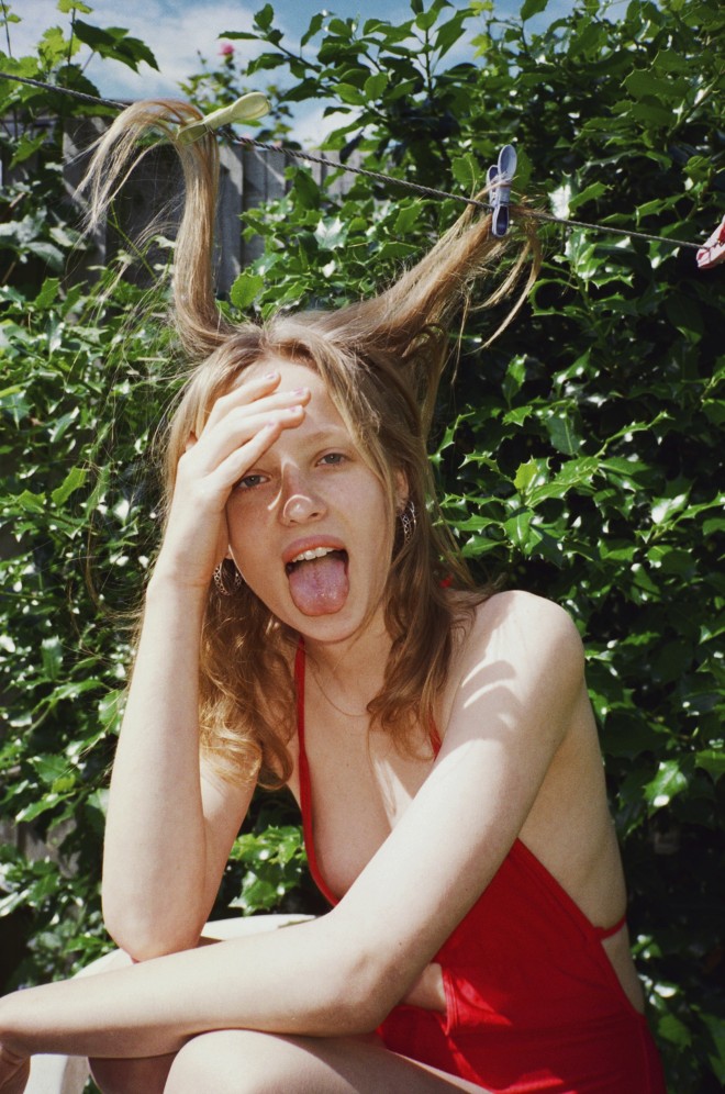
Rosaline Shahnavaz: Friendship through a Photograph
The relationship of a photographer and a model has long been documented to live beyond the flash. Love affairs, marriages, betrayals and betrothals have long been mapped out, but what about the friendship of a photographer to her subject?
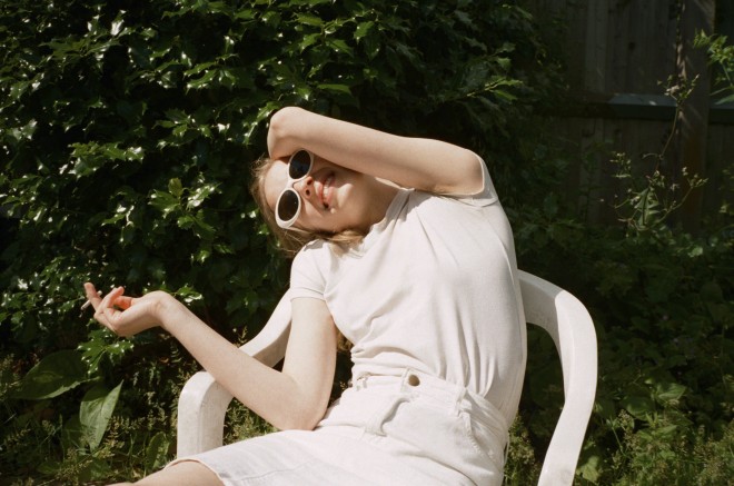
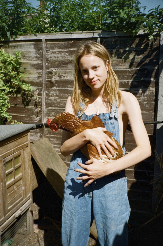
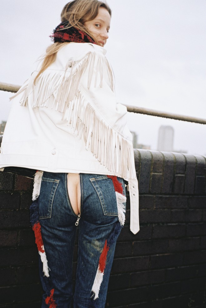
Rosaline Shahnavaz is a photographer whose work holds a unique elegance in its informality, often capturing her subjects in a limbo between self-reflection and personal expression. Her clients range from Coca-Cola to Urban Outfitters, her youth-centric approach editorially gracing the pages of i-D to ES Magazine.
The women she has photographed appear aware of their own elements, basking in a modern innocence – not so much picnics on the lawn, but more playing with their environments through a decided void of limitations and playful potential. Toothy smiles, cowboy stances, sunlight squints and legs akimbo. The women Rosaline has photographed feel like they own the frame she has caught them in: their selves and spirit bigger than their own image.
Rosaline has just published her first photo-book: an out-of-hours report with the model Fern that steps Rosaline’s photographic approach further. The result is a publication that pulls into question the relationship between the vision and the voyeur, and what happens when a friendship is formed on both sides of the camera. A lesson in capturing a two-sided relationship when only one side is visible.
Fern is the first photography book that you have released, how did the project come about?
I first met Fern after I casted her for an ad campaign I was shooting. We had this spark immediately and I loved photographing her. I kept casting her for everything when I decided to step away from fashion and spend some time photographing just her. She was thrilled and so it began. I had initiated the project however there was a role reversal and Fern would get in touch with me to shoot whenever she was in my area too. We got to know each other a lot during the process, and as our friendship bloomed the photographs did too.
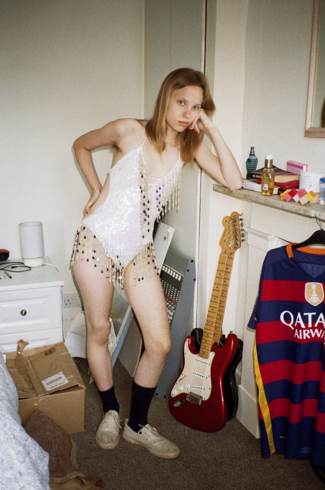
© Rosaline Shahnavaz
What sparked the idea to make this project into a book?
The photographs are really personal, and I think the tactile nature of the book suits perfectly. You physically look closer and the narrative woven into the sequencing reveals a lot about Fern and our relationship. I love the editing process, I always print out all of my images and plaster my studio with them before I start to make the book. It’s a laborious process and I’ll go away and come back to it numerous times until I’ve got it.
Why did you choose one year to document Fern?
I didn’t. I honestly think I could continue to shoot the project forever. I don’t think the book marks the end and I’d like to revisit Fern with my camera further down the line.
© Rosaline Shahnavaz
How would you describe the resulting book? A documentation, an exploration, a study?
All of the above! I’d say it’s also a celebration of femininity, friendship and coming of age.
What are your thoughts on the concept of muses? What does ‘muse’ mean to you?
I think the concept of the muse has shifted, and that’s happened with the emergence in female photographers. I am more drawn to the sensibility of a woman depicting another woman.
© Rosaline Shahnavaz
Would you consider Fern a muse to you?
She could be a muse, but I found that photographing Fern wasn’t just about her, but more about our relationship and the connection we shared as photographer and subject.
Fern was 17 when you started photographing her – do you feel the images capture Fern the young woman at a turning point in her life?
Fern was at a particularly pivotal time in her life. It doesn’t stop with age but I recall the extremity of it as a teenager. She’d described being in a limbo state between girlhood/ womanhood, her sense of home/place and the shift between education / career. Over the duration of the book we both went through changes and found solace in each other.
© Rosaline Shahnavaz
Do you feel it is important to gain a connection with the subjects you photograph?
Definitely. I first got into photography by documenting my friends like a ‘fly on the wall’. It was naive and I didn’t really have an intention. The intimacy and closeness of those relationships enabled me to photograph the way I did. This approach marked my interest and subject matter. I’d love to spend a sustained period of time getting to know and photographing all of my subjects. I never give much direction, I would rather share an experience with my subject and capture them candidly. I don’t want to take ‘perfect’ photographs, I am more compelled to the in-between moments.
Fern will be available in a selection of bookstores in New York and London from the end of August – check @rosaline_s for announcements. Fern is currently available online: http://rosalineshahnavaz.bigcartel.com/product/fern-by-rosaline-shahnavaz
Tags: Feminism, feminist photographer, feminist photography, photography, Rosaline Shahnavaz
NEW GUARD: the changing face of beauty
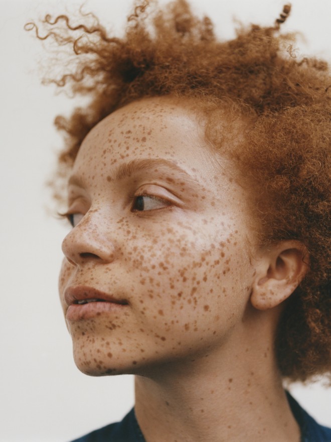
The beauty ideal has remained shamefully homogeneous in recent history, but is it fair to say there’s a new mood afoot? If current trends in fashion and beauty casting are anything to go by, there’s an unprecedented appetite for diversity in the faces that make up our visual landscape: one that better reflects the complexity and nuance of the real world, where interest and authenticity trumps perfection.
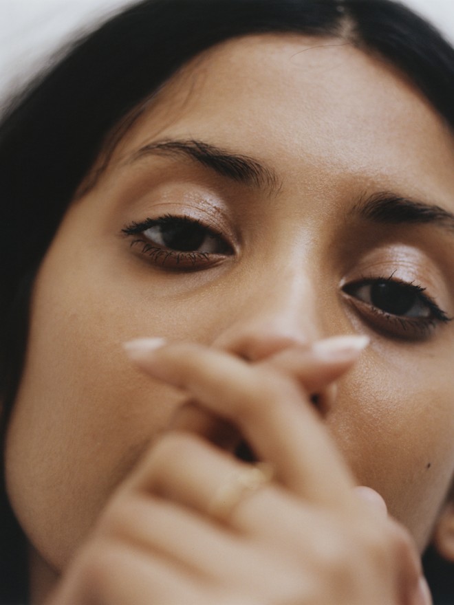
Beauty photographer Felicity Ingram captures this new mood in her work (pictured), and says a big part of the equation is in casting the right face, someone whose appeal lies more in their character than in their symmetry. She elaborates: “I got bored of clients and magazines telling me I couldn’t shoot a certain girl because they weren’t a ‘beauty’ model. Personally, I think this idea’s very dated. I’m more interested in shooting faces that I find interesting; girls with personalities that engage with the camera”.
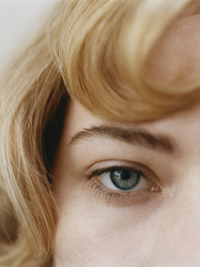
Similarly model bookers are riding the crest of this more inclusive movement, and seeing a shift in the way clients are responding to ‘unconventional’ models. As Steve Haynes, Head of Women’s New Faces & Image Division at Nevs Models explains: “2017 has definitely been a turning point for this, it’s been a bit of a domino effect. As an agent, if you don’t offer diverse talents then there’s no way of the clients booking these models, therefore how can the industry open up and grow in this area. I think once clients are presented with more unusual or alternative talent they can be enlightened and swayed into thinking outside the box. This is happening more and more as time – even the year- progresses.”
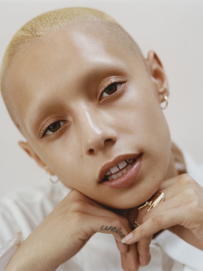
Trends in social media have given rise to street casting, which is shifting the beauty paradigm into new territories too. Model Julia from Storm (pictured) explains: “street casting and Instagram have changed the rules of the industry and the opacity of the game is diminishing. I think the more human models become, the more human we want them to be, I really hope that trajectory is stable”. Where previously it was a top-down dictatorship of the beauty ideal, now there’s a shift towards a more democratic selection process, where the people choose what they engage with and what they find beautiful; and in 2017 this certainly feels a little something like progress at the very least.
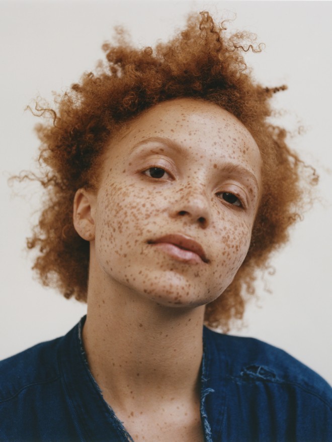
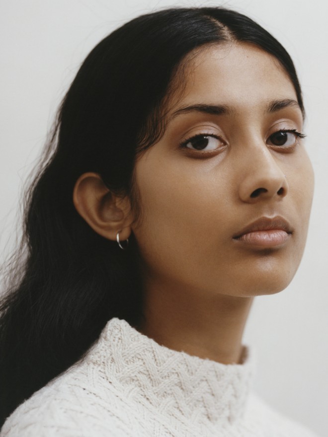
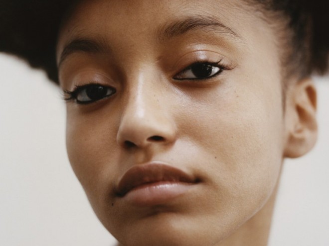
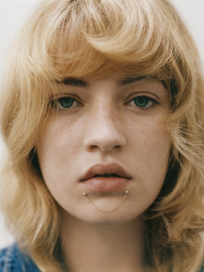
Shoot credits:
Models:
Jazzelle, Storm
Chantelle, Storm
Coral, Nevs
Razan, Storm
Julia, Storm
Makeup: Siddhartha Simone, Julian watson
Makeup: Pamela Cochrane, Bridge Artists
Hair: Anna Cofone, The Wall Group
Photography: Felicity Ingram, Visual Artists
With special Thanks to BD Images
Tags: beauty, Feminism, feminist, models
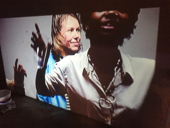
Lotte Andersen: Dance Therapy, Part III
The third and final instalment of Lotte Andersen’s project, Dance Therapy, Part III at V3 Gallery is an immersive exploration of community and the relationship we have we space and our environment.
A champion of youth and club culture, Andersen first made a major impact through ‘MAXILLA’ a cult night and zine which originated as a party for friends, and became a locus of energy for young Londoners everywhere. Since then, Lotte Andersen has enjoyed a fairly explosive career. Whether it’s Art Directing for major names such Stella McCartney x Adidas, organising panels or working on her own projects –the ability to shape, mould, capture and unleash the theatre of human existence in tandem with it actually unfolding renders Lotte a force to be reckoned with.
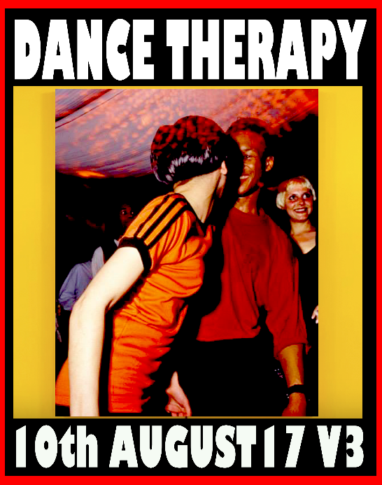
Dance Therapy, Part III is the latest instalment of a project that first began during Cairo Clarke’s curation ‘Touch Sensitive’. Catch this latest evolution until 19th August – a textured, multi-sensory experience in London that you don’t want to miss.
Tags: Lotte Andersen
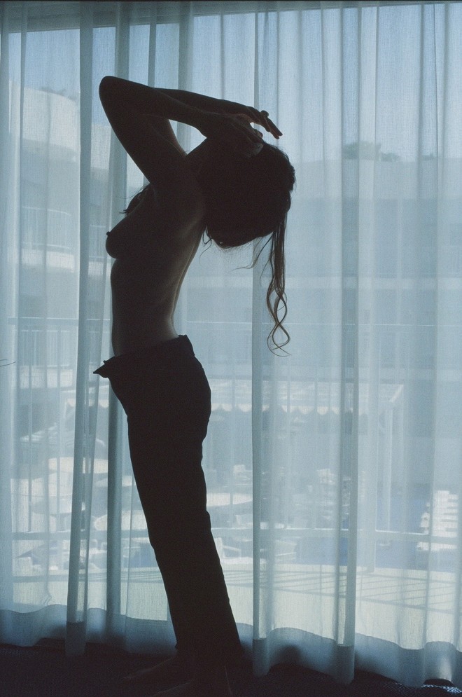
Disco Ball Soul
American photographer Emma Elizabeth Tillman comes to London this week with a new exhibition opening in Whitechapel. A long-time Twin favourite, Tillman’s portraits are intimate and watchful; her presence is always felt in the images but it doesn’t intrude.
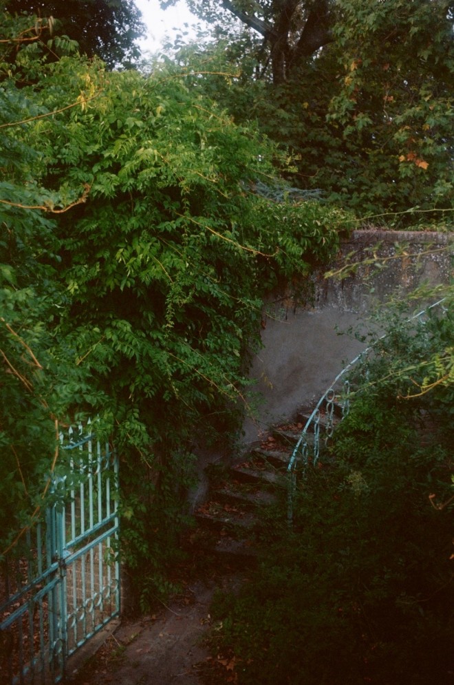
Tuscany, Italy, November 2015 © Emma Elizabeth Tillman, courtesy of the artist
From shots of sprawling nature to candid self portraits, the new exhibition and accompanying book offer an insight into her life over the last ten years with over 90 collages, as well as 14 large scale photographs. Photographs document her journeys through France, Arizona, Iceland and California; images are accompanied by diary extracts, providing in an all a memoir of an artist’s life
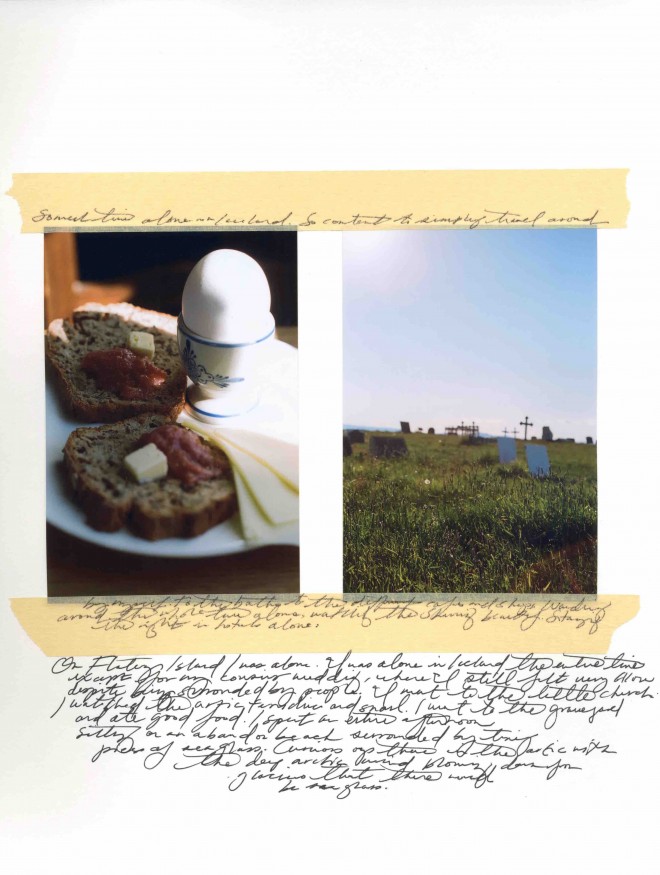
Iceland, 2010 © Emma Elizabeth Tillman, courtesy of the artist
Whether examining her own body, the forms of other women or the natural world around her, throughout Tillman’s work is a sense of working to stave off time, to build something concrete which cuts through the the waves: this new exhibition is a celebration of these moments of meaning, and sets an exciting precedent for Emma Tillman in the decade to come.
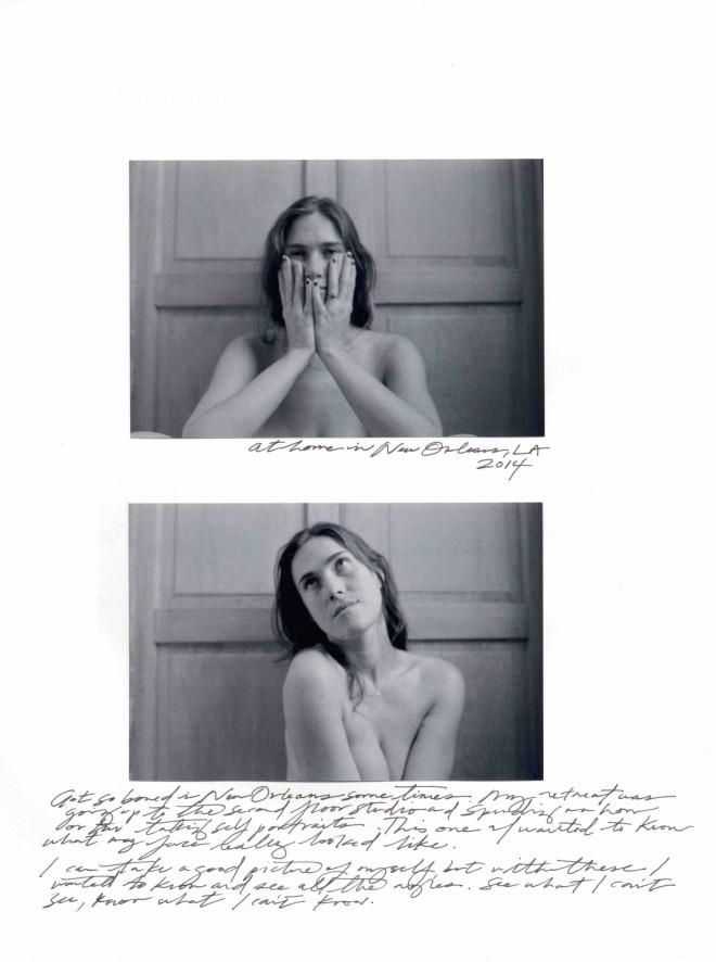
New Orleans, 2014 © Emma Elizabeth Tillman, courtesy of the artist
200 limited-edition signed copies of Disco Ball Soul, published by Dilettante Paper, will be available for purchase at the gallery.
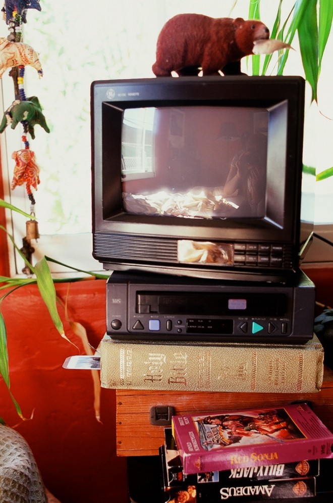
My Father’s Bedroom, 2015 © Emma Elizabeth Tillman, courtesy of the artist
Disco Ball Soul is at Gallery 46, Whitechapel 11th – 31st August 2017
Tags: emma elizabeth Tillman, Feminism, feminist, feminist photographer
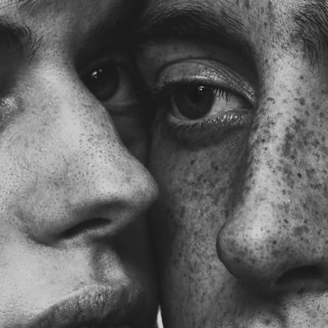
Helping People Feel Beautiful: Twin meets Sequoia Ziff
Born and raised in LA, photographer Sequoia Ziff has a magical way of merging fantasy and ultimate realness. Her photographs present human flaws in a complex light, holding in tension in a combination of vulnerability and spirit in striking, monochrome portraits. Ahead of her opening at Saatchi Gallery in London (where she is now based), Twin catches up with Sequoia to talk photography style and the magic of portraits.
How did you get started in photography and what’s your favourite camera to use?
I have known that I have wanted to be a photographer for as long as I can remember. It has always been my obsession. I worked on shoots through high school, decided not to go to college and have been living for it since. I am pretty low maintenance when it comes to gear, I found what works for me early on and have only made minor changes as my style has evolved. I have always worked with Canons, I started on film and now tend to work with the same camera for every shoot, a Canon 5d Mark 3.
Why black in white over colour?
Taste. A lot of the time, it’s just what I think looks better. It removes a sense of time and place and keeps the focus on connecting with the subject. I do love colour though….in moderation.
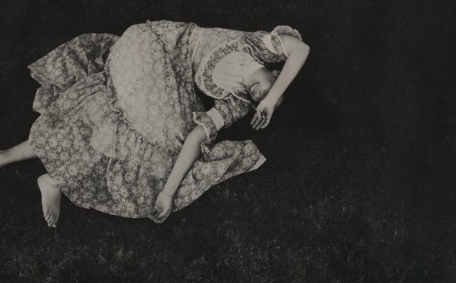
© Sequoia Ziff
Why portraiture?
I love people. Having your photo taken is a vulnerable process, and my job is to soul gaze all day long. That kind of vulnerability can be uncomfortable for people, and I enjoy helping people feel beautiful, just through the process of shooting them.
How did your style develop?
I have always been really specific in what I like aesthetically: old architecture, old movies, vintage clothes and a sense of timelessness. Anything that combines that with some haunted magical realism is always a bonus.
What is a good photograph to you?
One that makes you feel deep empathy and one that allows you to daydream.
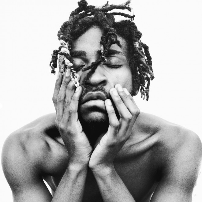
© Sequoia Ziff
Tell us about the worldwide tribe project. How did it come about?
I was the featured artist at Summit at Sea this year, the idea was to humanise the refugee crisis and dismantle the fear by bringing larger than life size portraits to the centre of the ship. I had known about the amazing work that Worldwide Tribe does and contacted them about partnering and ended up working with one of their partners on the ground in Greece documenting portraits and life in the camp. Excited that the show is coming to London next month, and will be featured at the Saatchi from August 9-31st.
Has Instagram helped or hindered the medium of photography?
Both. I think that social media is an amazing tool for photographers, and it has meant that upcoming generations are more invested and interested in photography than ever before. It’s made everyone a photographer. It means that as an artist, you are able to build a network and self promote to a much larger audience, and from anywhere in the world.
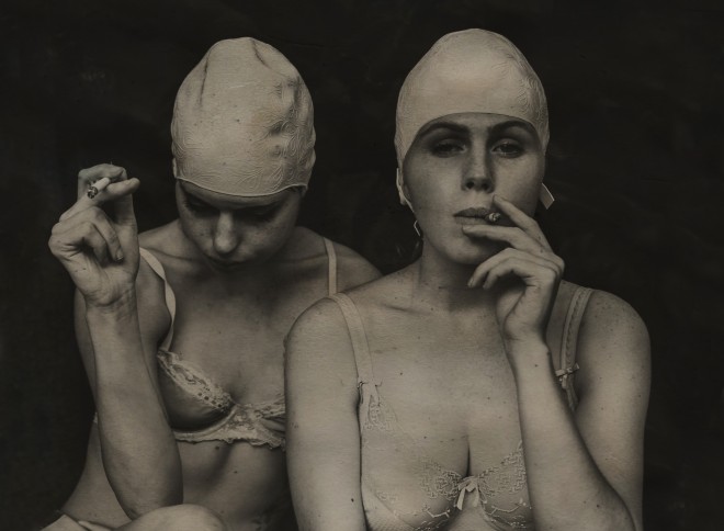
© Sequoia Ziff
As a user of social media, I’m exposed to so many awesome artists that I may not have discovered without platforms like Instagram. That being said, I think that art often doesn’t have the intended impact that it would offscreen and in person. For me, social media is more of a business tool than an artistic one and the more time that I spend off-screen, the more present, inspired, and grounded I feel.
What are your plans for the rest of 2017?
Shooting as usual. Since moving from LA to London, I have been working a lot in the music industry, so will continue to be shooting a bunch of album artwork and press shots for bands.
Worldwide Tribe exhibition is at Saatchi Gallery London, August 9th – 31st 2017
Tags: Feminism, feminism photography, feminist photographer, interview, Twin XVI
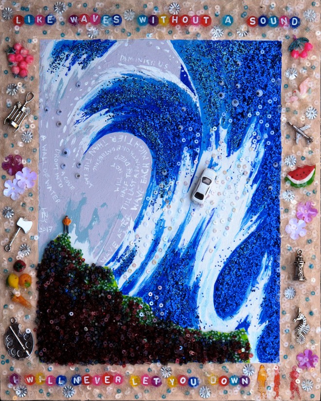
‘Our world is a riot of clashing images, sounds and smells’: Twin meets Nicholas Moore
Joy, being a post-bear bearded gay man, Greece and copious sequins: Nicholas Moore is adept at bringing great overarching themes of love and identity and intricate techniques to create artistic works that are unmistakably his; dissecting a whole into independent moments of meaning, then bringing them back together into a final finished piece. Having spent much of his life in Crete, Syros and Athens, the Greek influence is consistently evident in his work, with motifs, soft light and poignant splashes of colour pervading early oil paintings which covered landscapes as well as portraits. Although now London-based, Moore worked from Athens before and during peak times of austerity, witnessing and participating in the artistic revival of the city in spite of the economic crises in the country. The last five years have seen a widening of his approach, working with assemblage and sculpture to offer textured portraits of both individuals and pockets of feeling. As he starts planning solo shows this autumn, Twin caught up with him to discuss ByzantoJapanese Pop, celebrating gay and trans culture and perceptions of masculinity in 2017.
Your work focusses on mythology and also on portraits of people, I’m interested in how you perceive the relationship between the two – do you find that the two feed and influence each other?
Mythology has been an obsession with me since childhood and it is the core to a lot of what I do. There are times where I make obvious allusions to various stories and myths and others where it informs the work subconsciously as it has been part of my life for so long. I also have a huge comic book collection dating back to the 30s. These are modern Myths, their continuing success shows us how important such stories are to us.
The figure is an important part of my work however I am hesitant to use the word portraiture as it conjures up a certain type of work that I don’t aspire too. My work is most definitely representative and I’m commissioned to make portraits, however my work is as much interested in portraying, ideas, stories and myths, as much as character and appearance. When I make a portrait of someone, I surround them with objects relating to them and their life. There will be texts, either quotes from favourite songs etc or a stream of conscious memories and associations I have about them. Sometimes in the bigger works I will also have texts directly relating to mythology.
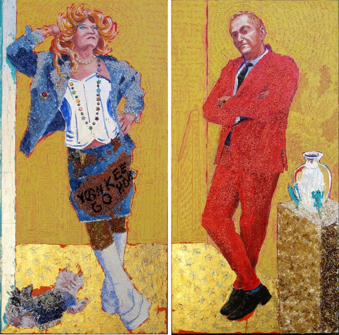
‘Stanley’, 2014 © Nicholas Moore
In this context I’m especially interested in how you depict the male body using mythological motifs. Do you feel that perceptions of masculinity have changed in recent times?
These things shift back and forth: just as you think things are all cool and dandy, someone calls you a poof on the streets – I didn’t expect that in 2017 ! Fluid sexuality, gay marriage, tolerance – all these other good things threaten those poor beleaguered straight men, so they fight back. Maybe in Europe and parts of America these perceptions have become more fragmented, and yet each of those fragments have a longer staying power than they once had. There are lots of different tribes in the gay community, I tend to get shunted into the ‘Bear’ community just by virtue of my beard. I am neither particularly fat nor hairy. It’s ridiculous, I’m Post-Bear! I would say the young (and the young at heart) care less about such things.
For your portraits, you often often focus on couples and dualities within one person. What is it about relationships that interests you as a subject?
I think it is more about the contrast between the two that interests me. I don’t paint these couples on the same panel, each individual has his own space, they then play against the other. The Stanley portrait being a good example of that. On one panel is his more serious business side versus his more playful ‘Hedwig’ role. I hosted a talk in a community collage in NYC about this painting. It was amusing to hear the students coming up with all these stories about who they thought he was. A few students got very involved in imagining his troubled life in the corporate world, and how he would find a release cross dressing at night – I hated to break it to them that, he was in fact a very happy guy, a Mexican silver dealer who just had a large sense of fun and a tad provocative. Who’s to say which version is the truth.
In recent years your focus has moved towards assemblage. What was it about the medium that interested you?
I had made small works using that medium in the 80s, but it wasn’t until my show in Athens in 2008 that I really started showing any. I had seen in the Topkapi museum an Ottoman miniature that was stuck on a page with seemingly random images surrounding it. I liked that, to my uneducated eyes, I could see no connection between the images. At the same time I had my first computer and the overlaying windows of different programs always fascinated me – how more and more disparate images were somehow ok within that context: the screen fixing the random images into one whole.
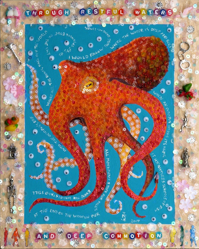
Last year I started to make images that were surrounded by borders that have charms, flowers, alphabet beads, etc. in them. This allows me to join disparate images together as if they were part of one of those cross-stitched samplers children used to make. I can then make larger images, sort of portraits of a person, from lots of seemingly disparate parts. In my series “The Last Lighthouse Keeper” the figure is broken into symbols: a leg is an octopus, an arm is a ray gun, and so on. Our world is not some marvellous minimalist construct but a riot of clashing images sounds and smells.
What are your favourite materials to work with? Do items assume significance once placed within the content of the portrait, or is it because they have significance that you choose them?
I still love working with paint but enjoy combining the different textures of paint, beads, sequins etc., layering different types of colour on top of each other. When I do someone’s portrait I ask them some set questions to get some ideas as to objects I could add, texts I could use, colour. This then governs what materials and objects I choose. In general I am fascinated with the power of objects and the personal history we attach to them. Also the cultural importance objects gain over time.
A previous interview classified your work as ‘Pop art’ – is that a label you feel represents what you do?
I feel ByzantoJapanese Pop is best.
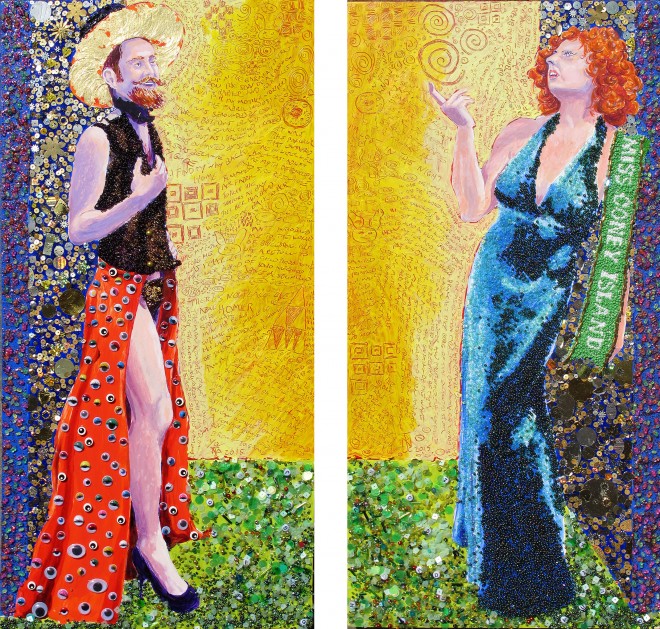
Matt and Lucy, 2015 © Nicholas Moore
More generally speaking, who and what are you influenced by?
Music, Mythology, Matisse, Sex, Humour, Colour and most of all Joy.
You spent a lot of time in Greece over the years, and that’s very present in your work. How would you describe the art scene in Athens at the moment?
Blossoming in adversity: I love Athens. Like everywhere else it’s hard for artists to survive financially. However it’s cheaper than a lot of places to live and work in, assuming of course you are not trying to live off a Greek income. There is the gallery scene which, though abundant, is again like elsewhere – struggling with sales. There is a huge street art scene and a strong sense of political struggle in a lot of the work.
What’s in store for the rest of 2017?
I was just in an exhibition at the Stash GalleryVout-O-Renee’s to raise funds for survivors of Grenfell fire, which has a strong resonance for me as I lost my Mother in a hotel fire. In September I’ll be showing at the Mykonos Biennale and later in September I’m part of a group show in Amherst Massachusetts America. Then I’ll be focussing on upcoming solo shows in Athens and New York.
Nicholas Moore will be on show at the Mykonos Biennale, from 1st September and at Hampden Gallery, Massachusetts from September 10th.
Tags: artist, london, nicholas moore
Skate it up, shake it off
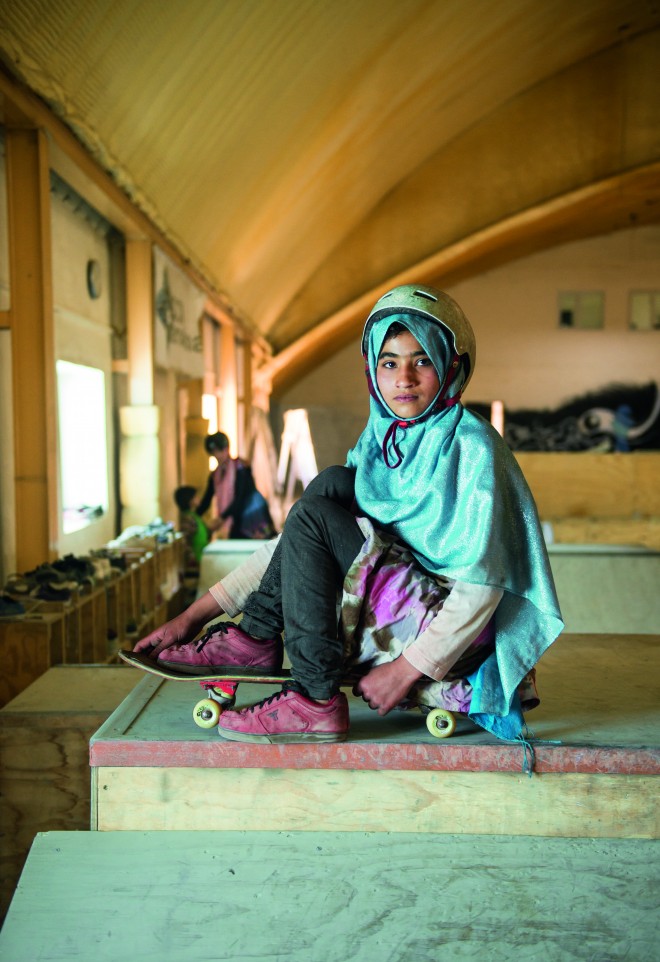
Girls who skate are achingly cool, as Twin knows – we profiled all-girl skate culture for issue XV. There’s something about the carefree, rebellious attitude that’s served with clothes to match that has always rendered ladies on the board an olly or two above the rest. But they’re even cooler when the skaters are girls from Kabul, and their portraits are currently on display in a new exhibition in Qatar – a famously conservative country.
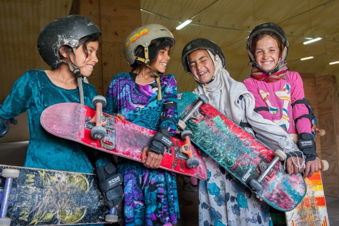
Skate Girls of Kabul | © Jessica Fulford-Dobson
Shot by photographer Jessica Fulford-Dobson, the series celebrates the energy and fearless spirit of a group of Afghan skater girls. Full of vivacious energy and bold attitude, the work won 2nd prize in the highly coveted Taylor Wessing Portrait Prize in 2014, and was named IPA’s Best of Show Exhibition 2015.
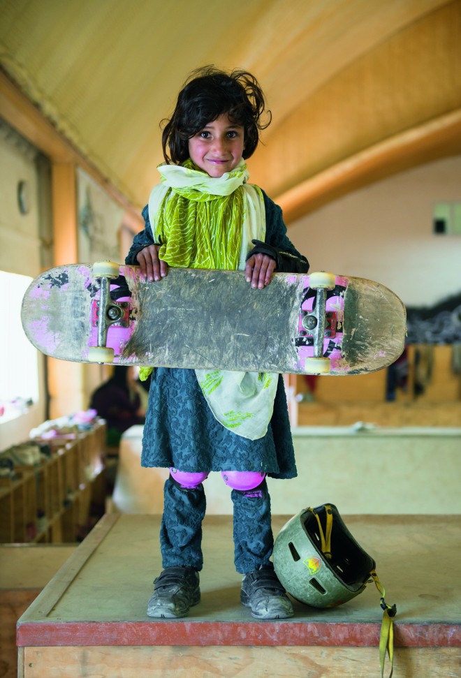
Skate Girls of Kabul | © Jessica Fulford-Dobson
The series came about through Skateistan, an Afghan charity that provides skate parks as a hook to get children from disadvantaged families back into the educational system. A few years later, Skate Girls of Kabul remains as compelling a series as ever– we only wish we could kick flip it with the best of them.
Skate Girls of Kabul at QM Gallery Katara in Doha from 20 July to 21 October 2017
Tags: Feminism, skate girls of Kabul
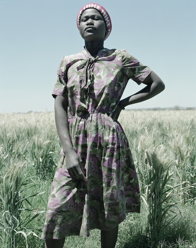
Jackie Nickerson: On Portraiture
Portraiture has the power to envelop a subject, and the ability to absorb the viewer through one mesmerising shot. The quiet poignancy of the work of Jackie Nickerson aligns these two traits, her photography exploring the spatial relationships of faces to places and expressing the interaction of identity with function and form. Speaking to Twin, Jackie discusses ownership, collaboration and female representation.
What does identity mean to you and how do you try to explore this in your imagery?
Identity is quite a dangerous word. It’s used to create an otherness but I don’t look for otherness – I just look at the person. I want to see the ‘personness’, not the box they fit into. In fact, I want to break them out of the box they’ve been put into. So you are not merely looking at the likeness of someone. I guess for me it’s about having a uniqueness, a selfhood, and a self-possession that transcends the intervention of the artist. In effect, it’s about making the artist invisible and having the sitter take ownership of their own image.
You discuss your work as portraiture: what do you believe a portrait should present to the viewer?
A great portrait should stop you in your tracks and have you spellbound – like a deer in headlights. It should ask all kinds of questions.
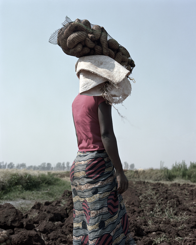
‘Ruth, 2012’ © Jackie Nickerson. Courtesy the artist and Jack Shainman Gallery, New York
Do you have the same desires for the outcome of your personal and commissioned fashion-orientated work?
Fine art and fashion are two totally different applications of photography, so although you’re using the same medium you need to use an entirely different approach. In fashion you have an end use, a specific use and you’re collaborating with a team of people to create this. In fine art you’re working on your own and trying to ask questions.
In your conversation with Brendan Rooney for the UNIFORM exhibition catalogue, you discussed the issues of photographers in art today: they seek inspiration from the real world yet don’t feel comfortable using the real world itself. What role do you think reality has to play in commissioned fashion editorial?
I think we all look for inspiration from things outside our immediate practice so for example a designer might look at architecture or industrial design, painting, sculpture and other art forms. But often they’re not looking for a literal translation of one thing to another, but a kind of wider context of an aesthetic or opinion. So in collaborations we can build up an impression or atmosphere that will help the designer to portray his or her vision. So for me, each collaboration is a separate conversation and working out how we can make images that respect that, and although you need to use an entirely different approach, (we’re talking about two totally different applications of photography) it would be difficult to separate the artist because I think about imagery all the time. I’m obsessed. Its just part of my everyday life.
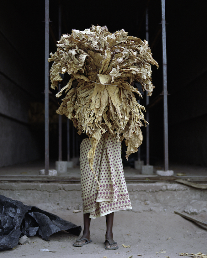
‘Catherine, 2013’ © Jackie Nickerson. Courtesy the artist and Jack Shainman Gallery, New York
What are your views on the representation of females in fashion photography today?
I recently bought a couple of vintage Vogues from the 1950s and apart from the clothes, and apart from a stylistic difference, I don’t think the imagery has, in essence, moved on because
you know we are looking at a commercial application and there’s obviously a formula that works. Saying that, in those old Vogues, there was only one way for a woman to be. Now there’s much wider representation of different types of women and lifestyles. I think the attitude and personality of the model is becoming more important and we are seeing a broader definition of beauty.
Do you hold a particular affinity to the women you photograph?
It depends on who I’m photographing and what I’m photographing them for.
Can the female gaze be reciprocal? Is that the most important link between the female photographer to her subject?
I don’t think of myself as a female photographer. I’m just me.
Communication is the key. When I photograph women I want to show the strength in them. I’m not interested in models flirting with the camera. I really hate that shit.
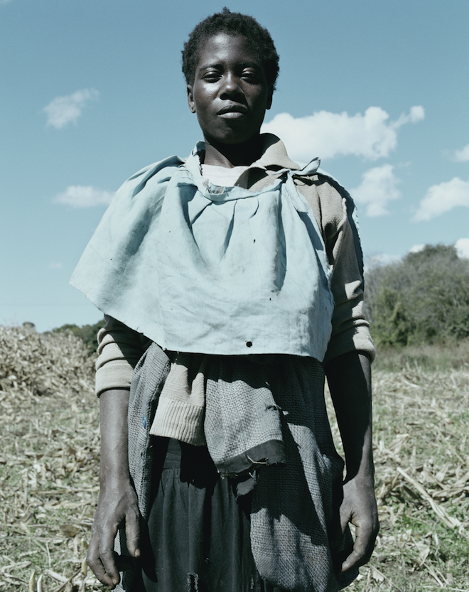
‘Monica 1997’ © Jackie Nickerson. Courtesy the artist and Jack Shainman Gallery, New York
What photographers do you admire, and what traits do you admire about them?
Well there are loads of them but a couple would be Dorothea Lange, Lee Miller, Joseph Koudelka, Cindy Sherman, I love these photographers primarily because they are great photographers but I love them because they all had something to overcome – Lee Miller, Dorothea Lange, Cindy Sherman – women in a man’s world, Koudelka – Czechoslovakia in ’68.
Featured image: ‘Chipo, 1997’ © Jackie Nickerson. Courtesy the artist and Jack Shainman Gallery, New York
Tags: Feminism, Feminism and art, feminist magazine, Jackie Nickerson interview, Twin issue XVI, Twin magazine interview
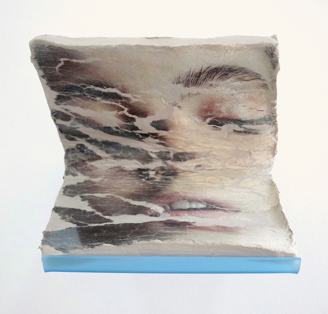
FACIAL RECOGNITION: A two-woman show
Dealing in themes of feminine representation in the media and the body at large, ‘Facial Recognition’ takes the work of two celebrated British-born artists and turns it into a striking visual dialogue. Images from glossy media form the basis of Melissa Jordan and Eve Ackroyd’s work; subjects are warped and reimagined, transported into otherworldly places, where the traditional figurative is given a new freedom of form.
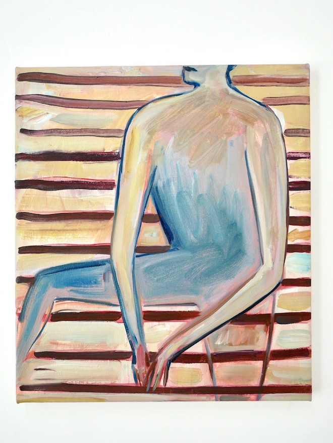
‘Slats’, Eve Ackroyd
Jordan’s work features process-led clay sculptures, Ackroyd is solely a painter; and while in execution their work is very different, the thematic undercurrents and inherent symbolism of their subjects live intuitively in quite a similar space. The artists explain: ‘Trapped in a state of conflict between the visual narratives of their new world and the expressive postures of their past, these paintings and sculptures exist in a remote place, caught in expressions of restlessness and desire’.
The show runs from July 14-22, by appointment at Convoy Projects.
Convoyprojects.com
Main image: ‘Interface 26’, Melissa Jordan
Tags: Art, convoy projects, Eve Ackroyd, exhibition, facial recognition, Melissa Jordan
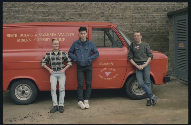
Love Happens Here: celebrating the 50th anniversary of the decriminalization of homosexuality
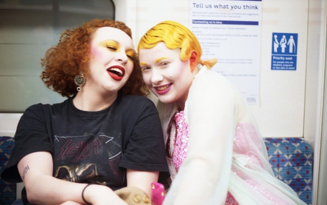
‘Love Happens Here’ is a commemorative exhibition that celebrates the historic struggle of the LBGTIQI movement. Presented by The Photographer’s Gallery off-site at City Hall, the exhibition displays a range of visual perspectives from London’s LBGTIQI community.
Constructed to mark the 50th anniversary of the decriminalisation of homosexuality in England and Wales, ‘Love Happens Here’ tracks the progression towards equality for the LBGTIQI community, since the milestone legislation was first introduced in 1967.

Emily Rose England, Inside London’s Enduring Queer Club Scene, 2016 | © Emily Rose England. Courtesy the artist
Included in the exhibition are works by prolific arts editor Ian David Baker, who worked for several gay magazines in the 1980s, and who documents early Pride parades through his black and white photographs. Reggie Blennerhassett provides intimate snapshots from the Greater London Council’s Lesbian and Gay Centre, allowing a candid insight into the Labour funded space, which was founded in 1984. Emily Rose England, who is both a photographer and an organiser for club night Sassitude, explores the currency of London’s vibrant clubbing scene.

Ian David Baker, Pride, 1980 | © Ian David Baker. Courtesy the artist
Curated by Karen McQuaid for London Mayor Sadiq Khan, every aspect of the exhibition has been designed to reflect the work of the LBGTIQI community. This includes the font, which is appropriately Gilbert, and commemorates Gilbert Baker, the artist, gay rights activist and designer of the iconic rainbow flag in 1978. Gilbert passed away earlier this year, and the font was created in his honour.
Emily Rose England, Inside London’s Enduring Queer Club Scene, 2016 | © Emily Rose England. Courtesy the artist
Other works on display are portraits by Anthony Luvera, Kate Elliott and Tania Olive, who each address gender, sexual identity and global politics through their studies of Londoners from the LGBTIQI community.
‘Love Happens Here’ will be on display at City Hall until 28th July.
(Title image credit: Reggie Blennerhassett, Outside London Lesbian and Gay Centre, early 1980s | © Reggie Blennerhassett. Courtesy the artist)
Forging solidarity in Anita Corbin’s ‘Visible Girls: Revisited’
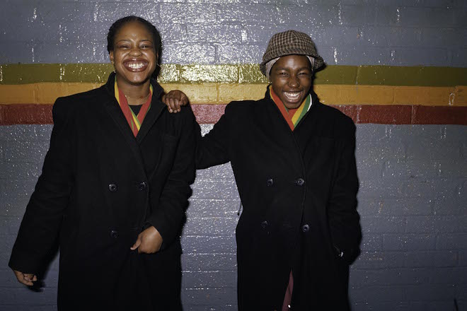
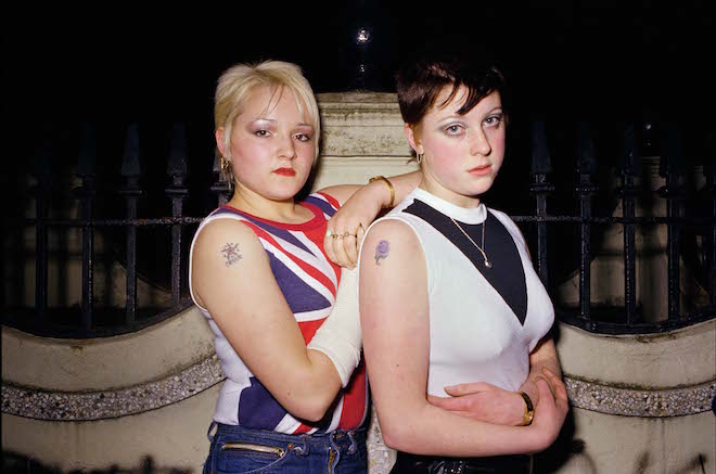
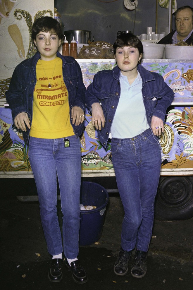
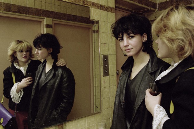
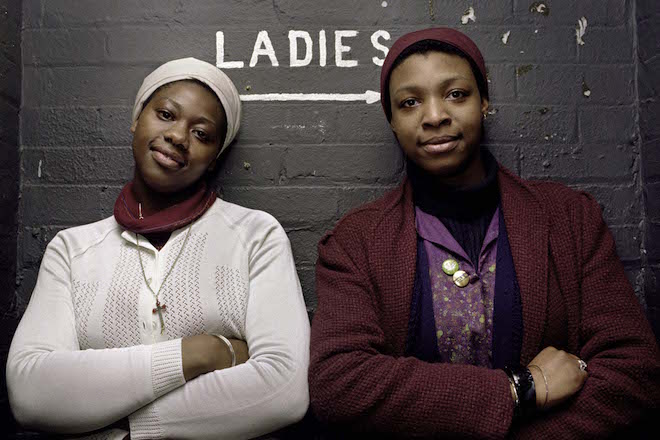
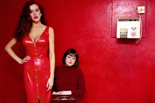
In the early 1980’s 22 year old photographer Anita Corbin captured the lives of women from different subcultures in the UK. Photographed mainly in London, the project documented the power of female friendship and individuality, offering candid portraits of their everyday lives. From mods to new romantics, rockabillies to punks, Corbin (who was just starting her career at the time) told the story of these women in their natural habitats, whether that was at friends house’s or social centres.
The project was called ‘Visible Girls‘ and Corbin’s 28 images toured the UK throughout the 1980’s and 1990’s, garnering acclaim both for her subject matter and for her photography style, which saw her shoot in slow film and with a portable flash.
21.tif
36 years later, Anita decided to find the women and offer a new series that centred on who the women have become. Having tracked down over 70% of those she photographed, Visible Girls:Revisited is a radical and vital examination of age and identity; an exhibition which allows individual spirit to transcend time.
The original portraits will be showcased alongside the new series, and audiences can also listen to original tape recordings from interviews in 1981.
© Anita Corbin
“This exhibition is not only about the powerful bond between women united by subculture, belief and friendship, but about the potential of women coming together across generations.” Says Anita, reflecting on the forthcoming exhibition. “Visible Girls: Revisited, allows the ‘visibility’ of youth to shine a light on the often-disregarded wisdom of the older woman, revealing a unique, cross-generational tribe with the power to provoke and inspire.”
© Anita Corbin
Launching in Hull, the exhibition will tour Norwich, Exeter and Bristol, with other spots to be announced soon. In an age where so much emphasis is placed on the power of a fleeting selfie, this tribute to female friendship, culture and style across decades is, kind of ironically giving the time lapse, offers a fresh approach to how women are depicted today.
“This is an exhibition where mothers and daughters will find mutually provocative ground through which to forge a rare solidarity” adds Anita. “At this point in our history we need [that] more than ever.”
© Anita Corbin
Anita Corbin ‘Visible Women: Revisited’ runs 7th July 2017 – 8th October 2018.
© Anita Corbin
Tags: feminist artist, feminsm, Twin issue XVI
Reserve and check in: Nobu Hotel Shoreditch is London’s hottest new haunt
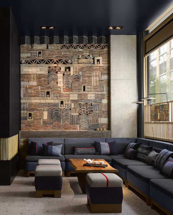
Escape the worst of London and embrace what it does best with a stay at the new Nobu Hotel in Shoreditch. Following on from openings in Miami, Manilla and Las Vegas, Nobu’s new opening in London is a welcome addition to the cultural scene.
With modernist exteriors and minimal interiors, the design reflects the creative prowess of East London; the hotel’s facade offers an interplay of colour, reflection and light, while inside Japanese influences take the fore.
Nobu Hotel Shoreditch | photos by Will Pryce
Offering 150 bedrooms and the latest Nobu restaurant, Nobu Hotel Shoreditch marries a casual atmosphere with captivating aesthetics, making it a wholly Instagrammable and über trendy place to head to this summer. Alongside dreamy rooms and suits, there’ll also be events throughout the year. It’s time to check it out, and check yourself in.
Tags: cultural hotels, hotels london

Gurls Talk x Coach Festival
Conversation-changing platform Gurls Talk and Coach have partnered up for powerful new festival, coming to London at the beginning of July. Throughout the day, the event will celebrate women in all their many and majestic facets, with the likes of Hari Nef, New Statesman columnist and fierce activist Laurie Penny and US Vogue contributor and relationship expert Karley Sciortino all joining to fuel debate and discussion around gender.
The event kicks off with a speech from Gurls Talk founder Adowa Aboah, who started the platform as a means of encouraging girls to speak more openly around issues of mental health and identity. Her ongoing commitment to activism has seen Gurls Talk grow into a formidable and vital organisation, offering a much needed space for young women to receive support and mentoring.
There will also be choreography classes from Wayne McGregor and a library by Claire de Rouen – and best of all, it’s free.
Gurls Talk x Coach Festival will take place 1st July, 12 – 6 pm at 180 The Strand, London
Tags: Gurls Talk
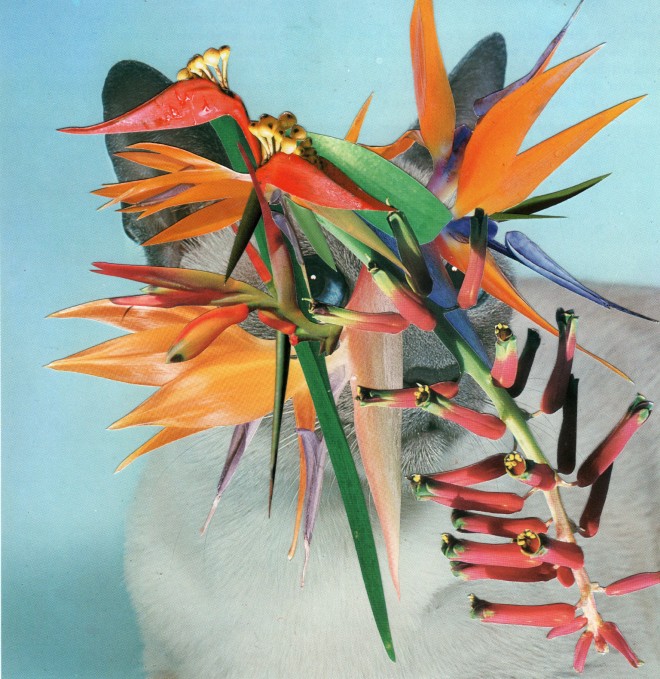
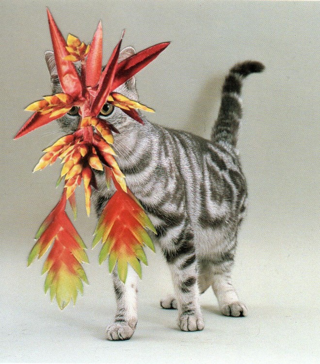
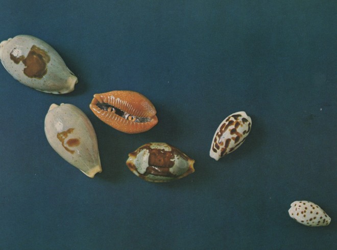
Cats & Plants
As simple as the title suggests, this new book from independent publishing house Zioxla is all of the internet clichés repackaged into something new, fun and fresh.
Featuring the work of Chicago-based artist Stephen Eichhorn, the book is a playful ode to one of the most familiar images in contemporary culture. There’s always something interesting about bringing Internet trends offline, and Eichhorn’s work offers a meta-read of what cats have come to stand for, taking what’s familiar and transforming it into something surprising.
While plants have been a constant recurrence in Eichhorn’s work, when he began working on this latest series of collages he decided to pursue images and references from niche publications only. This led to discovering and using images from publications such as Japanese cactus guide books and abstracted parts of Orchids.
Having started the project back in 2009, the 200-page tome is the culmination of years of work, with the honed, stylised graphic quality that has defined other work reflected here too. Cats eyes jump out of shells, blend with cacti and peek from behind coniferous leaves. Its’s funny, light-hearted and smart; we predict ‘Cats & Plants‘ will be your new obsession this summer.


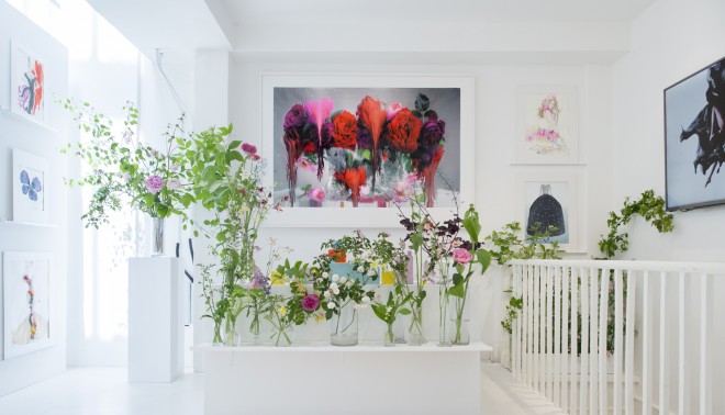
Fashion Flora at SHOWstudio
In their latest exhibition, SHOWstudio offers a botanical paradise in which fashion illustrators and flowers combine for a refreshing presentation.
The exhibition brings together an array of works by renowned names including Alexander McQueen, Dries Van Noten and John Galliano. Curated by Flora Starkey, the best seasonal British flowers combine with these works, and films from SHOWstudio’s 17-year archive, to create a summery, fresh space in which audiences can explore the long-standing relationship between fashion and flowers.
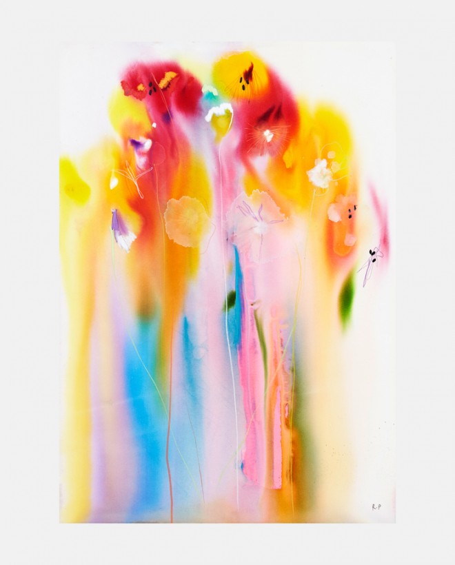
“Flowers have always been a huge influence and inspiration in the art of fashion design as well as a recurring theme throughout my own work.” Commented Nick Knight. “It is with great pleasure that I can announce the latest exhibition at the SHOWstudio Fashion Illustration gallery, ‘Fashion Flora’. The exhibition presents an explorative look at the use of flowers as a motif in fashion throughout the decades, as seen by 40 of the world’s preeminent contemporary fashion illustrators. Curated by Flora Starkey, who is one of the most exciting floral designers working today, the exhibition will also feature Flora’s beautiful flower arrangements.”
Fashion Flora is open at SHOWstudio now.
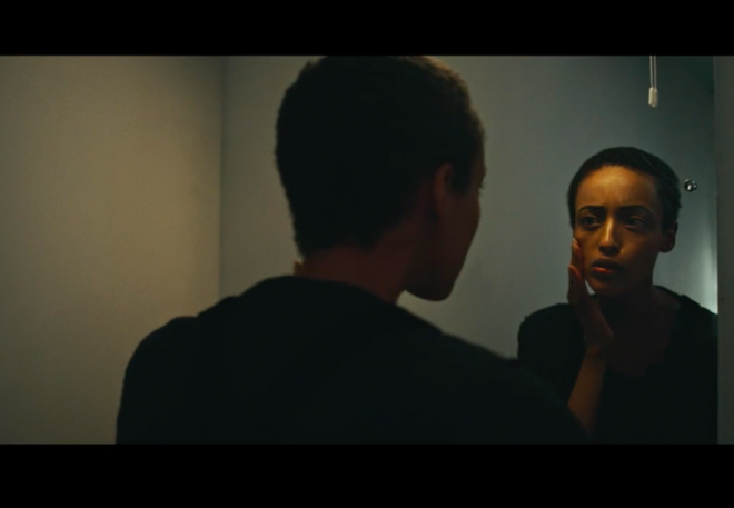
Politics, fashion, feminism and everything in-between: Twin meets Jade Jackman
Female filmmaker Jade Jackman and I speak over Skype, from her apartment in Madrid – a city which she has just moved to as a result of what she refers to as “the monumental cost of living in London” and of course, Brexit. She’s recently returned from Afghanistan where she was teaching film to Afghan women reporters so they could tell their own stories and also released a short creative documentary on Yarl’s Wood – a women’s detention centre in the UK – earlier this year. Not only this but Jackman is also spearheading a project named ‘Eye Want Change’, teaching young people how to make documentaries about issues that matter to them using just their smartphones. Needless to say she is one smart, endlessly creative and inspiring woman who Twin have been eager to speak with for some time now. Jade and I Skype-d for over an hour, from East London to Madrid about protests, politics, fashion, feminism and everything in-between.
As a woman, why do you feel like it’s important to support other women in the creative industries?
It’s incredibly important — someone doing well doesn’t mean you are going to do badly. I think there needs to be more of a conscious effort for women to support other women. It is starting to happen slowly… I think it’s about getting different voices out there. One thing that’s been amazing about the digital age / internet is that women have been able to get their voices out there talking about what is important to them. It’s about making sure our voices and the way we’re presenting ourselves is seen as legitimate. I think it’s a really exciting time because we’ve got more ways to put our opinion across than ever… I guess we’ve got to wait and see with this kind of movement whether millennials (or whatever people like to call us) will pierce the glass ceiling.
Hopefully!
I think so, I think it’s unstoppable!
How have you found being a female filmmaker? How has it impacted your journey?
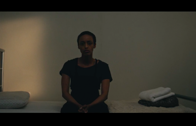
I’d say for me personally it has informed what I want to talk about more than having had a negative impact career wise. I think it’s taught me or shown me the things I’m interested in. In some ways as well being a woman isn’t always negative — like I wouldn’t have been able to make the film about Yarl’s Wood in the way that I made it if I was a man, and I wouldn’t have got so close to women in Afghanistan if I had been a man. There are lots of positives I think to being a woman, it’s just making sure your ideas don’t get sidelined or focus with a soft or feminine angle all the time. But then sometimes that’s what I’m interested in; I am interested in working with women and with some of the topics I do cover it is to give a different perspective, like a gender perspective because I think it’s necessary.
I remember when I first heard about Yarl’s Wood and what happened there I was horrified and felt powerless. How did this film come about?
I studied law at LSE at university and wanted to be a lawyer originally. It was around the time of the legal aid cuts and I wanted to use my law experience to help in some way. So during that I was planning a dossier of sexual abuse cases that were happening in Yarl’s Wood – women reporting cases of sexual assault from the guards. At the time I was quite young, I was nineteen, I hadn’t really thought about being a filmmaker then I wasn’t quite sure how to put that into film. Then I started to think about it more and more. In one of the interviews a woman calls them the invisible women and I guess I had an urge to put some visibility on them and make these women really visible as women — that’s how it started. As you can imagine trying to make a film somewhere you can’t film where video recording is illegal is almost impossible. I got a grant from Sheffield Documentary Festival in 2015 and that then I cut down on all these four hour phone conversations I’d had with women detained there and that’s how I started thinking about it. I was aware that I wanted it to look quite different visually to most documentaries. I think its because for the past two years I’ve been seeing a lot in lots of newspapers where I’ve felt really bombarded with the imagery of what refugees drowning look like and all these images of people in Calais and refugee camps are really important and valuable in some way but for me it didn’t feel real: it was like showing people in their lowest state ever and I felt like those images were almost so bad that we couldn’t associate with them. In my background I’m really influenced by music videos and fashion films and art films and I think today we are so used to seeing high quality video content and I think people are fed up of getting information from conventional news sources… it’s important to speak to people in a visually different way. If you think of Trump and Brexit the old ways of telling people information are not working, they’re failing to engage people…
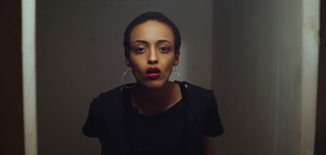
I think that gives more scope for finding something in the work to connect to, which makes resonate more and have more value. Let’s talk a bit about Great Women Artists the Instagram account that champions female artists on the social media platform, how did you get involved with them?
I’m always looking to work with women who are doing something they are passionate about. I think it makes for interesting projects and collaborations. I got in contact with them and they were saying they were doing a collaboration for International Women’s Day and I was like okay cool let’s do a video for that and explain why what you are doing is connected. Talking about this mass produced culture and imagery of women that isn’t by or for women. We couldn’t actually say we didn’t see images of women — we do, women are used to sell pretty much everything but in the same way that there’s lots of clothes and lots of brands being sold to us all the time, but those things aren’t the same, they want to collaborate with female artists because they are creating something unique by hand, more genuine imagery of something that is made by a female. That’s what got my interest. I think that I liked that they chose Frida Kahlo and Louise Bougeois who were open about being crazy and not being these ‘respectable’ women. I really admired that because there’s a certain image of a woman we have to aspire to or look to be like…That’s why I was keen to get involved with them. I really like they are planning to work with other young female artists to come. It’s out of a conventional gallery setting it’s really clever.
Definitely, and if you consider that Instagram is a platform where a lot more art is shared and consumed now, you’re more likely to see work on Instagram even if it is in galleries. You go to a lot of protests, what’s your opinion on protesting?
I am interested in politics as I’m a documentary filmmaker and I want my work to talk about things that I care about — that’s the most important thing to me. For example the next thing I want to make a documentary about is gender based violence and sexual assault. Even if I am taking a more creative approach to them I really want to talk about these issues. So, I guess protests if it is something that you’re interested in are something visual and political protests are a natural thing to end up covering because they’re energetic and visual and they also need to be documented — especially now in the digital age. A lot of what goes on online is shared through social media — a lot of the imagery we see is coming through social media of being at the protest. The kind of people you are protesting against probably aren’t going to be at the protest so someone needs to be documenting it… I guess that’s something I enjoy. Also it’s a great way for people to get together from all sorts of different places and feel connected to each other and to causes they care about.
I think too it’s important to feel heard, to have a belief that you have rights and that bleeds into the rest of your life and how you approach that what’s happening in the world.
I think what I find most important is the protests they do outside Yarl’s Wood. What’s great about a protest is the power people make. You can’t really hide from it because here are people there.
You studied Law, how did you then move from Law into documentary and filmmaking….
I studied anthropology with it and I think I always wanted to be a documentary maker but I didn’t know how because I didn’t want to make TV documentaries… so, I wasn’t sure if what I wanted to make existed I knew I didn’t want to do just fashion but I like to make things that look like fashion films so I was kind of confused when I was younger what I was interested in. For example I interned for a couple of fashion magazines whilst I was at university and I was always really interested in Pam Hogg not because I wanted to talk about the fashion or the craftsmanship but I wanted to talk about the politics — I think I’ve always understood images more than I understand anything else. I always am seeing something.
Watch Jade Jackman’s Yarl’s Wood documentary, ‘Calling Home’ here.
Tags: Feminism and art, feminist, feminist film

 PREVIOUS

 Twitter
 Tumblr
 YouTube
 Facebook
 Instagram
