Red, hot and blue
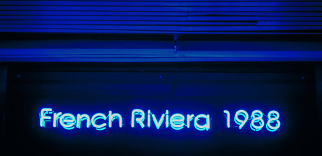
The East End’s newest gallery, French Riviera 1988, opened its doors last night to a packed house. Behind this otherwise inconspicuous neon-lit shop front is the latest project space by the artist duo Samuel Levack and Jennifer Lewandowski. Their spacey inaugural show, Horizon Hypnotique features an ambient collection of distorted photographs, holographic and video works by artists including Alex Ressel, Beatriz Olabarrieta, Lucy Woodhouse and Richard Parry. In-between the crowd, blurred silhouettes of red-hued figures almost dance across the downstairs rooms of the house. The spirit of hazy nights out and their seductive, reckless female stars floods the gallery, and it’s hard not to sway to their invisible beat.
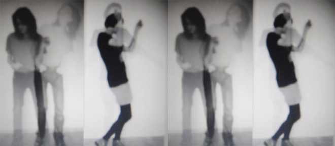
Horizon Hypnotique runs from the 18th February – 13th March 2011 at French Riviera 1988.
Open Friday – Sunday, 12 – 6 pm and by appointment.
Drag in the desert: A photo series by Jane Hilton
Of all the people and places photographer Jane Hilton has documented over the past three decades there is one location that she can’t quite shake – Nevada. The sweeping desert state in America’s west is of course home to the brash and bawdy Las Vegas, but beyond the neon lights there is a grainier side of life she is drawn to.
The London-based photographer first travelled to the States in 1988, sparking a fascination with all things Americana that would become a hallmark of her career.
“I just fell in love with it,” she says of that first visit which took her to Tucson, Arizona.
“It was like being in a film. It was those 180-degree, blue sky vistas, and the sunsets, and the light – it was the light! I’m so passionate about lighting and they’ve got it there, “god’s light”. They might not have got other things right but they’ve got the light.”
In 1992 she first visited Nevada on a job shooting the desert landscape, which covers the majority the state. Nevada is home to both Las Vegas and Area 51, with a transient allure that, beyond the casino tourists, attracts a myriad of characters often looking to either get rich or get lost. Over the past 25 years the photographer has documented many of the people that often inhabit the fringes of the place, including burlesque dancers, cowboys and sex workers.
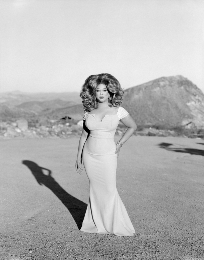
Jane Hilton, United Kingdom, Finalist, Professional competition, Portraiture, Sony World Photography Awards 2021 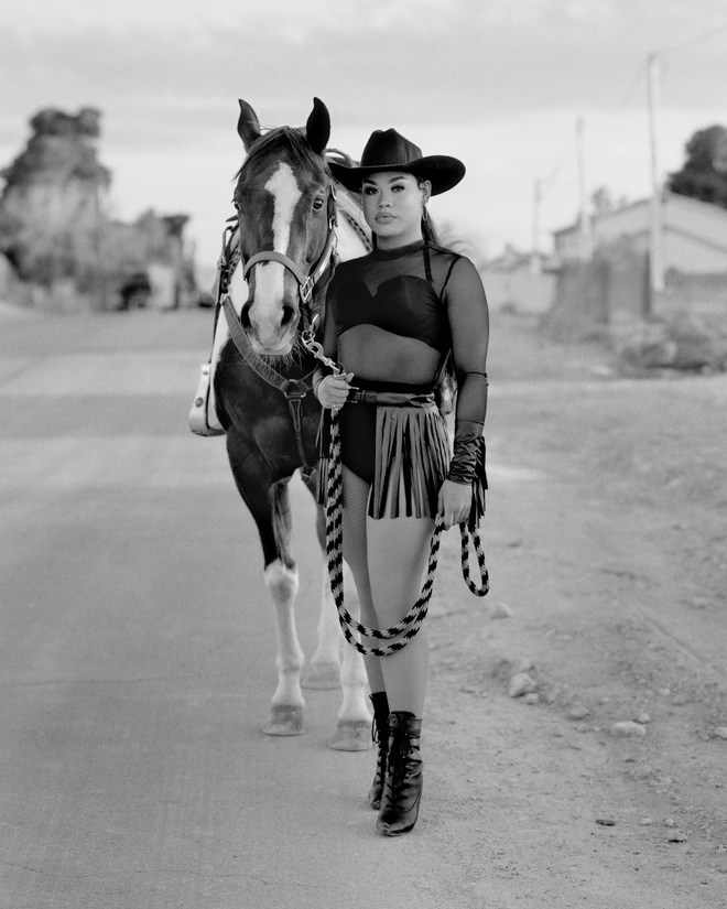
Jane Hilton, United Kingdom, Finalist, Professional competition, Portraiture, Sony World Photography Awards 2021
“It’s in stark contrast to the way I was brought up in English suburbia. I think had I gone to New York first, I might have a different relationship with America. I’m more interested in the American west and the way that genre (of Westerns) has played out.”
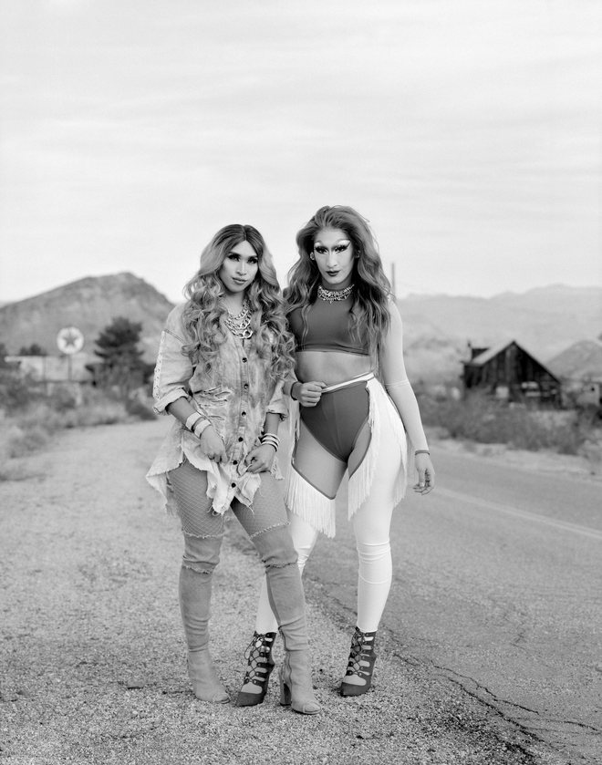
It was the Western genre that inspired her latest project, Drag Queen Cowboys, which was recently shortlisted as a finalist in the prestigious Sony World Photography Awards. Drag Queen Cowboys is a series of black and white portraits of Las Vegas drag performers in Western-inspired costumes shot out in the desert. Hilton was largely inspired by 1961 film The Misfits, written by Arthur Miller and starring Marilyn Monroe, Clark Gable and Montgomery Cliff. In it, Monroe plays a recently divorced woman who meets an aging cowboy, Gable, and his friend, played by Cliff.
Since its release the film has been trailed by a macabre notoriety due to the death of all three stars within five years of its release. Gable died of a heart attack ten days after filming wrapped; Monroe of a suspected drug overdose some 18 months later; Cliff’s health deteriorated and he was dead by 1966. It was the last film Gable and Monroe ever made, and it is said that Miller’s marriage to Monroe was also a casualty of the film. Despite the playwright specifically writing the part for her, their relationship disintegrated during the lengthy and over-budget shoot.
“Arthur Miller himself went to Reno to get divorced so he could marry Marilyn. There were all these divorce ranches on the outskirts of Reno where people wait and have a good time while they are waiting,” Hilton explains.
“In the thirties and forties they were full of mostly housewives because their husbands had sent them there to get a divorce within six weeks, which was unheard of. They’d do that, then party with some cowboys while they had left the husband at home with his mistress.”
“So Miller went there because he knew about getting a divorce in Reno and the strange displacement of people who go to Nevada looking for a new life. Whether they are hiding from something, or trying to find something… In all my experience that is how Nevada is for me too; it’s people searching or trying to cover something up.”
After discovering the strange legacy of the legendary film, in February 2020, just before the pandemic hit, Hilton drove a handful of drag performers in their stage makeup and Western outfits in her ’66 Mustang to an isolated stretch of desert on the outskirts of Vegas.
“I was looking for another community, a different community, that I could document, one I didn’t know much about,” she explains of the process of choosing her subjects.
“I started to go to drag bingo in Vegas and got to know some of the girls. I was thinking about how they are perceived and how post-Ru Paul, social media has gone mad with drag queens. They are always literally lit with flash, it’s so artificial, with so much retouching or a filter, so that their imagery looks almost homogenous because of the way they all photograph themselves. I decided I wasn’t going to do that.”
Instead, Hilton photographed each performer in natural light, shooting on a 5×4 plate camera and black and white film, with no flash or retouching. Rather than just being passive subjects the performers worked with Hilton on creating the visuals, each creating their own Western-inspired outfit for the shoot. By removing the drag performers from their usual environment, that of a dimly lit bar or nightclub or karaoke stage, the portraits subvert the type of image often associated with drag performers and create a contrary energy that is both powerful and poignant, and typical of Hilton’s work.
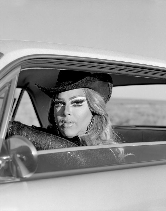
As a documentarian she has long been drawn to sub-cultures; in 2000 the BBC commissioned a ten-part documentary from her about two brothels in Nevada, the only US state in which sex work is legal. She has spent the past few years filming the ‘The Last Lion Tamer’, following a family’s fight to save their livelihood as the government moves to outlaw the use of wild animals performing in circuses. Currently the photographer is riding out lockdown in her London home working on various projects, eager to start shooting again. As always, there is one place in particular she is waiting to revisit.
“I am doing a book about the state of Nevada because I’ve spent a lot of time here – almost too much time! No matter where I go, I seem to end up back there…”
Jane Hilton is a finalist in the Sony World Photography Awards 2021: Professional Competition. Overall winners will be announced on 15th April 2021. www.worldphoto.org/
Header image credits: Jane Hilton, United Kingdom, Finalist, Professional competition, Portraiture, Sony World Photography Awards 2021
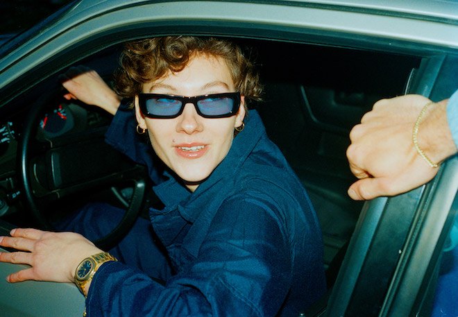
“We Make You Feel Exactly What You Want To Feel,” Twin Meets Danish Eyewear Brand FLATLIST
FLATLIST is cool. Their shapes are fresh, the circle of supporters are creative, the imagery that naturally has grown around the brand doesn’t stink of hours in a daylight studio – it smells of real life living.
Talking to the brand and taking a closer look at the provenance of this funk factor, we talk about the importance of the school of life lessons, trusting your inner feelings, and the acceptability of sunglasses indoors during lockdown.
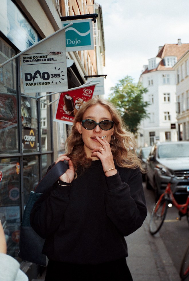
Tell Us How FLATLIST Came About .
The “Feeling”: Well, FLATLIST was founded way before the actual launch of any products. When we started our agency 8-years ago, we also started a global tour of socialising and networking. Working with international sales in the fashion industry, you often find yourself at trade shows, fashion shows, showrooms, launches, parties and dinners. And with 150 travel days a year in cities like Paris, Milano, London, New York, Berlin, Amsterdam you meet a lot of people that like to talk about fashion. You end up in endless of uninspired conversations and meetings.
To avoid this, we started hosting dinners ourselves 3-4 years ago after too many nights spend on “free dinner and drinks” that didn’t give us anything beside hangovers. We invited people we felt connected to, (that felt the same as us) and where the conversations and mutual mindset led to some unforgettable evenings, long nights and pictures. People were mentally present. Real but charming.
It was here FLATLIST was born. We “FLATLISTED” people. It means to be yourself and feel fucking great about it. It was in this period the actual brand and products started to take form.
We both love shades, and we both had design ideas, so the dream of running an eyewear brand was pretty mutual since day one. We didn’t have any personality or visual concept to go with it. The “Flatlisted” feeling was all we needed. We used that feeling when we started to create our brand and visual material and then we used our private collection of shades for design inspiration. Quality over quantity and eyewear designs and colour combos we thought were great and that we couldn’t find in the market at that time. No “trend analysis” but simply a look in the mirror and thumbs up to your partner when trying on our first prototype set of samples.
The “Business Plan” :We wanted to create affordable luxury frames that we thought were excellent and that we would wear ourselves. Not trend-driven at all, but based only on personal preferences. We wanted to be the brand priced below the big fashion brands while offering a quality just as good, if not better.
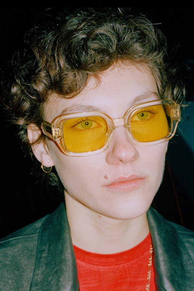
How Has It Grown Since Its Inception?
We have had a very strict distribution strategy since day one, choosing to work only with a handful of global retailers. Not just based on their name but also if they were a good match when it came to selling our brand and products, such as Need Supply, KITH, Totokaelo, Luisa via Roma, Hybebeast, END, Smets, LN-CC, Liberty, Matches Fashion etc. Furthermore, our e-commerce is really starting to pick up!
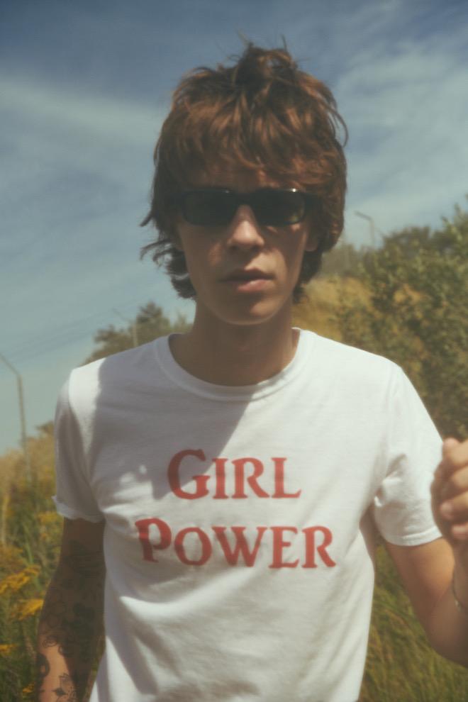
How Do Your Sunglasses Differ From Others?
There are many things to be said. Whether it is our uniquely designed straight side temples for a better all-round fit and grip on the head (fits all, kinda), our carefully sourced 90’s deadstock Italian acetate or our unique colour combinations and designs. Every style and colour also has its unique style code written in gold on the outside of the left temple. Our little trademark. And maybe the fact that our collection is pretty retro-inspired.
What Do You Think Sunglasses Impart In The Wearer? A Sense Of Mystery, Intrigue? Sexiness?
That is a very difficult question to answer – obviously some kind of Hank Moody coolness but, ultimately, we hope our eyewear makes our consumer fell exactly what he or she wants to feel. This can be a lot of things, but mainly we want them to feel themselves.
What Changes In The Fashion Landscape Do You See Ahead?
A LOT, but it’s difficult to predict at the moment. You see quite some self-proclaimed experts trying to predict the future at the moment, but the truth is that we don’t know other than our industry needs to slow down.
How Do You Feel FLATLIST Will Be Adapting To These Changes?
No need to adapt as our aim has always been to make long-lasting products instead of having to reinvent ourselves on a seasonal basis. We feel that we already created styles that have the potential of becoming icons of tomorrow (Hanky, Tishkoff, Le Bucheron, Bricktop). When we think it’s needed, we add some newness here and thereby adding new acetate colours and lenses, but that’s it.
Your Sunglasses Have A Certain Understated Grunge Elegance About Them… Would You Agree?
Yes! But also the absolute 70’s freedom of expression vibe as well as the 90’s minimalism.
Finally, Is It Acceptable To Wear Sunglasses Inside During Lockdown?
Of course – why not? Go for our Le Bucheron style with blue lenses if you want to add some colour to the wall you’ve been staring at for the last month or try Tishkoff with yellow lenses if you’re behind on your D-vitamins.
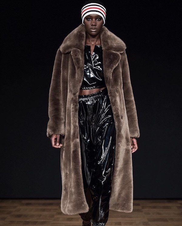
Stockholm Fashion Week Show and Casting Review
On her subsequent return to Stockholm fashion week, photographer and writer Sarah Jane Barnes set out to review new designers, encounter previously unseen brands, get honest feedback and most importantly shed some light on the choices of casting at one the leading Fashion Weeks of Northern Europe.
Jewellery Designer, Marian Nilsdotter chose to go her own way, communicating her vision through an intergalactic display of electro music and harpist amidst laser lights beside creeping smoke it was matched by a choreography of models that moved like celestial beings. The show ended in a crashing silence that enabled the audience to photograph the models posed as the army of angels they were. Nilsdottor uses jewellery as a medium to depict her universe of surrealist fantasy, with her careful approach to materials, all pieces are artisan produced. Her work is characterized by symbolic figures using precious metals, stones, and pearls to tell her story. This was the most well-presented show of the season, a true piece of theatre. The casting was inclusive and representative of a diverse Sweden.
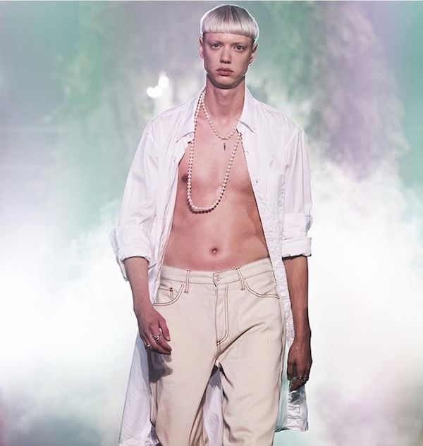
At Lazoschmidl, the Swedish-German menswear brand established models Fillip Roseen & Carl Hjelm Sandqvist led the show. Fillip experiencing well-earned success as the star of Missoni’s current campaign brought a definite international presence to the lineup. Carl a musician who tours as the frontman of rock band Tellaviv proved himself to be a multitasker by not only walking the show but managing the hip soundtrack as D.J in between looks. The collection was a combination of sparkling lurex knitwear and iridescent sequins. This loungewear look brought humour to the table via the added layering of crop tops featuring childlike depictions of teddy bears and monsters. Overall this self-entitled ‘playdate’ collection was clearly Missoni inspired by the patterns alone, the similarity was uncanny. Founded by Josef Lazo and Andreas Schmidl, the brand has a penchant for design that subverts gender norms. Initially creating made to measure garments, they traded via social shopping company Tictail before partnering with American retailer Opening Ceremony. With a target demographic of carefree party boys, they have gained a strong following in the New York club scene.
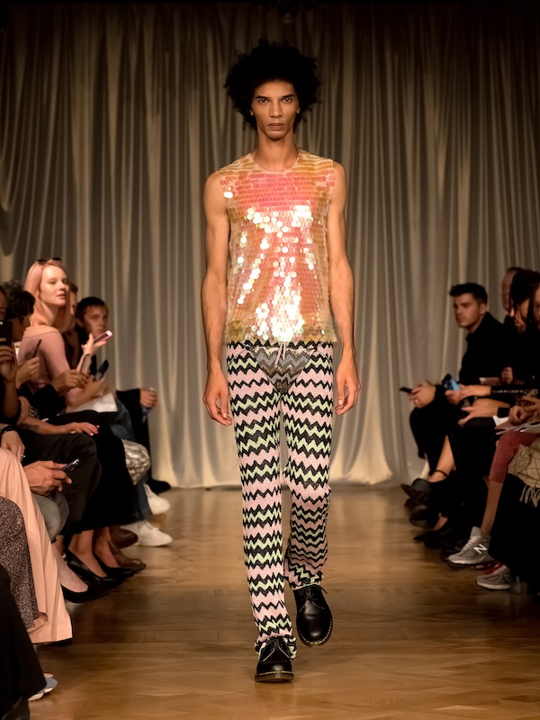
Soft Goat a commercial brand with proven international sales and accessible price point showcased cashmere loungewear styled in a refreshingly non-commercial way. Rich tones of colour supported by attractive shapes were displayed with a cultivated sense of streetwear modus operandi. Using the internet as the only distribution channel the brand is able to keep prices low with quick turnover. Building a brand with a sense of social responsibility they support Project Playground, an organization that works to provide aid to vulnerable young people in South Africa.
Celebrity favourite Jennifer Blom launched her brand in 2010, this season she continued her red carpet style with flawless precision, presenting flowing dresses of pale and hot pink tones, as well as more classic mint and blue shades. With a focus on femininity and glamour alongside her way of reading the female body, she created a stunning collection. The graduate of Sweden’s prestigious Beckmans College of Design practises sustainable production by using Italian and U.K farmed silk as her main material.
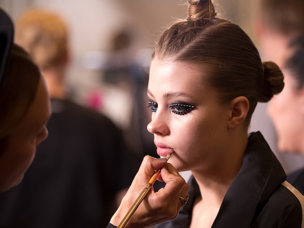
Camilla Thulin’s casting choices were both socially aware and politically aligned. With a roster of actresses, personalities and academics including Sara Danius this became a fine display of age equality. A charitable collaboration with Sara, in particular, led to the creation of a limited edition silk blouse. The pattern of which shows a clenched fist symbolizing women’s liberation. This in aid of GAPF, a non-profit women’s charity working against honour-related violence and oppression was modelled by Sara with discernment. In a time when gender issues are debated more than ever, Camilla Thulin remains strong in her feminine expression stating “My goal is for all women, regardless of age or size, to feel strong and beautiful.” Having founded her company in 1992 Camilla is a long-standing name in the industry. She is famously known for having created Malena Ernman’s gown worn at the Eurovision Song Contest at a whopping cost of 400,000 kroner (over €37,000).
Presenting at Fashion Week for the first time, Stylist and Costume Designer Salem Fessahaye was on fine form. This debut show, a family affair with friends both walking and in attendance was almost entirely non-caucasian cast. Her designs maintain an interesting mix of streetwear and couture showcasing asymmetric hems on sublime gowns alongside oversize suiting. These suits similar in design to zoot suits, a style popularised by African Americans in the 1940’s were striking. Her styling pedigree recognized through work with global clients including Adidas, Nike and David Beckham was apparent. The atmosphere was electric throughout resulting in a standing ovation from the full house. Runway photographers unable to capture the elusive finale designer shot accepted defeat, after pleas to audience members blocking the usual line of sight were left unheard.
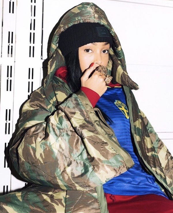
From initial inspection, Ivyrevel appears to be a typical commercial brand, however, attending the show I was delighted to see otherwise. Happening upon a new path under the creative direction of Sebastian Hammarberg, business is on point. Colourful and sexy pieces owned the runway, featuring styling nods to Wes Anderson’s The Royal Tenenbaums and Studio 54, the show was opened and closed with undeniable finesse by Sapitueu Jeng. Meeting with Sebastian later that day it was clear how ingrained his work ethic is. Overseeing every inch of the show production this season he had left nothing to chance, unafraid of last-minute change. With this true determination for the future, he has the capacity alongside founder Dejan Subosic to lead Ivy Revel to a broader audience beyond the domestic market.
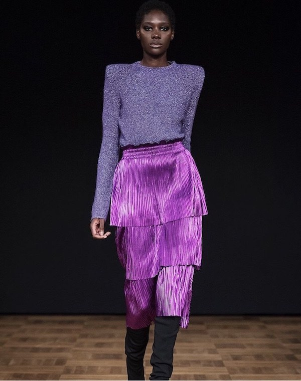
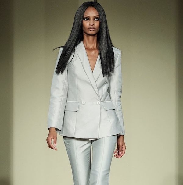
During my trip, I met two of Sweden’s auspicious modelling talents Anab Mohamed Abdullahi and Sapiteu Jeng both signed to Stockholm’s Mikas Agency. Anab’s family hail from Somalia, whilst Sapiteu’s parents are Gambian. Each maintaining a strong presence across the show lineup this season I was interested to learn of their casting experiences in Sweden and more specifically Stockholm fashion week. Anab although positive diversity was slowly improving was clear to inform me of her previous encounters, “They made us feel it was a competition because they only took one black model per show. After castings during my third season, most of the designers wanted to book me. Later my booker told me they cast another model but not me also because they didn’t want two black models. So, in the end, I only walked one show and I was the only model of colour in it.” Working for Sale Fes this season light was cast upon her hopes for the future “For the first time, I felt like other designers may open their eyes and see there is nothing wrong with many models of colour in the same show.” Sapiteu defining her observations expressed “Right now it feels like everyone is just focused on looking diverse without actually understanding what that really means. Hiring one or a few coloured models doesn’t make your company diverse. Even though there is still much work to be done by the agencies, casting agents and brands, I can see a change.”
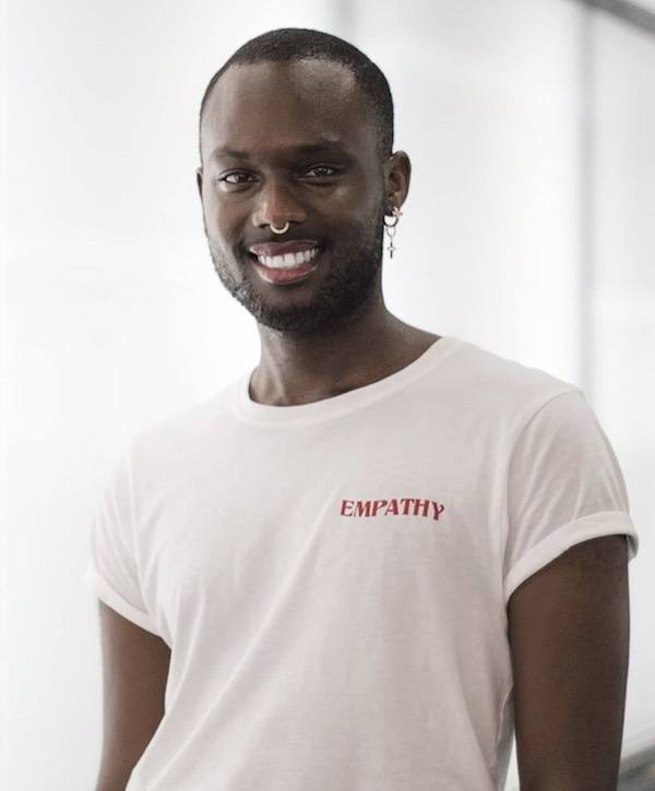
I also spoke with Ken Gacamugani who walked for three of this year’s graduates from the Swedish School of Textiles, Helga Lára Halldórsdóttir, Dick International and August Gille. Ken originally from Burundi in East Africa was signed to the Sunrise Agency after been scouted on Instagram earlier this year. Sunrise founded by Beckman College graduate Matilda Dahlgren in 2018 is a street casting agency with the objective to offer a less normative selection to clients through diversity in size and race. Ken explained his findings of casting in Sweden “They always look for the skinny, tall, white models, the blond and blue-eyed, throwing in 5 black models to call it diversity. But Sweden doesn’t look like this anymore. It is 2018, Sweden is a rich multicultural country with generations of immigrants. I feel that these fashion shows and the industry should represent that. There is a whole world of diversity beyond those boundaries we should normalise and appreciate.”
As touched upon by Sapiteu there is more work to be done. With power comes responsibility and the hope those who attain it will make future choices without bias or tokenism.
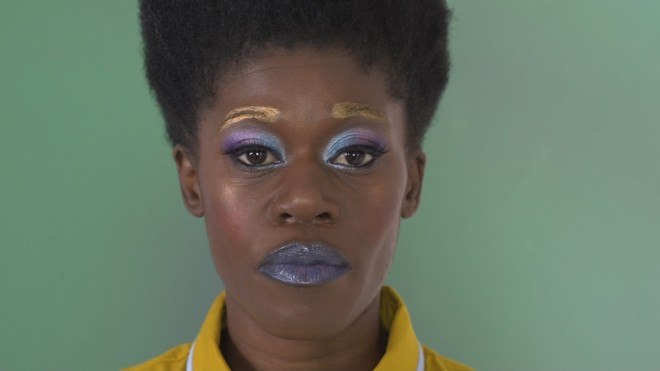
Twin meets winner of the Film London Jarman Award, Oreet Ashery, and nominees Adham Faramway and Marianna Simnett
Now in its tenth year, the winner of The Jarman Award was announced at Whitechapel Gallery on the 20th November. This year saw Oreet Ashery take home the prize, receiving £10,000 to develop her projects which consider gender and society with the support from Channel 4.
The award recognises artists working with moving image, celebrating and supporting experimental, imaginative and innovative UK-based work. The Jarman Award is named after legendary experimental director and cinematographer Derek Jarman.
Twin spoke to winner Oreet Ashery along with Adham Faramway and Marianna Simnett – both shortlisted for the award.
Adham Faramway’s work draws on the language of advertising and combines it with the transgressive aesthetics of ‘body horror’, Oreet Ashery is an interdisciplinary artist who confronts ideological, social and gender constructions, while Marianna Simnett surgically lowered her own voice with botox during her short film The Needle and the Larynx, which screened on Sunday. Together they represent some of the most exciting filmmakers on the scene today.
Twin meets Oreet Ashery
Why did you choose the web series format for your film Revisiting Genesis?
My work always reaches beyond the structure of the contemporary art institution, but this is my first major work created specifically for the internet so that it can be freely accessible to as wide an audience as possible. I was inspired by the independent filmmaking of web series’ such as F to 7, and wanted to develop my own approach to the genre as a visual artist. Revisiting Genesis aims to conceptually expand the entertaining and narrative driven elements of the format. One of the central questions explored in the work is around what happens to your online digital content (websites, social media profiles, photographs etc) after you die, and as such the internet provides an appropriate platform for the work.
How does Revisiting Genesis force viewers to consider their own mortality and their online legacies?
Hopefully it makes them think and contemplate whether they want to put anything in place in preparation for death (expected and unexpected) and if so what and how.
How does the film expand on some of the key ideas you have been exploring in your practice?
The film expands on the notion of a potential community, in the real sense that most of the people in the work know each other from the art and performance world. The fictional narrative speaks about a community of friends, outside normative family structures, that come together to help Genesis. I think a lot about how we can structure our busy lives so we can have space to help a friend if needed. The other issue that comes up in the film is the loss of social structures, such as the community college Charles Keene in Leicester, it was the first place I felt a sense of belonging as a young immigrant to the UK in the late 80s. the College has been demolished in 2010 and has been amalgamated to a multi campus university, as is the faith of most community colleges. After the films I received great emails from people who were outsiders and use to go there and achieved so much in their lives since. The emails mentioned what an important role this college played in their development. The other aspect, and there are many, is the idea of one’s identity or the narration of one’s life, in this film I’ve expanded this notion to the afterlife.
What do you hope viewers will take away from Revisiting Genesis?
I have no expectations as such. What I always hope people well take away from my work is something that lingers, that is not easy and that makes them think.
Twin meets Adham Faramawy
Where does the title of your film, Janus Collapse, come from?
The time that I was working on the video that’s shortlisted for the Jarman award was both personally and politically pretty unstable. I was recovering from a minor a road accident and
TV and social media were (and still are!) saturated with adverts and disaster politics. I was kind of trapped at home, looking at this stuff, reading sci-fi and feeling introspective. I had to think through some things while researching for the show at Bluecoat in Liverpool. Where the piece would first
be seen. I wanted to think through this instability, to think as an image-maker about how images are used to introduce and reinforce certain ideas. I wanted to examine the ways that images are disseminated and to consider what effect that has on me personally and whether it affected how I was thinking about my body.
The Janus is the two faced Roman god of doorways and transition. I decided to use his image as something to hang this examination of instability on, while casting the idea of a collapse as something generative, the possibility of the collapse of an image.
How does the film subvert tropes that are used in advertising?
In a way I consider almost all my output as a kind of contamination of aesthetic categories. I feel uncomfortable with hierarchies and I just don’t like being told who I am or what to do, so my interest in advertising is in a sense symptomatic of that sense of always wanting to investigate
and push back. The way that I’ve been investigating commercial images is to try to inhabit them, mimic them, intensify and distort certain aspects until they no longer possess a commercial potential.
When did you start incorporating the ‘body horror’ genre into your work?
Writer Jamie Sutcliffe pointed it out to me in an interview! He said, “We see a pair of hands moisturizing with a digitally enhanced, absurd and all-consuming slime. It’s a quick slip from Evian commercial to a kind of Cronenbergian symbiosis.”At that point I started looking for body horror in adverts and realized that images of melting teenagers were being used to sell pizza and escaped tongues were being used to sell beer.
It was Octavia Butler’s Xenogenesis Trilogy that introduced me to the idea of body horror as one facet of a potentially holistic, tender, nurturing, non-binary sexual experience.
What do you hope viewers will take away from the film?
I hope that viewers take away a feeling complicated and queasy enough to highlight the operative mechanisms of the image they’ve just ingested.
Twin meets Marianna Simnett
The Needle and the Larynx was screened on Sunday – what was the inspiration behind that film?
A sudden, terrible urge to lower my voice, a fascination with toxins and hypodermic needles, and a desire to warp my experience into a fable.
Why is it important for you to put yourself into your work, and to test the limits of your own body?
I can take risks with my own body I wouldn’t take with others. It’s my go-to tool for telling stories, and helps me to live out my ideas and not just think about them. At best, my work might prompt someone to cup their genitals or necks, as if to check they are materially, unmistakably present. That liminal space between being a thing or a someone, and then morphing or falling apart – I’m hooked on those moments.
You have often explored the gendered implications of voice and masochism, what draws you to these themes?
I’m interested in appropriating and spoiling archetypes, especially when it comes to the final binary constraints of heteronormativity. Pitch, tone, timbre and accent have implications on social bodies and their right to exist in one place and not another. Voices (often disembodied) in my work battle patriarchy and madness. Masochism is a submission to fantasy.
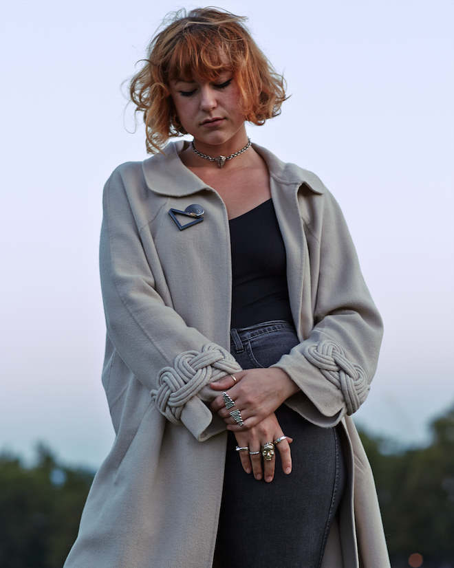
Joy Bc’s Hotline Bling
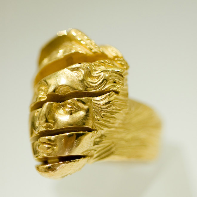
South London based jewellery designer Joy BC specialises in creating bespoke designs that embody both the anthropological and physiological sides of jewellery. Her work spans a range of themes, from ideas around protecting people while travelling; to remembering the dead; to celebrating love to more simple examination of form. Her aim is to use jewellery to engender conversation, imbuing fine jewellery with new and heightened significance. Ahead of her workshops at Draw Haus, Twin caught up with Joy BC to discuss the possibilities of silver and her collaborative ethos.
How did you become interested in jewellery?
It started with a ring which was made by one of my ancestors in Italy. It resembles a futurist sculpture. My mother use to wear it on special occasions and I found it hypnotic. I drew comparisons between the form and feeling that that ring gave me to those within Brancusi’s pieces and Barbara Hepworth’s. Otto Kunzli, a jewellery artist who made a necklace made from divorcees’ wedding bands, which subsequently became an emotionally laden piece, and thus un-wearable, really excited me in how powerful jewellery can be.
What are you influenced and inspired by?
A variety of things. Sometimes it’s simply the materials, and their intrinsic beauty.
Why is important to use jewellery as a tool for engendering conversation?
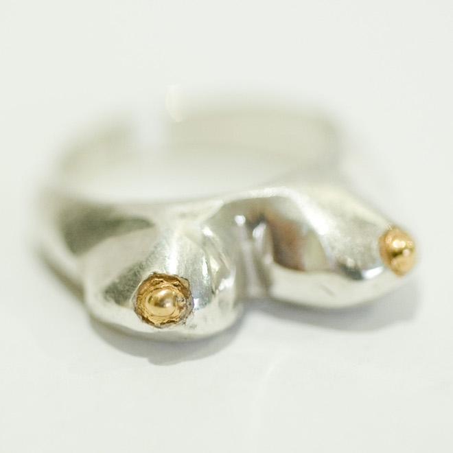
Jewellery travels with with you – lives with you and speaks for you. Without words it can convey messages or feelings. A huge Hellenistic marble sculpture which conveys strength (Nike at the lure, for example) isn’t something that you can strap to your body – but a boobies ring which encourages discussion on the natural way of breast feeding, or female nudity – literally ‘freeing the nipple’ – is something that you can. The ‘listening aids’ I make are to encourage people to be better listeners, something we could all benefit from. Especially myself! I talk way too much; it’s the Italian in me! In fact I’m currently wearing my ‘I’m all ears’ piece, which is made of 47 tiny ears in precious silver and gold, while I listen to the news of the news.
What are the limitations of working with silver? And do you have a favourite material to work with?
Limitations? I’ve never thought of the limitations of silver, only the possibilities. It oxidises, which gold doesn’t. However I like that – I often use a chemical to speed up the oxidisation process to create a dark blue black patina on some of my work. I don’t have a favourite material, but I have to say, 18ct yellow gold is delicious. I also love wax – especially the type I used in Tokyo which was made of beeswax and cedar resin. They use that combination to make traditional Kenji Stamps (then cast into bronze). And it smells beautiful.
What do you hope to achieve through your workshops at Draw Haus?
I hope people really enjoy themselves, and help people making something that they feel proud of. Whether it’s a playful experiment or precise present for himself or herself or someone they care about. It’s always fascinating to see what pieces people make.
Draw Haus Creative Workshops: Jewellery Making with Joy BC will take place on 17th November. Buy tickets here.
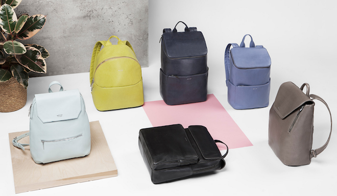
Matt & Nat: vegan arm candy to love
Material and nature: those are the focus behind vegan bag brand Matt & Nat. Their e-shop features a cornucopia of chicly-designed backpacks, satchels, totes, clutches and other assorted arm candy, all created from recycled goods.
From its inception, the company committed itself to not using leather or any animal-based materials in their designs. The result is a variety of sustainable fabrics: recycled nylons, cardboard, rubber and cork, with linings created from old water bottles.
Yet these are not fusty, out-of-date, hippy designs. Witness sleek backpacks, perfect for the city-slicker: the Paxx (£138) in midnight blue or black, or the more feminine Peltola (£115) – perfect for summer in duck-egg-blue. The vintage collection is rife with retro, structured shapes. The curved Nemesis (£103) and the Phil mini-messenger (£95) are favourites.
Using such textiles requires constant innovation. The vegan leathers produced by the team in Quebec are coloured with vegetable dyes, giving them an authentic appearance, much like the real deal, and means the bags come in an incredible range of hues, both on-trend pastel and day-glo brights. And the material’s strength means you can continue loving your bag for years to come.

Charlotte OC @ Hoxton Square Bar And Kitchen
On Wednesday 20 August, a steady stream of suits, hipsters and minor celebrities (Samwell Tarly from Game of Thrones – yes, really) flooded into Hoxton Square Bar & Kitchen’s performance area. In the darkened room, lit with blues and pinks and reds, an audience was assembling to see a hotly-tipped, up-and-coming musician.
The lady in question was Blackburn native Charlotte O’Connor, aka Charlotte OC. Despite being tapped as the sound of 2014, Charlotte’s path to stardom has had a rather slow beginning. Although she had a record deal in her teens, she was dropped and the album never saw the light of day. In the ensuing years she worked in her mum’s hairdressing salon.
But talent will out, and now this slight, leather-clad figure, complete with perfect, blunt-cut fringe, captivated the audience from the get-go. Her rich, soulful voice filled the room, accompanied by two keyboard players.
The stand-out track is her latest EP, Strange. An ethereal, haunting song with distinctly dark undertones, its electro feel was bewitching in the performance space. The tempo changed for a ballad, and then poppy Hangover’s toe-tappingly good beat swept the audience to the finale. During Colour My Heart, Charlotte’s voice developed a raw and emotional quality that contrasted with her previously upbeat songs.
Charlotte OC is clearly going somewhere. The only complaint was that the set was all too brief. Strange releases on 22 September.
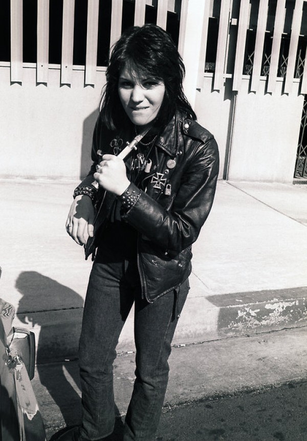
SCHOTT NYC X HOUSE OF HOLLAND
Over the last century Schott NYC has become a staple in the wardrobes of many a rock-star, Hollywood pin up and style icon, so much so that the label’s handcrafted outerwear has rapidly become just as iconic as the wearers themselves. Perhaps James Dean wouldn’t have been much of a Rebel Without a Cause without his Schott Perfecto® biker… Similarly, Joan Jett’s hit record Black Leather may have been a little less inspired without hers…
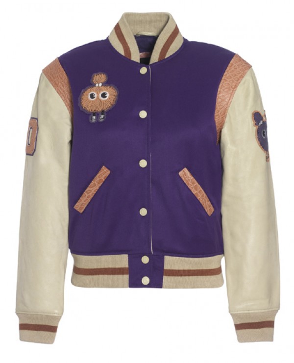
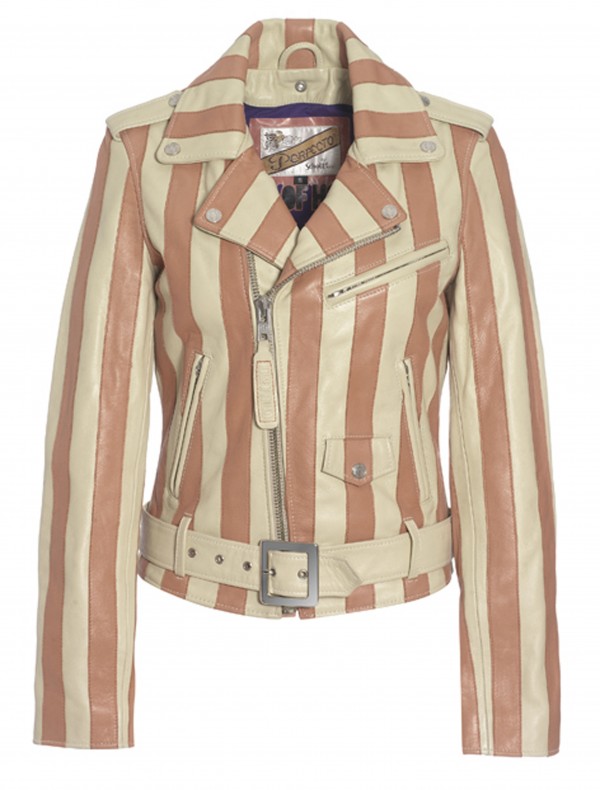
With an impressive true-blue American heritage dating all the way back to 1913, Schott’s 100th birthday is soon approaching. To celebrate, the New York based label has teamed up with British designer Henry Holland, to create a capsule collection that is scheduled to launch next month. Henry adorns the distinguished Perfecto® biker with butterscotch and peach candy stripes and creates a playful version of the signature American college varsity jacket, combining Schott’s celebrated history with a youthful and contemporary aesthetic.
The Schott NYC X House of Holland anniversary collection will be available to purchase at Selfridges, London from November 2012.
Wales Bonner launches AW20 Campaign “Lovers Rock”
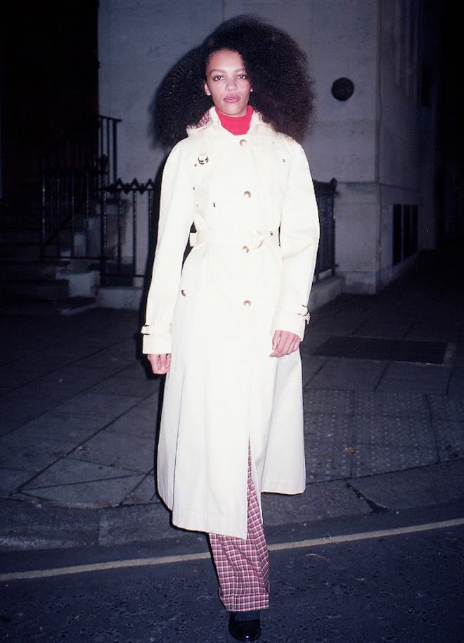
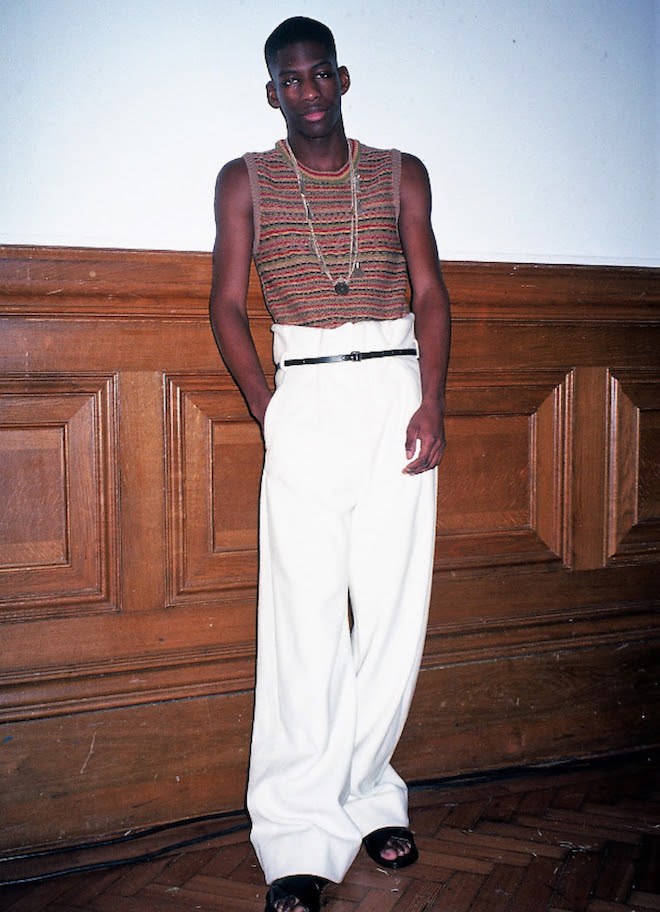
A dedication to dancehall – the fashion, the community and the music: Wales Bonner’s campaign is titled ‘Lovers Rock’; an ode to the work of British-Jamaican photographer John Goto. Photographed by Liz Johnson Artur, this line includes distinct pieces that hark back to the lively culture of the British youth in the 1970s: the donkey jackets, repurposed 1960s Saville Row tailoring, and moleskin double-breasted blazers adorned with found buttons.
Based on the British-born music genre ‘Lovers’ Rock’, which was a style that used the softer notes of reggae to create this passionate sub-genre. The romantic musings that were found in the dancehall scene and the underground blues parties created a convivial connection between black and Asian communities; this is shown through the integrated Adidas and Wales Bonner collaboration. An eclectic mix of colours can be seen in the Adidas freizeit in crimson, ochre and emerald green.
There is a heavy emphasis placed on Caribbean culture in the campaign, with mod jackets in two-tone tweeds and windowpane check mixed with crocheted sportswear silhouettes. The hand-knit beanies crafted in raw Scottish shetland wool, courtesy of Stephen Jones, reflects a strong Rastafarian presence. The military influence is also felt, with the inclusion of a tobacco gabardine cadet jacket and a navy twill pea coat fastened with Jamaican gold brass buttons.
From the turtlenecks layered with tailored jackets, the ankle-length skirts matched with dark tights and knitted sweater vests, this launch is a love letter to the vibrant culture in 1970’s Britain.
To discover the full collection, go to WalesBonner.net
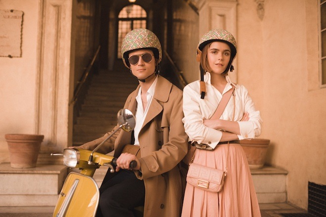
FENDI’s latest episode of #BaguetteFriendsForever features Netflix’s Sabrina
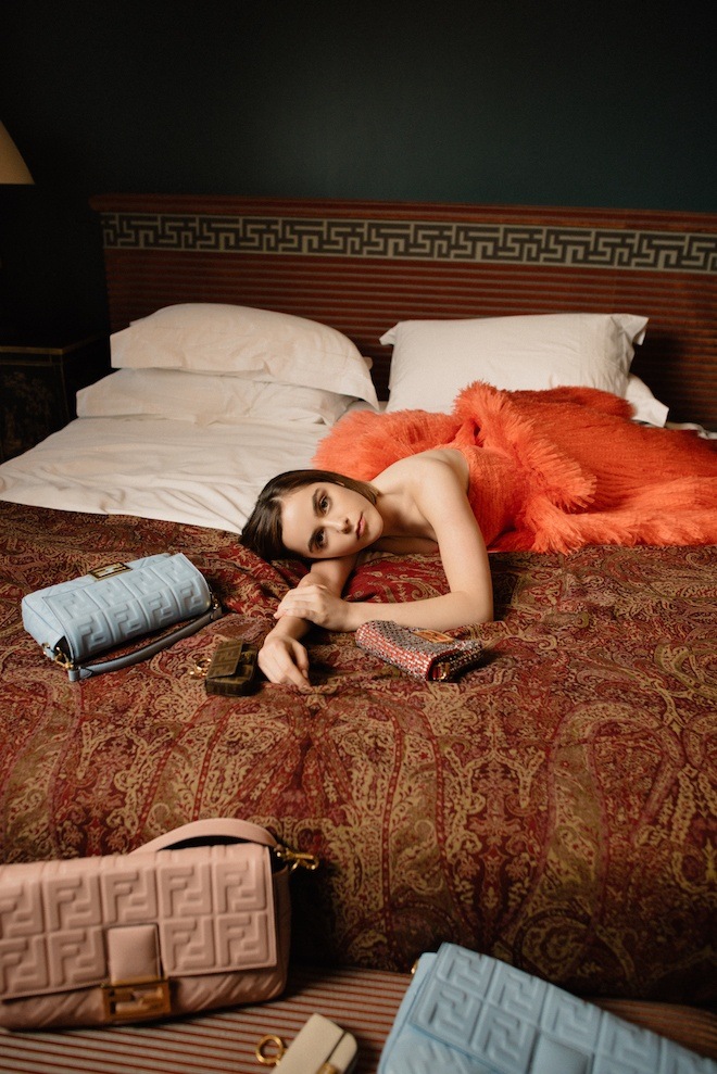
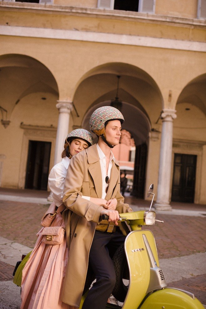
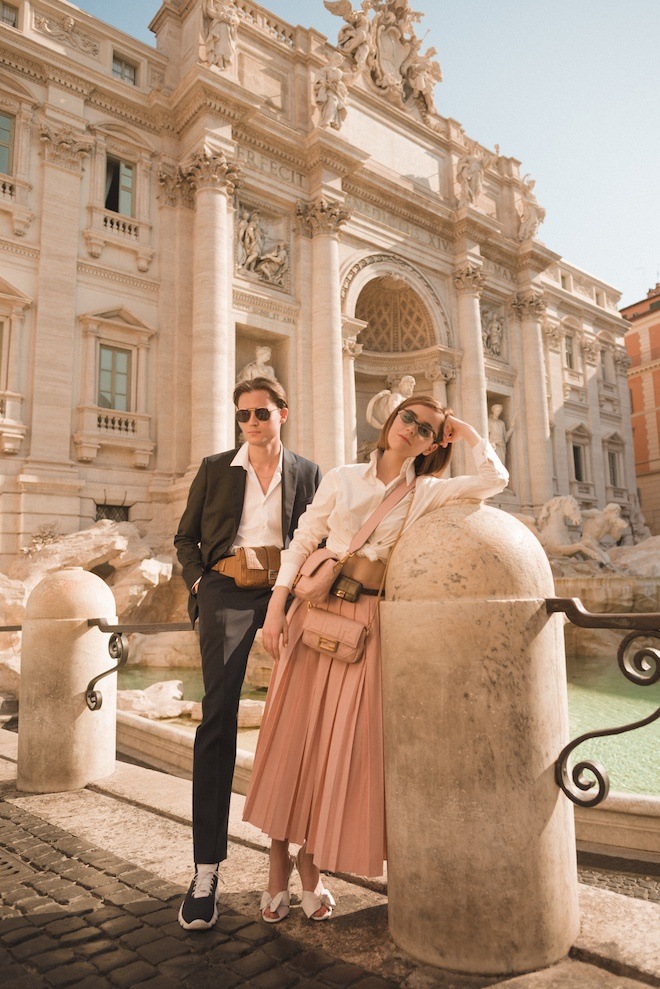
For the latest episode of their Baguette BFF series, Fendi tapped Kiernan Shipka , star of Netflix series Chilling Adventures of Sabrina , to travel on an adventure around Rome with her best friend, movie director Christian Coppola.
The short film first sees the actress in her bedroom surrounded by her Baguette Bags, when her attention is suddenly brought to the honk at her window from Christian and his yellow scooter. From here the duo is filmed exploring the city , eating gelato, tossing coins in the Trevi Fountain and finally to their arrival at Fendi’s Headquarters where they playfully explore the modern architecture of the building. Throughout the trip the Baguette can be spotted in different versions , from the FF embossed large , to a pink & blue pastel mini baguette to the newly added mens baguette in brown leather.
FENDI first launched the campaign #BaguetteFriendsForever earlier this year which included a series of short films featuring the storylines of inseparable groups of friends around the world throughout one of their daily routines which is centred around the iconic Fendi baguette. The first episode was titled “The Baguette is Back” and was an adventure set in the streets of Shanghai China. The second episode Titled “The Missing Baguette,” was shot in Hong Kong. All pieces are currently available in stores worldwide and online, to shop the looks , visit Fendi.
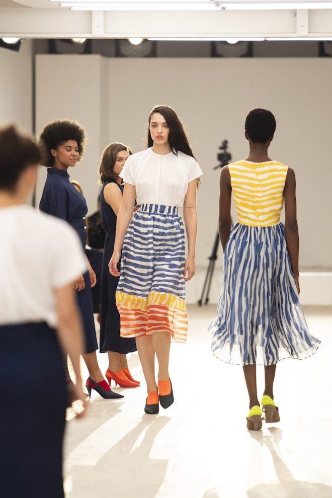
Edeline Lee’s Collage of Everyday Life
Images courtesy of Simon Melber
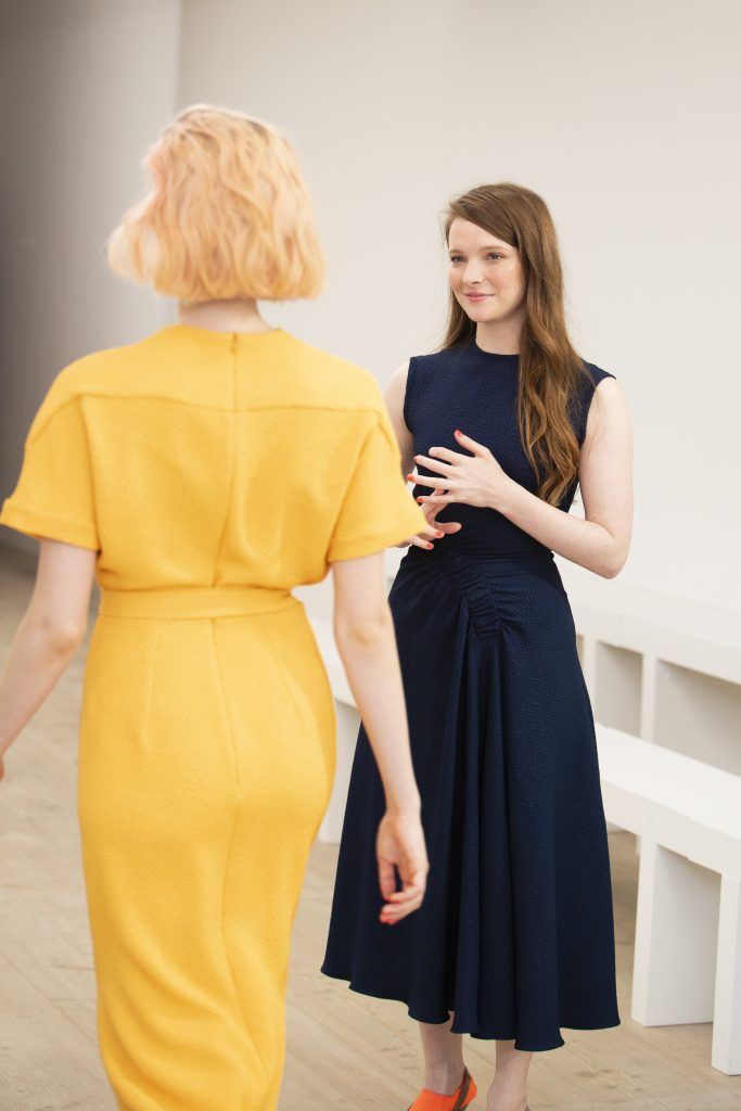
The world is a scary place at the moment. And this season, fashion has taken notice. Designers have been either making open political statements through their clothing or indulging in an escapist mode by presenting bold garments which express their need to run away to distant lands. British-Canadian designer Edeline Lee is very aware of it, and that’s exactly why her Spring Summer 2020 collection was a light, brightly coloured burst of joy.
This season, the designer wanted to inject a bit of optimism in her clothing, as past season’s fall-winter 2019 presentation had such a tough subject matter (she had been inspired by professor Mary Beard’s feminist manifesto, Women & Power, where Lee made the case for the runway as soapbox).
“I feel like we need a bit of optimism right now and so I felt like I needed something light which could contrast the darkness of everything that’s been going on at the moment,” she said.
Following up from her experiential presentation of last season, this time Lee collaborated with Sharon Horgan, the Irish actress and writer who starred and co-wrote Catastrophe and created HBO’s Divorce, for a presentation which verged on the line between theatre and runway.
“Sharon and I are friends but not only that. I am such a big fan of her work, her voice and the way she talks about the human condition is so acute and real and to the skin,” she says.
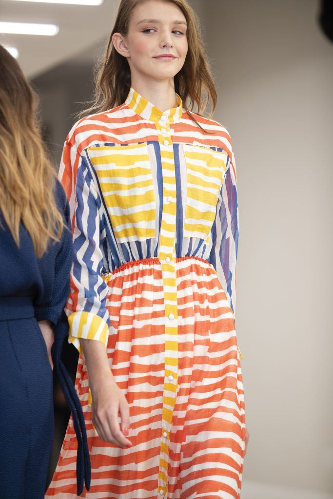
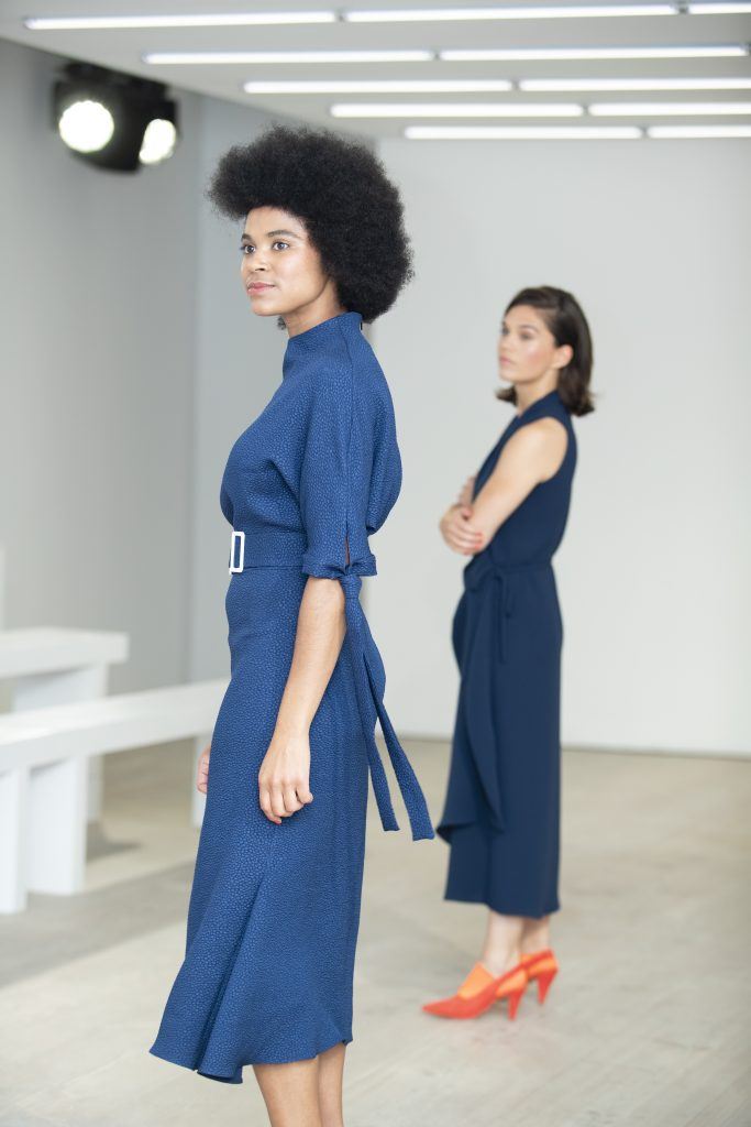
And the clothes she presented exuded exactly the same vibe, they were real clothes for real women, which featured simple silhouettes – ranging from a series of white shirts and brightly coloured midi dresses in a palette of greens, blues and reds, to a series of brightly coloured striped numbers, to finally, a series of dresses made in her signature jacquard.
“In the show in a way what we’re trying to do is juxtapose the lightness of the clothes to these real-life moments which are acted out by a series of actresses, who sort of stop and get distracted by real-life passing by and then they stop and go back to their intimate realities,” she says. “It’s sort of like a play on a juxtaposition of these different versions of life.”
Sitting in one spot over the course of 15 minutes you would be able to experience every skit presented by the actresses almost as if eavesdropping on conversations of everyday life.
Lee’s collaboration was a refreshing take on a runway experience – and it definitely helped her in trying to represent who her woman really is and making people understand who she’s making her clothes for and the audience she’s making it for. Collaborations like these are a fun way to get the point across and are also more memorable experiences in a month where editors see an enormous quantity of shows.
London Fashion Week Day 2: Ports 1961, Marques Almeida, Toga & Rixo
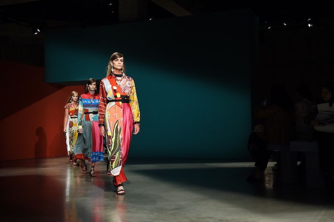
Karl Temper’s debut at Ports 1961
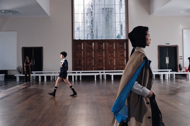
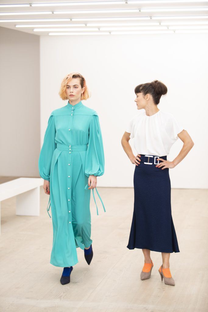
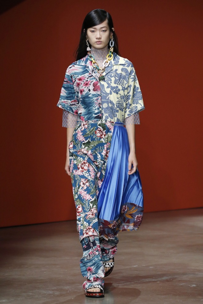
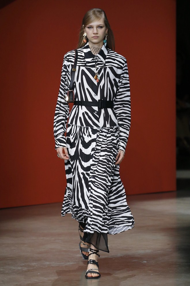
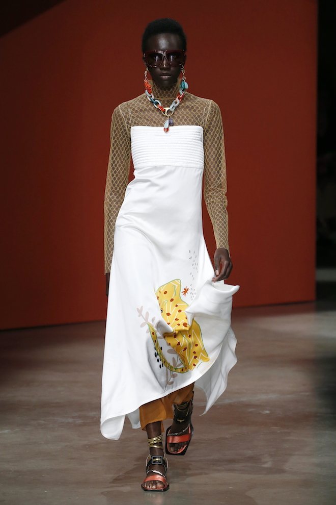
London Fashion Week Day 2 started with a bang as Ports 1961 set their newly re-launched and re-designed brand with a fantastic show at Tate Modern. The brand, renown for its minimalistic heritage has now been rebranded, from logo to collection, under the watchful eye of newly appointed artistic director Karl Temper. Breaking away from its previous minimalistic codes, Temper introduced us to a bold, maximalist collection. Tribal prints with slight nods to Matisse, covered pleated dresses, skirts and trousers, whilst triple-stitched trouser suits were presented in a varied palette of baby blue, terracotta and mustard, an interesting power alternative to the usual day-to-day workwear. Standout looks included a cue to a budding trend to come as a very cool mix of zebra and cow print covered a series of coats, trousers, a knitted two-piece set and a silky dress. Chinoiserie floral patterns covered silk panels on coats and shirts, adding a touch of etherealness and femininity. Chunky jewellery and bi-colour studded sandals accentuated the overall eccentric art-mom vibe of the collection. Definitely a great start for a first-time stylist turned designer.
The power of community at Marques Almeida
Images by Tom Warabida
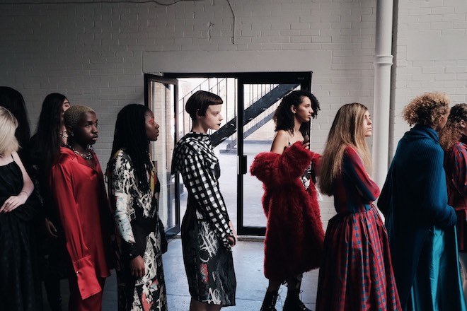
Multiple screens welcomed the guests at the Marques Almeida show. “If you had a daughter, what would you want her to know?” This was one of the questions posed by the designers to the M’A girls, the diverse group of young women featured in the video installations screened before the show started. “If I had a daughter I would want her to know that it’s ok to be who you are and to be super unapologetic about it,” said one of the girls. And indeed it was this empowering message that inspired the collection and wants to push the designers to create a strong community which aims at inspiring the youth. This season, the designer duo was inspired by a mix of rebellious icons, from slightly 50s freakish Hollywood actor shots to Riot Grrl zines and Bikini Kill. This duality of sensitivity, femininity and toughness was evident as different materials and colours were contrasted throughout the collection. Floral printed tight tops were styled with oversized denim frayed trousers, whilst oversized taffeta dresses in pink, acid green and blue were styled with a series of bold accessories, either tough or feminine, ranging from latex gloves to feathery kitten-heeled shoes.
Fashion as an indulgence at Toga
Images by Tom Warabida
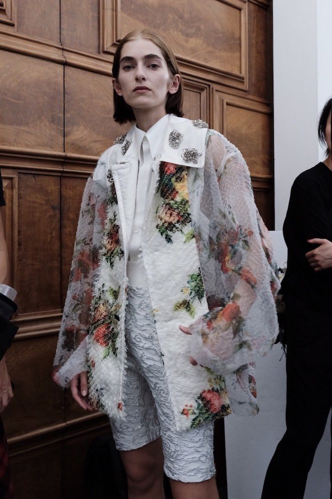
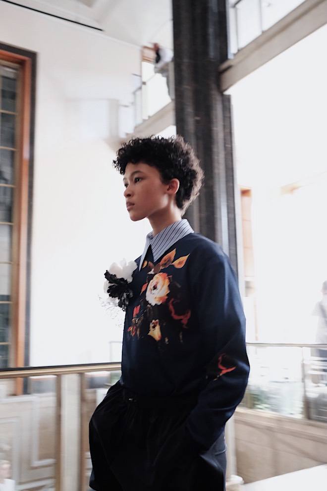
Set at London’s iconic Royal Institute of British Architects, the Toga show was a play of artistic temperaments. Every season, Yasuko Furuta, the designer behind Toga, defines her collection in three words, and this season these three words were “wrapping, re-development and efficiency,” words which she said connoted an ambience of not prioritising productivity in a world that does. Yet, how do you do that in this world which seems to be moving at an ever-changing and faster pace way of living? Slow down and indulge in the unnecessary details. This was the overall message conveyed by the collection as a range of romantic details accentuated the looks: big vinyl flower brooches accessorised perfectly tailored business suits, whilst urban items such as the now-very-popular bike shorts were updated in bold floral brocades. Beach sandals were re-interpreted for the city and paired with long, flowing formal dresses, whilst highlights of the collection were for sure the bold overcoats which gave an edge to the more minimal looks.
60s psychedelia at Rixo
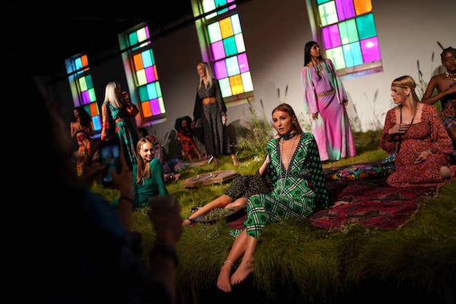
It seems like this season 16Arlington wasn’t the only brand who took inspiration from the 60s and its free, fun, atmosphere. Rixo, the British brand famous for its printed silk dresses and midi skirts popularised by Instagram’s it girl community, staged its SS20 presentation in a relaxed garden where models of all ages lounged on the grass, blowing bubbles and dancing around to a rock and roll soundtrack. Taking inspiration from Joni Mitchell’s style and featuring her vocals as the soundtrack to the presentation, the collection featured soft sixties silhouettes, psychedelic prints and florals featured on maxi dresses and mini dresses, and silky feel good flares perfect from morning to night.
The collection will also be available to buy the moment it debuts at the Rixo store at 94 Kings Road.
A Deeper Look (Book) : Lacuna
Twin takes a deeper dive into the jewellery and RTW brand Lacuna, based in Paris
An unfilled space; a gap. It feels like a statement definition already, with the designer Annabelle calling her namesake brand Lacuna. While it also happens to be Annabelle’s last name, it seems fitting to look at the meaning from both angles.
Lacuna is a brand with a grown up elegance but a sensual sensibility, matching Annabelle’s design pedigree within Chloe, Cerruti, Kenzo and now Margiela designing under Galliano the show collections.
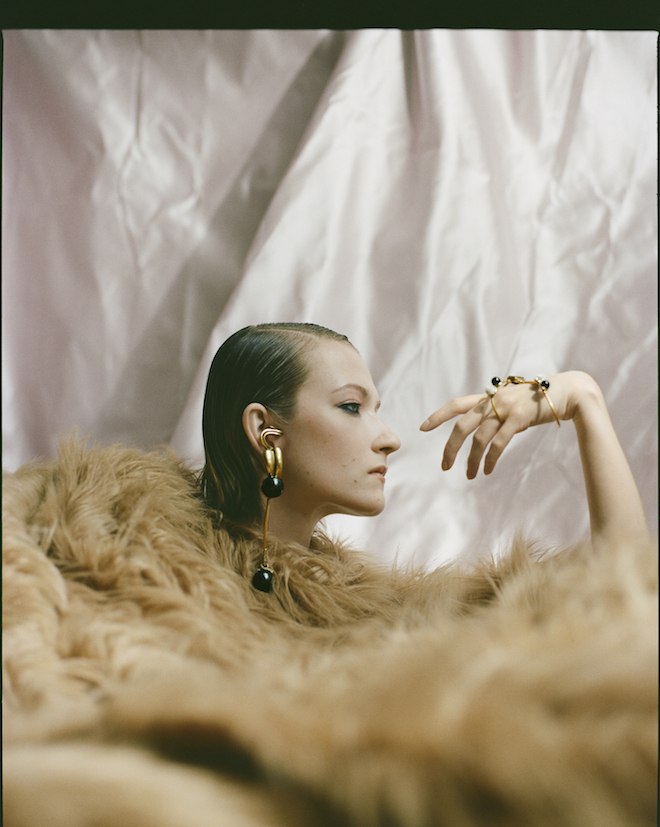
Seeding out these sensual and undoubtably mesmerising images of her first collection entitled ‘Serpent I’, within her jewellery we see beautiful beady eyes resting on a deep reddish gold that wraps over hands, loops under ear, swirls around necks. Beautiful peachy pearls and shimmery little Swarovski baubles drift amongst dark petroleum-black planet pearls.
Introducing the brand via her perfectly executed look book, Lacuna takes a classic introductory format and makes it sexy: she reminds us of the evocative powers of jewellery, of the way it can emphasise, flatter, signal something unsaid.
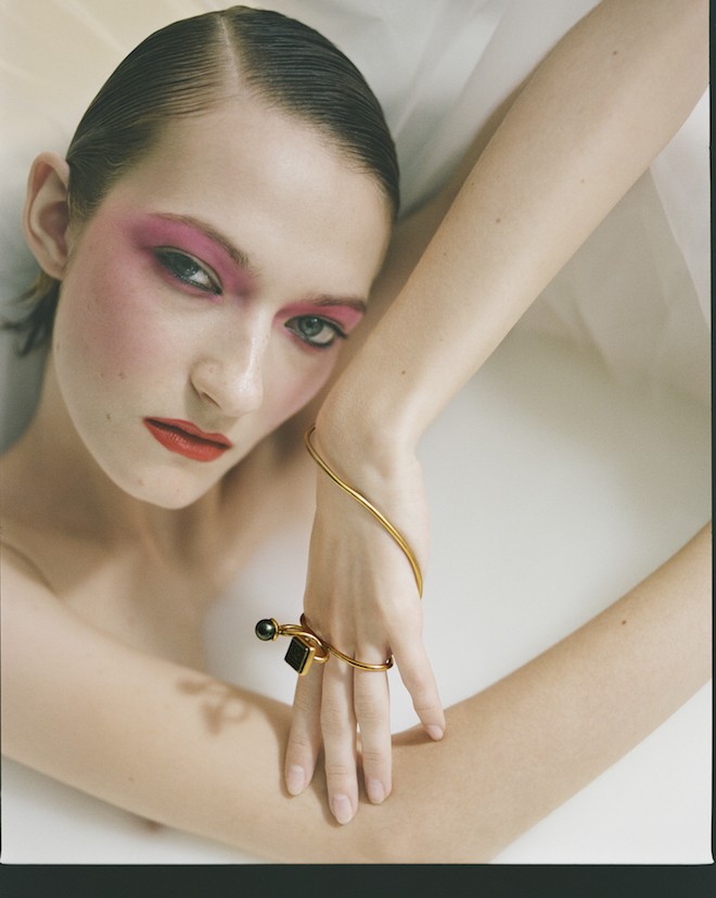
Photographed by the German photographer Marlon Rüberg and styled by Annabelle herself, you can see this is a brand Annabelle has planned for a while. Keeping the team intimate is reflected adamantly in the imagery – room for spontaneity and happy accidents, but clearly polished until it reached a standard Annabelle was happy to brand as her own.
This is not to mention the wonderful hand painted concise collection photographed alongside: a rose overlaid on a python in blues, yellows and red. Stiff silks in kimono shapes and slinky slips drip off the model’s frame.
Lacuna is a cosmic brand: refined but contemporary – the feeling that it is slightly intergalactic with these biomorphic forms floating on gold wires in unfilled space.
We anticipate great things in her future explorations of deep jewellery space.
What made you begin your brand?
I have lived and worked in Paris as a womenswear designer for the last ten years- at many different houses and for different sort of creative directors. I wanted to continue doing that and at the same time start working on a personal project. I chose fantasy jewellery as it’s a product that is not connected to my daily work but I had always interest in and I’m a collector… I researched for weeks in all kinds of libraries and museums which was amazing to do, I wanted to give it time to grow. I found the best jewellery ateliers in France to work together with as well as an amazing atelier for my hand painted pieces.
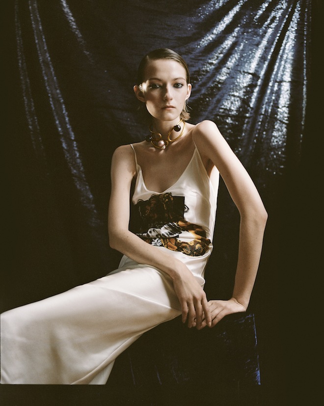
Who photographed and styled the look book?
Marlon Rüberg is a German photographer and director who shot my look book in Milan, where he also lives and works. He is a very good friend of mine who I met when we were both living in London more than ten years ago. He’s very talented, we share the same references and I knew that he could translate exactly what I had in mind and create a lot more to it than I had imagined. I trust him completely. I styled it myself- for my first look book I wanted to keep the team small and intimate. I like to be prepared and we planned out each shot- but I also like to see what happens on set when everything comes together … I like to try out new things spontaneously on the spot and see what happens.
What was the inspiration behind your first collection?
I went far back in my memory and landed at one of my first fashion obsessions that I could remember. My mother used to wear very colourful printed, Philippine exotic house dresses or caftans at home, which was very unconventional growing up in German suburbia and she also used to wear very decadent and chic 80s jewellery on special occasions like receptions or cocktails (my dad used to work for the Philippine government).
All the dresses are hand painted and have different kind of techniques on them, the colours are all mixed by hand. Each piece of my jewellery collection is single, the hand pieces as well as the earrings- I wanted a unique look.
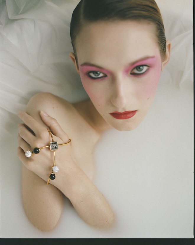
What did you want to explore in your look book imagery?
I wanted to present my pieces in a sensual but also sculptural way- that’s why I choose the milk bath scene, the model floating on (fake) fur…
What are your enduring interests.
I’m always looking at new exhibitions of artists, photographers, sculptors, painters, but also vintage books and magazines … I’m interested to see new aesthetics, mediums, point of views and I’m always happy to meet new people who I can learn from and work together with
Why do you think look books are important?
For me, editorial, video, look books, any sort of image that accompanies a project, is the ultimate visual diary to show the vision of the brand, its world. Every aspect should look considered. For my next project I would like to focus more on the printed version.
Do you think attitudes in fashion are changing?
The only ‘trend’ or attitude I support at the moment and hope will endure is the sustainability and recycling one in terms of how fashion is being made and produced. But in general I think fashion attitudes go cyclical and one movement will always trigger the counter movement.
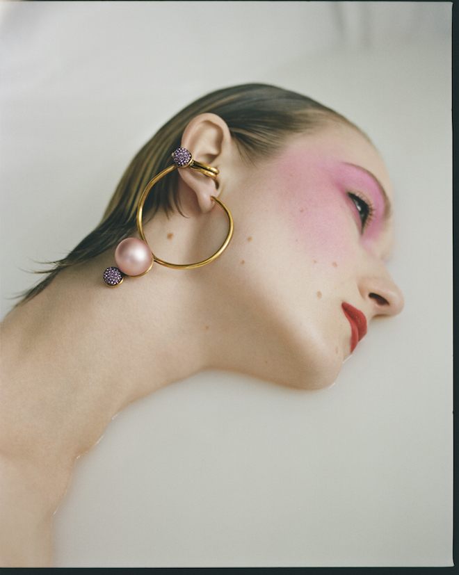
What do you want your audience to take away from your brand?
I want it to become synonymous for an avant-garde and extravagant look.
What powers does jewellery hold?
When you buy it for yourself, it’s empowering. As a gift, it can become very memorable- when it’s family jewellery or from your loved one.
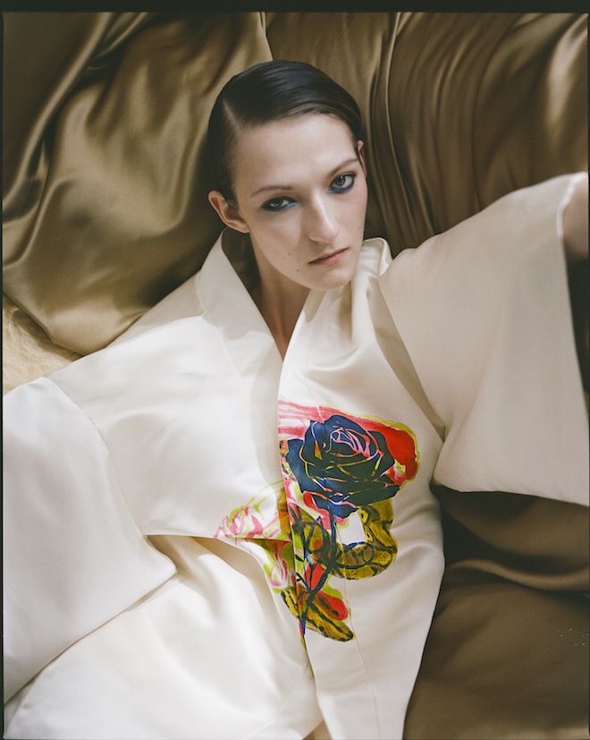
What powers does clothing hold?
It’s empowerment and disguise at the same time.
What was the last thing that made you excited?
Coming to a conclusion what my next project will be about! A lot of different ideas have been going through my head, I was with a friend and talked and talked and talked- and it all became clear.
Credits:
Photographer : Marlon Rueberg
Model : Kasia Jujeczka
MUA: Giulia Cigarini
Hair : Daniela Magginetti
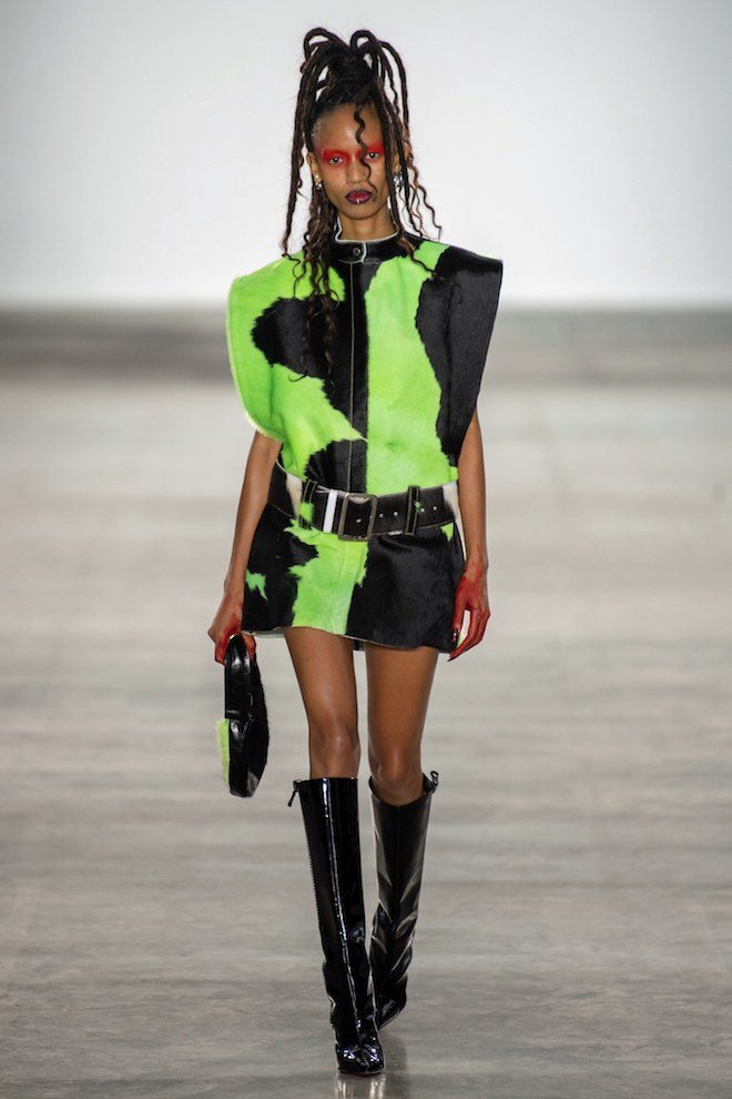
LFW: Fashion East SS2020 Showcase
Last week three young designers under the Fashion East Initiative presented their SS2020 collections. A small tribe of Londoners and British fashion school alumni who each spoke with very different voices.
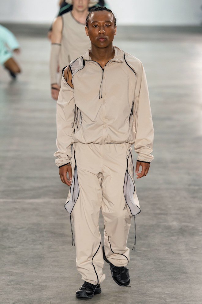
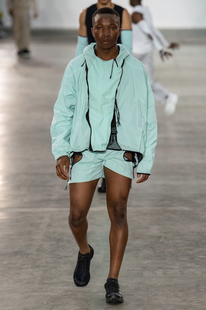
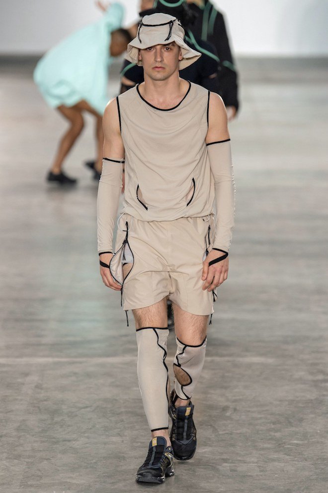
The newest designer to the bunch was British dancer and choreographer Saul Nash who opened the showcase and his section of the evening with a group of models standing on the runway. Followed by a dance performance upon the guests being seated. This performance helped to show off Nash’s construction abilities in creating functional pieces with technical fabrics, curved zippers and mesh. From steel grey nylon pants, to light blue tracksuits. Each piece was made with an awareness of comfort and sensitivity towards movement.
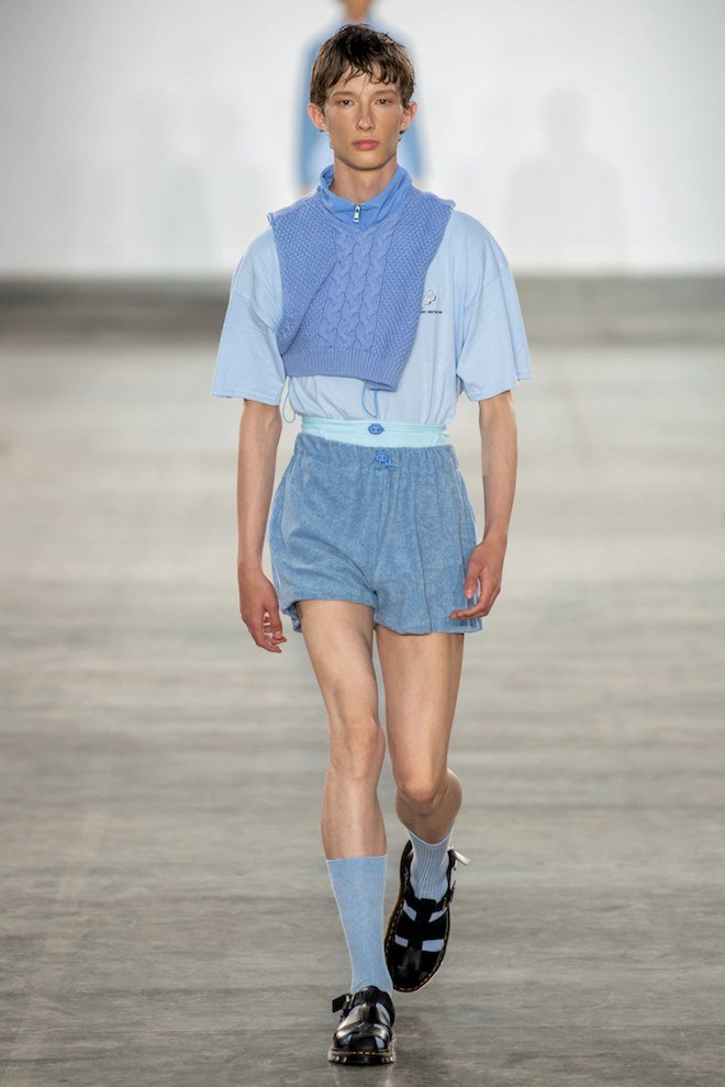
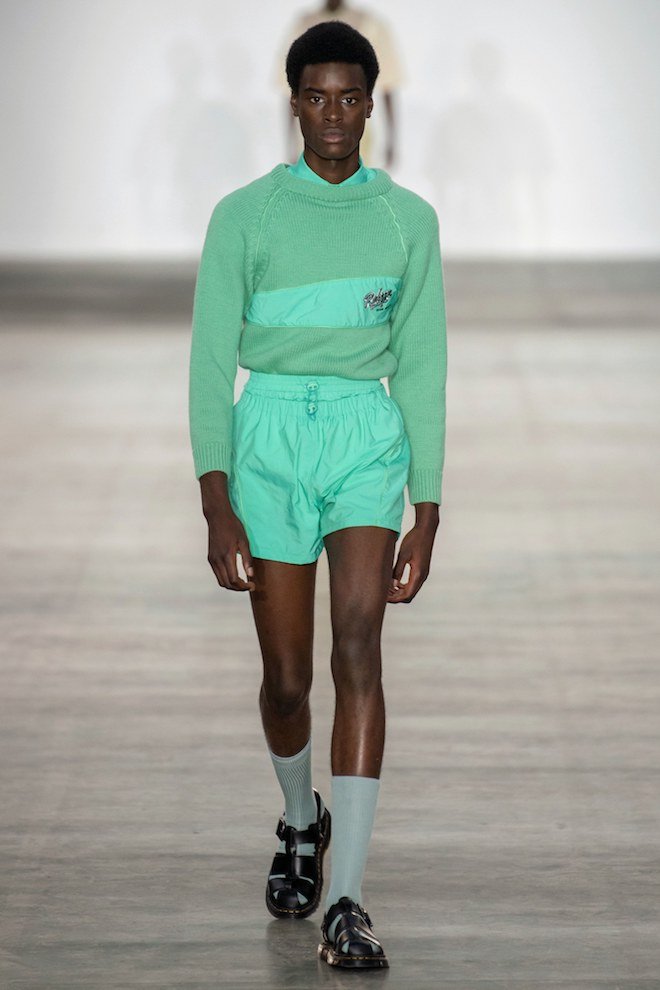
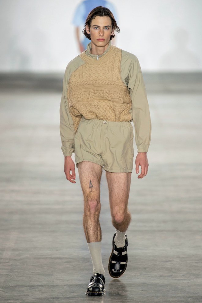
Irish designer Robyn Lynch presented a solid coloured men’s collection inspired by the sport uniforms worn throughout Irish communities in earlier decades. This was brought out through a selection of cable knit sweaters, terry cloth shorts, t-shirts and cropped sweatpants all rendered in a palette of mint greens, lilac and cornflower blues.
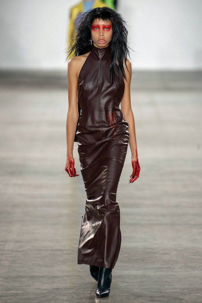
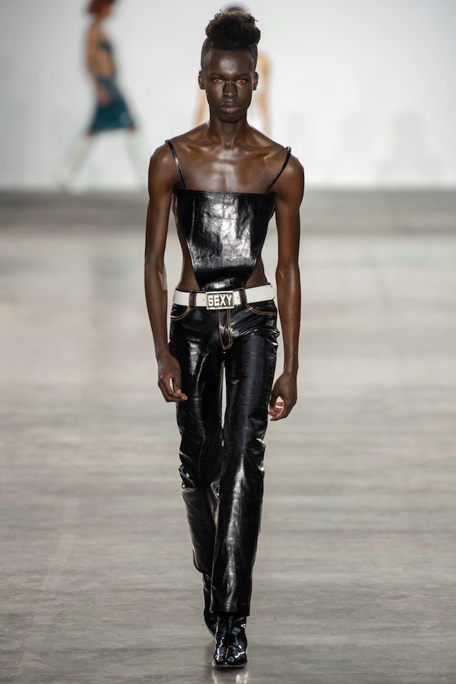
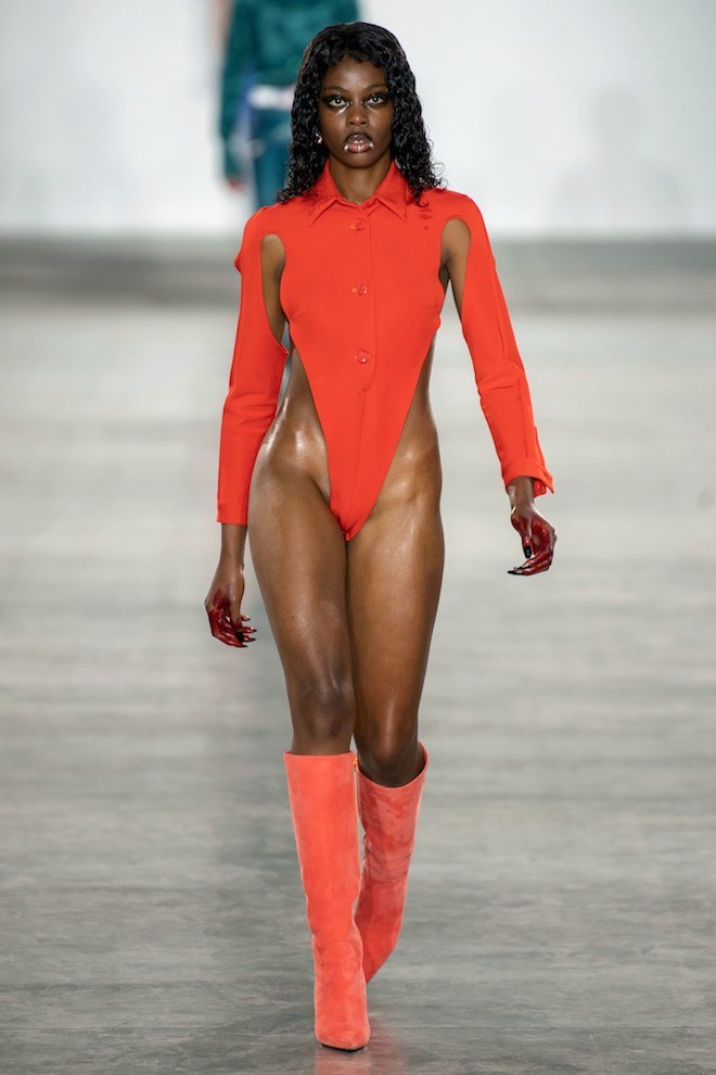
Nigerian designer Mowalola Ogunlesi showcased her second collection with Fashion East that was inspired by her experiencing the woes of romantic love for the first time, “I’ve just fallen in love for the first time and I feel as if no one talks about the horrific side, the dangers of love, losing control of your emotions and feeling like your crazy. It’s like a horror movie. So this is as if I’m in a black Woodstock Festival and someone has been murdered,” she explained. And henceforth this included looks with gunshot wounds placed against large lip prints, religious symbols in colourful halter necked suits, skin tight pants, revealing bodices, jumpsuits, and coats made from leather, cotton and cowhide fabrics.
Fashion East Fall-Winter 2019
Last weekend passed this year’s first Fashion East showcase which featured a list of three intriguing London based emerging designers, in showcase of their Fall Winter 2019 Collections. The non-profit initiative, set up by Lulu Kennedy and Old Truman Brewery to support and nurture emerging British talent celebrates its 18th year of triumph after housing designers such as JW Anderson, Kim Jones and Gareth Pugh; just to name a few.
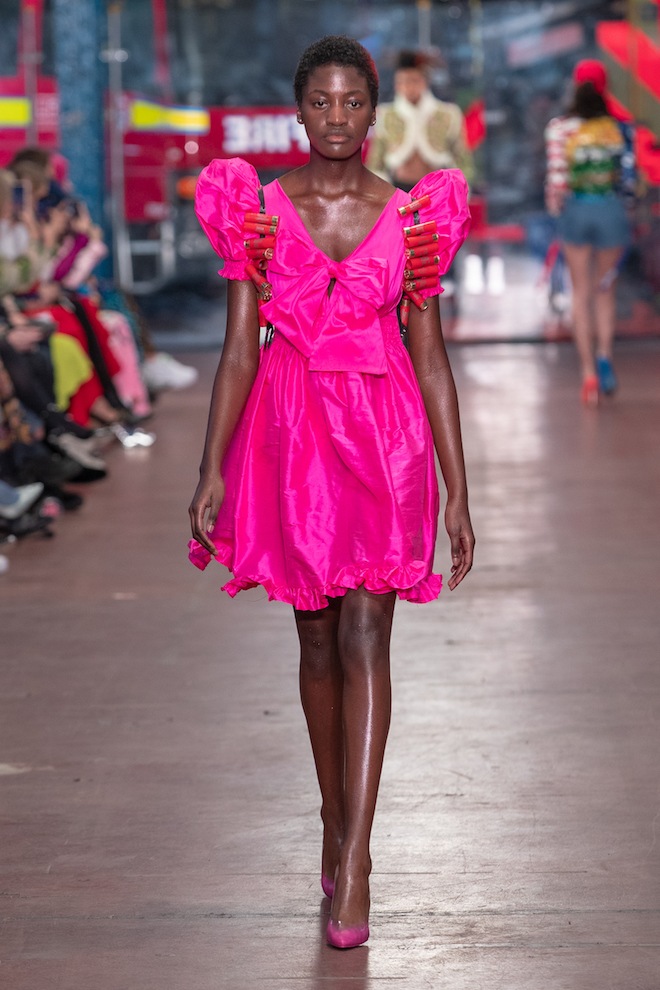
Central Saint Martins graduate Gareth Wrighton was one of the three talents to showcase. Wrighton presented a 22 look collection in collaboration with stylist Ib Kamara titled “Smooth Criminal.” The collection was inspired by a four month residency the designer previously took in Johannesburg with Kamara and South African photographer Kristin Lee Moolman. It cohesively spoke to the stories of political coups, warring dynasties and feuding families caught in a violent power struggle. The looks included flaming hair, bullet accessorised mini dresses and sweaters with burning forests. The collection in itself was nothing short of a political statement.
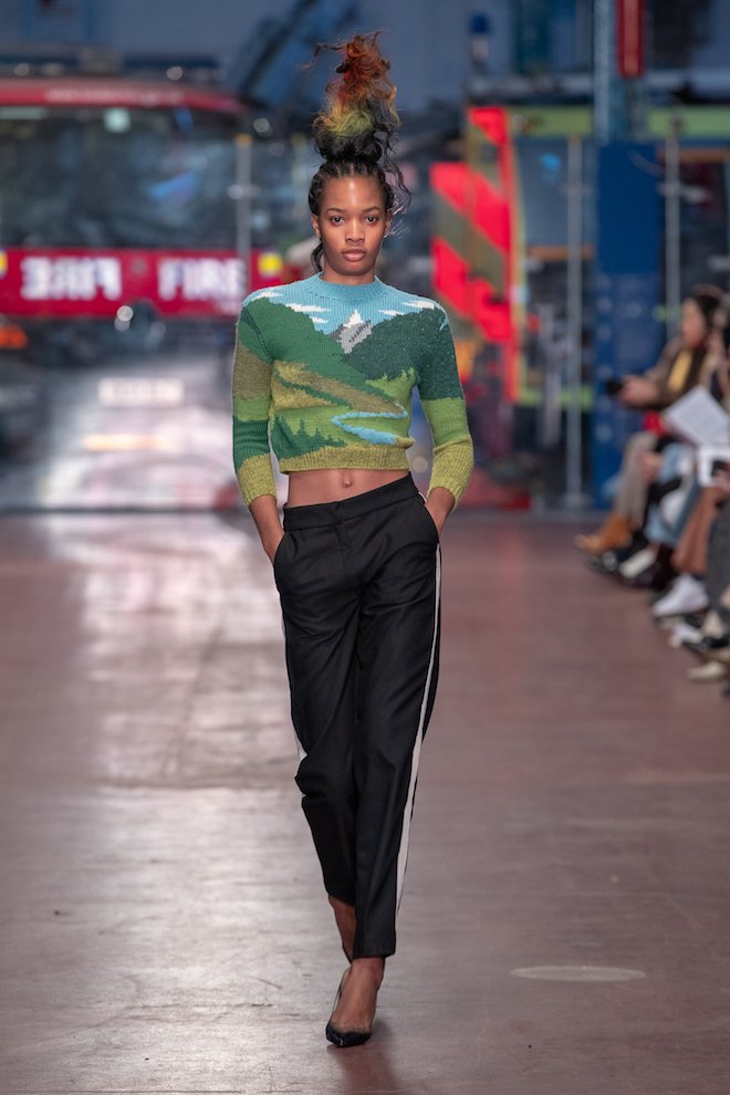
In 2017 Designer Charlotte Knowles and partner Alexandre Arsenault launched their South London label Charlotte Knowles London after also completing their masters at Central Saint Martins. Designing for a feminine and strong woman, in the AW19 collection, Knowles explores femininity and ready to wear in a way which disrupts traditional boundaries. Boundaries between the vulnerable and the combative, the human and the natural, the intimate and the public and the strange and familiar. The collection featured wool and technically crafted fabrics, made in soft pastel colours from form fitting, to minimal to fluid. This was the designers’ final showcase with the support of the Fashion East Initiative .
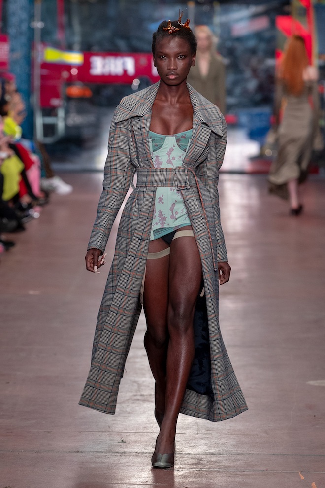
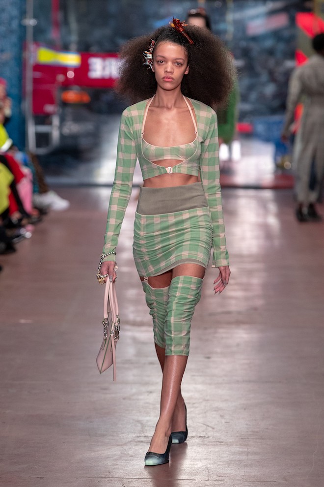
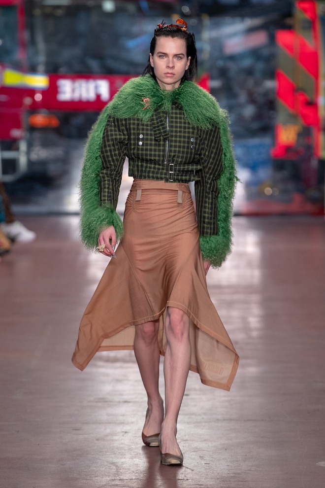
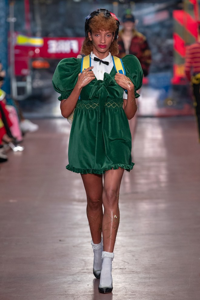
The final collection was that of Chinese CSM trained designer Yuhan Wang whose collection was inspired by traditional Chinese concepts of femininity and their connections to western culture. She explored the lines between beauty and strangeness , softness, delicacy and sensibility. In her second season showcasing for the Fashion East initiative, Wang’s pieces were made in silk satins, lace, velvet and tulle in ripple technique to flounce around the female form. She presented sheath and tea dresses in a 3 Dimensional way where her ruches and other artistically danced around the body. “ I think of it as the push and pull we experience as women. The constant dialogue between our inner and outer worlds,” says wang. With soft colours of blue, lilac and primrose yellow, the designer pieced together a cohesive collection which told an impactful and interesting story.
Megan Rooney on her performance SUN DOWN MOON UP
London-based artist Megan Rooney premiered a new performance SUN DOWN MOON UP yesterday at Park Nights at the Serpentine Pavilion.
In collaboration with Nefeli Skarmea, choreography, and Paolo Thorsen-Nagel, sound. The piece was performed by: Temitope Ajose-Cutting, Daniel Persson, Leah Marojevic and Megan Rooney.
Park Nights takes place at the new Serpentine Pavilion each year and requires artists to respond to this environment. How has Frida Escobedo’s 2018 Serpentine Pavilion influenced your performance and how will you interact with it? And in this space, how will you physically and performatively explore more metaphorical themes of boundaries, forbidden space, transgression, etc.?
SUN DOWN MOON UP has been constructed specifically around the pavilion, that is our site and that provides the intention. It becomes for me the skin of the piece, holding everything inside of it. Frida’s Pavilion has four entry/exit points, so it encourages movement very naturally. I’ve written a new text which deals with the present moment: the festering chaos of politics with its myriad cruelties and the laden violence of our society, so resident in the home, in the female, in the body.
“I saw you dropping eggs out your car window
Passing through the stop signs
Yielding to blue sky
Praying for a pay rise
You were honking and choking
Singing out malarkey
True as god”
This performances uses the body as a site of resistance and as a site for storytelling. I am interested in the transferring of the myths, in the boundaries between real and fake in the construction of new stories. This work is responding to the present moment, to the complication and confusion of it. Things are swinging around violently and moving further and further to the right. The characters are resisting.
Your works have been described as fragments of a larger whole. How does SUN DOWN MOON UP fit into your larger body of work and or propel it further?
Yes, I think of the performances as chapters in an ongoing story. I am interested in the movement of stories, and what happens to stories overtime, which stories are preserved and which are lost? We are at a difficult moment in the story and as a result things have become quite stark and stripped back – only the urgent things remain.
I like that idea of focusing on what’s urgent or imperative. And that’s really apparent in your work, in the subjects that recur and the characters that often return. Gender and the body, the female body and femininity in particular, and the natural world and environment seem to always play an important. How do they manifest in SUN DOWN MOON UP?
I write about the things I know, the things that I experience in my everyday life. The things that I see in the people close to me. The stories I hear.
My performances occupy a slippery territory, I want you to come and see them. Not to look at static single pictures of the work on Instagram, not to watch documentation – although, of course, we do this all the time. But this is something that unfolds in real time and that is important. It’s about the bodies in the room and the bodies in the piece. It’s about sharing something together. There’s something very powerful in that.
For Park Nights, you’re working with Nefeli Skarmea on choreography and Paolo Thorsen-Nagel on sound. What was this process of collaboration like? What have you achieved together?
I met Nefeli Skarmea three years ago at the Serpentine when I was working on another performance called, Last Days. Last Days. Last Days. Over the past few years, we have been developing a universe of movements that relate to the texts that I write. I see the performances as different chapters in an ongoing story that is constantly changing and evolving but that drags that past with it. Nefeli and I have developed a number of pieces over in past few years in very different locations.
Similarly, I’ve also been collaborating with Paolo Thorsen-Nagel across different projects. His understanding and intimacy of sound really changed the way I hear the world. We started sending sound files to each other, creating a landscape of sound for the performance to live inside of. I’m interested in the transfer of sound between bodies and places and across time, how we can trap and store sound and then use them as tools for communication. The wail of an angry child, the sound of a bus engine, the howl of a dog tied to a rope. The relentless hum of crickets chanting in unison. The blocking out and isolating of sounds. When the roll of a wave takes over this invisible landscape. How water sounds in different places and the different types of words for describing this sound. For example, on the west coast of Finland, you can hear the roar of the sea in the distance almost like a constant hum – only discernable when you isolate it but after impossible to ignore. They call this the brus. Like a storehouse of sound attached to memory.
I spend a lot of time in the studio working on my own. Performance is my chance to be social and I love that feeling. The studio is full. Everyone is picking each other’s ideas apart, and we’re building something together. Performance is also about orchestrating something – about bringing the right people into the situation and working it out together. You have to have a vision, of course. It can’t be everything – it can’t be a soup. It has to sing. It’s about having control and losing control for me and sucking the thing out of people that you see in them.
Why Mount Athos? Why magpies? Where did the inspiration come from? How did this setting and these characters connect for you?
Many years ago I saw an opera by Giannetto De Rossini called La Gazza Ladra – The thieving Magpie. It tells the story of a French girl accused of theft who is tried, convicted and executed. Later, the true culprit is revealed to be a magpie. La Gazza Ladra is best known for the overture with its use of snare drums. This section of Rossini’s overture evokes the image of the opera’s main subject – a clever, cunning, thieving magpie. Magpies are extremely intelligent, ancient birds that are surrounded by myth and superstition, especially in Britain. There are always bird references inside my performances.
And Mount Athos?
I read a news article about Mount Athos a couple of years ago. It’s situated in Northeastern Greece, a peninsula that extends its boundaries into the sea. A place women are banned from entering, including all female animals. It’s been inhabited by a group of Eastern-Orthodox Monks for over a 1000 years. Athos becomes a kind of literal, visible boundary. One that is shrouded in secrecy and perhaps can be interpreted as having little consequence. What impact if any does banning woman for this place really have? You could argue very little. But I think we can use this to speak about invisible boundaries and invisible violence. Access. Isolation. Separation. Distance.
Humans have always had the impulse to create barriers. To say you can go here and not there. This belongs to you. This belongs to me. This is mine. That is yours. You cannot enter here. The idea of boundaries are forever caught in a wave of absurdity – and yet every aspect of our lives is wrapped in this basic idea of territory and belonging.
It’s not really about Mount Athos. I did go there this summer or to the closest town Ouranoupoli. I went on this boat cruise around the peninsula, 500 meters from the shore, which is the closest women can get to visiting the monasteries. The Monks ride out from the monastery on a speed boat and board the main ferry that holds about 350 people – with suitcases full of merchandise that folks can purchase. This loud speaker describes the different monasteries, explaining all the incredible relics inside that you don’t have access to. I did a lot of filming on the boat. You can buy beer and sandwiches.
I think you have to go to places to make references real. To observe the people in those places. To sit on a night train clutching your belongings in your lap, surrounded by drunk men. The trip itself was intense and difficult at times; at other times, it was totally banal and very fucking hot. I watched this singed landscape blowing past the window, stopping where wildfires had scorched sidewalks into carpets of ash.
Megan Rooney, Park Nights in partnership with Cos at the Serpentine Pavilion, September 14th.
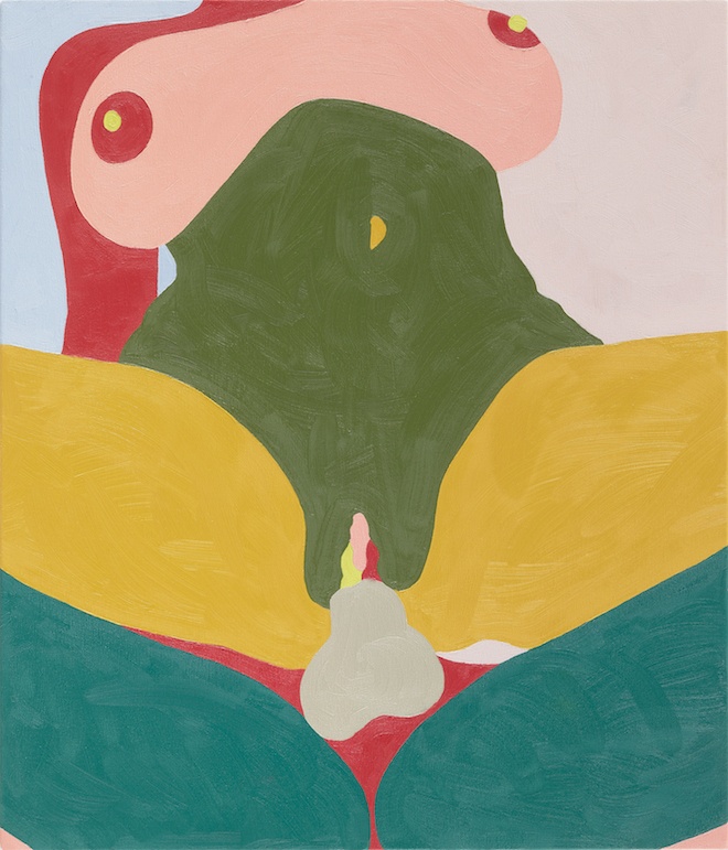
Helen Beard’s True Colours
Damien Hirst’s most recent exhibition True Colours at his private museum, Newport Street Gallery, shines a light on three female artists Boo Saville, Sadie Laska and Helen Beard as it examines each of their unique explorations into the possibility of colour, form and subject. Twin Factory had the opportunity to speak with Helen Beard on her inclusion in the show.
Hirst initially commissioned Beard to make a selection of large works last summer, she explains; “It wasn’t until he asked me to make some more works recently that I realised he wanted to show them at Newport Street Gallery.” Hirst’s generous offering of his Peckham and Gloucester studio’s allowed Beard to make her largest pieces to date;
“I have really enjoyed working at a bigger scale, it adds something to the work, gives it a power. I do really like working at a smaller scale too though. ‘’Each, Peach, Pear, Plum’ (2017)’ is one of the smallest works in the show but it is one of my favourites. I will need a bigger studio if I continue to make big works though, I am running out of space!”
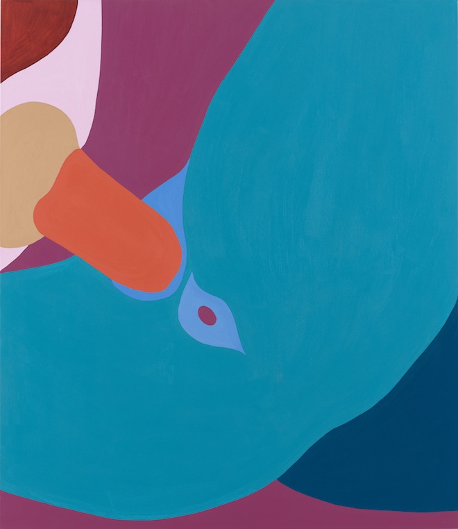
Helen Beard ‘Blue Valentine’, 2016 | courtesy of Newport Street Gallery
Situated partly between representation and abstraction, Beard makes it clear she doesn’t like to chose between either when it comes to discussing her work; “I like both. I started with abstraction because it was less direct, less revealing.” Centred around themes that examine gender, sexual psychology and eroticism. Her vivid rainbow palette of primary colours have in fact been taken from explicit found imagery. The bright, bold colours of Beard’s works lure you in, like a moth to a flame, until it becomes apparent, rather abruptly, that the abstract patterns are in fact cropped and edited pornographic images. As well as the internet, Beard often uses magazines and photographs as part of her process when sourcing material for her practice;
“I draw and work out the composition in small studies and then I also work out the colours at small scale, it saves the paint becoming too thick and the colour losing its vibrancy, but I am not always true to the study if I mix a better colour with the oils I am happy to change them and I often change the drawing with the paint too.”
Beard chooses to work with sexual imagery as a way of subverting the male gaze, something she has focused on since becoming an artist and studying Graphics at Bournemouth and Poole college of design (1990-1992);
I have always painted sex, it has always fascinated me how closed people are when it comes to talking about it. I think it is important for women to express themselves. Sex is such a fundamental in our psyche after all, and art always comes back to those big ideas like sex and death.
As we see in True Colours, Beard’s practice is multidisciplinary, as she works across a selection of mediums that include painting, collage and tapestry. She explains that this is a conscious choice; “It is so exciting to work with various materials all the time, I collect a lot of stuff in my studio, like most artists do and then wait for an idea of how to use it.”
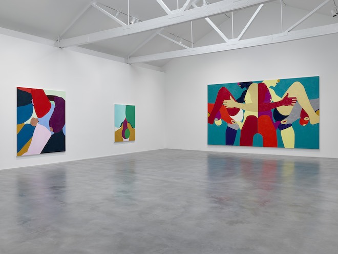
Installation View, ‘True Colours’, Helen Beard | courtesy of Newport Street Gallery
Her use of needlework is striking and unique, as seen in the mid-sized tapestry ‘Can we Conceive of Humanity if it did not Know the Flowers?’ (2014) with its pretty pink stitches that brilliantly contrast with the subversive subject matter. Beard explains that she began to use needlework because of her grandmothers lessons in the technique rather than for its strong associations with the feminine and domesticity;
I don’t think it was a conscious thing to use needlepoint because of it being a female pastime, but I was very conscious that I didn’t want to make the traditional images associated with embroidery or needlepoint, the chocolate box, kittens in a basket, type stuff. So I just used the imagery I was painting.
Since it’s opening, True Colour’s has been praised for its strong aesthetic and positive representation of female painters, with impressive reviews that includes fours stars from Time Out. As an artist who openly wants to celebrate sex from her point of view and strongly advocates that there is no shame in doing so, Beard is pleased with the positive reaction shown by the general public; “its been so well received and so well covered in the press, I am actually quite surprised by how much people love it.”
True Colour’s is on show at Newport Street Gallery until Sunday September 9th
Amazing Grace, Wales Bonner’s greatest hits
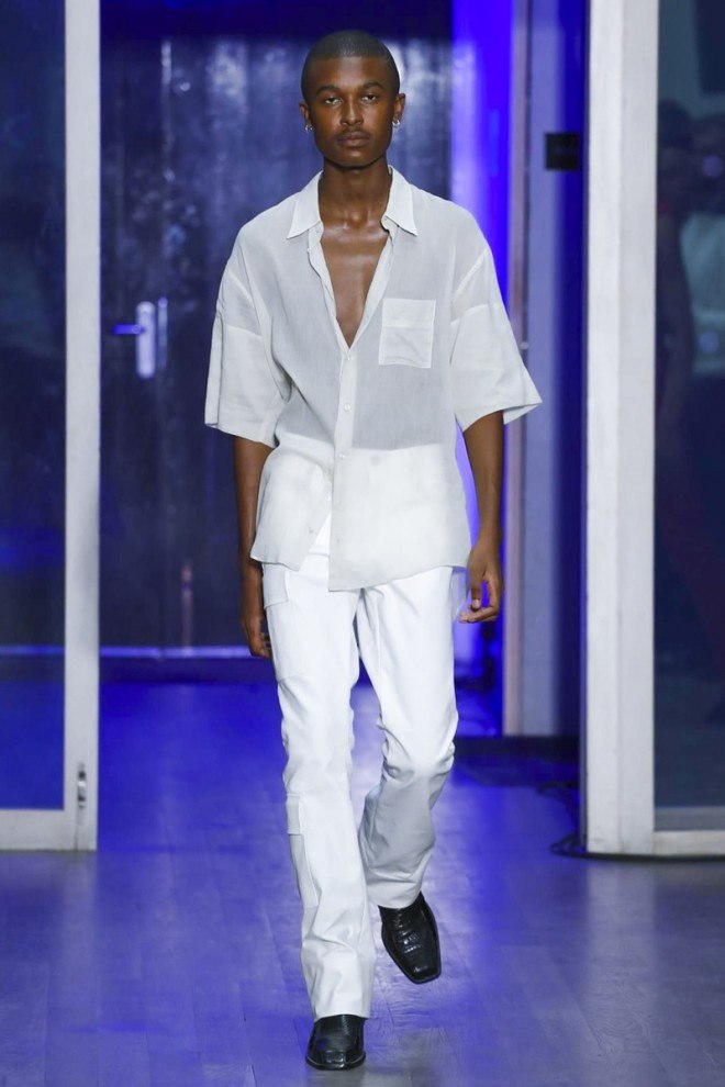
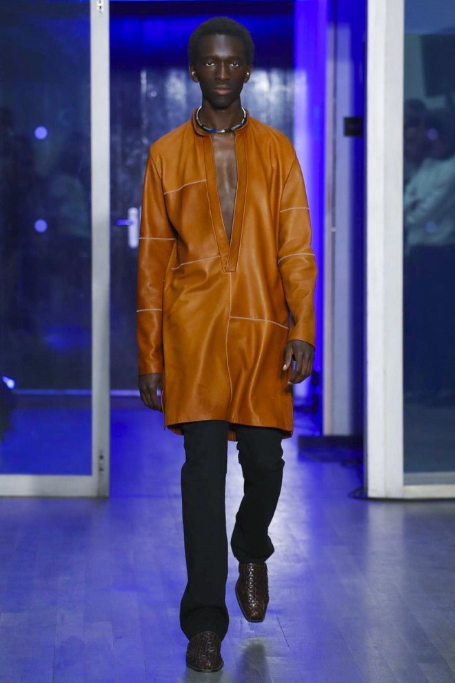
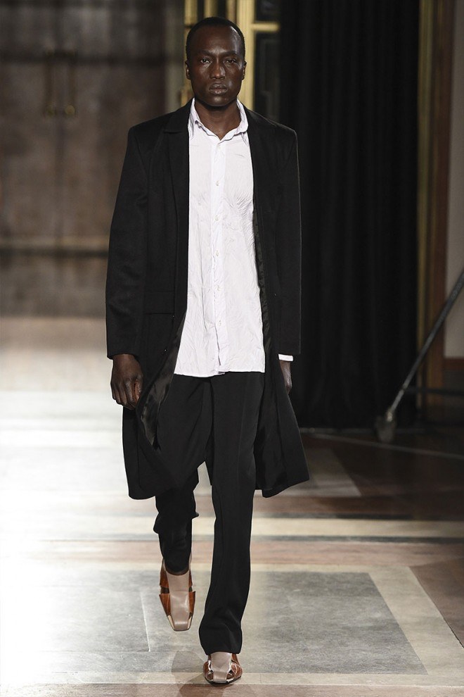
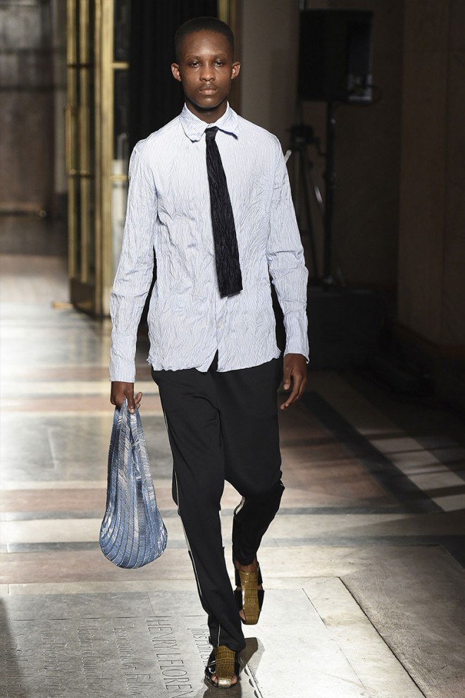
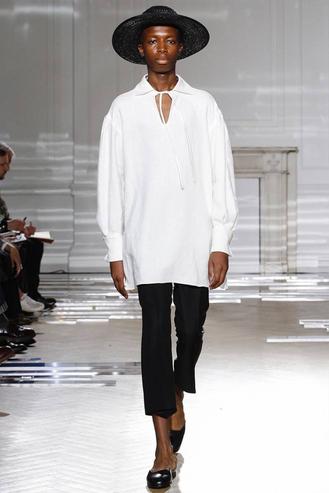
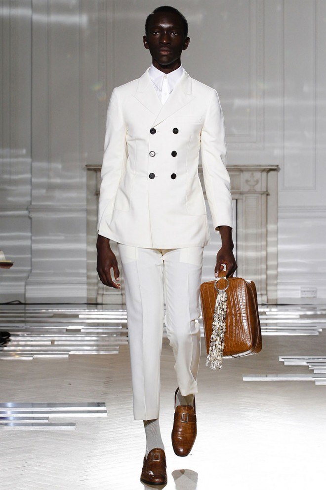
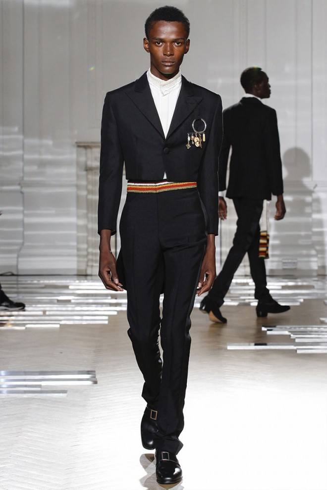
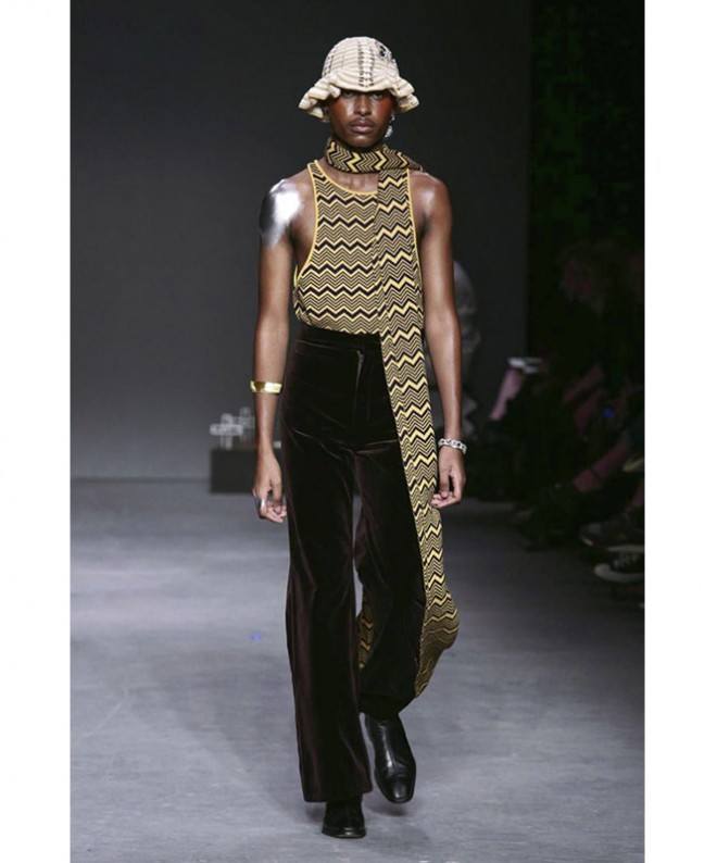
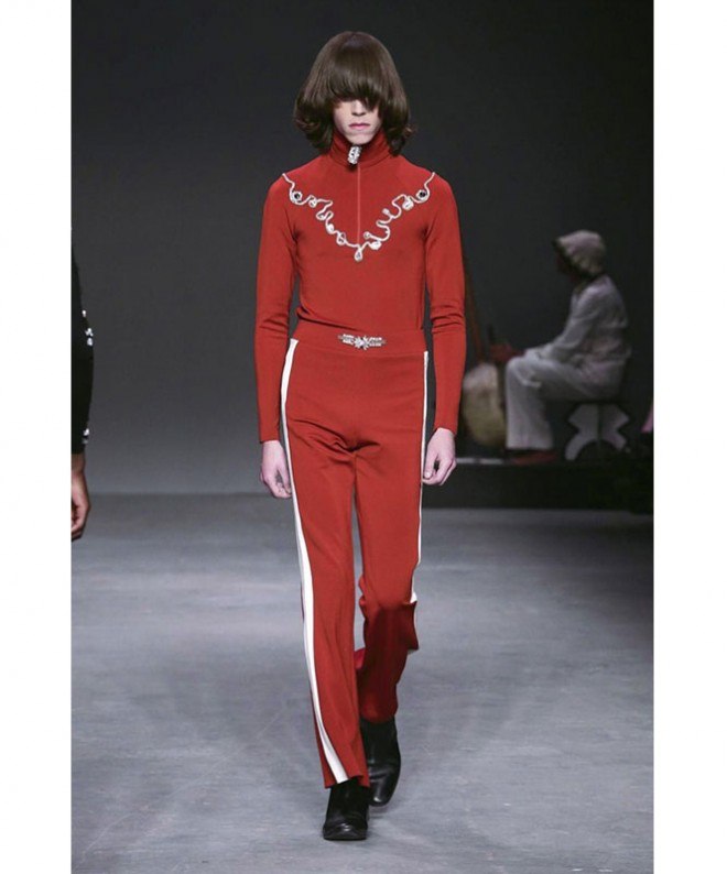
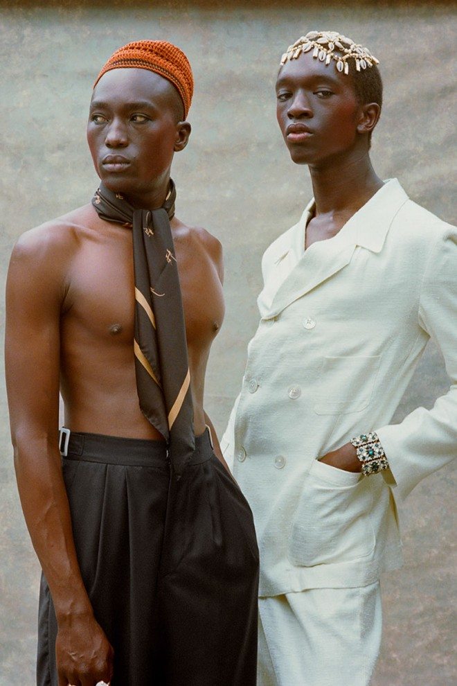
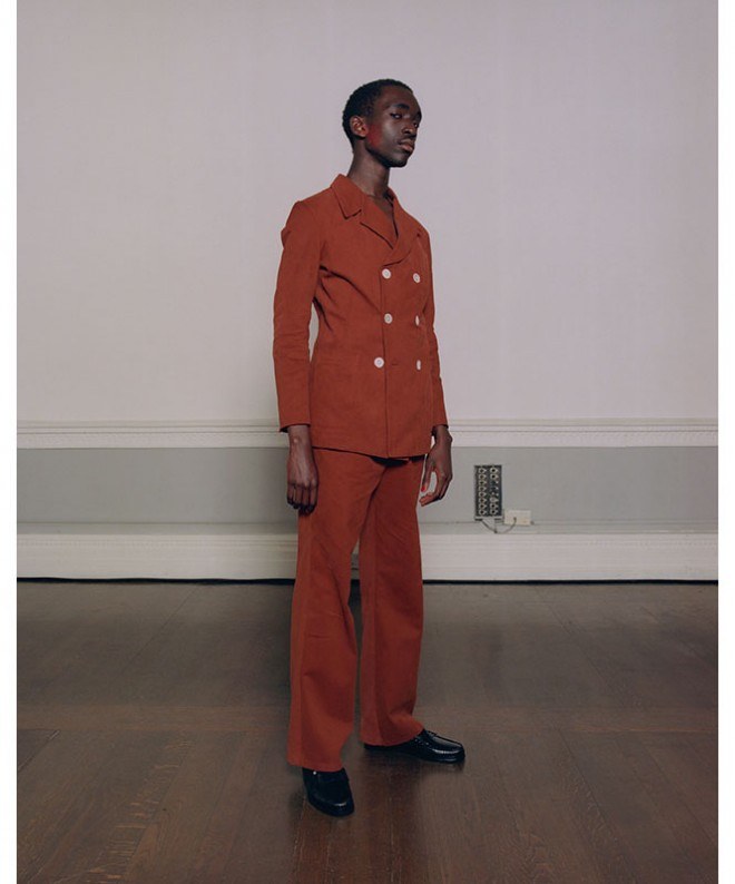
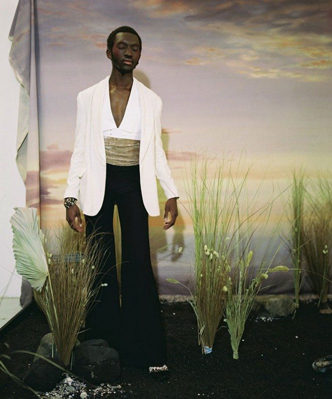
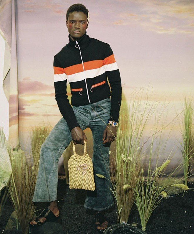
As London Fashion Week Mens kicks off, Twin offers a survey of the innovate designs from Grace Wales Bonner, the menswear designer who has the city smitten. And quite right, too. With her natural flair for 70s tailoring and exquisite eye for detail, the London designer riffs across the aesthetic spectrum of menswear –from studded cropped velvet jackets to pristine white, ethereal-feeling two pieces – always ensuring tightly executed and intelligent collections.
Whether she’s inspired by the streets of London and Dakar or the works of James Baldwin, Ralph Ellison and Marlon Riggs, Wales Bonner creates romance that’s steeped in historical and cultural context – her shows are often accompanied with a rich set of literary references, and she produced a 10,000 word dissertation as part of her final collection for Central Saint Martins, in spite of it not being mandatory.
A winner of the LVMH young designer prize, as well as receiving the award for emerging menswear designer at the British Fashion Awards in 2015, Grace is guaranteed to stir the hearts and minds of the industry this season – as a new year begins, take a chance to catch up on the best of Wales Bonner’s work to date so you’re all switched on for her show on Sunday.
Blue Duets, SS18
Spirituals II, AW17
Ezekiel, SS17
Spirituals, AW16
Malik, SS16
Ebonomics, AW15
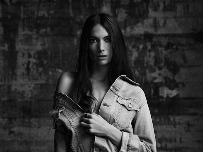
Citizens of Humanity x Mytheresa
This month, an exciting collaboration between premium denim line Citizens of Humanity and luxury retailer mytheresa.com will become available online. The six-piece collection will launch exclusively on the respective websites and is comprised of limited edition denim outerwear and bottoms.
Heavily inspired by the ’80s and early ’90s heavy metal scene, the designs have drawn a lot of influence from cult band Metallica, introducing subtle details in the designs which hint at the ’90s grunge era. The women’s capsule collection goes against the grain, keeping in mind Metallica’s uniform of denim jackets and distressed jeans. To showcase the line and capture its heavy metal influence, Metallica drummer and founding member Lars Ulrich shot the collection, choosing his wife Jessica Miller to model it.
The collection was designed by the Citizens of Humanity Founder Jerome Dahan and Women’s Creative Director Catherine Ryu. Working in collaboration with mytheresa.com, each piece has been produced in Los Angeles, using Citizens of Humanity’s in-house laundry and manufacturing facilities to produce items unparalleled in quality and fit.
Three new outerwear silhouettes have been introduced in the collection, including the Classic Jacket, an oversized boyfriend fit in a light blue wash, a slimmer fit denim jacket in a vintage blue wash called the Trucker Jacket, and the Trucker Vest, a sleeveless washed black denim vest. Three new trouser styles will also become available, these include a high-rise skinny jean in washed black, a mid-rise straight leg jean in a vintage blue wash, and a mid-rise straight fit in washed black.
Head to citizensofhumanity.com or mytheresa.com to browse the pieces for yourselves, which are now available online.




 PREVIOUS
 Twitter
 Tumblr
 YouTube
 Facebook
 Instagram
